 Bank OZK Logo PNG
Banking services include managing deposits, loans, and project financing, serving both individual and business clients. Financial institutions support transactions of various scales, from everyday transactions to investment activities. The Bank OZK logo is associated with a bank that provides lending, asset management, and project financing services across various regions of the United States.
Bank OZK began operations in 1903 as Bank of Jasper. It was a small rural bank in Arkansas established to serve farmers and local entrepreneurs. After decades of stable performance, the institution was acquired by attorney George Gleason in 1979. He saw potential in consolidating regional banks. At that time, the bank’s assets amounted to about $ 7 million.
In 1980, the bank adopted a new name, Bank of the Ozarks. After that, it began a series of acquisitions of small banks in Arkansas and neighboring states. By 1997, the organization was listed on NASDAQ under the ticker OZRK and managed assets of about $ 500 million. In the 2000s, the bank expanded into Texas, Georgia, and Florida.
After the crisis, the bank acquired several failed institutions with support from the FDIC. In the 2010s, it focused on commercial real estate financing. Projects included developments in New York and Miami.
In 2018, the bank shortened its name to Bank OZK. In the following years, the bank diversified its portfolio, expanded small business lending, and invested in digital technologies.
In 2023, Bank OZK launched new online services and mobile applications. In 2024, expansion began into Illinois and Pennsylvania.
The bank manages assets exceeding $ 30 billion. It operates in more than ten states and maintains a reputation as one of the most stable regional banks in the United States under the leadership of George Gleason.
Meaning and History
What is Bank OZK?
An American commercial bank based in Little Rock, Arkansas. One of the largest financial institutions in the Mid-South region of the United States, managing a network of more than 240 branches across several states. It offers deposits, mortgages, credit cards, consumer and commercial loans, and financing for development and agricultural projects. The institution is known for its strict underwriting standards and continuous dividend growth over more than 60 quarters. Its main focus is commercial real estate and construction lending in the southern United States.
before 2018
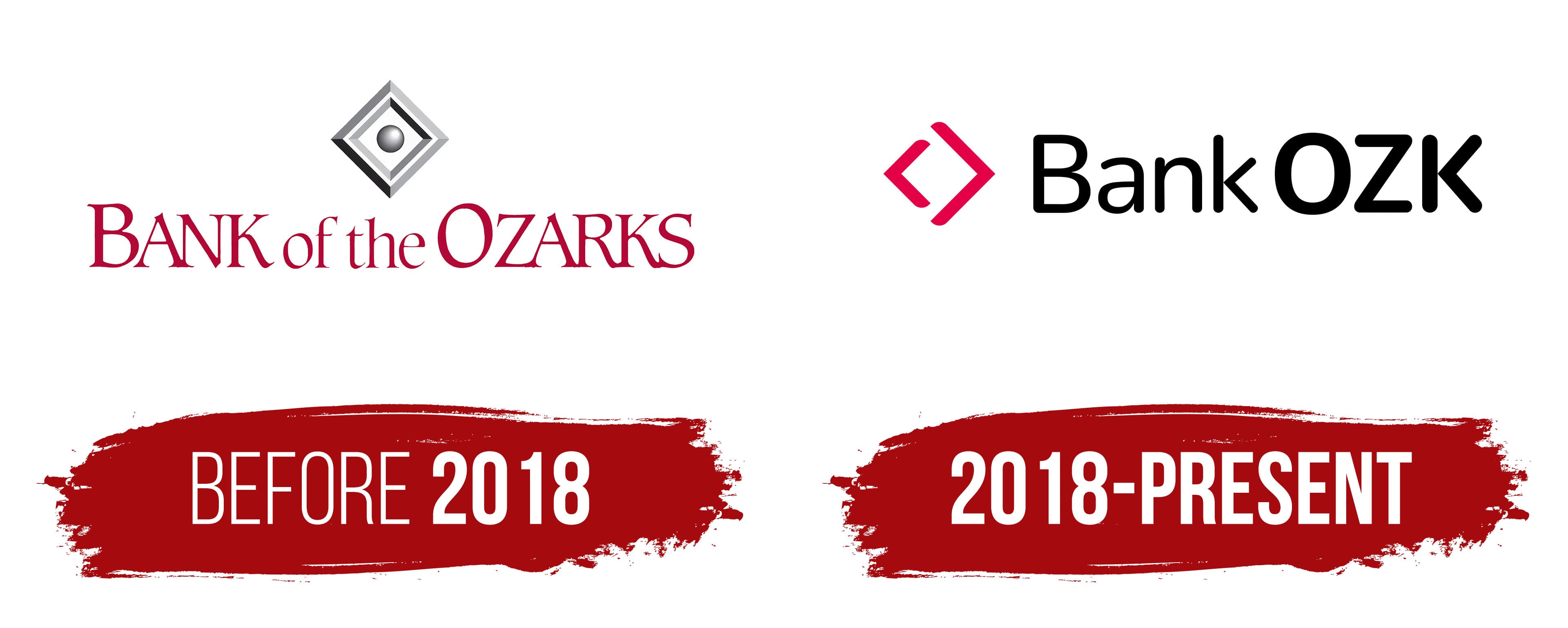
Before 2018, Bank of the Ozarks used a logo featuring a crest-like arrangement of diamonds and a large wordmark. The identity reflected the bank’s connection to the Ozark region, whose name appeared in the company name. The emblem appeared above the text, and both parts formed a unified corporate signature.
The bank’s history began in Jasper, Arkansas, in 1903. Its original name was Bank of Jasper. The name changed as the business expanded. Bank of Western Arkansas appeared in 1937 and reflected its operations in the western part of the state. The bank became Bank of the Ozarks in 1997. The name refers to the Ozark mountain region and identifies the company’s place of origin.
The upper section of the logo contained an emblem composed of diamonds positioned inside one another at the same angle. The color gradually transitioned from light to dark, creating depth. A round gray metallic sphere appeared in the center. Highlights gave it the appearance of a metal surface.
The words BANK of the OZARKS appeared beneath the emblem. BANK and OZARKS were written in uppercase letters, while “of the” used smaller lowercase letters. The letters “B” and “O” were enlarged, giving stronger emphasis to the beginning and end of the name.
The burgundy wordmark used a serif typeface resembling traditional banking fonts. Large letters and formal forms complemented the geometric emblem. The logo was used while the bank expanded beyond Arkansas and preserved its connection to the Ozark region.
2018 – today
The name Bank OZK appeared on July 16, 2018, following the renaming of Bank of the Ozarks. The former name connected the bank to the Ozark region even though the business had long operated beyond Arkansas. The company was active in new markets, developed federal lending operations, and sought a name suited to a broader geographic reach. The abbreviation OZK preserved a reference to the former name and suited a bank with nationwide operations.
Shareholders approved the renaming at the annual meeting on May 7, 2018. Management considered the word “Ozarks” too closely tied to the company’s place of origin. By then, its actual operating territory had become much broader. The new name retained three letters from the regional name, while the word “Bank” continued to identify the company’s business.
The abbreviation OZK had been used before the rebranding as the bank’s NASDAQ ticker symbol. Following the name change, a single designation entered stock market use, corporate materials, and customer communications. Investors already knew the three letters from the bank’s stock, so the transition preserved continuity with its earlier history.
The logo has a horizontal layout. A magenta-red figure composed of two angular brackets appears on the left. The smaller bracket points left, while the larger one opens to the right. The lines have the same thickness and remain separate. Together, they form the silhouette of a diamond with open space inside. The new emblem has a lighter appearance than the former multilayered Bank of the Ozarks figure.
The Bank OZK wordmark appears on the right. Bank begins with an uppercase letter, while the remaining letters are lowercase. OZK appears in large uppercase letters with heavy strokes. A small space joins both parts into one line. Bank identifies the type of business, while OZK serves as the primary name.
The wordmark uses a black sans-serif typeface resembling Avenir or Google Sans. The letters have soft contours and uniform stroke widths. The new version differs from the previous logo, which featured a burgundy serif wordmark and a three-dimensional diamond emblem. The magenta figure adds color, while the black name maintains a professional appearance.