 Alpha Bank Logo PNG
Users complete transfers, payments, and account management in a few steps through mobile apps and online services. People use these tools daily, and they form the basis of their interactions with the bank. The Alpha Bank logo represents a financial institution that provides banking services and digital solutions for private clients and businesses.
Ioannis F. Costopoulos founded Alpha Bank in 1879 as a trading firm in Kalamata. In 1885, he expanded operations and began conducting foreign exchange transactions. In 1916, the company was transformed into a bank named Bank of I.F. Costopoulos. By 1918, the institution became a joint-stock company called Bank of Kalamata. In 1925, the bank was listed on the Athens Stock Exchange.
In the 1970s, Yannis Costopoulos took over management and began modernizing the corporate image. The bank adopted the new name Credit Bank and began expanding into international markets. In 1984, Yannis Costopoulos became chairman of the board. By the end of the decade, the bank had begun expanding into the Balkan region.
Between 1995 and 1997, the bank opened branches in Bulgaria, Romania, and Albania, strengthening its regional position. In 2000, the company Ionika was acquired, after which the institution adopted its current name, Alpha Bank. In 2001, it merged with the National Bank of Greece. It became the country’s largest financial institution and expanded its network to eighteen countries.
In the 2000s, the bank launched a mobile banking service called Alpha Bank m-Banking. During the same period, Greece’s first factoring company, ABC Factors, was established. From 2008 to 2015, the bank endured the effects of Greece’s financial crisis and completed two recapitalization programs.
In 2020, Alpha Bank introduced its 2020–2022 strategy, which focused on network optimization and digital service development. In October 2023, Alpha Bank began a partnership with UniCredit Bank, expanding into Greece and Romania. In 2024, UniCredit acquired a 91.1 percent stake in Alpha Bank Romania. The transaction was fully completed in August 2025.
Alpha Bank continued to strengthen its position. It completed an internal merger with Alpha Services and Holdings S.A. In November 2025, it acquired AstroBank in Cyprus. As a result, it became the country’s third-largest bank, with assets exceeding € 6 billion. The full integration plan is scheduled to be completed in 2026.
Meaning and History
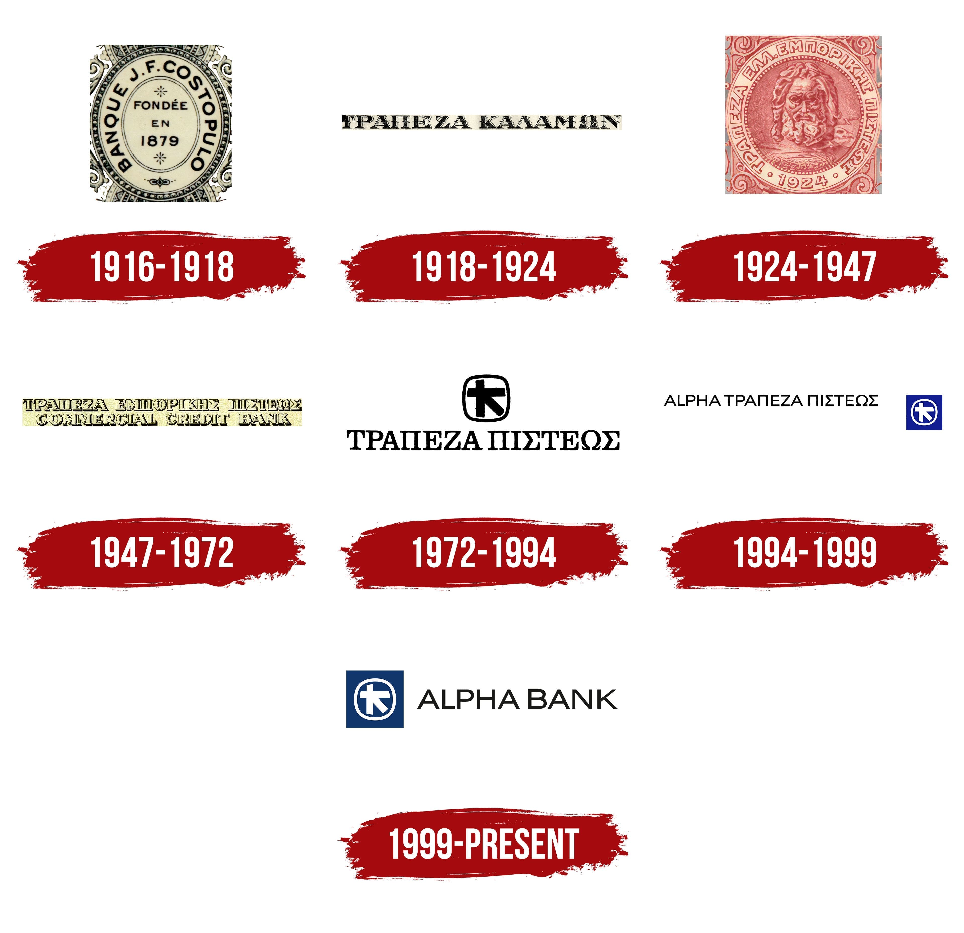
What is Alpha Bank?
A financial group headquartered in Athens, part of Alpha Services and Holdings S.A. It ranks third among Greek banks and operates across Europe and the Balkans. The bank provides loans, investment and insurance products, asset management, and real estate solutions. Its portfolio includes deposits, cards, online banking, leasing, and trade finance.
1916 – 1918

The 1879 date on Alpha Bank’s first banking emblem referred to Ioannis F. Costopoulos’s trading business in Kalamata. His enterprise began in trade and gradually expanded into banking, particularly currency exchange. On February 12, 1916, Costopoulos established a bank within the trading company under the family name Banque J. F. Costopulo, also known as J. F. Costopoulos Bank. The earlier date linked the new institution to the family business’s history.
The 1916 logo resembled an oval seal. BANQUE J. F. COSTOPULO ran around the outer edge in large black uppercase sans-serif letters. The straight strokes were nearly uniform in thickness, and the lettering followed the oval’s curve. Inside a second border, the French founding statement was stacked vertically, with FONDÉE above EN and 1879 below, meaning “Founded in 1879.” Small rosettes appeared above the words and beneath the date. The owner’s surname dominated the lettering around the seal, while the center indicated how long his business had existed.
Several nested borders separated the inscriptions from the edge pattern. Scrolls, botanical forms, and intricate ornament surrounded the inner oval. The dark blue artwork appeared on a light beige background, and the heavy lettering kept the name Banque J. F. Costopulo legible among the small decorative details.
1918 – 1924

The bank’s conversion to a joint-stock company brought a name change. On March 14, 1918, J. F. Costopoulos became Τράπεζα Καλαμών, or Bank of Kalamata. The city where the business began replaced the founder’s surname. The change was reflected in the bank’s visual identity, with a long Greek inscription becoming the main element.
ΤΡΑΠΕΖΑ ΚΑΛΑΜΩΝ appeared in large uppercase serif letters. Their dark forms stood against a light background, with double outlines, internal hatching, and shadows that suggested engraved relief. The name appeared above the other text on securities, surrounded by dense botanical ornament. The elaborate pattern framed the inscription while keeping the bank’s name the composition’s main text.
1924 – 1947
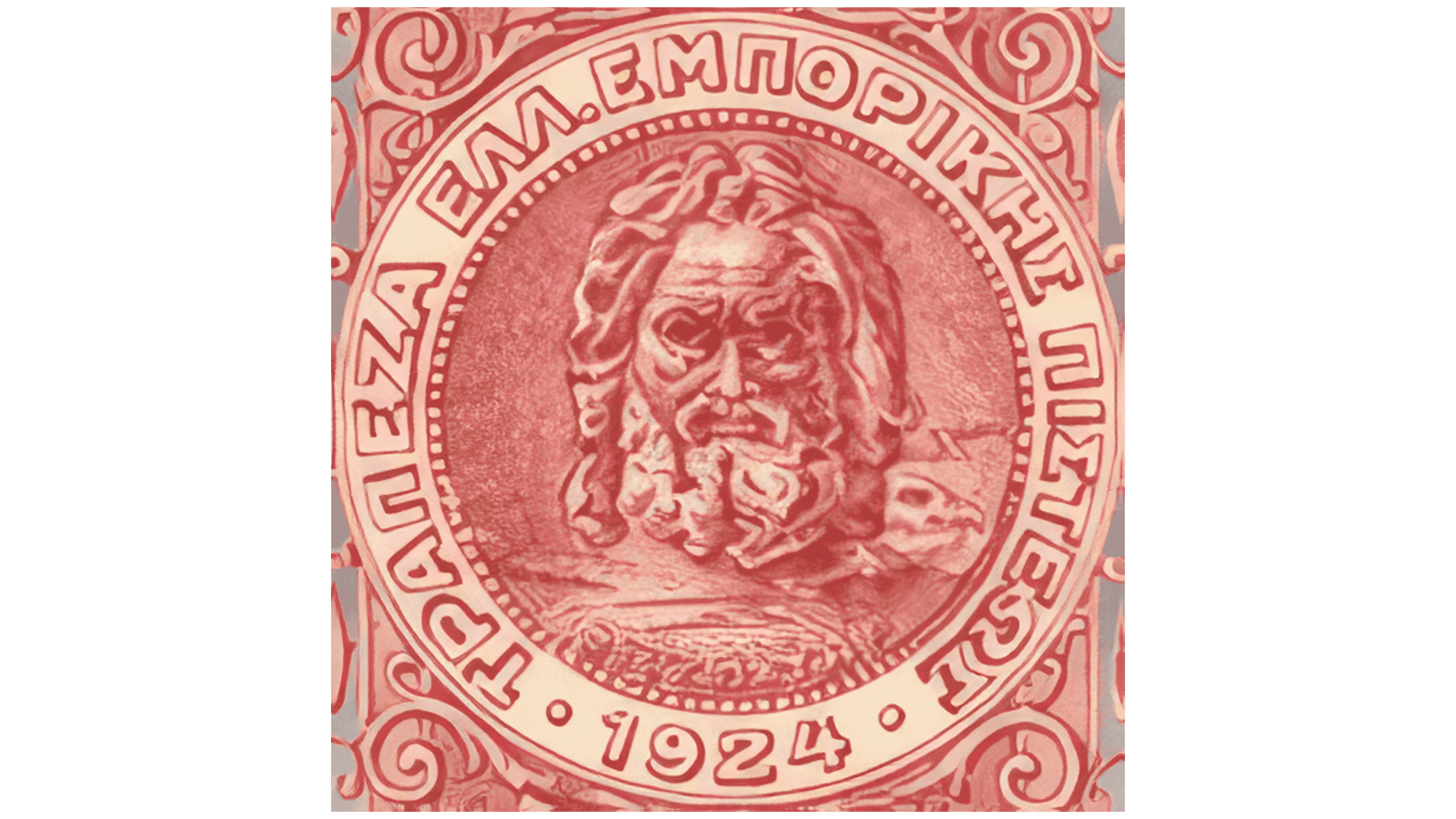
In September 1924, Bank of Kalamata merged with the banking division of the Costopoulos trading house. The new institution, headquartered in Athens, was named Banque de Crédit Commercial Hellénique, meaning “Hellenic Commercial Credit Bank.” Artist Georgios Prokopiou created a seal featuring a portrait of Zeus. The complete design identified the two merging businesses above and below the medallion, with 1879 beside the Costopoulos trading house and 1918 beside Bank of Kalamata.
Prokopiou placed the head of Zeus, with thick hair and a beard, inside a circular medallion. The modeled facial features, deep shadows, and shifts in red and pink gave the portrait a sculptural appearance. An eagle and lightning bolts, attributes of the god’s power, appeared behind his shoulder. The inscription “ΖΕΥΣ ΠΑΤΗΡ,” meaning “Zeus the Father,” ran nearby. A ring separated the portrait from the bank’s name.
ΤΡΑΠΕΖΑ ΕΛΛ. ΕΜΠΟΡΙΚΗΣ ΠΙΣΤΕΩΣ, meaning “Hellenic Commercial Credit Bank,” ran around the circle in uppercase Greek sans-serif letters. Heavy, angular strokes contrasted with broad inner spaces. The year 1924 appeared at the bottom, flanked by decorative dots. Symmetrical scrolls and volutes extended beyond the ring. Ochre, scarlet, and warm pink tones united the ornament, lettering, and portrait.
The bank faced difficult events after the seal was introduced. The 1929 economic crisis forced it to reduce its branch network. Liquidation was scheduled for December 19, 1944. Still, the events of the Dekemvriana prevented the liquidation, and the bank remained in operation.
1947 – 1972

In 1947, Banque de Crédit Commercial Hellénique became Commercial Credit Bank. Zeus continued to appear in the bank’s visual materials, including watermarks on stock certificates. The wordmark took a different form, with the name displayed on two lines in Greek and English.
ΤΡΑΠΕΖΑ ΕΜΠΟΡΙΚΗΣ ΠΙΣΤΕΩΣ appeared above COMMERCIAL CREDIT BANK. Both lines used large uppercase serif letters. Thick vertical strokes alternated with thinner horizontal ones, while outlines and internal shadows created a raised effect that continued the bank’s earlier engraved style. Black letters with deep shadows and pale cream highlights appeared on a beige background.
1972 – 1994

In September 1972, the bank shortened its name to Credit Bank, Τράπεζα Πίστεως. The changes were part of a modernization program led by Yannis Costopoulos. A new emblem drawn from an ancient Greek coin accompanied the name. The model was a silver stater from Aegina, with a sea turtle on the obverse and a square incuse, divided into five sections, on the reverse. The bank adapted the reverse design.
The black symbol was a square with rounded corners. Inside, three thick strokes formed an asymmetrical intersection. A vertical line stood on the left, a horizontal line crossed it near the top, and a diagonal descended from their meeting point. Beneath the emblem, ΤΡΑΠΕΖΑ ΠΙΣΤΕΩΣ appeared in upright uppercase Greek letters with large serifs. The flat, high-contrast design made the ancient motif easy to reproduce on different surfaces.
Branches used a green background and an orange stripe. Fashion designer Yannis Tseklenis incorporated the bank’s emblem into employee uniforms, including dresses, ties, scarves, women’s belt buckles, and document bags. The coin design extended beyond signage to become a consistent feature of Credit Bank’s visual identity.
The name Alpha entered the group later. In 1981, the subsidiary Alpha Computers adopted it. Alpha is the Latin-alphabet spelling of the first letter of the Greek alphabet. In the summer of 1994, the bank announced its international name, Alpha Credit Bank. Then it introduced the Greek form Alpha Τράπεζα Πίστεως. Adding Alpha connected the bank with the group’s companies and products and helped distinguish it internationally. At the time, 43 banks worldwide had “Credit” in their names.
1994 – 1999

In 1994, Credit Bank began using the name Alpha Credit Bank. The new identity paired Alpha with the emblem based on the ancient coin design. The bank introduced blue and white to reflect its Greek origins. The rollout began at three branches with different architectural styles, and development of the identity was completed in 1995.
In the horizontal version, ALPHA ΤΡΑΠΕΖΑ ΠΙΣΤΕΩΣ appeared on the left. The Latin-alphabet ALPHA stood beside the Greek bank name. All letters were uppercase, upright, and equal in height, with even sans-serif strokes. The black lettering resembled Univers or Eurostile. On building facades, the name appeared in three-dimensional silver letters, each individually illuminated.
A bright blue square containing the white emblem sat to the right of the words. Inside the rounded white outline, three thick strokes intersected. A vertical stroke on the left was crossed near the top by a horizontal line, with a diagonal descending from their meeting point. The coin-based form preserved a connection to the earlier symbol. At the same time, the bank’s new name was accompanied by Latin and Greek lettering.
1999 – today
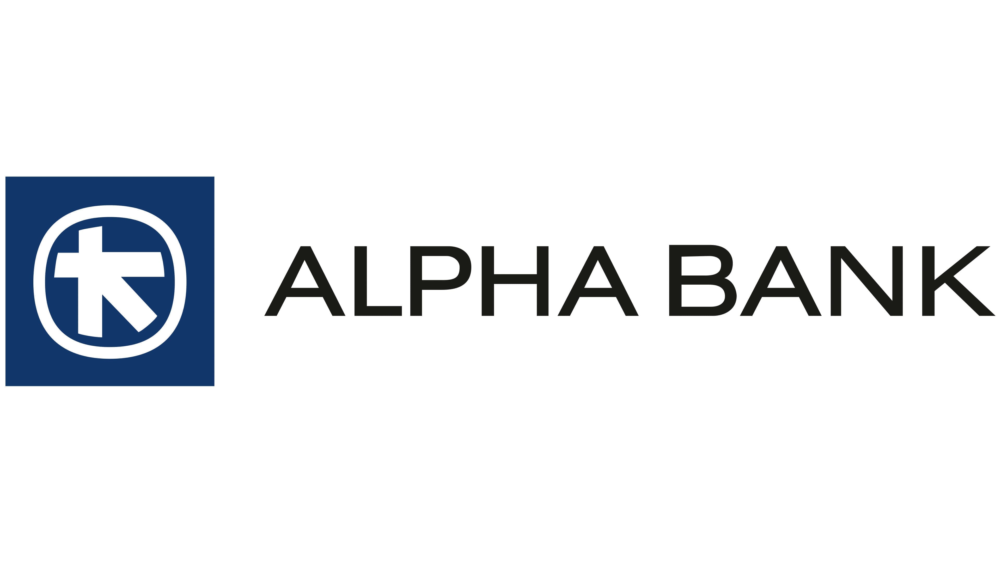
The merger of Alpha Credit Bank with Ionian Bank, acquired in 1999, culminated in the adoption of the name Alpha Bank in 2000. “Credit” was dropped, and the merged bank’s logo received the shorter Latin-alphabet inscription ALPHA BANK. The blue-and-white emblem retained its connection to the Aegina stater.
In the horizontal composition, a solid indigo-blue square appears on the left. A thin, rounded outline surrounds the white symbol, which consists of three thick lines. A vertical stroke stands on the left, a horizontal line crosses it near the top, and a diagonal descends from their intersection. To the right, ALPHA BANK appears in black, upright uppercase sans-serif letters. The medium-weight strokes are nearly uniform, and the lettering resembles Gotham or Avenir.