 Bank Rakyat Indonesia (BRI) Logo PNG
Financial services in Indonesia cover a wide range, from microloans for farmers to accounts for small businesses and savings for families. In many regions, a single bank serves multiple groups, providing basic transaction services and access to financing. The Bank Rakyat Indonesia (BRI) logo represents a bank that serves retail customers, entrepreneurs, and the agricultural sector, offering loans, accounts, and other banking services nationwide.
Bank Rakyat Indonesia, or BRI, was founded in 1895 by Raden Aria Wirjaatmadja in Purwokerto. The institution was created as a savings bank to protect farmers from moneylenders. In its early decades, the bank provided small loans to farmers and civil servants. In the 1930s, the colonial administration reorganized it to expand microcredit programs.
After Indonesia declared independence in 1945, the government nationalized the bank. It received its modern name and became a symbol of the new state. In the 1960s, under Sukarno and Suharto, BRI became a pillar of rural development. The bank opened branches in villages.
In 1984, the Kupedes program was launched to provide unsecured microloans. This made the bank the world’s largest microfinance institution. In 1992, the bank obtained commercial institution status, thereby expanding its authority.
During the Asian financial crisis of 1997, BRI remained stable. Its extensive branch network and low loan default rate supported this stability. In 2003, the bank held its initial public offering on the Jakarta Stock Exchange. The government retained a controlling stake.
In the 2000s, BRI modernized its infrastructure. It introduced ATMs, internet banking, and mobile banking. By the 2010s, the bank had created a network of agent outlets, providing access to financial services in remote regions.
Since 2017, the bank has pursued digitalization. The bank launched the BRImo app, a microcredit platform, and the digital bank BRI Direct.
The company serves more than 140 million clients. The bank manages over 10,000 branches and remains the largest in Indonesia by the number of microloans and the scale of its operations.
Meaning and History
What is Bank Rakyat Indonesia?
It is Indonesia’s largest bank, with more than a century of history, a global leader in microfinance, and a state-owned enterprise. It has thousands of branches and tens of thousands of microfinance outlets, providing access to banking services across the archipelago. The main business activity is lending to small enterprises, rural farms, and individual entrepreneurs through microfinance programs, trade operations, and payment solutions. The bank was the first in the world to launch its own satellite, BRIsat, enabling it to serve even remote regions without communication networks. Its market capitalization ranks among the largest in Asia, and the dividend yield remains around 9.7%.
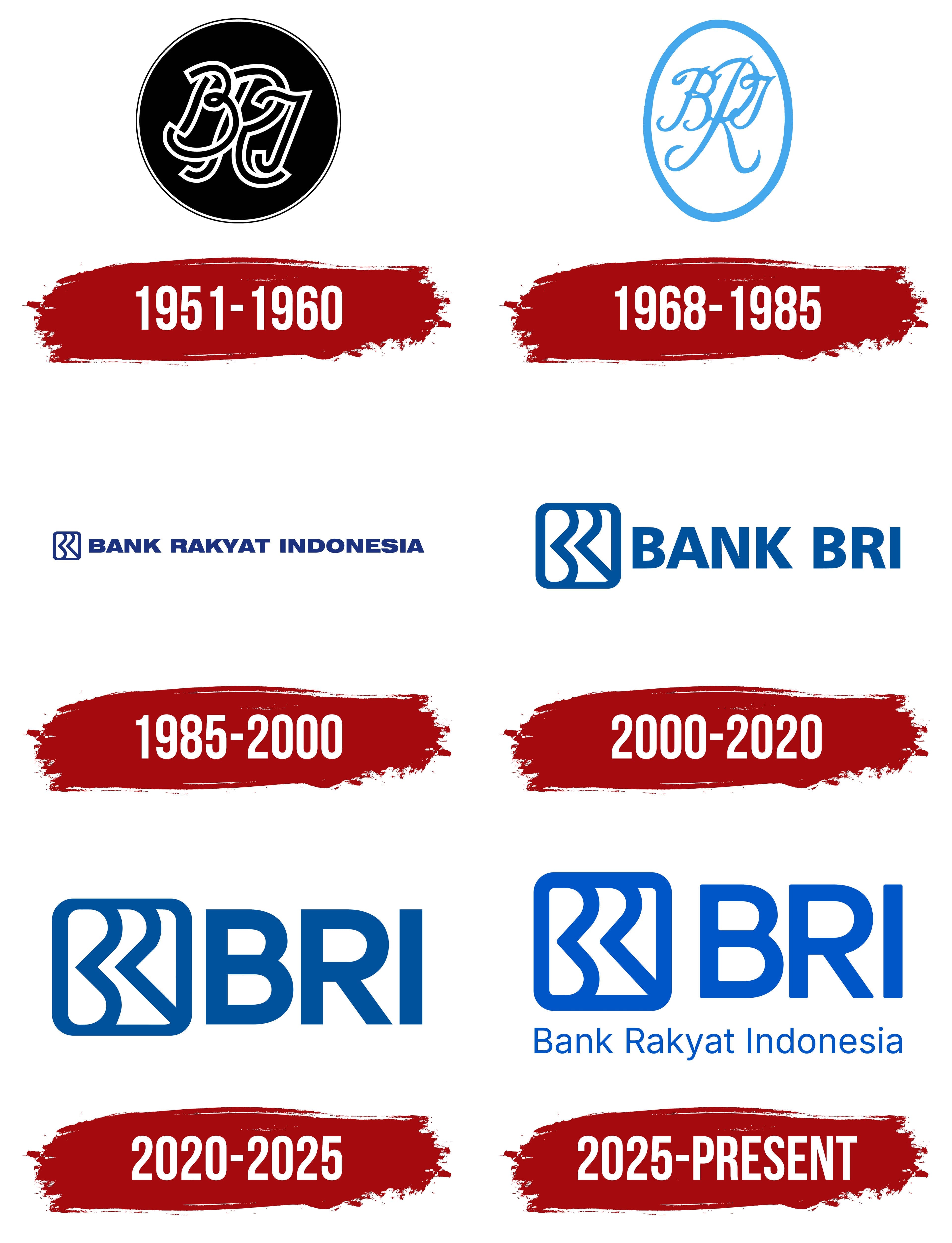
1951 – 1960

Bank Rakyat Indonesia began as a local savings-and-loan institution in Purwokerto, Central Java. Raden Bei Aria Wirjaatmadja founded it on December 16, 1895. Its original name, De Poerwokertosche Hulp en Spaarbank der Inlandsche Hoofden, identified an institution serving local nobility and officials. It managed mosque funds and provided affordable loans to the indigenous population, helping borrowers avoid dependence on moneylenders.
The institution later began serving agriculture. This expansion was reflected in the name De Poerwokertosche Hulp, Spaar-en Landbouw Credietbank. It also used the shortened form Volksbank. In 1934, the institution was incorporated into Algemene Volkscredietbank, and during the Japanese occupation, it operated as Syomin Ginko.
Following the declaration of independence, the government reorganized the institution as Bank Rakyat Indonesia. A decree dated February 22, 1946, approved the name. “Bank” means bank, “rakyat” means “people,” and “Indonesia” identifies the country. The name translates as “People’s Bank of Indonesia” or “Bank of the Indonesian People.” The first letters of the 3 words formed BRI. The abbreviation became part of the bank’s visual identity and later became its primary commercial name.
The early emblem combined the initials into an interwoven monogram. White letter strokes appeared on a black circular field with a thin double border. The 2 outer outlines separated the image from the background. At the same time, the white-on-black contrast helped distinguish the intricate design inside.
The letterforms resembled decorative calligraphy. Their strokes intersected, creating a dense knot of 3 initials. The monogram occupied the circle’s interior and represented the name through the abbreviation BRI.
1968 – 1985
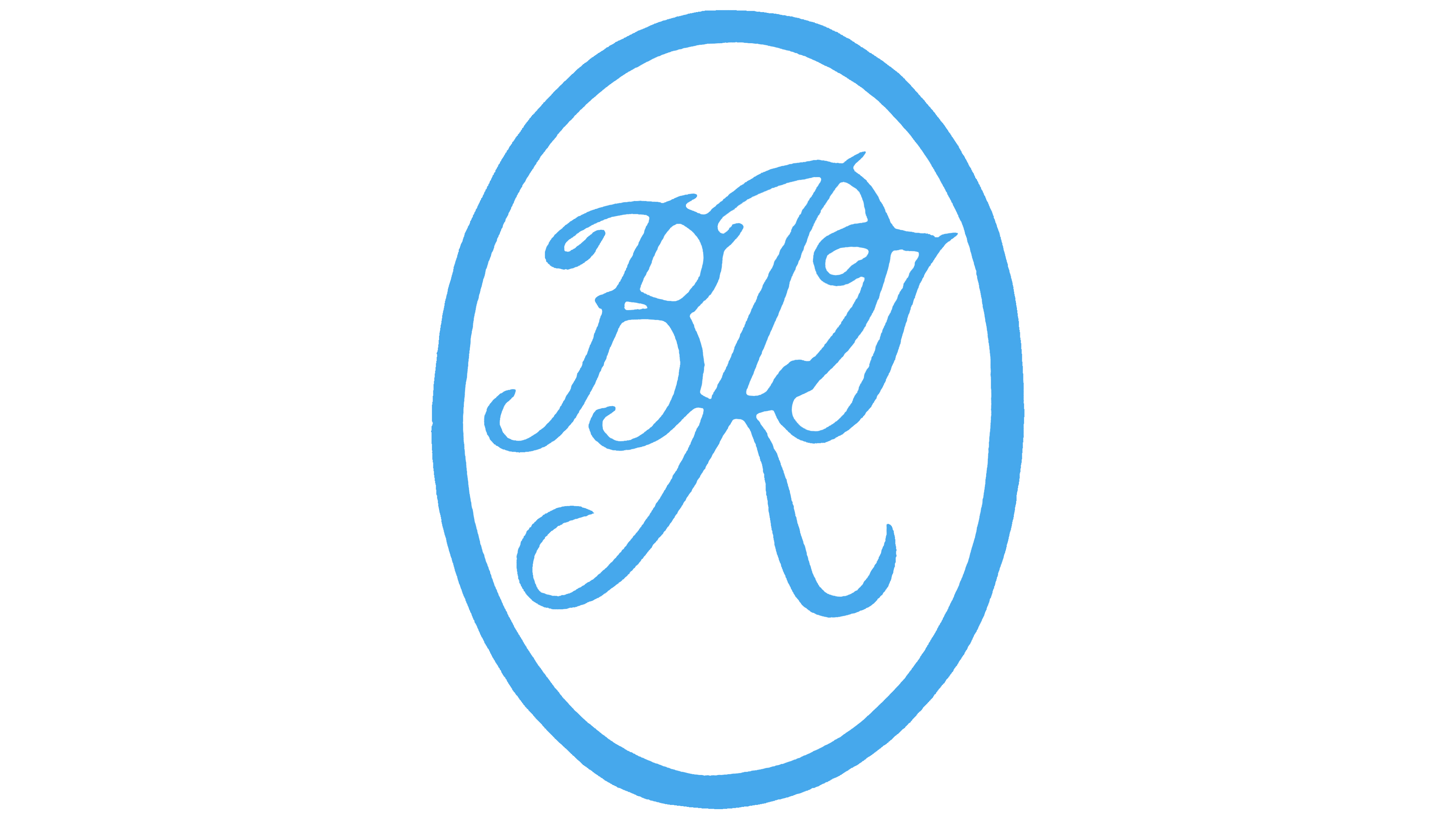
In 1968, Bank Rakyat Indonesia regained its previous name and commercial bank status. Before that, it had operated within Bank Koperasi Tani dan Nelayan, which it joined in 1960 along with several agricultural and cooperative institutions. Law No. 21 of 1968 restored BRI as a separate commercial bank. A 3-letter monogram once again represented its name.
In the logo used from 1968 to 1985, a vertically elongated oval frame surrounded the letters. The monogram and outline were light blue, while the interior remained light. Compared with the previous circular emblem, the interwoven lettering became more open, with additional space between the strokes.
The uppercase “B,” “R,” and “I” were drawn in a slanted calligraphic style. Flowing curves and intersections connected them in a unified design. A large “R” occupied most of the oval. The other 2 letters were woven into its contours, forming a decorative BRI abbreviation.
The oval frame had a medium stroke weight and followed the monogram’s elongated proportions. Light blue united the border and lettering, while the light background helped distinguish their curves and intersections.
1985 – 2000
In 1985, Bank Rakyat Indonesia updated its logo, replacing the calligraphic monogram with a geometric BRI design. The bank adopted a shared identity for branches, uniforms, documents, and the BRI Unit network serving microenterprises and rural areas. A compact linear emblem appeared beside the bank’s full name.
The initials were enclosed in a square frame with rounded corners. Inside, a continuous blue line formed the letters, while the gaps helped distinguish their outlines. The “B” on the left had 2 curves, the central “R” had 1, and the vertical stroke on the right represented the “I.” Medium-weight lines left open space within the monogram. Straight sections combined with curves that echoed the outer frame’s shape.
The emblem’s construction reflected the “The Leader of Change” role in Indonesia’s banking industry. The progressive reduction in curves from “B” through “R” to “I” was linked to service development and BRI’s contribution to people’s economic lives. The rounded frame represented its reach across different customer groups. Blue became the bank’s enduring corporate color.
In the version used from 1985 to 2000, a small emblem appeared to the left of “BANK RAKYAT INDONESIA.” The full name was set on a single line in dark blue uppercase sans-serif letters. Upright lettering and geometric forms complemented the monogram’s lines. The shared color united the image and text, while their different proportions distinguished the abbreviated BRI from the full name.
The horizontal logo appeared on signs and banking materials. The initials maintained a connection to earlier versions, while the wording spelled out the abbreviation for customers. Decorative interwoven lettering gave way to a combination of lines and open spaces.
In 1992, the state institution adopted the legal status of PT Bank Rakyat Indonesia (Persero). It retained the name and existing logo. Microlending continued to connect the word “Rakyat” with support for the population, rural areas, and small businesses.
2000 – 2020
розділено на два періоди
2000 – 2007
In 2000, Bank Rakyat Indonesia shortened the wording in its logo to “BANK BRI.” The shorter name replaced the full “BANK RAKYAT INDONESIA” and shifted the emphasis to the familiar abbreviation. The design became shorter while retaining the existing monogram beside the text.
The emblem was enlarged relative to the wordmark. The rounded frame extended above the “BANK BRI” lettering and occupied a substantial portion of the logo. The bank’s initial-based design remained inside. The update changed the relative sizes of the image and name.
“BANK BRI” was set in heavy uppercase sans-serif letters. The upright lettering and thick strokes complemented the enlarged emblem. An open gap between the words separated the bank designation from the abbreviation. Blue replaced the previous dark blue. The monogram, frame, and lettering used a single shade.
The 2000 version was used until 2007. It later appeared on certain materials as an additional version. The next update retained “BANK BRI” and the emblem’s internal design while revising their proportions.
In 2007, the emblem became more compact. The frame’s corner curves were made consistent, and the internal stroke weights were evened out. The name moved closer to the image, reducing the gap. The logo adopted a tighter horizontal layout.
2007 – 2020
In 2005, for BRI’s 110th anniversary, the bank added the tagline “Melayani Dengan Setulus Hati,” meaning “Serving with All Our Heart.” The phrase appeared as an anniversary message to customers and conveyed the bank’s service approach. It later became part of its regular communication.
The tagline was placed beneath “BANK BRI” in small letters. The main wordmark was enlarged slightly, preserving its leading role. The monogram represented the bank through its initials, the “BANK BRI” line named the organization, and the phrase below explained its promise to customers.
The rest of the identity remained unchanged. The additional line became part of the familiar arrangement and continued to be used after the anniversary year ended.
2020 – 2025
By 2020, BRI brought together businesses in banking, insurance, financing, securities, money transfers, and digital products. This expansion was reflected in the logo introduced on November 21, 2020. The shortened BRI became a shared name for the parent company and its related businesses.
The word “BANK” was removed from the previous “BANK BRI” wordmark. A large abbreviation remained to the right of the monogram, representing the group’s full range of services. The update was explained through the phrase “The Leader of Change.” It referred to BRI’s role as the parent company of financial institutions with different specialties.
The emblem retained the stylized “B,” “R,” and “I.” The main changes involved the image size and the lettering. Both were enlarged and combined into a short horizontal design. The initials appeared in 2 forms, as a linear monogram on the left and a wordmark on the right. The existing emblem design maintained a connection to the brand’s history.
The wordmark used AU Passata Bold. The uppercase “BRI” letters featured a bold sans-serif style with thick, even strokes. Their visual weight complemented the enlarged monogram, maintaining the balance between the logo’s 2 parts.
The abbreviation also suited mobile services. It became part of the name BRImo, which developed into a familiar digital brand within the group. Using BRI in names helped connect financial businesses and mobile products to the parent company.
2025 – today
For its 130th anniversary, Bank Rakyat Indonesia updated its logo and restored the full historic name. The 2025 version accompanied the BRIVolution Reignite program and the positioning statement “Satu Bank Untuk Semua,” meaning “One Bank for All.” The bank sought to retain its traditional customer base, expand its work with urban customers and younger generations, and bring subsidiary brands under shared identity guidelines.
A preview took place on October 16, 2025. The full corporate update was presented on December 16. The return of the Bank Rakyat Indonesia name was linked to the institution’s roots in serving the people and its longstanding closeness to the country’s residents. The shortened BRI remained the primary commercial name, while the lower line spelled out the abbreviation.
The monogram retained the interwoven 3 letters within a frame. The lines became thinner, increasing the space between them. The outer outline was also reduced in weight, and the emblem and “BRI” wordmark were placed farther apart. The existing design gained open space within and around the letters.
The upper line used modified lettering based on AU Passata Regular. Compared with the 2020 version, the uppercase “BRI” letters became narrower, with thinner strokes. “Bank Rakyat Indonesia” appeared beneath the abbreviation in Inter Display. Each word began with an uppercase letter followed by lowercase letters. Size and capitalization distinguished the full name from the large abbreviation while bringing them together in a single text block.
The primary blue shade was named Nusantara Blue. The word “Nusantara” refers to the Indonesian archipelago and connects the color to the bank’s national reach. Supporting materials used Mentari Blue, Cakrawala Blue, and white. “Mentari” means “sun,” while “Cakrawala” means “horizon.” The range of blue shades was intended to create a consistent identity across divisions and applications.
The phrase “Satu Bank Untuk Semua” represented a universal service model. It encompassed micro, small, and medium-sized businesses, as well as consumer, commercial, and corporate banking segments. The team prepared typeset and handwritten versions of the tagline. The promise of “One Bank for All” connected the expansion of its customer base with BRI’s historic work serving the people of Indonesia.