 SLM Logo PNG
Education financing involves issuing student loans and managing repayments over many years. These services help cover tuition costs and spread expenses over time. The SLM logo is associated with a company that provides student loans and manages education financing in the United States.
Sallie Mae was founded in 1972 in Washington and was originally called the Student Loan Marketing Association. Its mission was to provide liquidity to the student loan market and expand access to higher education. In the 1970s and 1980s, the company solidified its position as a government-sponsored enterprise. It managed both federal and private student loans.
In 1996, the U.S. Congress approved the SLMA Reorganization Act, beginning privatization. In 1997, the company created SLM Corporation as its holding company. By December 2004, Sallie Mae had fully transitioned to a private corporation, ending all ties with the federal government.
In 2008, the company received government support through the FFEL program. In 2010, Sallie Mae acquired a $28 billion portfolio of federally guaranteed loans from the Student Loan Corporation. In 2013, SLM Corporation became the official management structure for the Sallie Mae brand.
In April 2014, the company split its business, spinning off Navient as an independent organization. The new entity focused on servicing federal loans. Sallie Mae then shifted its focus to private student loans, banking products, and credit cards for students and their families.
From 2020 to 2022, Sallie Mae Bank sold several private loan portfolios and repurchased its own shares. By the third quarter of 2024, the company had repurchased about 52 percent of shares outstanding since early 2020. In 2024, the company issued a record $7 billion in private education loans, exceeding its target.
In July 2025, the federal student loan reform act was passed, repealing the Grad PLUS program and limiting Parent PLUS loans. The new rules will take effect on July 1, 2026. Forecasts suggest this will increase demand for private loans.
Meaning and History
What is SLM?
An American financial company based in Newark, Delaware, specializing in private education loans for students and their families. It manages one of the largest student loan portfolios in the United States and also offers savings programs, refinancing, and education-related banking services. The company operates as an independent lender and competes with Discover, Citizens, and Wells Fargo.
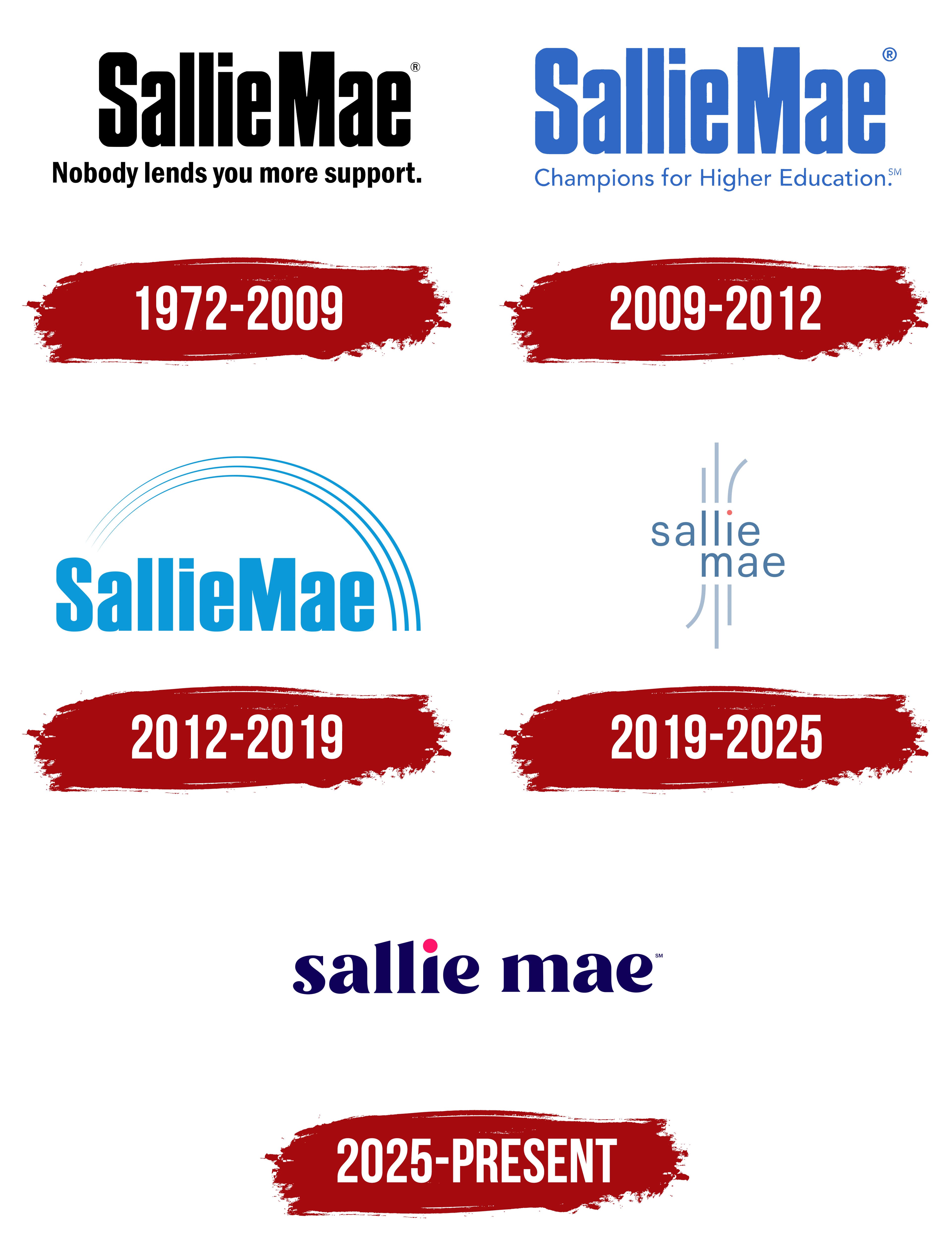
1972 – 2009
The line “Nobody lends you more support.” beneath Sallie Mae’s early logo connected lending with support for students and their families. “Lends” referred both to providing loans and to the expression “lend support.” The slogan appeared in smaller black lettering, beginning with a capital “N” and ending with a period. Above it, SallieMae was written without a space, with capital “S” and “M” letters distinguishing the two parts of the name.
The name began with the Student Loan Marketing Association. Congress established the organization in 1972 to support the student loan market. It purchased student loans from lenders, freeing up funds for additional education loans. The initials of “Student Loan Marketing” formed SLM, which remains part of the SLM Corporation name. The informal name Sallie Mae developed from the abbreviation SLMA. It sounded like a woman’s name and eventually became the financial company’s consumer-facing name.
The upper line used heavy, upright sans-serif lettering. The SallieMae letters were tall and narrow, with strong vertical strokes, tight spacing, and small interior openings. The corners were softened, and the square dot over the “i” reinforced the lettering’s geometric forms. Black unified the name and slogan, with differences in size and stroke weight distinguishing them.
2009 – 2012
Blue changed the SallieMae logo’s appearance while preserving the main wordmark’s letterforms. The capital “S” and “M” letters continued to separate the two parts of the name without a space. Tall, narrow letters with heavy vertical strokes and straight contours remained tightly arranged on a single line. The sans-serif style stayed in place, with bright blue replacing black.
“Champions for Higher Education” appeared beneath the name. Its thin, sans-serif letters and softly rounded forms contrasted with Sallie Mae’s heavy lettering. The company had used “Champions for Higher Education” since 2005, linking the phrase to expanded access to education. It presented Sallie Mae as an advocate for higher education. Replacing the slogan changed the message to its audience while preserving the name and its recognizable lettering.
2012 – 2019
In 2012, three arcs above the name replaced the slogan beneath the SallieMae logo. They begin as thin lines near the first “S,” rise in a semicircle above the letters, and descend beyond the right end of the word. The strokes become thicker as they curve, with equal gaps between them. Light blue unifies the arcs and lettering, while the new upper section makes the design taller and wider than the earlier wordmark.
The name remained unspaced, with capital “S” and “M” letters and the remaining letters in lowercase. Its heavy, upright sans-serif style retained elongated vertical strokes and tight spacing. The new imagery changed the logo’s structure without altering the Sallie Mae name.
2019 – 2025
A coral dot above the “i” became the focal point of Sallie Mae’s 2019 logo. It represented a person and the beginning of their life journey. Light-colored lines extending above and below the lettering represented customers’ different paths. The agency co-developed the update for Sallie Mae’s fifth anniversary as an independent consumer bank after separating from Navient. The company wanted to communicate its role more clearly as a private financial institution and maintain customer relationships after graduation.
The tightly spaced SallieMae wordmark, with its capital “S” and “M,” shifted to lowercase lettering on two levels: “sallie” appears on the upper line, left-aligned, while “mae” sits offset to the right beneath it. The “m” begins below the “lli” portion of the upper word. Thin, upright sans-serif letters appear in blue. The round dot over the “i” is coral orange and sits slightly higher above the lettering.
Three blue-gray lines extend above the letters “l,” “l,” and “i.” The left line is shorter than the others, the middle line reaches higher, and the right line curves outward. Three additional strokes extend downward beneath the “m,” with one turning left. Their shade is lighter than the lettering. Their differing lengths and curves convey the variety of personal experiences, connecting the new logo to the bank’s intention to support people through life after education.
2025 – today
Within the updated brand system, Sallie and Sallie Mae took on different roles. Sallie encompasses college preparation and education planning services. Sallie Mae remains the name for loan and savings products. The distinction is reflected in the wordmarks, which share details.
Designer Laura Moustis-Parent began working on the Sallie wordmark in 2022. She used Astila as a starting point, then softened its sharp sections, aligned the lower terminals, and modified the “s” by lightening its lower curved stroke. The upper-left edge of the “i” gained a curve. Together with its dot, the letter formed a small human silhouette representing each student’s individuality.
In 2025, the Sallie Mae logo adopted the horizontal wordmark “sallie mae.” Both words remained lowercase, with a space added between them. The previous version’s external lines were removed, and a heavier serif style replaced the thin lettering. Its letterforms combine thick and thin strokes, rounded terminals, and angled tops on the tall letters. The dark blue is close to indigo. A large, bright pink circle replaces the usual dot above the “i,” continuing the color emphasis placed on that letter in the previous logo.