 Bank Negara Indonesia Logo PNG
Financial operations in Indonesia encompass transfers, settlements, savings, and business services across the country’s various regions. The banking system connects the islands through a network of branches and digital services. The Bank Negara Indonesia logo is associated with a state-owned bank that provides financial services to private clients and companies, including international transactions.
Bank Negara Indonesia was founded on July 5, 1946, in Yogyakarta shortly after the country declared independence. In its early years, the bank functioned as a central institution. It issued the national currency and financed the revolutionary government. After independence was recognized in 1949, BNI expanded its operations across Indonesia.
In 1953, Bank Indonesia was established. After that, BNI became a state-owned commercial bank supporting industry and trade. In the 1960s, the bank helped finance government projects under President Sukarno. After Suharto rose to power in 1965, the bank focused on industrial and infrastructure development.
In the 1970s, BNI financed the oil and gas sector. In the 1980s, it expanded its branch network and opened overseas offices in Singapore, Hong Kong, and Tokyo. In 1992, the government placed 25 percent of the shares on the stock exchange and began partial privatization.
The 1997–1998 crisis became a turning point. The rupiah’s devaluation and rising non-performing loans led to large-scale restructuring. Between 1999 and 2001, the bank received government support through the IBRA agency. It carried out deep management reforms.
In 2004, authorities uncovered a major fraud case totaling 1.7 trillion rupiah. This event led to a review of internal procedures. In 2007, BNI began digital modernization. In 2010, it opened branches in New York, London, and Seoul.
In 2014, it launched a mobile application. In 2017, it began a digital transformation program, introducing artificial intelligence and blockchain. In 2019, the bank invested in fintech companies and expanded digital payments.
In 2022, BNI introduced BNI Digital, an online bank. It focused on small businesses and young clients. In 2023, BNI expanded its ATM and terminal infrastructure. In 2024, it implemented cloud technologies and digital skills development programs.
BNI is among the four largest banks in Indonesia. It serves tens of millions of customers through thousands of branches and online platforms nationwide.
Meaning and History
What is Bank Negara Indonesia?
Founded after Indonesia’s independence, it is one of the four largest banks and is state-controlled. It serves over sixty million customers and offers export-import operations, corporate accounts, pre-export financing, and the BNI Cash Management system linked to BNI Direct. The international network includes eight offices. In the retail segment, it offers accounts, credit cards, mortgages, auto loans, and mobile banking with QRIS. Through BNI Life and BNI Sekuritas, it provides insurance and brokerage services, and the BNI Emerald program serves wealthy clients.
1946 – 1988

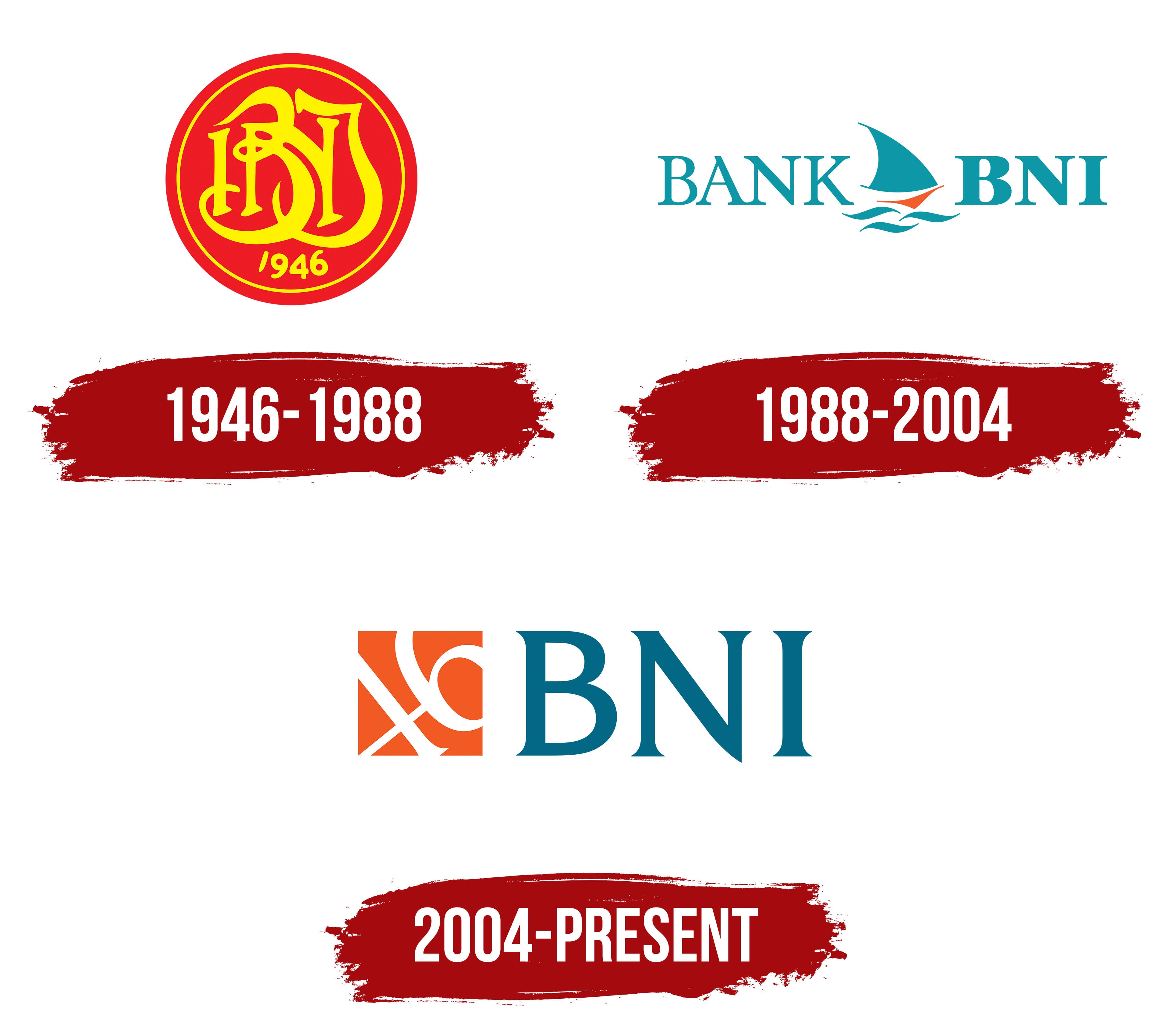
A red circle with a gold monogram represented Bank Negara Indonesia during the formation of the independent republic’s banking system. Used from 1946 to 1988, the emblem had a narrow gold border. The letters “B,” “N,” and “I” intertwined across the red field. The “B” appeared on the left, the “N” occupied the center, and the “I” completed the monogram on the right. Elongated vertical strokes, curves, intersections, and flourishes resembled historical calligraphy with Gothic and Victorian influences. Despite the close connections, the outlines of all 3 letters remained identifiable. The gold number “1946” appeared beneath the abbreviation.
The year referred to July 5, 1946, when the bank was established in Yogyakarta under Emergency Government Regulation No. 2/1946. BNI was the first state-owned bank created by the government of independent Indonesia. During its early years, it combined commercial banking with the functions of the country’s primary currency-issuing institution. Its system issued and distributed Oeang Republik Indonesia, the republic’s first national currency, introduced on October 30, 1946.
After currency-issuing authority was transferred to De Javasche Bank, BNI focused on commercial services. The institution received authorization to conduct foreign exchange operations in 1950 and began operating as a commercial bank in 1955. Its branch network expanded during the following decades, along with the introduction of mobile banking services. Bank Negara Indonesia means “State Bank of Indonesia” and refers to the institution’s origins. Bank Negara Indonesia 1946 became the official name in 1968, incorporating the founding year into the bank’s name.
The emblem’s meaning was connected with BNI’s role as a state institution and its participation in building the national financial system. The circle represented unity, red stood for courage, and gold symbolized patriotism. The number “1946” recalled the bank’s origins and the republic’s early years. The decorative monogram placed the BNI abbreviation in the leading position and suited the status of a state-owned institution.
1988 – 2004

On July 5, 1988, Bank Negara Indonesia replaced the circular emblem and calligraphic monogram with a maritime symbol. A sailing ship entered the new identity, referring to Indonesia’s geography and the bank’s expansion beyond the domestic market. The full name, Bank Negara Indonesia, was replaced by the shorter form, Bank BNI. The abbreviation assumed a separate role in public materials and communications with customers and business partners.
The wordmark consisted of 2 sections separated by the ship. BANK appeared on the left and BNI on the right. All letters were uppercase and turquoise. BANK used thin lines, while BNI had thick strokes and occupied the primary position. The letters had serifs and resembled Times New Roman and related traditional typefaces. The space between the words accommodated the emblem and maintained the logo’s horizontal arrangement.
An abstract sailing vessel appeared between the text blocks. It consisted of turquoise and red-orange geometric components. A large triangle represented the sail, a short curved band completed the upper area, and an elongated orange section formed the boat’s hull. Three turquoise wavy lines beneath it represented water. The sail, hull, and waves communicated the maritime theme through a limited set of forms.
BNI associated the ship with Indonesia’s identity as a maritime nation and with the bank’s plans to expand its international presence. The waves represented its transition toward a market-based commercial banking model and the development of its operations. The maritime theme connected BNI with an archipelago where waterways have historically linked islands, cities, and trading centers. Turquoise unified the name, sail, and water, while the red-orange hull served as an accent color.
The identity accompanied major changes in BNI’s history. Its legal name became PT Bank Negara Indonesia (Persero) in 1992. In 1996, BNI became the first Indonesian state-owned bank to list shares on the Jakarta and Surabaya stock exchanges. The public listing expanded its shareholder base and continued the international direction associated with the sailing ship.
Horizontal and vertical versions appeared in printed materials. Some applications used the shortened name Bank BNI, while others added the full name Bank Negara Indonesia. Shades of blue and turquoise varied depending on the printing technology. Development of the emblem has been attributed to Cleaver Landor. BNI publications explain the meaning of the ship and waves, while information about the design team requires separate confirmation.
2004 – today
The Asian financial crisis and subsequent restructuring required BNI to restore its reputation and update its corporate system. On July 21, 2004, the bank introduced an identity created by Landor Associates. The project covered branch environments, banking procedures, and internal operating principles. The sailing ship was replaced by the number “46,” referring to the institution’s founding year.
The logo consisted of an orange square and the BNI abbreviation. The square appeared to the left of the name and contained the numbers “4” and “6.” White lines inside the colored shape formed “46” and rose from the lower-left area toward the upper-right corner. The slanted numbers distinguished the 2004 version from the horizontal arrangement featuring a ship and 2 text blocks. The compact form worked across building facades, documents, and banking materials.
A large blue-green BNI wordmark appeared on the right. It used Friz Quadrata, a typeface with heavy serifs, compact proportions, and formal contours. The abbreviation became the brand’s primary verbal identifier, and the standard version focused on the short name. The orange square separated the historical component from the blue-green wordmark within the shared block.
The number “46” referred to 1946, when the first bank established by the government of independent Indonesia began operating. The numbers connected BNI’s new stage with the organization’s origins. The bank associated green with strength and uniqueness. Orange represented the updated image and the modern development period. The historical date preserved the national heritage, while BNI continued the short name long used by customers and business partners.
Expanded versions placed the line “melayani negeri, kebanggaan bangsa” beneath the main block. Its English wording was “serving the nation, being the pride of the nation.” The statement connected the update with BNI’s state origins and its role as a national financial institution.
The team created horizontal, single-color, and reversed versions for different applications. The standard version retained the orange square on the left and the blue-green wordmark on the right. The single-color editions were intended for limited-color reproduction, while the reversed versions were for dark backgrounds. The number “46” remained part of every edition.