 State Street Logo PNG
Asset accounting, securities custody, and transaction processing occur within infrastructure outside the individual investor’s control. Behind these processes is an organization that provides data management, calculations, and operational support for large financial institutions. The State Street logo represents a company that operates in custodial services, asset management, and financial administration for funds and investment organizations.
State Street traces its origins to 1792. That year, a group of Boston merchants founded Union Bank. The main goal was to finance maritime trade. In 1865, it merged with the State Bank. As a result, it formed State National Bank of Boston. The name reflected its office location on State Street.
By the end of the 19th century, the bank specialized in serving wealthy clients and managing trusts. In 1891, it established a division to handle estate and investment management. In the 20th century, the organization began focusing on institutional clients, including pension funds and insurance companies.
In 1924, it merged with the Second National Bank of Boston. In the 1960s, the bank began automating its operations. In 1972, the company introduced the first accounting system for mutual funds. After the passage of the ERISA Act in 1974, the bank concentrated on custodial services for pension assets.
In 1975, the bank listed its shares on the New York Stock Exchange. In the 1980s, the bank began expanding globally into Europe and Asia. In 1993, State Street created the first exchange-traded fund, SPDR S&P 500. This instrument later became the world’s largest.
In the 2000s, the company strengthened its position through acquisitions. These included Deutsche Bank’s Global Securities Services division and Investors’ Financial Services. After the 2008 crisis, the bank received assistance through the TARP program. By 2010, it repaid all funds to the government.
In the 2010s, State Street invested in developing blockchain technologies. It launched the Alpha platform, designed to integrate investment processes. In 2018, the bank acquired Charles River Development for $ 2.6 billion.
In the 2020s, the company has been developing crypto custody services and fund tokenization technologies. At the same time, it is implementing artificial intelligence–based solutions. State Street manages about 4 trillion dollars in assets. Assets under custody total about $45 trillion, making the company one of the largest players in the global financial industry.
Meaning and History
What is State Street?
An American financial holding company and one of the largest custodian banks in the world. It serves institutional investors, including pension and insurance funds, asset managers, and central banks. It does not work with the retail segment; it focuses on custodial services, clearing, settlements, foreign exchange operations, and back-office outsourcing. State Street conducts asset management through State Street Global Advisors, with a portfolio exceeding five trillion dollars, and more than fifty trillion is under custodial administration.
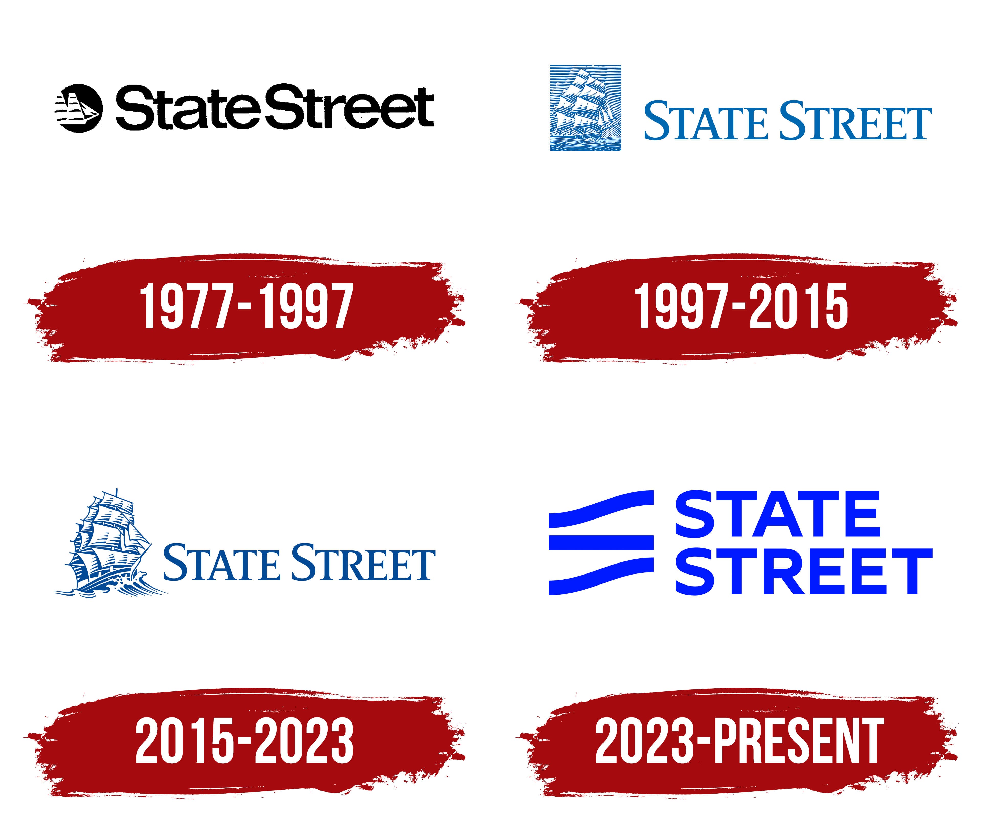
1977 – 1997

The name State Street comes from a Boston street leading to the harbor. In the 18th century, it was called the Great Street to the Sea. It connected the administrative center with the waterfront and trading wharves. Nearby banks served merchants and shipowners and handled international payments. The sailing ship in State Street’s logo later connected the company’s name to Boston’s port history.
State Street’s banking history dates to Union Bank, established on June 25, 1792. Massachusetts Governor John Hancock signed its charter. Boston’s third bank stood at the corner of State Street and Exchange Street. In 1865, it received a federal charter and became the National Union Bank of Boston.
A separate institution, State Street Deposit & Trust Company, opened in July 1891. It was renamed State Street Trust Company in 1897. In October 1925, it merged with National Union Bank. The combined organization retained the State Street name. It continued operating under National Union’s charter, bringing together both banks’ histories.
Maritime imagery was part of State Street Trust Company’s identity long before the 1977 logo appeared. The bank collected ship models, engravings, nautical charts, and images of old Boston. In 1926, it published The Log of the State Street Trust Company. The book described colonial-style banking halls, ship models, and maritime prints. The collection recalled State Street’s role as a commercial route to the port.
A logo designed by Selame Design appeared in January 1977. Its introduction accompanied the renaming of State Street Boston Financial Corporation as State Street Boston Corporation. A circular ship emblem appeared on the left, with the name on the right. Both parts were rendered in black and white and combined horizontally.
Inside the black circle, a white sailing ship appeared in profile, facing right. Several sails, the hull, and bands of water conveyed the vessel’s basic outlines. Parts of the hull and sails extended beyond the circle. The frame brought the image together in a compact form, while the limited detail helped distinguish its parts.
The joined wordmark “StateStreet” appeared on the right. Uppercase “S” letters marked the beginning of the 2 words, while the remaining letters were lowercase. The name used heavy sans-serif lettering with rounded strokes and soft transitions between verticals and curves. Tight spacing created a dense line. The substantial letters complemented the emblem’s black field, while their rounded forms echoed the circle.
The logo used the shortened name State Street. The full corporate name gave way to the historic street name, while the sailing ship continued the bank’s maritime tradition.
1997 – 2015

In 1997, State Street Boston Corporation shortened its legal name to State Street Corporation. The historic name preserved its connection to Boston, even as the company operated internationally. It served institutional investors through securities custody, asset management, research, and trading services. FutureBrand developed a logo update to accompany the name change.
The maritime theme remained, but the ship illustration and frame shape changed. A blue rectangle containing a white clipper ship replaced the circle. The vessel was enlarged and rendered in greater detail. It featured 3 masts, unfurled sails, fine rigging, and a defined hull. The ship faced right, with parallel lines depicting the sea beneath it.
The image resembled an antique maritime print. Horizontal blue-and-white strokes depicted the background, the vessel’s contours, and the waves. Dense areas alternated with open spaces, allowing fine details to be shown through single-color printing. The frame united the ship and sea in a separate block.
“STATE STREET” appeared on the right, with a space separating the words. Uppercase serif letters replaced the joined sans-serif wordmark. The initial “S” letters were larger than the others, marking the beginning of each word. The serif typeface gave the name a traditional banking appearance and complemented the engraved style of the clipper illustration.
Blue replaced black as the identity’s primary color. White sails and hull sections distinguished the vessel from the hatched background. In the full version, the emblem appeared beside the name. State Street used the clipper separately for compact applications.
2015 – 2023

In 2015, State Street updated its identity to unify its divisions’ disparate branding. Plan-It Marketing studied perceptions of the company’s 3 institutional business areas and recommended a shared corporate brand. The work included assessing the clipper’s role and considering redesign options.
The team retained the historic ship, but changed its depiction. The team removed the rectangular frame and horizontal background hatching. The clipper appeared in an open field beside the name. Open space surrounded the vessel, while the maritime theme remained the emblem’s basis.
The ship was shown at an angle, with its bow pointing right. Spreading waves appeared beneath the hull. The masts, sails, and rigging were drawn with fine lines in an engraving style. The strokes conveyed the vessel’s structure, while its outer contour separated the image from the background.
The uppercase serif “STATE STREET” wordmark remained on the right. The traditional lettering complemented the historic clipper and connected the updated logo to the previous version. The blue shade became slightly darker. The main changes concerned the ship and the surrounding background, while the wordmark remained unchanged.
The open arrangement was intended for shared use across divisions, business materials, and digital applications.
2023 – today
On September 18, 2023, State Street introduced a new identity alongside the opening of its global headquarters at One Congress Street in Boston. The company described the update as its first comprehensive brand redesign in more than 50 years. The shared brand was intended to unite investment platforms, data and technology operations, asset servicing, and asset management.
Lippincott developed the project with State Street’s internal teams. The system covered more than 20 subbrands and established shared guidelines for presenting the business areas. The new logo connected them to the parent company. The word “Street” became the basis for the emblem, replacing the previous maritime theme.
The emblem was named “The Street.” It consists of 3 horizontal bands of equal thickness. The middle band runs straight, while the upper and lower bands curve gently upward. Gaps remain between them. This abstract linear form replaced the detailed clipper illustration.
The space between the bands resembles a road or route. The middle line represents the path State Street creates for its clients. Through the street image, the designers connected the company’s name to its role in investments and financial services.
“STATE STREET” was placed on the right in 2 lines. “STATE” sits above “STREET,” with both words left-aligned and roughly the same length. The compact text block reduced the logo’s horizontal length. The uppercase letters were given a heavy sans-serif treatment with uniform strokes and straight cuts. Their geometry and stroke weight complement the emblem’s construction.
Blue was retained but made brighter and more saturated. It appears on both the bands of The Street and the name. The primary version is intended for a white background. In the reversed version, white lines and letters appear on a blue field.
Kevin Grady, Jenifer Lecker, James Atkins, Aurelio Saiz, Victor Rijo, Devin Sager, and Kaito Gengo led the project at Lippincott. The team included senior designer Charlotte Sunnen, designer Labelle Chang, and motion designer Kishen Pujara. Aurelio Saiz wrote the launch film script, while Victor Rijo oversaw animation direction.
At State Street, the update involved Global Chief Marketing Officer Brenda Tsai, Head of Brand and Design Patrick Gray, and Design Director Joseph Cowan. Hillary Gove, Raja Singh, Joshua Mason, Shivakumar Basavaraju, and Eric Garuley also joined the internal team. The collaboration covered the master brand, divisional identities, and implementation at the new global headquarters.