 PKO Bank Polski Logo PNG
A first bank account, a card for everyday expenses, and a home loan form a financial timeline that spans years. In Poland, many of these transactions happen through a single bank with an extensive network and a wide range of services. The PKO Bank Polski logo represents an institution that serves both private clients and businesses, offering accounts, loans, investment products, and payment services.
PKO Bank Polski was founded on February 11, 1919, by decree of Józef Piłsudski. The institution’s original name was Pocztowa Kasa Oszczędności, which means Postal Savings Bank. It was created to attract citizens’ savings through the post office network. By the late 1930s, PKO operated about 4,000 offices throughout Poland. It became the country’s largest savings institution.
After World War II, the bank was restored and came under state management. In 1950, it received state savings bank status. For several decades, PKO remained the main retail bank of socialist Poland. In 1975, the organization took on a new name: Powszechna Kasa Oszczędności Bank Państwowy.
After Poland transitioned to a market economy in 1989, PKO became a commercial bank. In 1991, the institution became a joint-stock company. In 2004, the bank was listed on the Warsaw Stock Exchange. The state retained a controlling stake.
In the following years, the bank developed digital services and strengthened its market position. In 2008, it acquired Nordea Bank Polska and expanded its corporate segment. In 2013, Nordea Finance Polska joined the assets.
In 2016, Nordea launched the IKO mobile app. By 2018, the number of users exceeded three million. Later, the bank introduced the virtual assistant iPKO and began investing in artificial intelligence technologies.
In 2023, PKO introduced a digital mortgage lending platform. In 2024, the bank expanded its cooperation with fintech companies.
The company serves about ten million clients. It operates through eight hundred branches and online platforms. The bank remains Poland’s largest financial institution by asset volume. The state owns about thirty percent of the shares through government institutions.
Meaning and History
What is PKO Bank Polski?
As Poland’s largest financial institution, it has a developed network of branches and ATMs across the country. It serves more than 9 million clients across the retail, corporate, and small-business sectors. It offers accounts, mortgages, auto loans, Visa and MasterCard credit and debit cards, and insurance and brokerage products. Clients use online and mobile banking, as well as leasing and factoring services.
1919 – 1939
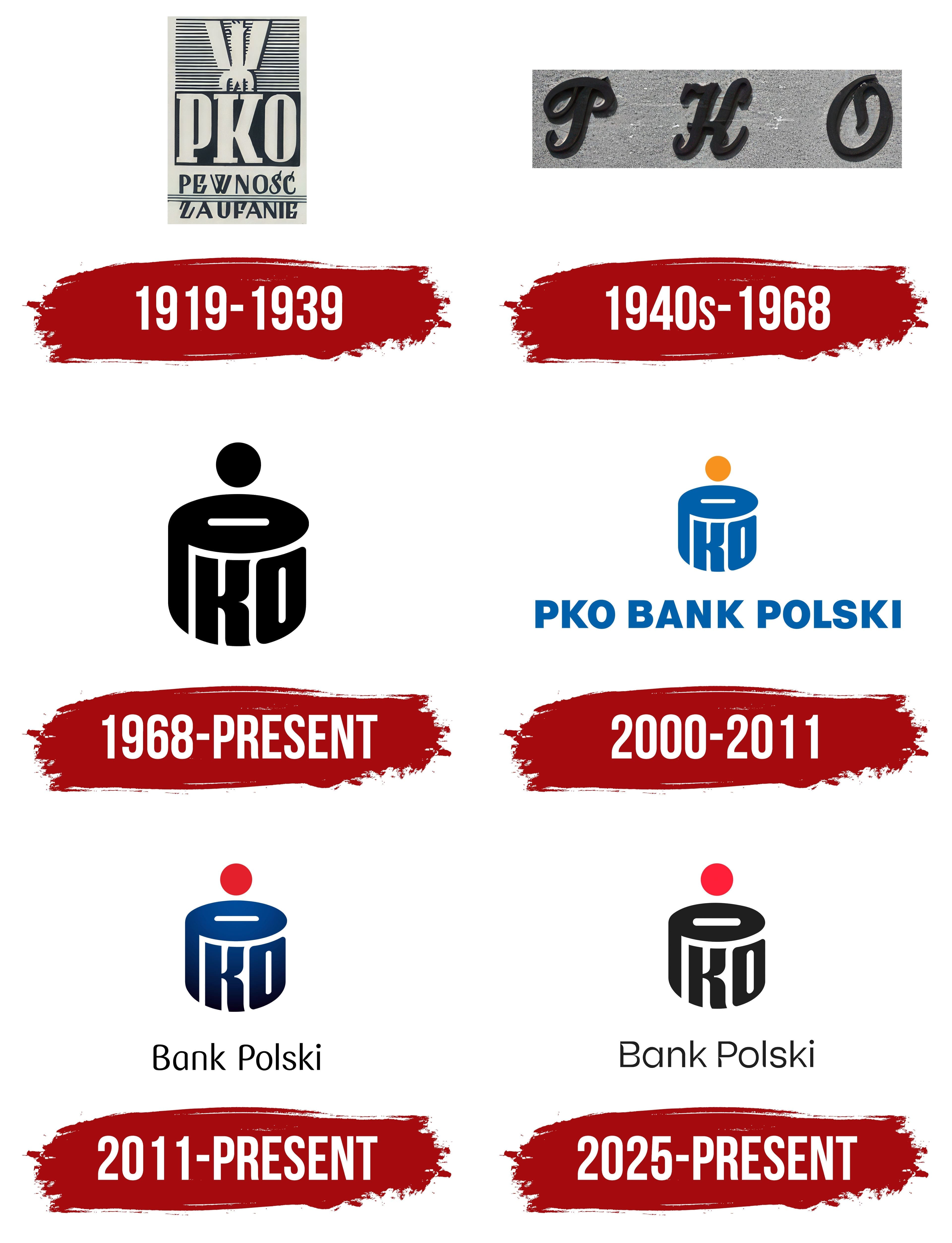
The institution that would become PKO Bank Polski began operating through post offices accessible to residents throughout Poland. Established on February 7, 1919, Pocztowa Kasa Oszczędności accepted savings, handled checking transactions, and processed cashless transfers. Its name translates to “Postal Savings Bank.” Polish Chief of State Józef Piłsudski issued the founding decree. Prime Minister Ignacy Jan Paderewski and Minister of Posts and Telegraphs Hubert Linde signed the document. Linde initiated the project and became the institution’s first head.
During the interwar period, PKO’s identity relied on national symbolism. Instead of a shared corporate emblem, it used a large “P.K.O.” abbreviation, usually beside the Polish white eagle. The bird indicated state oversight and guarantees, connecting the savings bank to the young Polish Republic.
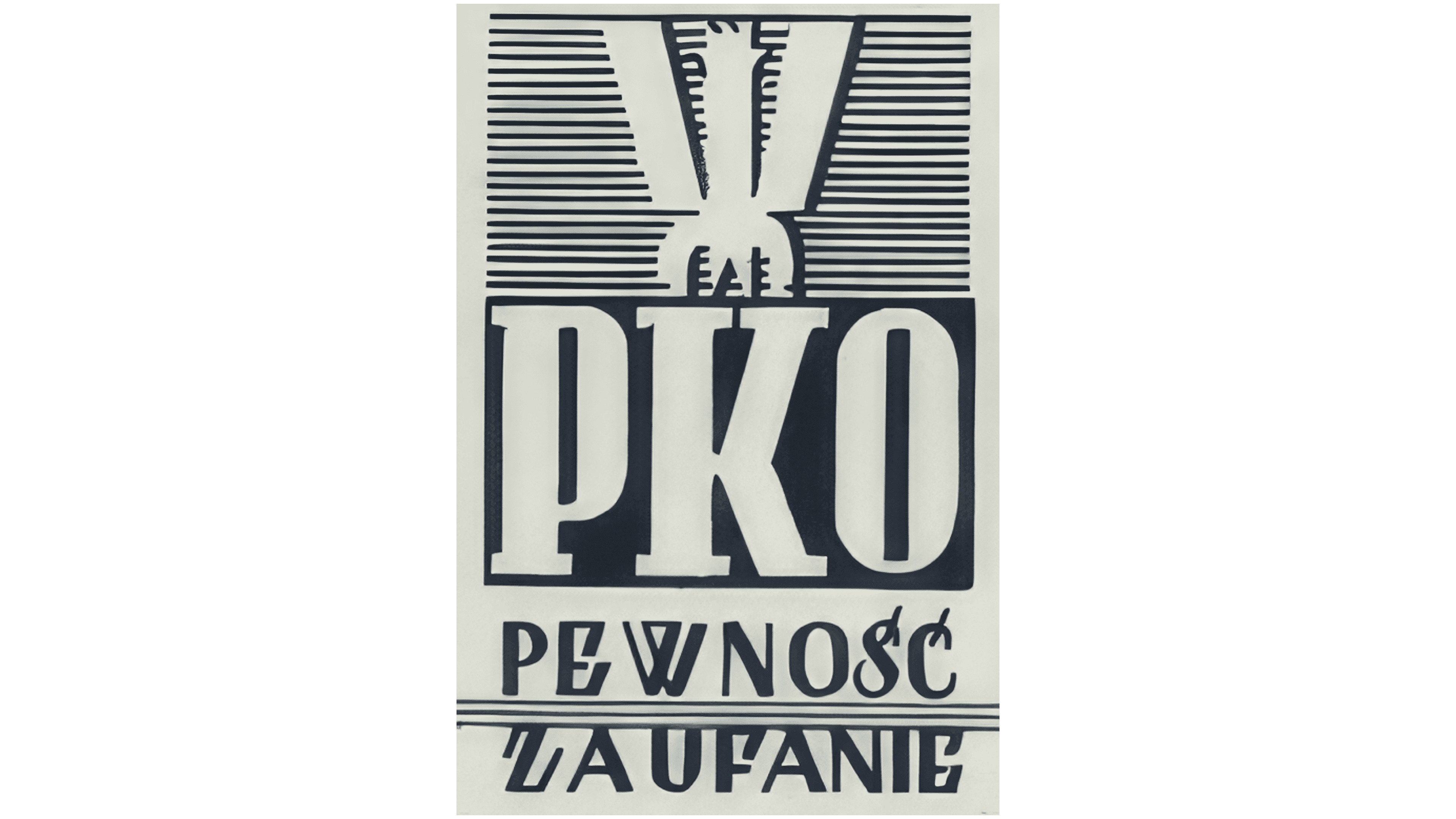
In the design used from 1919 to 1939, tall light gray serif “PKO” letters formed part of a vertically arranged block on a dark field. A simplified eagle appeared above the name. Its elongated silhouette resembled a “W” with 3 vertical projections. Symmetrically arranged horizontal lines surrounded the bird. Beneath the abbreviation were the dark words “PEWNOŚĆ” and “ZAUFANIE,” promising reliability and trust. Three horizontal strokes separated them.
The abbreviation PKO survived subsequent name changes, while its expanded form changed. Following the 1950 reorganization, the institution became Powszechna Kasa Oszczędności, or “Universal Savings Bank.” In 1991, the full name became Powszechna Kasa Oszczędnościowa Bank Państwowy. In 2000, the institution became a joint-stock company under the legal name Powszechna Kasa Oszczędności Bank Polski Spółka Akcyjna. The shortened PKO Bank Polski combined the historic abbreviation with a reference to the bank’s Polish origins.
1940s – 1968

After the war, PKO rebuilt its branch network and banking services. Development of a new emblem was postponed, and 3 separate letters continued to appear on building facades. The name Pocztowa Kasa Oszczędności changed to Powszechna Kasa Oszczędności, retaining the previous initials.
Three-dimensional “P,” “K,” and “O” letters were installed far apart. Their calligraphic forms combined flowing curves with decorative flourishes. The letters differed in design, while their dark, nearly black color and cast shadows distinguished them from the building’s surface.
The phrase “Pewność. Zaufanie.” appeared beside “P.K.O.” When it returned to everyday operations, the institution also used modified versions of this phrase as an addition to its name.
1968 – today

In 1968, Polish artist Karol Śliwka created an emblem for PKO shaped like a coin bank. The letters “P,” “K,” and “O” formed a cylindrical body, while a coin above it indicated saving money. The artist connected the bank’s name to its purpose through a familiar household object.
The upper curve of the “P” formed the coin bank’s oval rim, with a white horizontal slot for money. A round coin appeared above the slot. The heavy stem of the “P” adjoined the upper oval, while the vertical strokes of the “K” and “O” formed the sides. The uppercase sans-serif letters followed the body’s geometry, serving simultaneously as lettering and an image.
The rollout took several years. The bank showed the work to employees in different roles. A critical comment from one participant in the discussion delayed the project. In 1969, Śliwka’s colleagues and PKO representatives took the initiative to submit the poster “Październik miesiącem oszczędzania,” meaning “October Is Savings Month,” to the poster biennial in Katowice. They arranged the entry without the artist’s knowledge. The poster won a gold medal, after which the emblem began appearing on signs, neon installations, and printed materials. Bank employees called the coin bank “śliwka,” Polish for “plum,” playing on the artist’s surname.
In the first color version, the body was red and the coin silver. The coin bank later became blue, and the coin image was simplified to a circle. The letter construction was preserved. A black version with a white slot was used for single-color printing.
2000 – 2011
In 2000, the name “PKO BANK POLSKI” was added to the coin-bank emblem. The update accompanied the joint-stock bank’s new name and connected it to the existing symbol. The wordmark appeared beneath the coin bank or to its right.
The name was set in large upright uppercase Helvetica letters. The sans-serif typeface had uniform stroke weights. All the words shared the same weight, giving “PKO” and “BANK POLSKI” equal standing in the wordmark.
The coin bank retained the form Karol Śliwka had created in 1968. It colored the body bright blue to match the name. The circle above it, representing the coin, became orange. The color difference distinguished the coin from the rest of the emblem.
2011 – today
Customer surveys at PKO Bank Polski showed that the previous logo was associated with the bank’s tradition. However, people already perceived it as dated. The new version was introduced on March 18, 2011. Michał Łojewski of White Cat Studio adapted Karol Śliwka’s 1968 coin bank for digital channels, consulting with the emblem’s creator.
The body’s shape was retained, while the colors changed. According to Łojewski, the updated shades were intended to convey the desired level of quality. A dark, nearly black shade replaced the light blue. In the gradient version, the top of the coin bank was lighter than its base. The coin circle changed from orange to red. The dark foundation gave the logo a serious appearance, while red referenced Poland’s national colors.
The words “Bank Polski” remained beneath the emblem, removing the repeated PKO abbreviation. The black wordmark used thin sans-serif lettering with rounded forms and increased letter spacing. Alongside the logo rollout, the NANOVO program redesigned branches.
The bank prepared an anniversary version for its 2019 centennial. The number 100 and the dates 1919 to 2019 appeared beside the main emblem. The zeros repeated the bank’s rounded contours, while a red dot resembled a falling coin. The bank used the addition during centennial events.
2025 – today
In June 2025, PKO Bank Polski began updating its identity with 4/4 BRAND DESIGN. The previous system, designed for traditional media, was adapted for screens. Advertising materials released in 2025 were the first to receive the new identity.
The logo retained Karol Śliwka’s coin bank, the red circle above it, and the “Bank Polski” wordmark. We slightly adjusted the body’s contours and replaced the transitions between dark blue shades with solid black. The red “coin” remained the emblem’s only colored component.
We prepared updated, rounded lettering with wider letters for “Bank Polski.” The name remained beside the coin bank in its previous position. Adjustments to proportions and contours helped adapt the logo for screen display.