 Bank of the Philippine Islands Logo PNG
Financial transactions, including account openings, transfers, loans, and business services, form the foundation of the country’s monetary system. Banking services support daily transactions and long-term financial goals. The Bank of the Philippine Islands logo represents a bank that serves individual customers and businesses in the Philippines.
The Bank of the Philippine Islands, abbreviated as BPI, was founded on August 1, 1851, as El Banco Español Filipino de Isabel II. It was the first bank in the Philippines and Southeast Asia to be granted the right to issue a national currency, the peso fuerte. The first banknotes were printed in May 1852. The first loan was granted to the Chinese entrepreneur Tadian.
In 1869, after the overthrow of Queen Isabella II, the bank changed its name to Banco Español-Filipino. In 1897, it opened its first branch outside Manila in Iloilo. After the U.S. took control of the Philippines in 1898, the bank became privately owned. On January 1, 1912, it adopted its modern name, Bank of the Philippine Islands.
After World War II, the bank participated in the country’s economic recovery. In 1949, the bank lost its right to issue currency. In 1969, the Ayala Corporation acquired a controlling stake.
Since the 1970s, the bank has acquired other financial institutions. These included Peoples Bank and Trust, Commercial Bank and Trust, Family Bank, and Asian International Bank.
In the 1980s, BPI became an innovator in banking technology. It launched the first ATM network, Express Teller, and issued debit cards. In 1991, the Express Banking Centers format was introduced. In 1999, BPI launched the country’s first online bank, BPI Direct.
By the beginning of the 21st century, the bank had become a universal financial institution covering retail, corporate, and investment banking.
BPI is implementing a bond and commercial paper issuance program worth 200 billion pesos. The bank remains the country’s largest private financial institution and manages an extensive network of branches and digital services.
Meaning and History
What is Bank of the Philippine Islands?
The largest private bank in the Philippines, with headquarters in Makati. Founded by decree of Queen Isabella II, it is considered Southeast Asia’s oldest bank. Its network includes more than 900 branches and the most ATMs among private banks. It serves over ten million customers and provides loans, asset management, investment, and insurance services. After merging with Family Savings Bank, it became the fourth-largest by assets and ranks among the top three banks for foreign companies, alongside Banco de Oro and Metrobank.
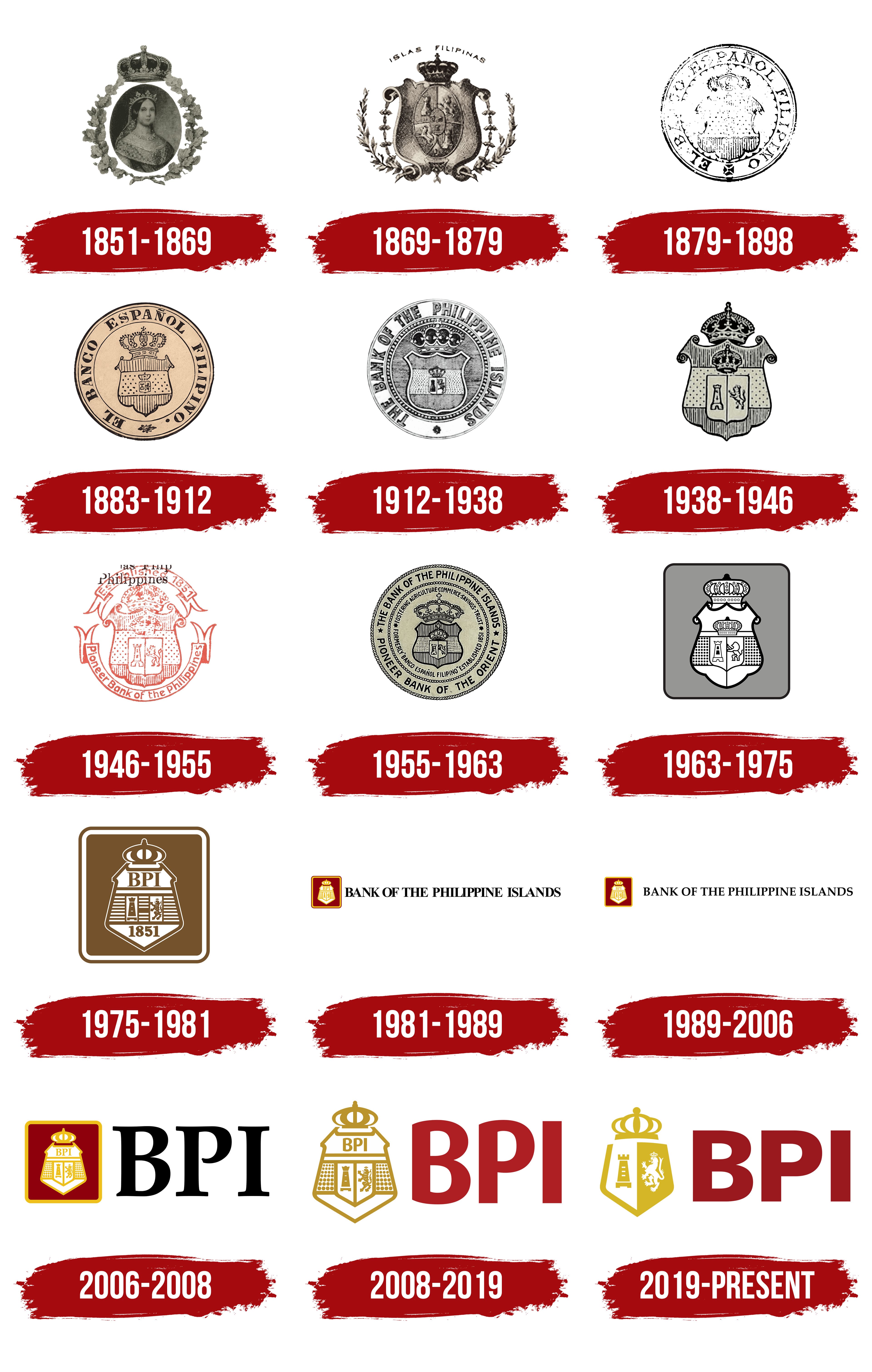
1851 – 1869

The history of the Philippine universal bank BPI began on August 1, 1851, with the establishment of El Banco Español Filipino de Isabel II. Its name translates to “Spanish-Filipino Bank of Isabella II,” connecting the institution to the Spanish colonial administration, the Philippines, and the reigning queen. Isabella II was the daughter of Ferdinand VII. The bank became the country’s first banking institution and the oldest in Southeast Asia. The queen presented it with its heraldic emblem.
Royal portraiture also appeared in the bank’s visual identity. An image of Isabella II sat inside an oval medallion surrounded by a wreath of oak leaves. The queen faced the viewer with her shoulders turned slightly, wearing a formal gown and jewelry. A small crown with tall points rested on her head, and a veil fell on either side. Detailed rendering conveyed the weight of the gown’s fabric and its decorative trim. Soft transitions between light and shadow gave her face depth. Large oak leaves with visible veins formed a ring that closed at the bottom. A substantial crown rose above the oval and wreath. The gray-and-black rendering and fine detail recalled a 19th-century engraving.
Isabella’s portrait also appeared on the bank’s first banknotes. They were dated May 1, 1852, although they entered circulation in 1855. Their name, “pesos fuertes,” translated as “strong pesos.”
In 1869, Isabella’s name was removed, leaving Banco Español-Filipino. In 1912, the bank adopted the English name Bank of the Philippine Islands and its Spanish equivalent, Banco de las Islas Filipinas. The initials of the English name formed the abbreviation BPI.
1869 – 1879
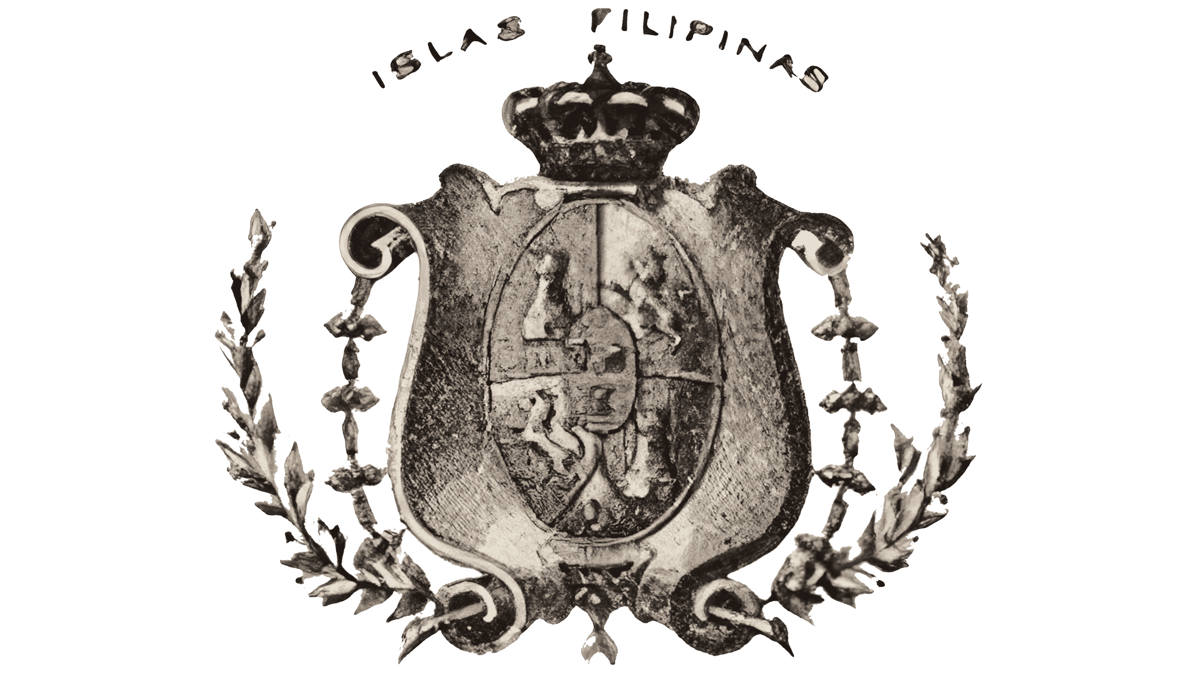
Following the revolution that deposed Isabella II, the bank removed her name from its title. The bank was approved as Banco Español-Filipino on September 3, 1869. In an early heraldic design, “ISLAS FILIPINAS,” meaning “Philippine Islands,” curved above the crown in dark sans-serif capitals.
Below the lettering, an elaborate shield featured wavy edges, symmetrical scrolls on either side, and hanging ornaments. The large crown had a heavy base, arches, and an orb topped by a cross. Deep shadows and highlights gave it a three-dimensional appearance. The shield’s surface resembled aged bronze or cast metal. Inside, an oval cartouche divided into four sections contained heraldic lions, towers, castles, and other figures from Spanish tradition. A smaller oval emblem occupied the center.
Branches with dense leaves and small knots framed the shield along its sides and base. Their gray-brown tones matched the rest of the image. Hatching, the shield’s multiple divisions, and the surrounding ornaments distinguished this coat of arms from the later, compact Escudo. The Spanish word “escudo” means “shield” and became the bank’s emblem.
1879 – 1898
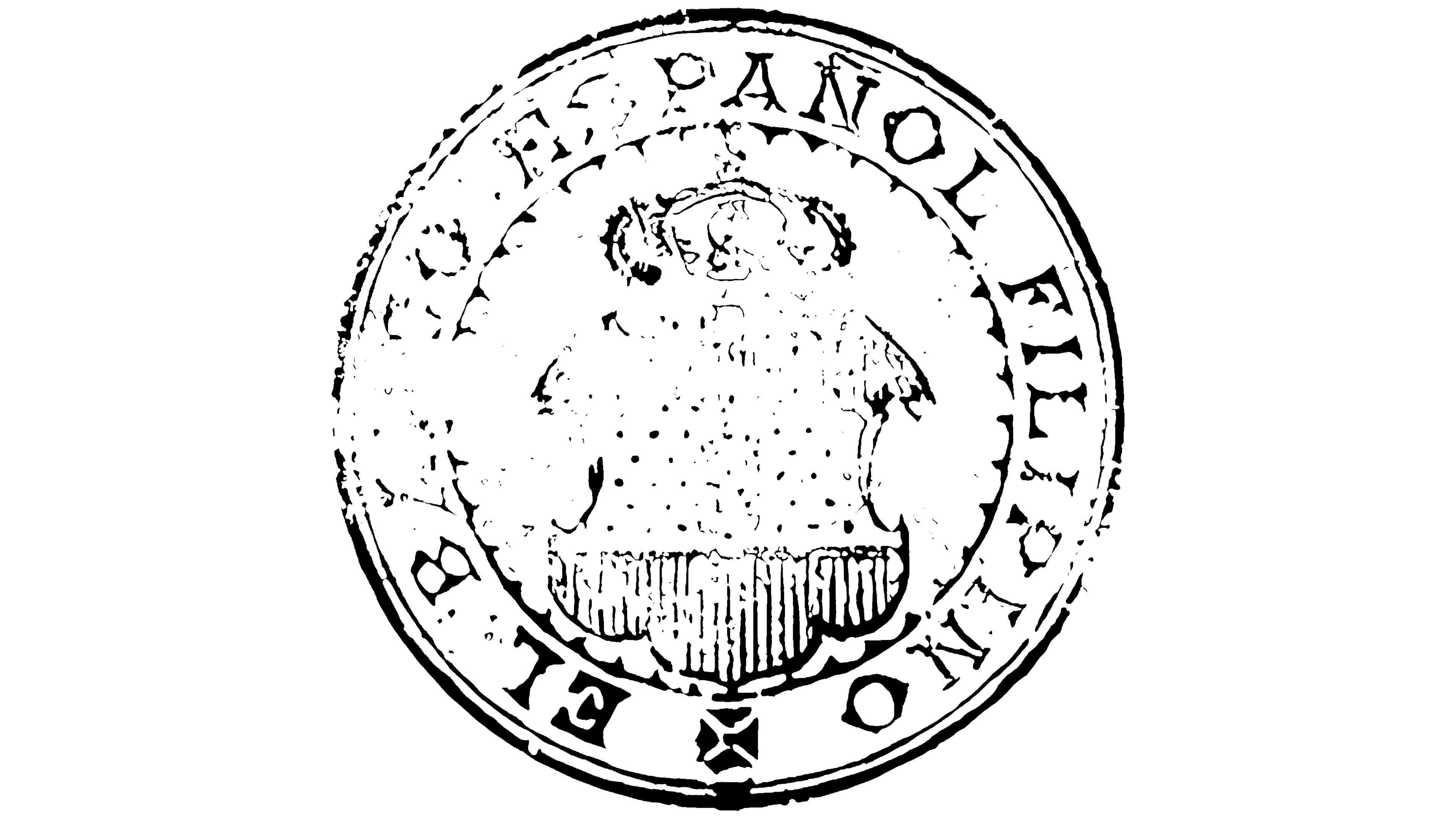
Circular El Banco Español Filipino seals appeared on the bank’s business documents, including impressions on Spanish-period postage and revenue stamps. They were used alongside the more elaborate heraldic design. In one version, a narrow outer rim surrounded a small central image. In another, the name occupied a substantial portion of the seal between two concentric circles.
“EL BANCO ESPAÑOL FILIPINO” appeared in heavy serif capitals curving around the perimeter. The lettering resembled that used on official 19th-century seals. A small ornamental divider sat at the bottom. Black unified the text, circles, and coat of arms.
At the center was an elongated shield with a decorative top and a three-lobed base. Its interior was divided into three areas. Vertical hatching filled the upper and lower sections, while a dotted pattern resembling fur or fabric covered the middle. Small heraldic figures completed the design. Folds of a heraldic mantle fell symmetrically on either side. A crown with rounded arches and a cross rose above the shield.
The castle and lion connected the bank’s emblem to Spanish history. The castle represented Castile, while the lion standing on its hind legs represented León. In 1883, the bank issued a series of banknotes featuring both figures inside a crowned shield. The Spanish heraldry survived the bank’s name change and the transfer of the Philippines to U.S. administration. BPI’s lion remained a land animal, distinct from the fish-tailed sea-lion in Manila’s coat of arms.
1883 – 1912
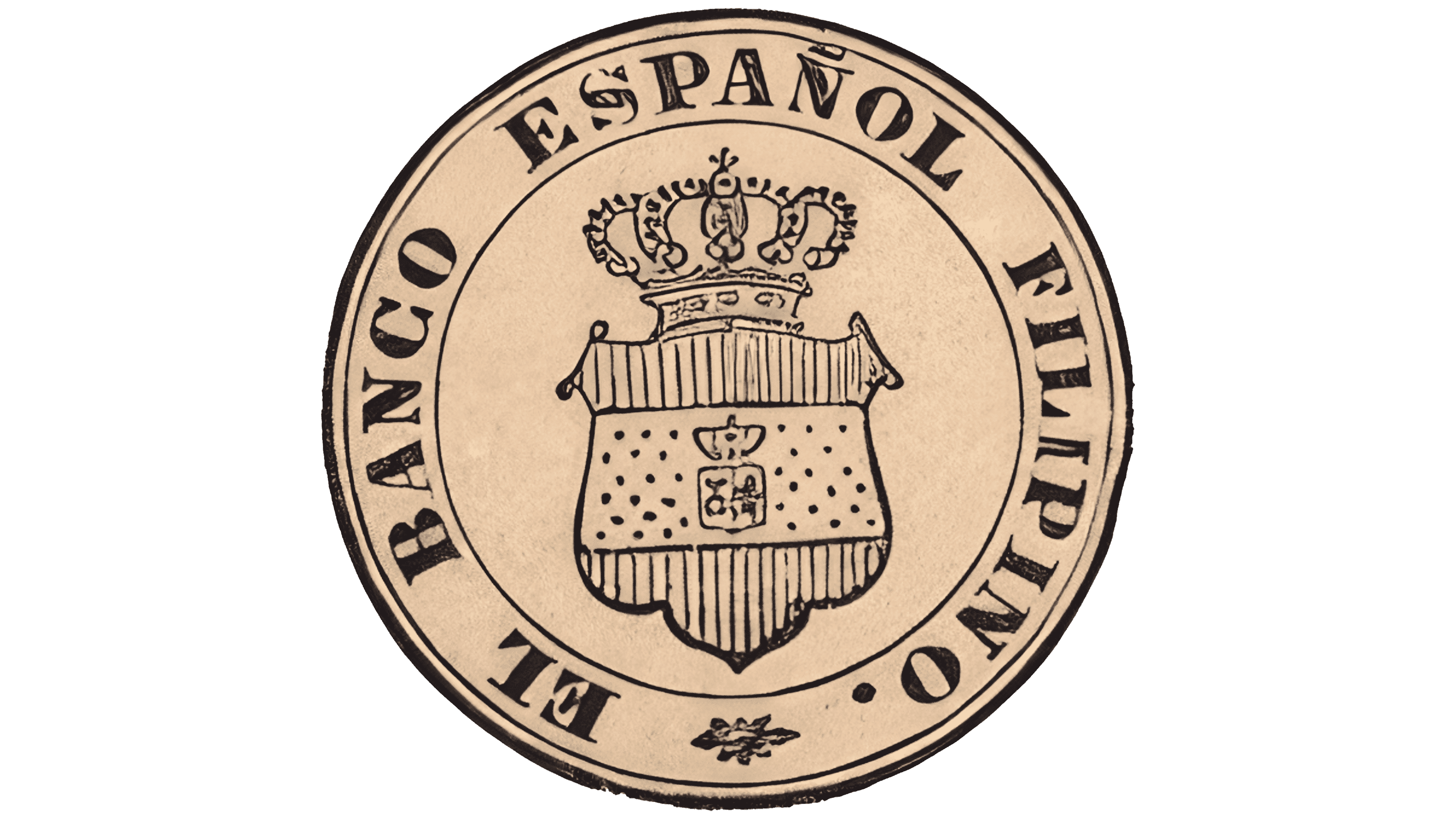
From 1883 to 1912, El Banco Español Filipino used a circular heraldic seal with a double outline. Black lines formed two rings against a beige background, with the bank’s full name between them. “EL BANCO ESPAÑOL FILIPINO” appeared in serif capitals resembling Garamond or Caslon. The tilde remained above the “Ñ” in “ESPAÑOL.”
Inside the ring was an elongated shield with a decorative top and a three-lobed base. Its field was divided into three areas. Vertical hatching filled the upper and lower sections, while a dotted pattern resembling fur or fabric covered the middle. A miniature coat of arms sat at the center. Outlines and internal details were drawn in black, leaving the beige background visible between the lines.
A royal crown topped the shield, featuring a domed upper portion, arches, pearls, and a cross. Its shape was slightly simplified, while the ornamental details remained. The crown, shield, and circular frame shared the same black outline treatment.
1912 – 1938

Act No. 1790 of October 12, 1907, authorized Banco Español-Filipino to change its name. Shareholders approved the change on January 1, 1912. The bank adopted the English name Bank of the Philippine Islands, or BPI, and the Spanish name Banco de las Islas Filipinas. During the American colonial period, it became entirely privately owned while retaining the coat of arms granted by the Spanish monarchy. Both the English and Spanish names appeared on the bank’s mailing envelopes during the first half of the 20th century.
“THE BANK OF THE PHILIPPINE ISLANDS” now appeared on the circular emblem. Large, heavy sans-serif capitals filled the outer band. Several thin circles separated it from the center of the seal. A small rosette sat below the name. Black lines combined with a gray background and gray interior fills.
The shield had slightly concave sides, a double decorative curve at the top edge, and an elongated lower point. A dotted pattern covered the middle section, while light hatching textured the upper and lower areas. A miniature coat of arms at the center was divided vertically. A tower appeared on the left and a lion standing on its hind legs on the right.
A substantial crown rose above the main shield, with four prominent rounded ornaments and small connections between them. Dense shading gave it depth. Two decorative rings surrounded the coat of arms. The inner ring was smooth, while the outer ring featured raised round dots. After the lettering changed to English, fine lines continued to define the seal’s detailed design.
1938 – 1946

This heraldic version of the Bank of the Philippine Islands emblem combined a shield with two crowns. A large royal crown rose above the emblem’s center. Its dome, arches, pearls, and cross were rendered in detail. A smaller crown appeared below it, above the shield’s main field.
The shield’s sides curved toward a rounded base. Its upper edges turned outward and ended in scrolls. The interior was divided into three horizontal areas. Vertical lines filled the upper and lower sections, while the middle retained a smooth field with a dotted texture.
A rectangular cartouche at the center was divided vertically into two equal sections. A stylized tower appeared on the left and a standing lion in profile on the right. The design used black shades against a light background. Hatching and dotted fills distinguished the shield’s fields.
1946 – 1955
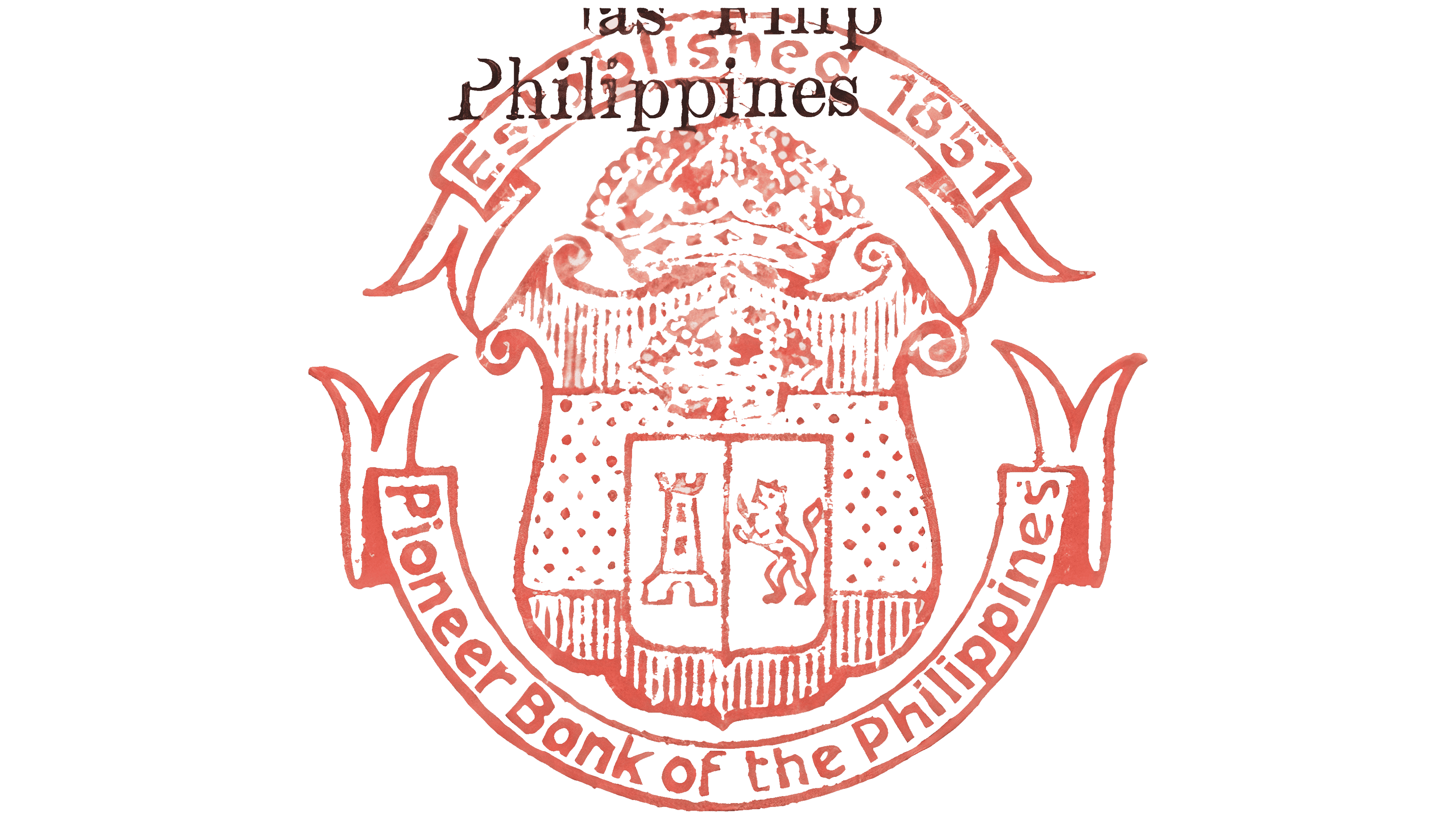
In a reddish-brown heraldic version of the Bank of the Philippine Islands emblem, two decorative ribbons replaced the circular lettering. The upper ribbon read “ESTABLISHED 1851.” The lower one carried “Pioneer Bank of the Philippines.” Separate inscriptions identified the founding date and the bank’s historic position.
The shield had an elaborate outline with rounded, flaring edges and symmetrical spiral projections at its upper corners. Vertical hatching filled the upper and lower sections, while a dotted pattern and side panels occupied the middle. A small vertical shield at the center was divided in half. A stylized tower appeared on the left and a lion standing on its hind legs on the right.
A small crown sat beneath the upper scrolls. A larger crown topped the entire design. Its drawing was simplified, but the arches, pearls, orb, and cross remained.
The upper ribbon formed an arc with folded ends. The lower ribbon curved around the shield’s base. The inscriptions combined uppercase and lowercase letters in a rounded sans-serif style resembling Century Gothic or Gill Sans.
1955 – 1963

From 1955 to 1963, the circular Bank of the Philippine Islands emblem combined the coat of arms with inscriptions describing the bank’s history and activities. “THE BANK OF THE PHILIPPINE ISLANDS” and “PIONEER BANK OF THE ORIENT” ran around the outer band, separated by stars. Bold lettering emphasized the outer text, and a rope border framed the seal’s edge. Black outlines and inscriptions appeared against a warm gray background.
The inner ring contained “FOSTERING AGRICULTURE,” “COMMERCE,” “SAVINGS,” and “TRUST,” referring to agricultural support, commerce, savings, and trust services. “FORMERLY ‘BANCO ESPAÑOL FILIPINO'” identified the previous name, while “ESTABLISHED 1851” gave the founding year. The sans-serif capitals resembled DIN or Univers. Small stars separated the inscriptions about the bank’s business and history.
A symmetrical shield with wavy edges remained at the center. Vertical hatching covered the upper and lower fields, while a dotted texture filled the middle. Inside a vertical panel, a small coat of arms was divided into two sections. A tower appeared on the left and a lion standing on its hind legs on the right. A small crown above the inner coat of arms echoed the larger crown at the top.
The main crown had five visible projections connected by arches, with a cross at its summit. Fine strokes depicted pearls, texture, and small ornaments. Decorative leaves flanked the crown, preserving the coat of arms’ royal styling.
1963 – 1975
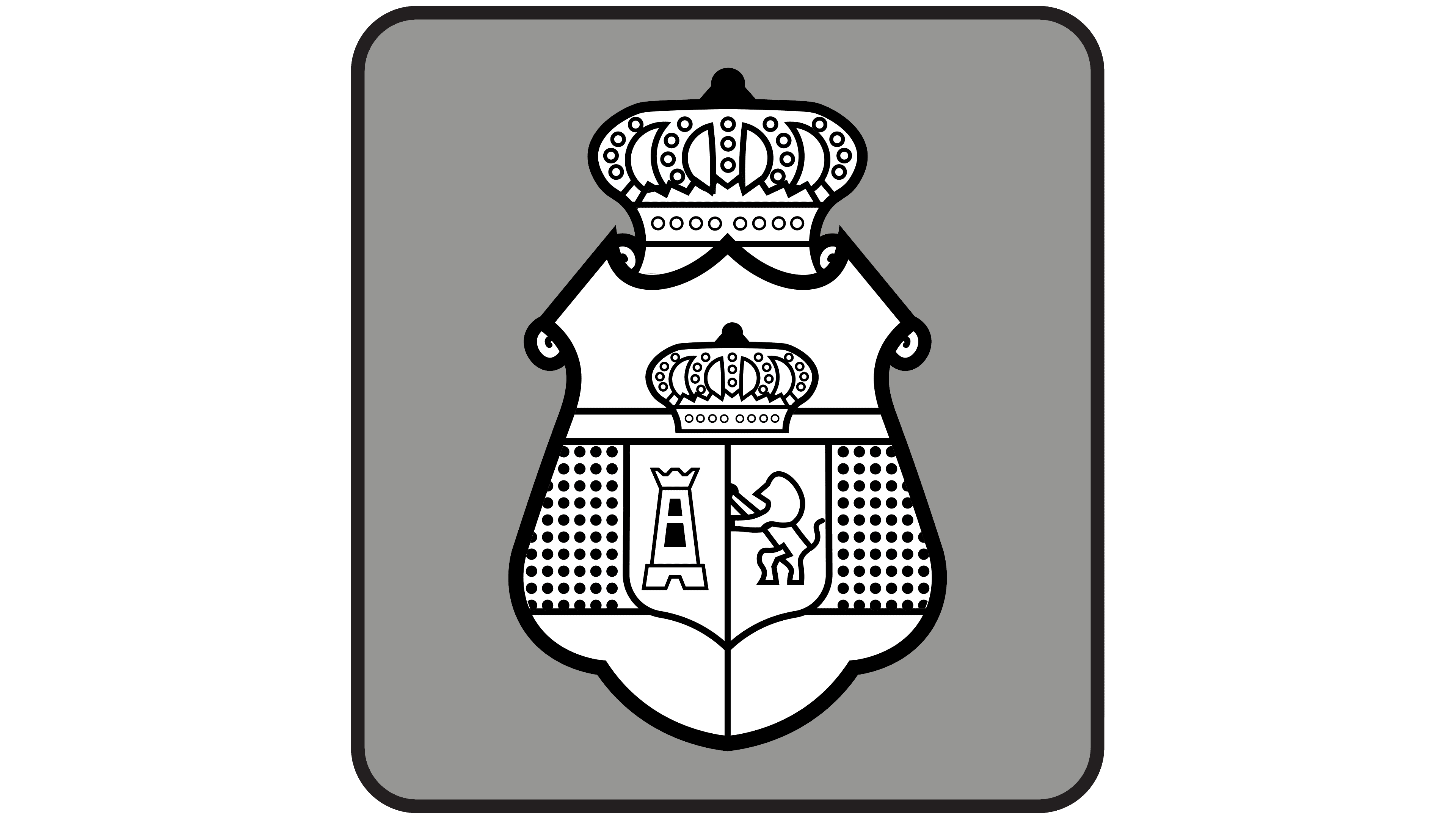
In BPI’s compact design, the circular inscriptions were removed, and the coat of arms was placed inside a four-sided field with rounded corners. A dark frame surrounded the gray background. The crowns, tower, and lion remained, with thicker black lines and simplified interior details.
The shield had gently curved sides, a rounded base, and decorative scrolls at the top. Above it stood a large crown with rounded arches, a central orb, and large circular ornaments around its perimeter. A smaller crown was incorporated into the shield’s upper horizontal section.
The interior was divided into three sections. An evenly spaced dotted pattern filled the side panels. A vertical line divided the small central shield. The left field contained a tower, while the right held a lion standing on its hind legs. Both figures were simplified into silhouettes. Thick black outlines set them apart from the white field.
The bank’s control changed on December 31, 1969. Ayala Corporation, associated with BPI since its founding in 1851, became the dominant shareholder. The bank later became the flagship of Ayala’s financial businesses.
1975 – 1981
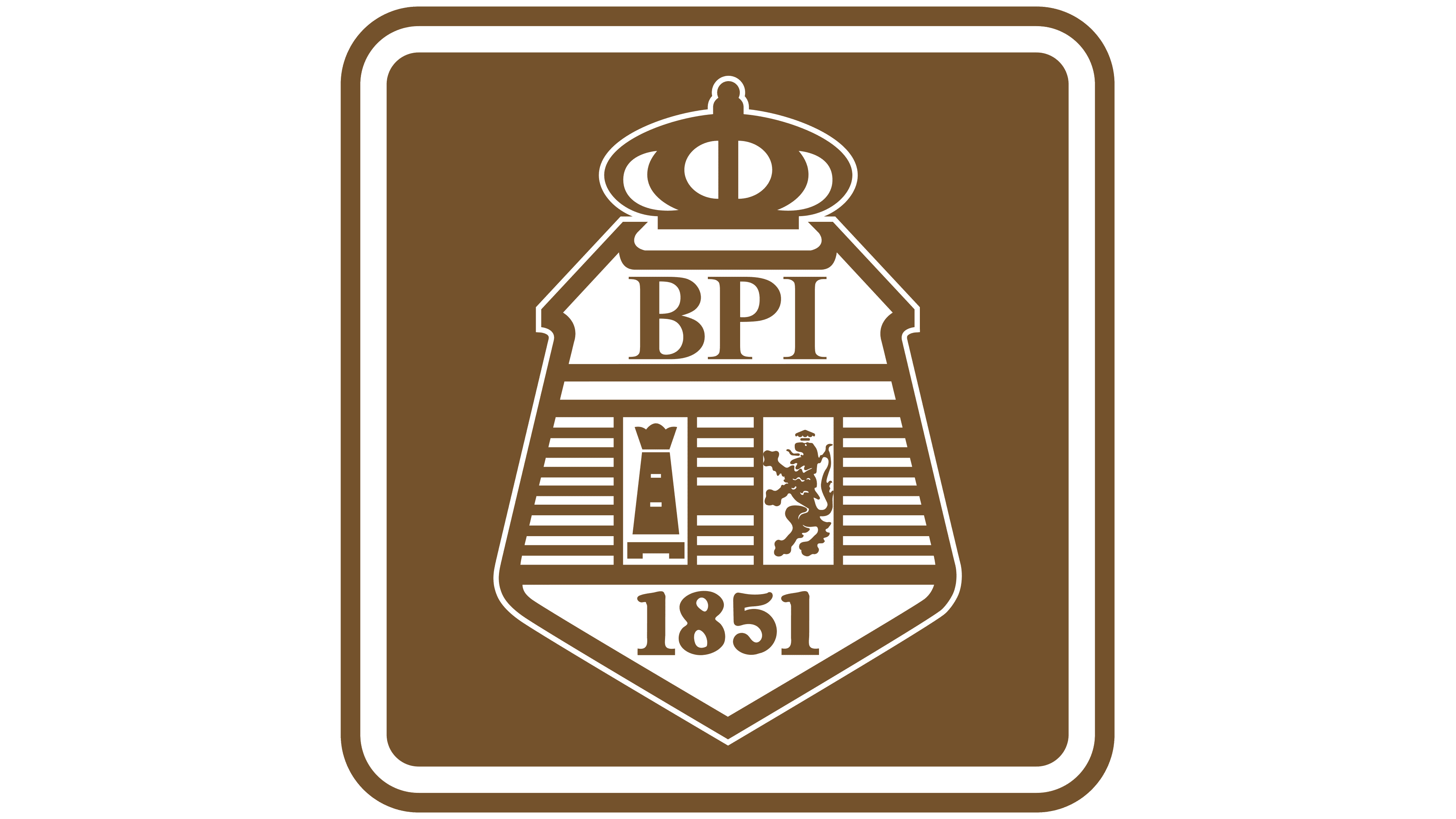
A brown version of the Bank of the Philippine Islands emblem brought together the coat of arms, the abbreviation “BPI,” and the founding year. A light-colored shield sat inside a rounded square with a double border. The inner white outline followed the frame’s outer shape.
The shield’s sides led into an angular triangular base that tapered downward. Its upper portion remained symmetrical. The crown was drawn schematically, with large arches, oval shapes, and a central projection. Small dots represented pearl ornaments.
Below the crown, “BPI” appeared in serif capitals resembling Times New Roman. Beneath the initials were two vertical rectangular fields, with a tower on the left and a standing lion on the right. Horizontal lines filled the gap between them. “1851” appeared in the shield’s lower triangular section, incorporating the founding date into the heraldic design.
1981 – 1989

A horizontal Bank of the Philippine Islands logo paired a smaller coat of arms with the full English name. The emblem sat on the left and the lettering on the right. Two versions differed in their letterforms and spacing, the proportions of the red block, and the thickness of its frame.
The coat of arms sat inside a dark red rounded square with an inner golden-yellow border. White and gold areas stood out against the background. The large crown was simplified into rounded shapes, dots, and a cross. Below it, “BPI” appeared in bold serif capitals at the shield’s center.
Two vertical rectangular fields sat beneath the initials. A schematic tower occupied the left field and a standing lion the right. A dotted pattern filled the shield’s side sections, while the lower portion remained empty. Yellow outlines unified the interior figures and the frame.
The full name, “BANK OF THE PHILIPPINE ISLANDS,” appeared in black Times New Roman Bold capitals. Its serifs and heavy strokes echoed the initials inside the coat of arms.
1989 – 2006

The Bank of the Philippine Islands logo used from 1989 to 2006 changed the lettering of the full name while retaining the rest of the design. Palatino replaced the previous typeface. The letters became slightly smaller, with thinner strokes. The emblem’s proportions and details remained unchanged.
2006 – 2008

In the abbreviated version of the logo, “BPI” replaced the full name Bank of the Philippine Islands. The red square containing the coat of arms remained beside it, and the rest of the design was unchanged.
The three large black capitals were set in Palatino. Serifs and contrasting thick and thin strokes defined the lettering. The letters sat closely together on a single line, with small gaps between them.
2008 – 2019

BPI’s 2008 refresh covered both its logo and corporate identity. Bank president Aurelio Montinola III discussed the changes with internal committees. He recalled the earlier burgundy color and the red-and-blue Express Teller identity introduced as ATM services developed in the 1980s. The bank shifted to a brighter corporate color meant to convey friendliness.
The red square surrounding the Escudo was removed. The pale gold coat of arms became a standalone shape on a light background, positioned to the left of the large initials. Dark red “BPI” lettering in FF Dax replaced the black Palatino serif letters. The upright capitals had uniform stroke weight, with smooth terminals replacing serifs.
The shield retained its symmetry, softened sides, and elongated lower portion. A simplified crown with a central cross sat atop gold “BPI” lettering. These upright sans-serif capitals were thinner than the large initials to the right. The main field was divided into three vertical sections. Diagonally arranged grids of round dots filled the side sections. The tower and the lion standing on its hind legs remained in the center. Outlines, fine hatching, and light gaps conveyed the heraldic details.
In October 2015, BPI launched a campaign encouraging people to make the best things happen. After the new logo appeared in 2019, subsidiary BPI Family Savings Bank continued using a version of the previous identity. It remained in use until the subsidiary merged with its parent bank in 2022.
2019 – today

As digital banking expanded, BPI needed an identity suited to small screens, younger customers, and its different banking businesses. Bonsey Design developed the project. The identity was tested before its rollout. The new version was preferred by 63% of respondents, and 83% identified BPI from the image alone. The bank unveiled the logo on April 25, 2019, and officially launched it on August 1, the bank’s 168th anniversary.
The gold coat of arms retained the crown, tower, and lion. The internal initials, decorative side panels, hatching, and fine details were removed. The shield received a symmetrical, elongated outline with inward-sloping sides, softened edges, and a pointed base. Its upper portion remained open. A simplified crown rested on a horizontal base connected to the shield’s outline. A golden-yellow tower with battlements occupied the white left half. The right half was gold and featured a white lion standing on its hind legs. A small crown appeared above the lion’s head.
Bonsey Design associated the crown with trust and the bank’s heritage, the shield with protection, the tower with responsibility, and the lion with courage. The open upper outline conveyed openness and a willingness to engage with customers. Reducing the detail made the coat of arms easier to reproduce at small sizes on digital platforms.
Large burgundy-red “BPI” lettering appeared to the right in Zurich. The upright sans-serif capitals had uniform stroke widths and broader proportions.
The logo was accompanied by the tagline “Ready today. Ready tomorrow.” Marketing head Cathy Santamaria connected it to continuity, planning, preparedness, and customer service.