 Ayala Logo PNG
Conglomerates combine various business lines, including real estate, finance, telecommunications, and infrastructure. These structures manage projects and assets across multiple industries at the same time. The Ayala logo is associated with a Philippine group of companies involved in real estate development, banking services, and urban infrastructure.
Ayala Corporation dates back to 1834. That year, Domingo Roxas and Antonio de Ayala founded Casa Roxas as an agribusiness that produced distilled spirits. Later, the enterprise created Ginebra San Miguel rum, which became a national brand. In the 1840s, Ayala helped found El Banco Español Filipino de Isabel II. The bank later became the Bank of the Philippine Islands, the Philippines’ first bank.
In 1876, the company was named Ayala y Compañía. In 1881, it launched Manila’s first tram. In 1908, the first steel bridge across the Pasig River was opened. In 1929, the distillery was sold to La Tondeña Inc., and the company shifted its focus to infrastructure and real estate development projects.
Since the 1930s, Alfonso Zóbel de Ayala and Joseph McMicking transformed suburban lands into what became Makati’s new business district. By the 1950s, it had become Manila’s financial center.
In 1969, Ayala Corporation acquired a controlling stake in the Bank of the Philippine Islands. In the 1970s and 1980s, the company expanded into telecommunications, energy, retail, and investment banking.
In 2010, FinanceAsia magazine named Ayala the best-managed company in the Philippines. In the 2010s, the corporation strengthened Ayala Land, BPI, Globe Telecom, and AC Energy. It expanded its presence in Australia, Vietnam, and India.
In 2024, the company continued its digital development and invested in Mynt and GCash. In February 2025, Japan’s MUFG Bank invested in Mynt, valuing the project at $5 billion.
The company invested 3.7 billion Philippine pesos in AC Mobility. It signed an agreement with the Asian Development Bank to support electric vehicle initiatives. The corporation was included in TIME and Statista’s global World’s Best Companies ranking. It ranked 210th, confirming its reputation as a leader in Philippine business.
Meaning and History
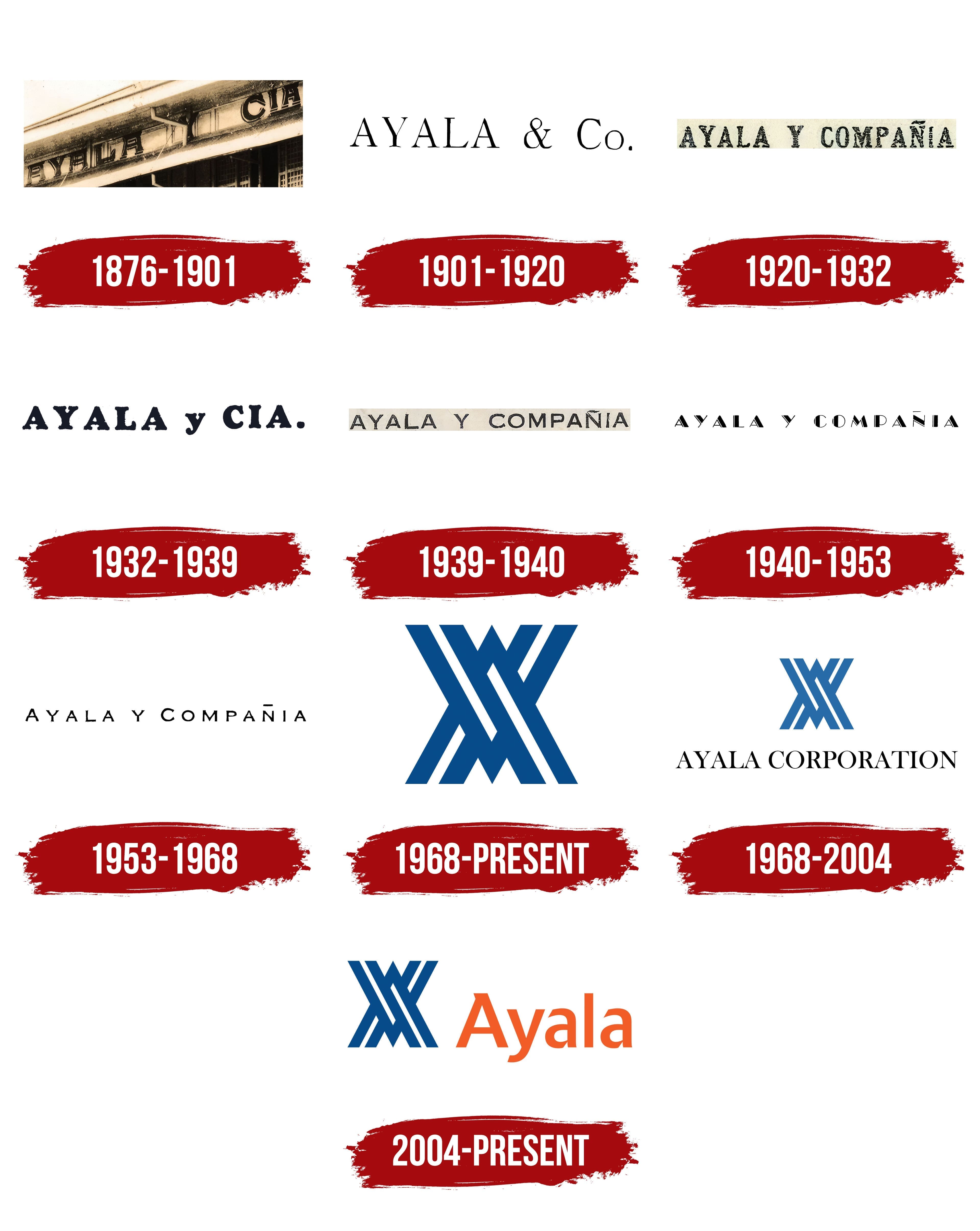
What is Ayala?
The largest private business group in the Philippines, with a century-long history, it unites about 20 companies across real estate, finance, energy, telecommunications, water supply, logistics, education, and healthcare. Its structure includes Ayala Land, Bank of the Philippine Islands, ACEN, Globe Telecom, Manila Water, and Ayala Healthcare. The conglomerate combines the development, financial, and technology sectors and collaborates with international partners, including Mitsubishi and GIC.
1876 – 1901
One of Ayala Corporation’s founders’ surnames remained part of the Philippine group’s name throughout its history. In 1834, Domingo Roxas and Antonio de Ayala established the Casa Roxas partnership. One of its early businesses was a distillery that produced Ginebra San Miguel gin. The group later expanded into real estate, banking, telecommunications, energy, and other industries. Antonio de Ayala’s surname continued to appear in its name.
In 1876, the Ayala y Compañía partnership succeeded Casa Roxas. The Spanish name translates as “Ayala and Company.” Its abbreviated form was Ayala y Cía., with “Cía.” standing for “Compañía.” In English, the name became Ayala & Co., and both versions retained the owners’ surname. At the same time, “and Company” changed with the language. The early identity consisted of the written name.
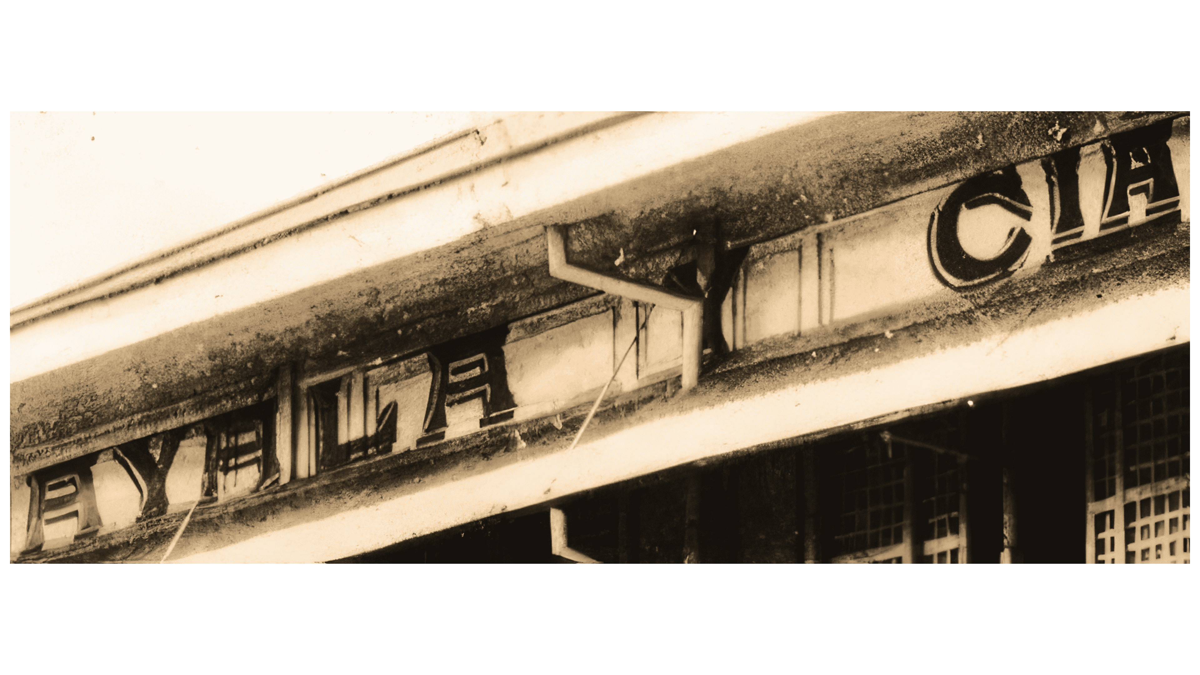
A historic building sign used the Spanish form “AYALA Y CÍA.” The inscription occupied the upper facade at cornice level and became part of the building’s architectural treatment. Individual rectangular recesses held the letters in a horizontal row. Their alignment brought them together as a name. At the same time, the recesses’ boundaries set the spacing and guided the eye from left to right.
The sign used formal serif capitals. Light outlines framed their black surfaces, separating the letters from the surrounding facade. Shadows gave them a slight sense of depth. The rectangular recesses and raised lettering echoed the cornice’s structure, incorporating the company name into the architecture.
1901 – 1920
By 1901, Ayala was using the English form “AYALA & Co.” The surname occupied most of the line, followed by an ampersand and the abbreviation for “Company.” The logo used only black lettering.
Thick vertical strokes combined with thin horizontal strokes. The formal serif letters resembled Didot or Bodoni. “AYALA” appeared in tall capitals with open spaces between them. Even spacing gave the first part of the name an airy appearance.
The ampersand following the surname reached the height of the capitals. In “Co.,” a large “C” paired with a lowercase “o,” and the period indicated the abbreviation of “Company.” The difference between uppercase and lowercase distinguished the company designation from the surname. All parts of the logo remained on one line.
1920 – 1932
The Spanish form of Ayala’s name also remained on its office sign. In 1927, “Ayala y Cía.” appeared on the facade of the company’s office on Echague Street in Manila’s Quiapo district. The abbreviated name stretched along a horizontal band of the building. Large letters spelling the surname stood apart from “y Cía.,” dividing the inscription into two parts.
The facade lettering differed from conventional printed serif type. Internal lines added depth to its angular forms. The inscription formed part of the facade’s design, and its length followed the building’s horizontal sections.
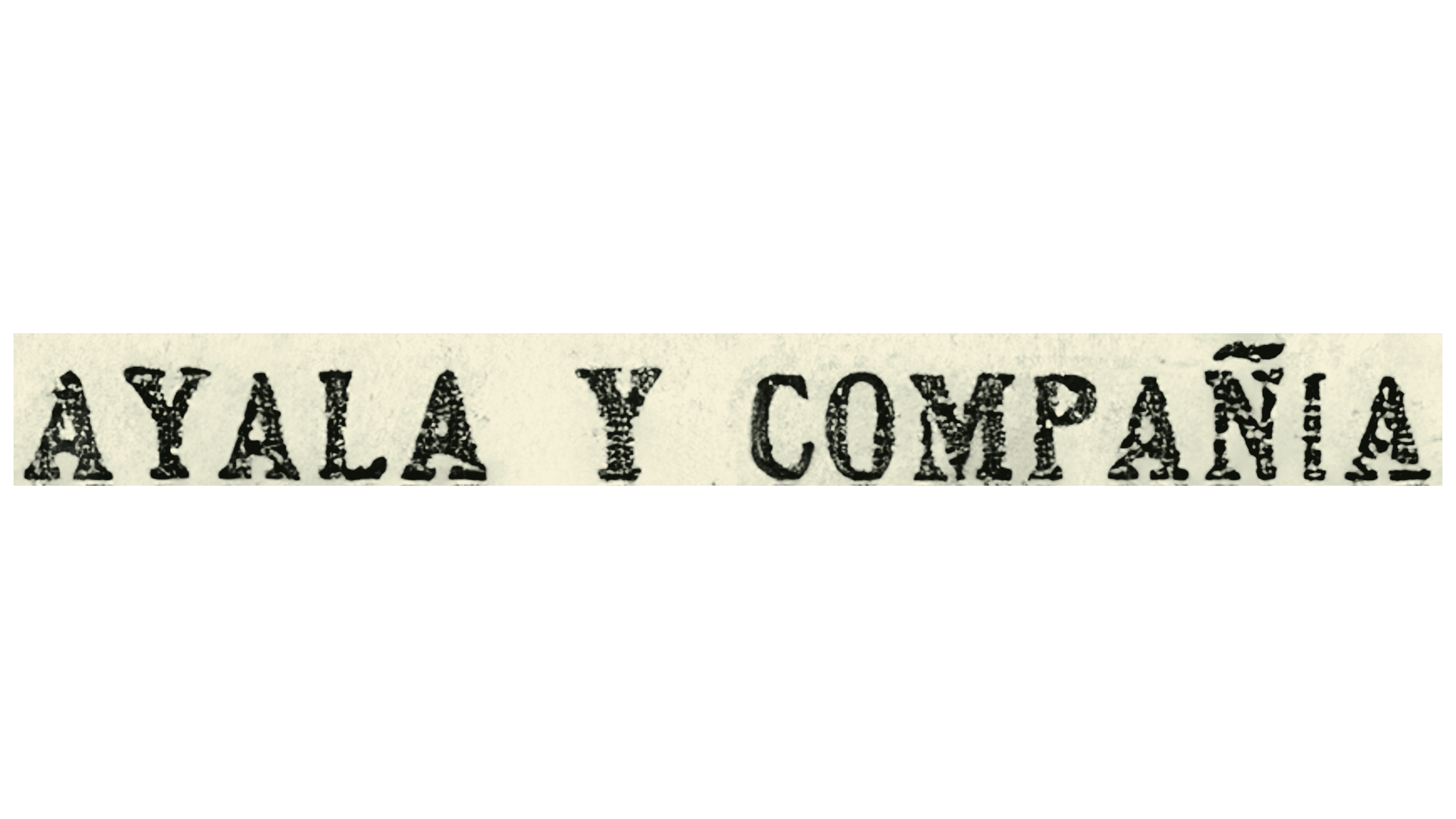
The full name, “AYALA Y COMPAÑÍA,” appeared in several typographic versions. In one, black lettering sat against a light rectangular background. The entire phrase used narrow capitals with heavy serifs, thick vertical strokes, and small internal openings. “AYALA” and “COMPAÑÍA” were approximately equal in size and occupied comparable portions of the line. The tilde above the “Ñ” preserved the Spanish spelling.
1932 – 1939
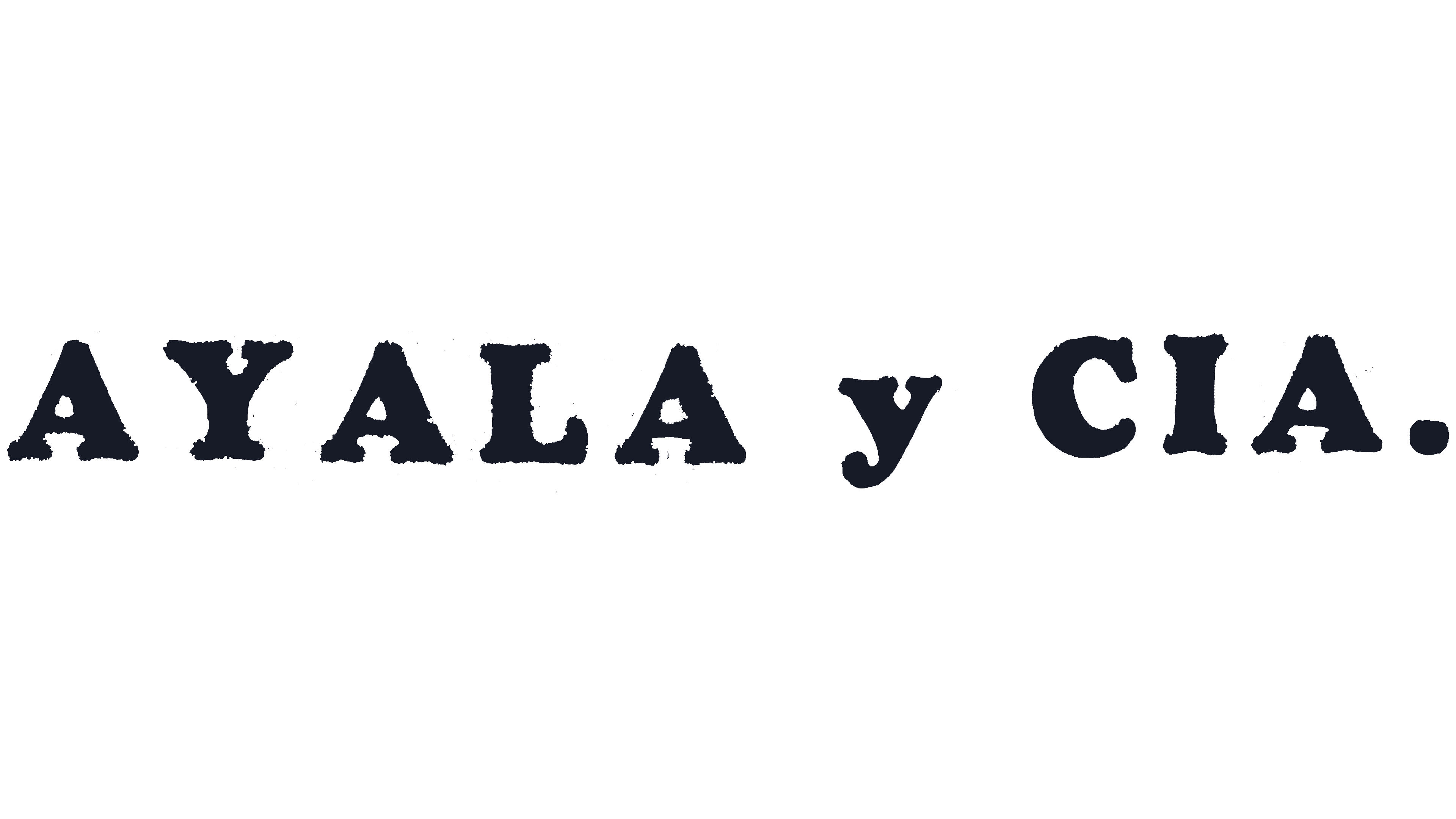
The abbreviated “AYALA y CIA.” received a different typographic treatment. Wide letters with thick strokes and heavy serifs replaced the full Spanish name’s narrow capitals. Rounded terminals softened their weighty forms. The shorter name took up less space while still looking dense.
“AYALA” and “CIA” appeared in capitals, while the Spanish conjunction “y” remained lowercase. The height difference separated the two parts of the name. Black unified the inscription, which ended with a period after “CIA.” The logo consisted entirely of large letters with a smaller “y” between them.
1939 – 1940
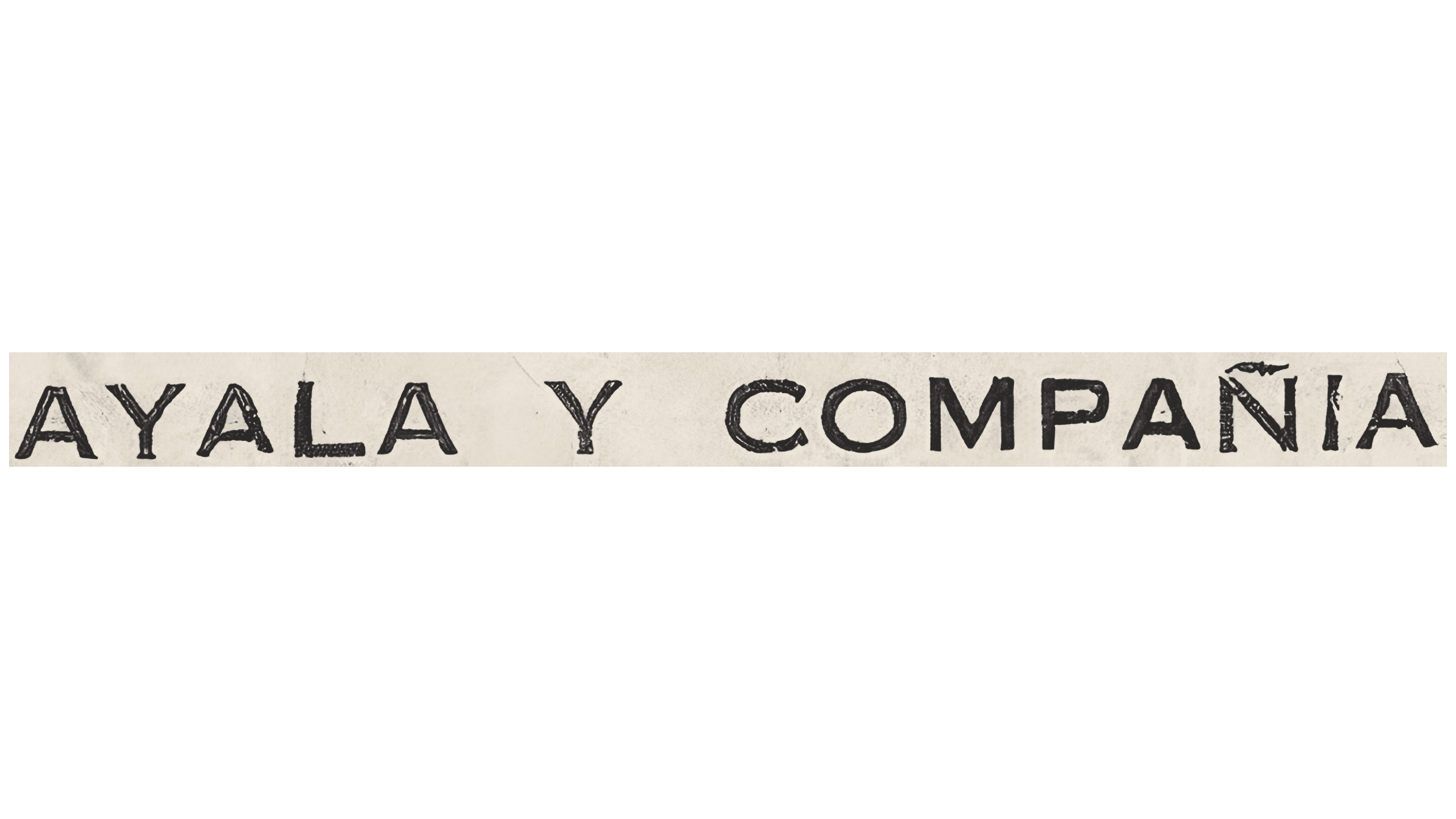
Another version of the full Spanish name, “AYALA Y COMPAÑÍA,” used strokes of uniform thickness. The black inscription appeared on a single line against a light rectangular background. All letters, including the conjunction “Y,” were uppercase and equal in size.
The upright lettering resembled monospaced typewriter fonts of the 1930s. Rounded “O” and “C” forms alternated with angular “A,” “Y,” and “M” letters. Consistent stroke weight unified the different shapes. A tilde above the “Ñ” preserved the Spanish spelling of “COMPAÑÍA.”
1940 – 1953
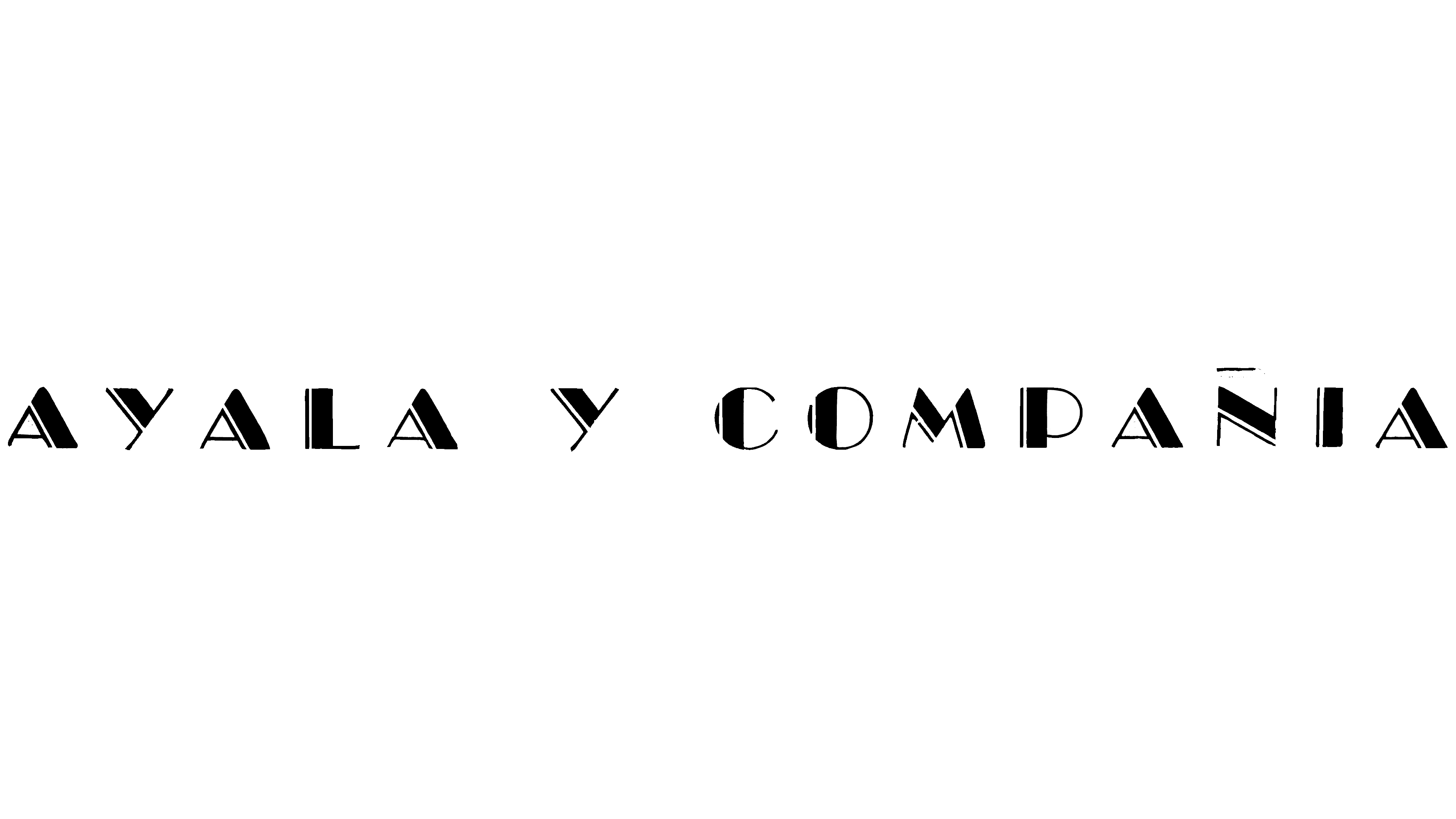
In a decorative version of “AYALA Y COMPAÑÍA,” black sections alternated with white cuts within the letters. The sans-serif capitals stood upright. Thin contour lines ran alongside broad dark areas, and changes in stroke weight gave the lettering a striped structure.
Light and dark bands followed the diagonals of the “A,” “Y,” and “M.” Wider letter spacing left room for the intricate design. In contrast, the reduced letter height gave the name elongated proportions. Above the “Ñ,” a thin, offset strip formed a tilde. It preserved the Spanish spelling and echoed the fine lines inside the other letters.
1953 – 1968
In a later wordmark, solid fills replaced the decorative cuts in “AYALA Y COMPAÑÍA.” The name retained its black color and full Spanish form, stretching across a long line with increased spacing. The small sans-serif capitals were arranged more loosely than before.
The first “A” in “AYALA” and the first “C” in “COMPAÑÍA” were slightly larger than the other letters, emphasizing the beginning of the name’s two parts. A short black horizontal bar replaced the wavy tilde above the “Ñ.” The style resembled older typefaces used in mid-20th-century Spanish and Latin American publications.
1968 – today

After the partnership incorporated on January 23, 1968, the company became Ayala Corporation. The English word “Corporation” replaced the Spanish partnership designation. A blue emblem accompanied the new corporate name. Artist Fernando Zóbel, a member of the founding family, Fernando Zóbel de Ayala y Montojo, created it.
The design was based on the initial “A” of Ayala, repeated four times. Interwoven diagonal bands formed a symmetrical figure with a narrow center and broader upper and lower portions. Its outer contour resembled an “X.” The shape consisted of two overlapping “V” forms, with their points facing up and down. Stylized “A” letters appeared at their intersection.
Four white gaps ran along straight paths, separating the blue bands. Alternating blue areas and white spaces formed pairs of diagonal lines that met at the center. The white lines converged toward the middle and spread outward. The interwoven letters formed the emblem’s outer contour.
1968 – 2004

From 1968 to 2004, Ayala paired Fernando Zóbel de Ayala y Montojo’s emblem with the full corporate name in different typographic versions. In the vertical arrangement, the symbol occupied the upper portion, with black “AYALA CORPORATION” lettering on a single line beneath it. The entire name appeared in capitals.
The light blue figure consisted of two overlapping “V” forms pointing upward and downward. Their sloping sides formed blue bands with white gaps inside. The interwoven shape resembled an “X,” with a stylized “A” visible at the center. The emblem also appeared without the name, retaining the same bands and openings.
This typographic version used serif lettering resembling Bodoni or Didot. The contrasting thin and thick strokes gave the name a traditional printed look. The letters complemented the symbol’s angular forms. The logo occupied two levels, with the letter-based emblem above the corporation’s full name.
2004 – today
Preparations for Ayala’s 170th anniversary prompted a review of the relationship between the corporate name and its well-known subsidiary brands. Work began in 2003 with Hong Kong design firm Enterprise IG. Management discussed the update, and employees participated in focus groups. The goal was to strengthen the group’s shared name and coordinate its use with individual business brands. The firm introduced the result in 2004, the anniversary year.
Fernando Zóbel’s emblem remained, but the name’s placement changed. In the horizontal arrangement, the light blue symbol sat to the left of orange “Ayala” lettering. Its intersecting bands resembled two overlapping “V” forms pointing upward and downward. White gaps separated the blue sections, while the overall silhouette resembled an “X” with a stylized “A” inside.
The full name, previously set in capitals, gave way to the shorter “Ayala,” with an initial capital followed by lowercase letters. The wordmark used a heavy sans-serif style with angled cuts on some terminals. A projection appeared at the apex of the initial “A,” the “y” descender curved left, and the tall “l” separated two rounded “a” letters. The warm orange color conveyed energy and a willingness to explore new business areas. From 2004 onward, public materials used Ayala, while legal documents retained Ayala Corporation.
The update was accompanied by “Pioneering the future,” expressing the idea of breaking new ground and exploring future possibilities. The “pioneering arrow” was developed from the emblem’s diagonal bands as an additional symbol. It appeared in materials to identify their connection to Ayala. A green version of the logo was introduced for Ayala Land in 2006.