 Keppel Logo PNG
Infrastructure projects include building energy facilities, developing urban real estate, and creating technical systems for modern cities. Such tasks require engineering calculations and the management of complex projects at various stages. The Keppel logo is associated with a Singapore-based company that operates in infrastructure, energy, and development, implementing projects across various regions.
Keppel was founded in 1968 based on the shipyard facilities of “Keppel Harbour” in Singapore. Initially, it specialized in ship repair and construction. The company was named after British Admiral Henry Keppel.
In 1971, the company acquired a stake in Far East Levingston Shipbuilding. In 1975, it was listed on the Singapore Stock Exchange. That same year, it opened its first overseas branch in the Philippines.
In 1983, it entered the real estate market by acquiring Straits Steamship Land. In 1986, the company changed its name to Keppel Corporation. In 1989–1990, it acquired shipyards in the Philippines, Texas, the UAE, and India.
In 1990, Keppel entered the banking sector and established Keppel Bank. By 2001, Oversea-Chinese Banking Corporation sold the bank. In 1997, the company launched a telecommunications division through Keppel Telecommunications & Transportation and the M1 network. In 1999, it began a partnership with Hitachi Zosen. In 2002, the collaboration led to the creation of Keppel Offshore & Marine.
In 2017, the company was involved in a corruption investigation in Brazil and paid a 570 million dollar fine. After that, Keppel began restructuring and reallocating assets. It strengthened its real estate, infrastructure, and investment management businesses.
By 2020, Keppel began transforming from an industrial conglomerate into an asset management company. In 2024, the company changed its name to Keppel Ltd and completed a corporate reorganization.
Keppel Ltd continued to implement its Vision 2030 strategy. The main focus was on developing infrastructure and digital assets. In the first half of the year, profit amounted to $431 million. Assets under management reached 91 billion. The company strengthened its position as a global player in infrastructure and investment management.
Meaning and History
What is Keppel?
A Singaporean conglomerate that grew out of a shipbuilding department and became a leader in offshore rig construction. The company operates in four areas: Offshore & Marine designs and upgrades platforms; Infrastructure manages power plants and a data center network; Property develops real estate projects in Asia; Investments, through Keppel Capital, manages assets worth $29 billion. The conglomerate owns shipyards in several countries.
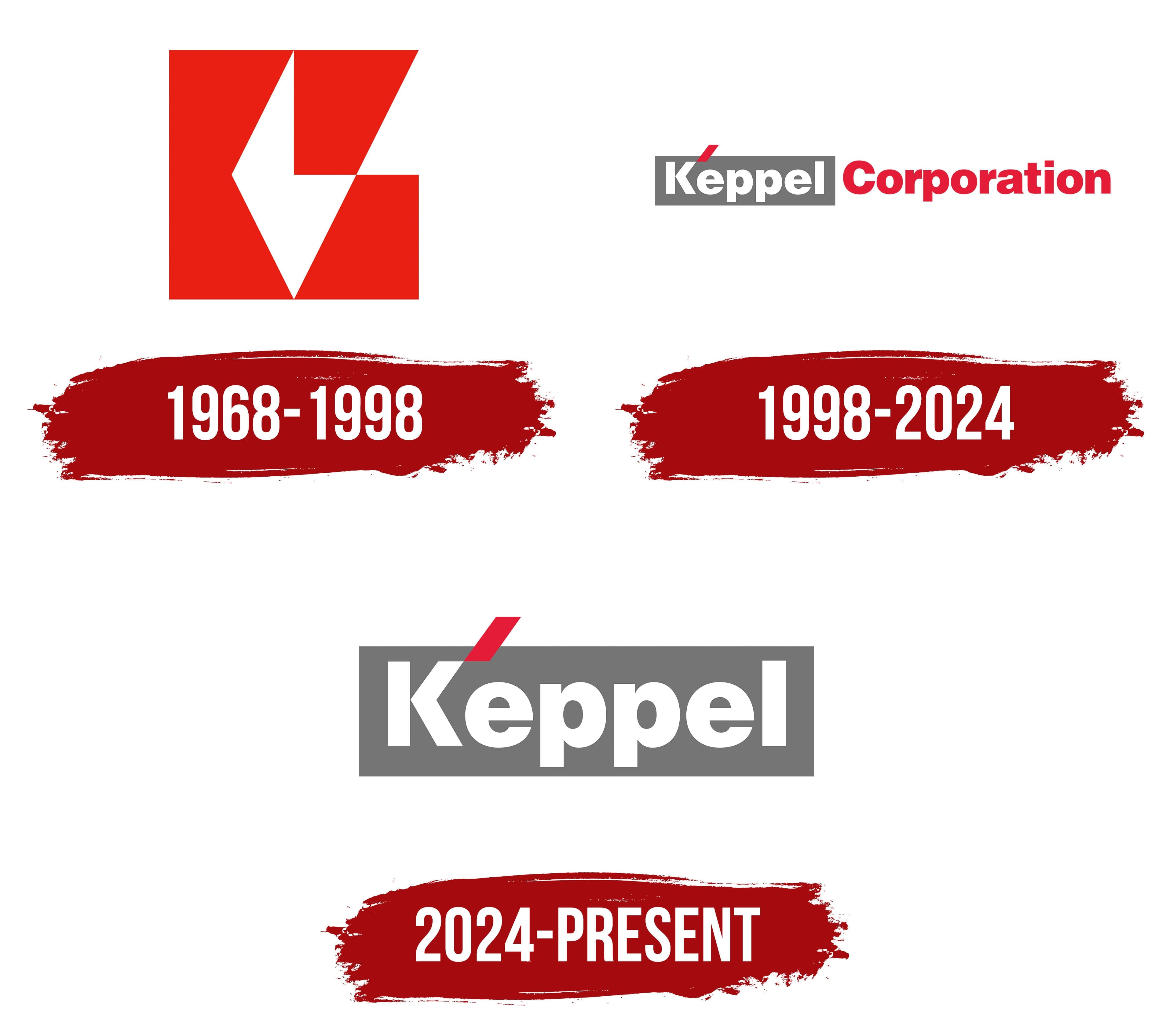
1968 – 1998

Keppel selected its first logo through a student competition. In 1968, Keppel Shipyard invited entries from educational institutions in Singapore and required participants to use red and white. The organizers received 182 designs from 75 contestants. Sim Bee Ong, an 18-year-old second-year Advertising Art student at Baharuddin Vocational Institute, won. She received 500 Singapore dollars, while six other contestants were awarded 50 dollars each.
The competition took place during the year the shipyard began operations. Keppel Shipyard opened on September 1, 1968, after the Dockyard Department of the Port of Singapore Authority was converted into a government-owned commercial ship repair organization. The shipyard took its name from Keppel Harbour. The harbor was named after British Admiral Henry Keppel on April 19, 1900. In 1848, he surveyed the New Harbour area and identified waters suitable for large steamships.
Sim Bee Ong combined the initials “K” and “S” in an angular monogram. Red geometric planes formed a shape resembling a square. White negative spaces created the diagonal elements of the letters. An incomplete diamond appeared inside, extending along three sides. The upper right section had an opening, with a triangular element shifted toward the outer edge. The “KS” monogram served as the complete logo and represented the shipyard’s abbreviated name. The company associated its angular shape with honesty, energy, and growth.
Keppel Shipyard Ltd. became Keppel Corporation in May 1986. The “KS” monogram continued to reflect the company’s shipbuilding origins, while the new corporate name represented the group’s expanded operations. The red-and-white emblem remained part of Keppel’s identity after the renaming.
1996 – 2024
Keppel chairman Sim Kee Boon’s statement “One Team. One Identity. One Vision” became the foundation of the company’s 1996 rebranding. The group needed a common logo for the parent company and its many subsidiaries, which had been using different names. DPC Design, a Singapore studio founded by Patrick Chia, completed the project. The firm served as Keppel Corporation’s corporate identity consultant.
The unified identity accompanied the group’s expansion beyond ship repair. In 1971, Keppel acquired an interest in Far East Levingston Shipbuilding. It later expanded into overseas shipyards, real estate, financial services, and infrastructure. By the mid-1990s, the portfolio included numerous companies with individual logos. A common system connected them with the Keppel name and helped present the group in international markets.
A wordmark replaced the “KS” monogram. The name “Keppel” appeared inside a gray rectangular block. The white letters used a heavy, rounded sans-serif typeface with uniform stroke thickness. A short red bar was placed diagonally above the initial “K,” extending beyond the upper edge of the gray field.
The red word “CORPORATION” appeared on the right. It was set in uppercase sans-serif letters, lighter than “Keppel.” The gray background separated the short name from the legal descriptor, while the red color connected “Corporation” with the bar above the “K” and continued the color tradition of the previous emblem. DPC Design also created logo versions for the subsidiaries. Each version retained the Keppel name and added the relevant business designation. Companies involved in shipbuilding, real estate, finance, and infrastructure used the system.
2024 – today
In 2024, Keppel shortened its logo to a single word. Keppel removed the red word “CORPORATION” from the right side, making the white “Keppel” inscription inside the gray rectangular field the complete corporate signature. The red diagonal stroke above the “K,” the block shape, and the letter design remained unchanged. “Ltd.” continued to appear in the company’s legal name.
The shortened identity accompanied the Singapore-based group’s transition to a new business model. Following a multiyear restructuring and the sale of its offshore and marine division, Keppel moved away from its former structure as a diversified conglomerate. The company combined asset management with operating expertise in infrastructure, real estate, and connectivity. The shorter name represented all these businesses under the unified Keppel brand.
In the fall of 2023, management proposed changing the legal name from Keppel Corporation Limited to Keppel Ltd. Shareholders approved the proposal, and the new legal name took effect on January 1, 2024. The company began using the shortened logo that same day. Corporate documents used Keppel Ltd., while the visual identity centered on the word “Keppel.”
The Keppel name’s long history supported the decision to retain the established wordmark. CEO Loh Chin Hua confirmed its continued use in January 2024. The group presents itself to customers, partners, and investors as Keppel, while Keppel Ltd. remains its legal designation.