 Elevance Health Logo PNG
The Elevance Health logo doesn’t contain obvious symbols, yet still reflects the company’s connection to the healthcare industry. Its color palette, font, and abstract shapes suggest modern approaches to medicine and emphasize its commitment to improving clients’ quality of life.
Elevance Health traces its roots to the 1940s in Indianapolis, Indiana, where Mutual Hospital Insurance Inc. and Mutual Medical Insurance Inc. were created as nonprofit health insurers for residents. In 1960, the two organizations merged to form Blue Cross Blue Shield of Indiana, giving the company a broader base for medical coverage and service expansion across the state.
The company changed direction in 1985 when it went public, gaining capital for acquisitions and regional growth while many comparable insurers remained nonprofit. In 1993, it became Associated Group, a name tied to its broader geography and wider service portfolio. Through the 1990s, the business expanded by acquiring and merging with insurers in other states.
In 2001, Associated Group merged with insurance operations that formed Anthem, Inc., creating one of the largest health insurance providers in the United States. In 2004, the company bought WellPoint Health Networks for $16.5 billion and became the largest U.S. health insurer by membership. WellPoint later acquired Amerigroup for $4.9 billion in 2012, strengthening its Medicaid and Medicare business.
In 2015, the company attempted to acquire Cigna Corporation for $54 billion, but antitrust concerns led to the deal’s termination in 2017. Later milestones included digital health investment in 2017, IngenioRx in 2018, and Beacon Health Options in 2020. In 2022, the company took the name Elevance Health. In 2023, it bought Blue Cross and Blue Shield of Louisiana, expanded telemedicine and prevention programs, and, in early 2024, announced AI investments in claims processing and health risk detection.
Meaning and History
What is Elevance Health?
It is a health insurance and health services company in the United States. Formerly known as Anthem, it provides various health insurance products and services, including individual and group health plans, Medicare and Medicaid plans, and specialty services such as dental, vision, and behavioral health. The company focuses on improving access to, quality of, and affordability of health care for its members.
2004 – 2022
From 2014 to 2022, the company now known as Elevance Health was called Anthem, and the name appeared in its previous logo. The six-letter word “Anthem” evokes associations with harmony, unity, and significance, making it an excellent choice for the healthcare industry.
The designers did not experiment with the wordmark, opting for a classic serif font. The simple typography underscores the company’s professionalism and instills confidence in the high quality of all its services, from medical insurance to health improvement programs. The modern font conveys a sense of solidity and trust, which is precisely what Elevance Health’s clients seek.
The letters appear dynamic due to the combination of thick and thin strokes. Some strokes evoke a sense of reliability, while others lend elegance and refinement to the logo. This contrast enhances the wordmark’s expressiveness, boosting its visual appeal. The smooth transitions between the broad and narrow parts give the word “Anthem” a harmonious appearance, reflecting the balance that the healthcare provider strives to achieve.
The long, thin serifs are aligned strictly horizontally, symbolizing precision. Their shape is influenced by a minimalist style, emphasizing the company’s relevance and high standards. The logo’s apparent simplicity reflects the brand’s professional approach to protecting its clients’ lives and health. At the same time, the elegant curves create a sense of lightness, hinting at the broad accessibility of health insurance.
Despite its minimalist design, the logo includes several interesting details that reflect Anthem’s mission.
- The main element is a long horizontal line beneath the wordmark. This line underscores the company’s significant role in the healthcare industry, representing the stability and support millions of Americans can rely on in any life situation.
- The second element is the connected serifs at the bottom of the “A” and “n.” These serifs merge into a single line, creating a sense of unity. This symbolizes the support and assistance that the insurance company’s clients need.
The logo’s blue color is associated with the medical field, conveying trust, stability, and professionalism. It’s no surprise that many doctors and nurses wear blue uniforms. This color creates an aura of calmness for Anthem, instilling confidence in the company’s services.
2022 – today
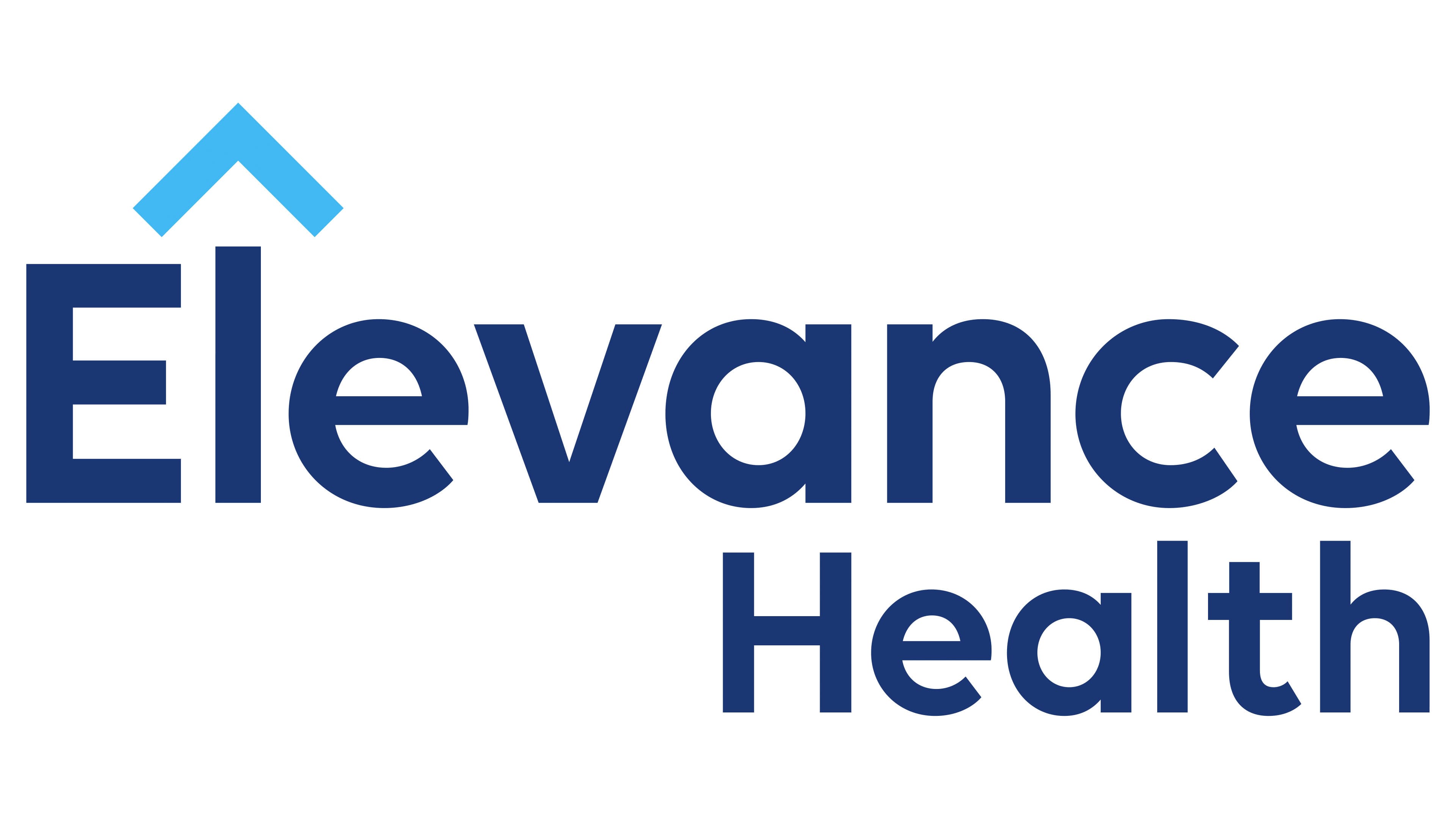
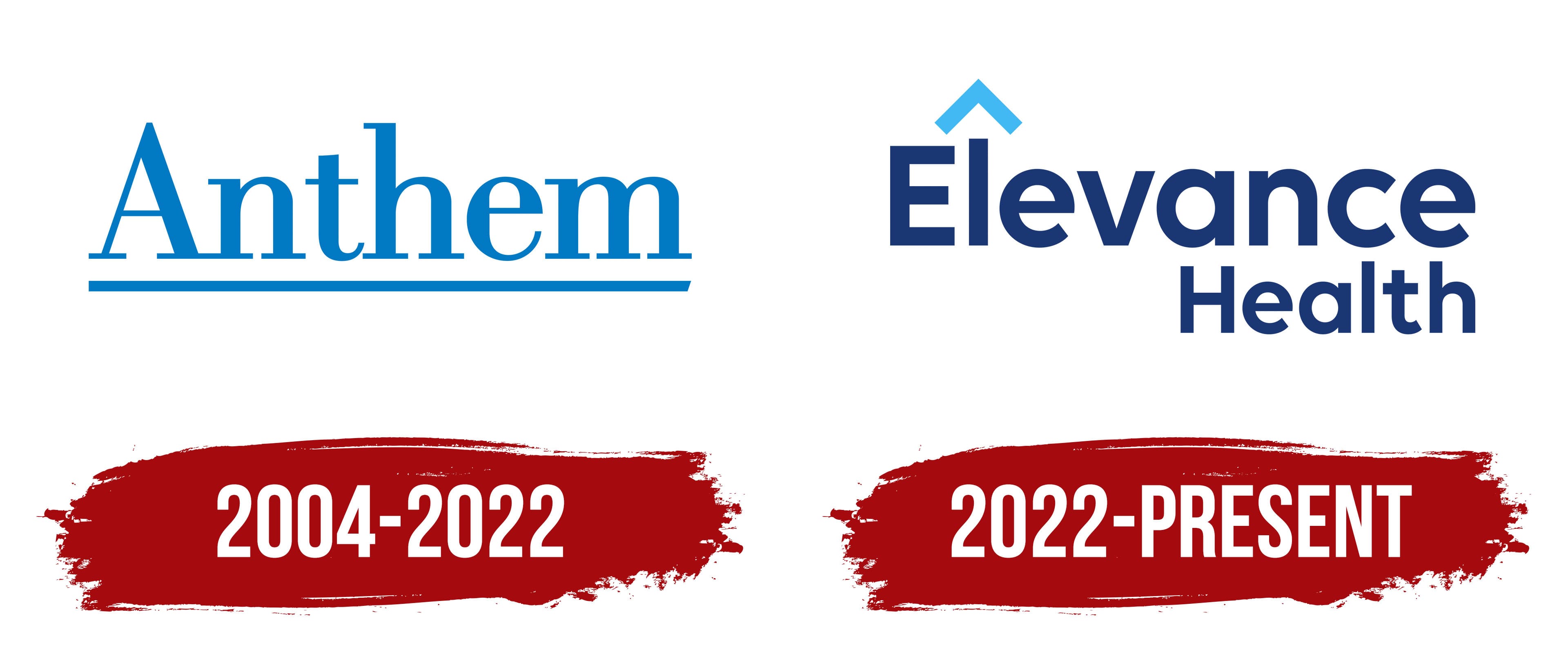
In mid-2022, Anthem officially rebranded as Elevance Health and updated its logo to align with the new concept. Since the brand name now consists of two words, the designers had more room for creative experimentation. They made the text two-tiered and right-aligned, as the imbalance naturally draws attention.
Another expression of asymmetry is the difference in letter sizes. Although both parts of the text are in the same bold, sans-serif font, they differ in size: “Elevance” is larger than “Health” because the first word plays a primary role in identifying the company. This is an example of how the emblem’s creators use visual emphasis to guide consumer attention.
The font is unremarkable; the designers chose a simple geometric grotesque, harmoniously combining straight lines and smooth curves. The color is also standard: dark blue text on a white background. The contrast ensures excellent clarity of the logo, which is important for brand recognition.
The emblem could be considered simple if not for one detail. Above the “l” is a triangular “cap,” formed by a 90-degree angle turned upward. This graphic element transforms the letter into an arrow, symbolizing:
- Continuous progress
- Greater opportunities for clients
- An expanding range of services
- A call to immediate action
The angle above the “l” also resembles a roof. In this capacity, it symbolizes protection, safety, and support, everything associated with Elevance Health. Beyond insurance, the company offers a range of healthcare services, including diagnostics, treatment, rehabilitation, medical consultations, and assistance with obtaining necessary medications.
To make the logo cohesive, the designers made the “cap” above the “l” light blue, choosing a shade similar to the Anthem emblem’s color. This is a nod to the brand’s origins, which previously had a different name and visual identity. The combination of two shades of blue enhances the text’s dynamism and underscores the company’s connection to the healthcare industry.