


![]() Beatbuddy Tale of the Guardians Logo PNG
Beatbuddy Tale of the Guardians Logo PNG
The Beatbuddy: Tale of the Guardians logo immerses you in a world where music becomes the engine of everything, from the hero’s rhythmic movements to lively, hand-drawn locations. The project combines game dynamics with melodies, embodying the developers’ love for bold musical experiments.
Beatbuddy: Tale of the Guardians started its journey in 2011 when students from the Berlin University of the Arts teamed up to create a fresh, music-driven game. Johannes Voigt led the group to THREAKS to bring their innovative vision to life. The core idea was to make music playable, shaping the game’s rhythm with each player’s actions. The project soon attracted collaborations with well-known composer Austin Wintory and other talented artists, significantly enhancing the game’s unique sound and visuals. Upon its official release on Steam for PC, the game was warmly received for its engaging musical experience. Later, the developers introduced the game to the Mac platform, reaching even more players. Eventually, Beatbuddy became available on mobile devices, launching successfully on both iOS and Android, with gameplay carefully adapted for touchscreens. The game continued to evolve through updates and improvements, making its immersive musical world more accessible.
Meaning and History
![]()
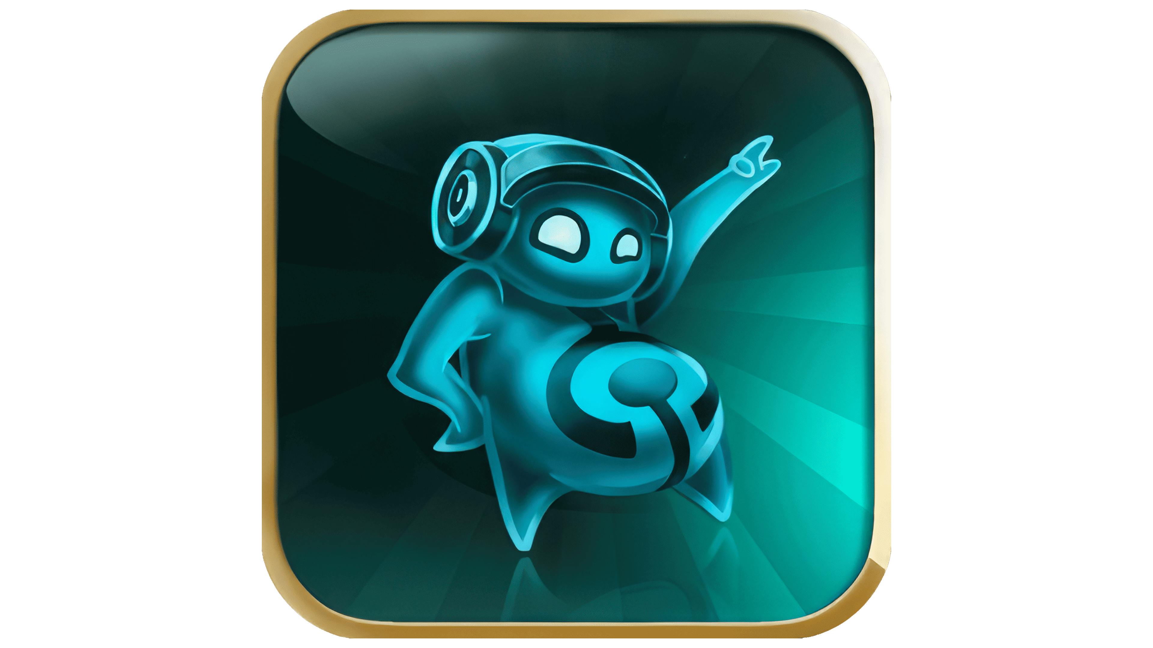
What is Beatbuddy Tale of the Guardians?
It is a music video game in which gameplay is closely tied to melody and rhythm. The main character travels through the underwater world, where the levels become a living musical composition. The player’s actions add new layers to the melody, and enemies, obstacles, and challenges move to the beat of the beat. The game features six unique worlds, each with its own musical style, from pop to hip-hop. The soundtrack was created with the participation of famous musicians from different countries.
2013 – today
![]()
The Beatbuddy: Tale of the Guardians logo throws us into a world of music and fantasy, which form the game’s core. It looks lively, fun, and even a little fantastical. There’s nothing dull about it, just pure energy and movement.
The name “Beatbuddy” roughly translates to “rhythm buddy.” The game is about a creature living in a musical world where everything moves to the beat. That’s why the lettering was designed to be as rhythmic and energetic as possible. The upper part of the name is written in huge, thick letters in a bright blue color with a subtle gradient, almost as if they’re glowing from within. The letters are geometric squares, with sharp angles and elongated elements resembling blocks or puzzle pieces. This creates the impression of something mechanical, technological, and deeply connected to rhythm and movement, just like the game, which is built around musical interactions and reactions to the beat.
The second line, “Tale of the Guardians,” is designed completely differently, written in thin, swirling golden letters. The font is much softer, the letters flowing and curving, sometimes even ornate, reminiscent of old fairytale inscriptions. This part of the title hints at the game’s story, where the main characters are guardians of the musical world, and everything in their universe moves in sync with the rhythm.
The logo includes some interesting details: musical ribbons with notes and symbols are woven along the edges of the design. These elements emphasize the game’s musical nature, where all life and movement are tied to the beat. The musical ribbons twist at the bottom, partially hidden in dark shadows, adding depth and volume to the design.
The name itself reflects the game’s core themes: “beat” (rhythm) and “buddy” (a companion), who assists the guardians in their adventure. The protagonist journeys through a fantasy world filled with music, protecting it from evil while everything around them moves and breathes in sync with the beat. This is reflected in the visual design—it feels dynamic and almost alive.
The color palette of the emblem also conveys the mood of the game:
- Bright blue represents music, positivity, and movement.
- Gold symbolizes adventure, magic, and ancient fairy tales.
These elements create a unified image, evoking a world of sound and fantastical characters.
The brand was created by the German development team Threaks, who released the game in 2013. It gained popularity among players thanks to its unique gameplay based on musical rhythm. That’s why the logo turned out the way it did. This is a fantastical musical story where everything moves to the beat.