


![]() Beefeater Logo PNG
Beefeater Logo PNG
The Beefeater logo shows elegance and strength. The inscription elements indicate varying alcohol concentrations and perfectly balanced taste qualities that have attracted more and more connoisseurs from past centuries to the present.
Beefeater traces back to 1863, when James Burrough, trained as a pharmacist, acquired the John Taylor & Son distillery in London. His background shaped a precise approach to blending botanicals and refining recipes.
In the first years, the company produced liqueurs and fruit spirits. By 1871, operations expanded, and in 1876, the name Beefeater gin appeared in records. Around this time, Burrough finalized a formula based on nine botanicals, including juniper, angelica, coriander, and citrus peel, which were infused for 24 hours before distillation.
After Burrough died in 1897, the business passed to his sons, who continued expansion. In 1908, production moved to new facilities in Lambeth with improved equipment and water supply. By 1917, exports to the United States had begun, establishing an important growth trajectory.
In 1958, production relocated to Kennington, using a former industrial site adapted for distillation. During the 1960s, demand for gin in the U.S. increased, and Beefeater expanded its presence alongside competitors such as Gordon’s and Tanqueray.
In 1987, the Burrough family sold the company to Whitbread, ending more than a century of family ownership. The brand later moved to Allied Domecq and, in 2005, became part of Pernod Ricard.
In 1995, Desmond Payne became master distiller. Under his direction, Beefeater 24 launched in 2008 with additional botanicals, followed by Burrough’s Reserve in 2013. In 2014, the distillery opened a visitor center, marking a shift toward public engagement.
Meaning and History
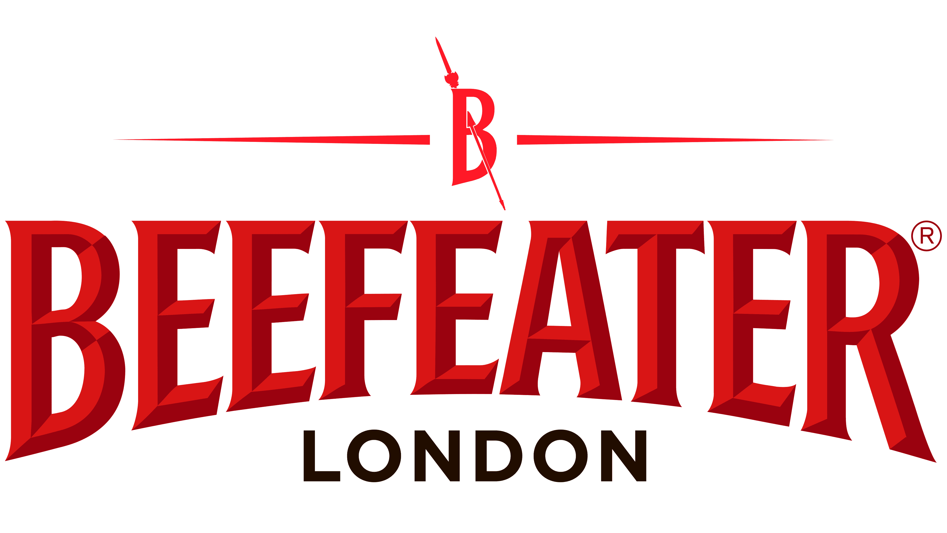
The iconic brand logo has survived to our time in its original form. Like a century and a half ago, the label is adorned with a large red Beefeater inscription. This word is the unofficial name for the guards of the Tower of London.
The logo of this trademark consists of the word “Beefeater” and its graphic design. Above is the name; below is an ancient warrior with a spear. This is the same, “beefeater.” Otherwise, they are called the Yeomen Warders, a separate corps of the English palace and fortress guards to protect the royals and participate in various ceremonies. They are bodyguards, which is why they are secretly called Royal Bodyguards.
What is Beefeater?
Beefeater is a British gin brand with a distinctive vegetable flavor. Its flavors include coriander seeds, angelica, juniper, lemon peel, almonds, and other natural ingredients. It has been produced since 1863, but officially registered in 1876. It is produced by James Burrough Ltd. and distributed by Pernod Ricard.
The guard stands in full ammunition. His clothes depict traditional ornaments, the royal crown, and the heraldic emblem of the Tudor rose, or English rose. It is directly related to the royal dynasty, which ruled England for over a century (almost 120 years). Her representative, King Henry VII, formed the guard, the emblem of which still appears on the bottles of the legendary British gin.
Above are the brand’s full name and the type of alcoholic drink, because this was originally the name of an alcoholic tincture with nine ingredients. But before that, the word “beefeater” stood for the guards of the Tower of London. It was originally their nickname given to them for their addiction to meat.
The bodyguard warriors were well fed to carry out their duties, which is why there are two versions of the origin of the guard’s name and, therefore, the brand. One by one, the guards’ nickname comes from the phrase “beef-eaters,” meaning “meat-eaters.” On the other hand, from the phrase “bef or beffy,” fatty, hearty, and strong meat broths were in the royal soldiers’ diet. Now, this is the name of the brand of gin and its manufacturer.
Also, the logo reflects Beefeater’s close relationship with London. The city’s name is depicted in black, strict sans-serif type, which makes it stand out. Another iconic detail is the personal signature of James Burrough, the very founder of the brand. This is a tribute to historical memory and centuries-old traditions that Pernod Ricard has tried to preserve.
Font and Colors
The designers chose an elongated font with miniature serifs for the Beefeater logo, which are almost invisible. The font is simple but decorated originally. The fact is that they are depicted as sharp ends and look harmonious on the letters. Classic letters with short, sharp serifs appear three-dimensional due to the peculiarities of the coloring. The word is written in uppercase with minimal space between characters. At the same time, “R” resembles as much as possible a walking guardsman, the trademark mascot after which it is named.
The letters are uneven in size: “B” and “R” are the longest, “FEA” is the shortest. Because of this, the inscription resembles an arch. This design has been used since the brand’s founding.
The emblem’s color is also associated with the separate corps of the English palace and fortress guards, the Yeomen Warders. Its representatives now wear a deep red uniform, like blood and like a heraldic rose. The combination of scarlet and burgundy forms smooth edges that divide each line in two. The logo also uses black, white, and a light golden hue.
FAQ
What spirit is Beefeater?
Beefeater is a London Dry Gin known for its clean flavor with bold juniper and strong citrus notes. The brand uses a traditional process where botanicals are steeped in alcohol for 24 hours before distillation. This method integrates the flavors well.
Founded in London by James Burrough, it has a long history. Its name comes from the Yeoman Warders, the ceremonial guards of the Tower of London, reflecting its London heritage.
Gin is used in classic cocktails like the gin and tonic, martini, and Negroni. Its versatility makes it popular with bartenders and gin lovers. The brand’s commitment to quality and tradition has earned it many awards and a top reputation in the gin world.
Why is it named Beefeater?
The name “Beefeater” comes from the Yeomen Warders, the ceremonial guards of the Tower of London. This name reflects a strong connection to London’s history. The Yeomen Warders were called “Beefeaters” because they received large daily beef rations while serving at the royal court.
James Burrough chose this name to highlight British tradition and heritage. The name stands for strength, reliability, and a deep connection to London. In their unique uniforms, the Yeomen Warders are iconic symbols of British history, much like the gin itself.
What does the Beefeater logo mean?
The logo features a letter B with a spear at the top. This design connects deeply with the brand’s name and heritage. The term “beefeater” refers to the guards of the Tower of London, known as the Yeomen Warders, who are seen with spears.
The spear in the logo represents these guards’ historical roles and duties. It shows the brand’s link to British history and tradition. The letter B stands for the brand’s name, making it easy to recognize and reinforcing its identity.
This combination of the letter B and the spear visually represents the brand’s heritage. It reflects strength, protection, and connection to London’s history.
What is the Beefeater logo?
The logo has three levels, each highlighting the brand’s identity and heritage.
At the top is a red letter “B” pierced by a spear, flanked by symmetrical lines. The “B” stands for the brand’s name, and the spear represents the Yeomen Warders, known as Beefeaters, who guard the Tower of London. The spear is part of their traditional uniform.
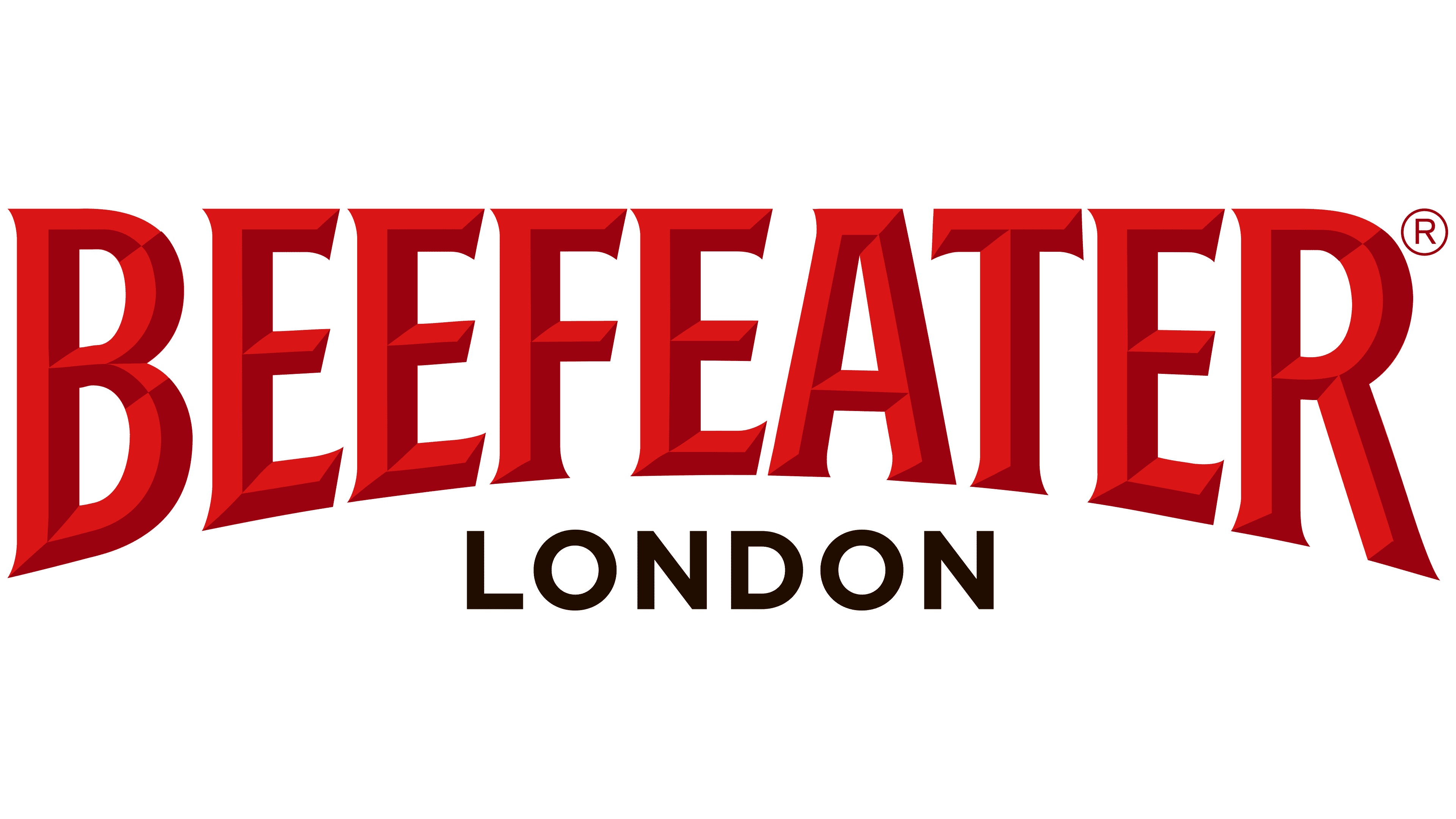
The brand name “Beefeater” is centered, shaped like an arch. The designers used two shades of red to make the name stand out and give it a bold look. At the bottom, the word “LONDON” in black emphasizes the brand’s strong ties to the city’s heritage and history.
What is the font of the Beefeater logo?
The Beefeater logo’s font is unique and customized. The word “BEEFEATER” is arched, which changes the letters’ proportions in length and width. This design uses a bold font with short triangular serifs, making the brand name stand out.
The word “LONDON” is written in a standard sans-serif typeface. This typeface resembles Miller Type Foundry’s Uniform Bold, GT&CANARY’s Mirai Bold, or Wiescher-Design’s Dylan XBold. The sans-serif style for “LONDON” is simple and contrasts well with the brand name’s more complex design.