The Blackbox logo symbolizes mystery, innovation, and technological excellence, reflecting the brand’s desire to offer advanced solutions and products in high technology. The emblem’s design, executed in strict and concise forms, conveys the idea of hidden possibilities and potential revealed to users.
Blackbox: Brand overview
Black Box Corporation was founded in Dallas, Texas, in 1975 by Billy Welch and Hugh Little. The company started under the name Expandor, focusing on selling telephone equipment and wire. Welch and Little recognized an opportunity in the growing market for telecommunications equipment and sought to provide small businesses with reliable, affordable telecom solutions. Their hands-on approach in both sales and installation gave them a deep understanding of their customers’ needs and the market’s specifics.
By the late 1970s, the company had expanded its product line to include more telecom-related items. Around this time, Expandor introduced a product catalog that quickly became popular due to its detailed descriptions and technical information.
A pivotal moment in the company’s history came in 1981 when Expandor rebranded as Black Box Corporation. The new name reflected the reliability and confidentiality of the company’s high-tech products, much like the “black box” used in aviation.
Throughout the 1980s, the business experienced significant growth. The company opened offices in various U.S. states, expanding its reach beyond Texas. As the demand for local area network solutions increased, the focus shifted more towards networking equipment.
In 1989, the company went public and listed its shares on the NASDAQ stock exchange. This move provided additional funding for further expansion and accelerated growth.
During the 1990s, the company expanded internationally, establishing operations in Europe and Asia. It also began offering network infrastructure design and installation services, evolving into a comprehensive solution provider for business customers.
In the 2000s, the company continued diversifying its offerings through strategic acquisitions, strengthening its position in managed services and data center solutions. The acquisition of Norstan, Inc. in 2001 significantly boosted its network services capabilities.
The 2010s marked a period of digital transformation for the business. The company introduced cloud computing, cybersecurity, and the Internet of Things services. In 2015, the company celebrated its 40th anniversary as a respected leader in the IT infrastructure sector.
A significant development occurred in 2018 when AGC Networks Limited, a global technology solutions provider, acquired the corporation. This acquisition brought new resources and a broader customer base, creating further growth and development opportunities.
From 2019 to 2020, the company underwent corporate optimization and reorganization, focusing on its core areas: managed services, unified communications, and network infrastructure.
By 2021–2022, the business continued to adapt to the rapidly evolving technological landscape, enhancing its digital transformation services to help clients implement cutting-edge technologies and modernize their IT infrastructure.
As of 2023, the company remained a key player in the network solutions and IT infrastructure market, focusing on developing advanced technologies like edge computing, 5G, and artificial intelligence to provide clients with state-of-the-art digital transformation solutions.
The history of this corporation demonstrates how a company can successfully evolve over nearly 50 years by continually adapting to market changes and technological advancements.
Meaning and History
What is Blackbox?
Black Box is an IT solutions provider. It offers advanced technology and consulting services to companies around the world. With a global presence and unrivaled expertise, we ensure business success by bringing people, ideas, and technology together to solve the most critical business challenges. Our broad range of IT infrastructure solutions, services, and products enable organizations across industries to stay connected and collaborate easily wherever they are. Black Box has been at the forefront of the IT sector for over forty years, having started operations on June 25, 1975.
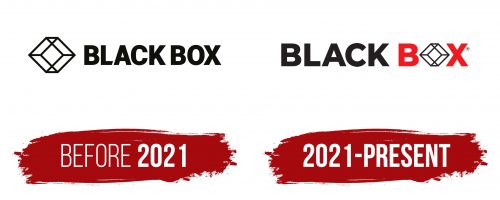
Before 2021
2021 – today
The Black Box logo reflects a unique approach to creating and delivering IT products and digital solutions. At first glance, it appears simple, yet it is layered, much like the concept of a “box” in IT. When the tech world says a product works “out of the box,” it is ready to use after purchase. The logo reflects this principle: the letter “O” is replaced by a cube, which seems simple but hides something more within.
The cube in the emblem is a complex figure composed of a diamond surrounded by trapezoids and triangles. This intricacy symbolizes innovation and hidden potential, characteristic of the company’s products. The other letters are rendered in bold, strict, grotesque typeface, emphasizing the company’s reliability and professionalism.
The black color symbolizes seriousness, confidence, and stability, while the red represents energy and a passion for innovation. Together, they create a powerful visual contrast that attracts attention and is memorable.
Through its emblem, the company sought to highlight the deep functionality of its products, which are hidden behind a simple form.


