![]() Blue Moon Logo PNG
Blue Moon Logo PNG
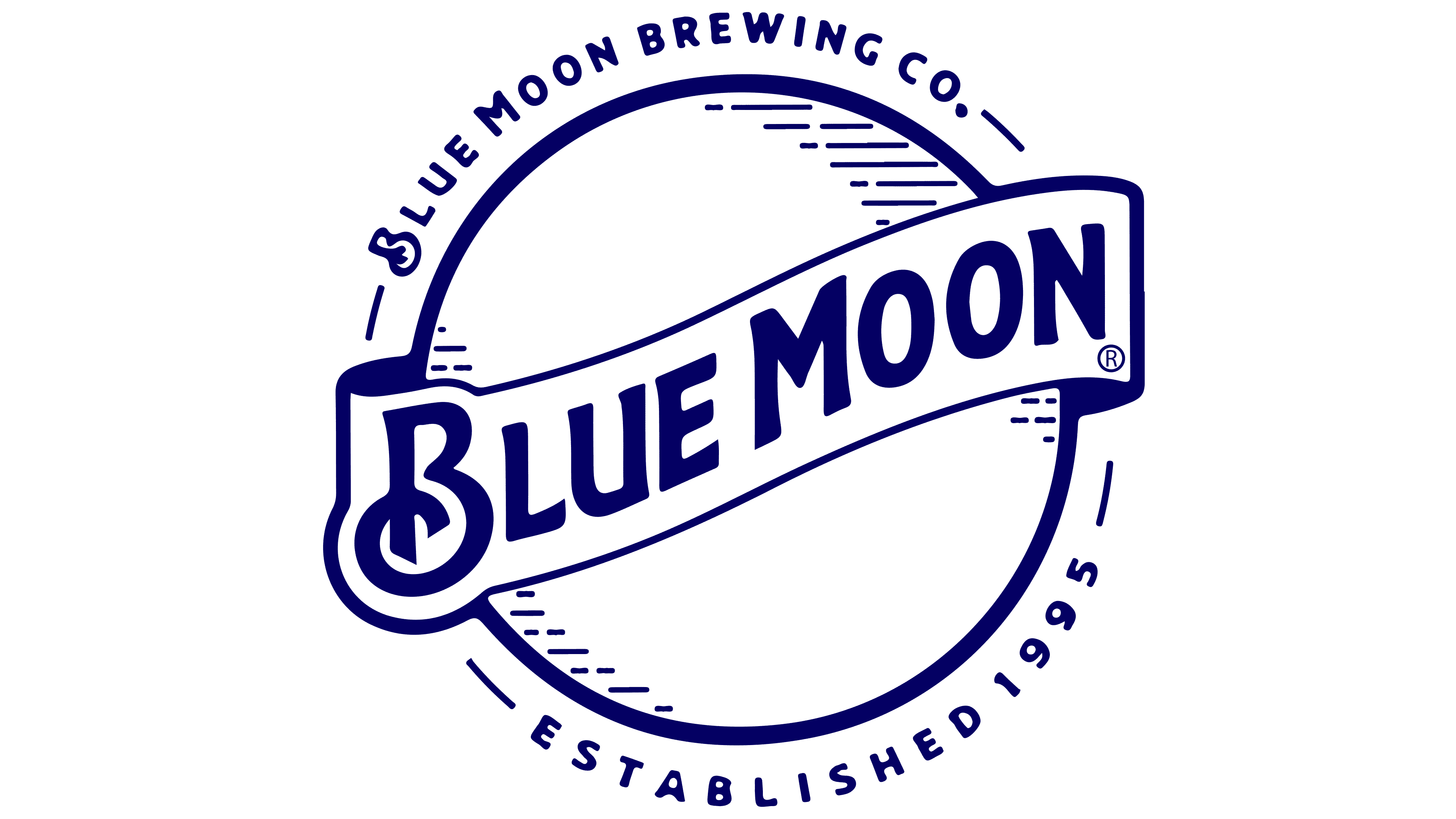
The Blue Moon logo is a harmonious combination of text and illustration. They perfectly complement each other, creating a remarkable image that corresponds to the brand of white beer. Smooth lines, soft shapes, and rounded strokes convey the subtle, delicate, and hidden essence of the alcoholic beverage.
Meaning and History
![]()
When Keith Villa created his beer, he named it Bellyslide Belgian White. But later, a more creative inscription appeared on the Blue Moon labels. The alcoholic beverage is now brewed at Blue Moon Brewing Co. (MillerCoors) and comes in various forms that are constantly updated. All of them feature a common emblem. It inspires trust among Americans and many other countries, as beer is distributed worldwide.
The manufacturer remains loyal to the original logo and carefully maintains its visual identity. New varieties of alcoholic beverages are simply supplemented with information about the composition, while the name against the background of a round blue moon is always preserved. This design is not just a standard product marking. It represents the trademark and the company to which it belongs. The image’s style is also preserved.
What is Blue Moon?
Blue Moon is a light beer brand with an alcohol content of 5.4%. It belongs to the Belgian top-fermented wheat varieties, with white wheat prevailing over barley malt. Its composition also includes oats, orange peel, and coriander. The beer was first brewed by brewer Keith Villa from Denver’s Sandlot Brewery (Colorado).
1995 – 2001
![]()
The Blue Moon logo, naturally, features a blue moon. This is the name of the third full moon in an astronomical cycle, unrelated to sacred concepts. The moonlight during this period has a typical shade, but it takes on an unusual optical effect due to various atmospheric phenomena. It is caused by the accumulation of fine-dispersed particles in the air from volcanic suspensions, dust, fog, smoke from fires, and so on. As it passes through Earth’s atmosphere, the light ray scatters at short wavelengths, corresponding to the blue end of the spectrum.
This rare phenomenon is represented on the logo of the Belgian-style light beer brand. The moon is drawn large and blue, with an uneven distribution of color: in some places it is saturated; in others, it is pale. A wide, dark-beige, wavy-shaped band overlaps the moonlight. On it, in a large, soft, handwritten font, the product name is indicated. Both words are connected. The letters have serifs and curls, making the inscription original. Below is a duplicating strip, dark blue, specifying the type of alcoholic beverage: “Belgian White.”
2001 – 2016
![]()
In this emblem, the moon is depicted in its entirety. The only part that remains obscured is the one under the diagonal wavy ribbon. In this case, the circle is evenly colored in light blue. Small white dots and strokes are on the edges of the disk, symbolizing the celestial body’s silvery glow. The beverage’s name is shortened; the designers removed the lower strip to clarify the beer’s type.
Moreover, they have slightly separated the words, so there is now a small gap between them. The inscription style is calligraphic and handwritten. All letters have serifs and edging, and the “B” is decorated with an elegant curl.
2016 – today
![]()
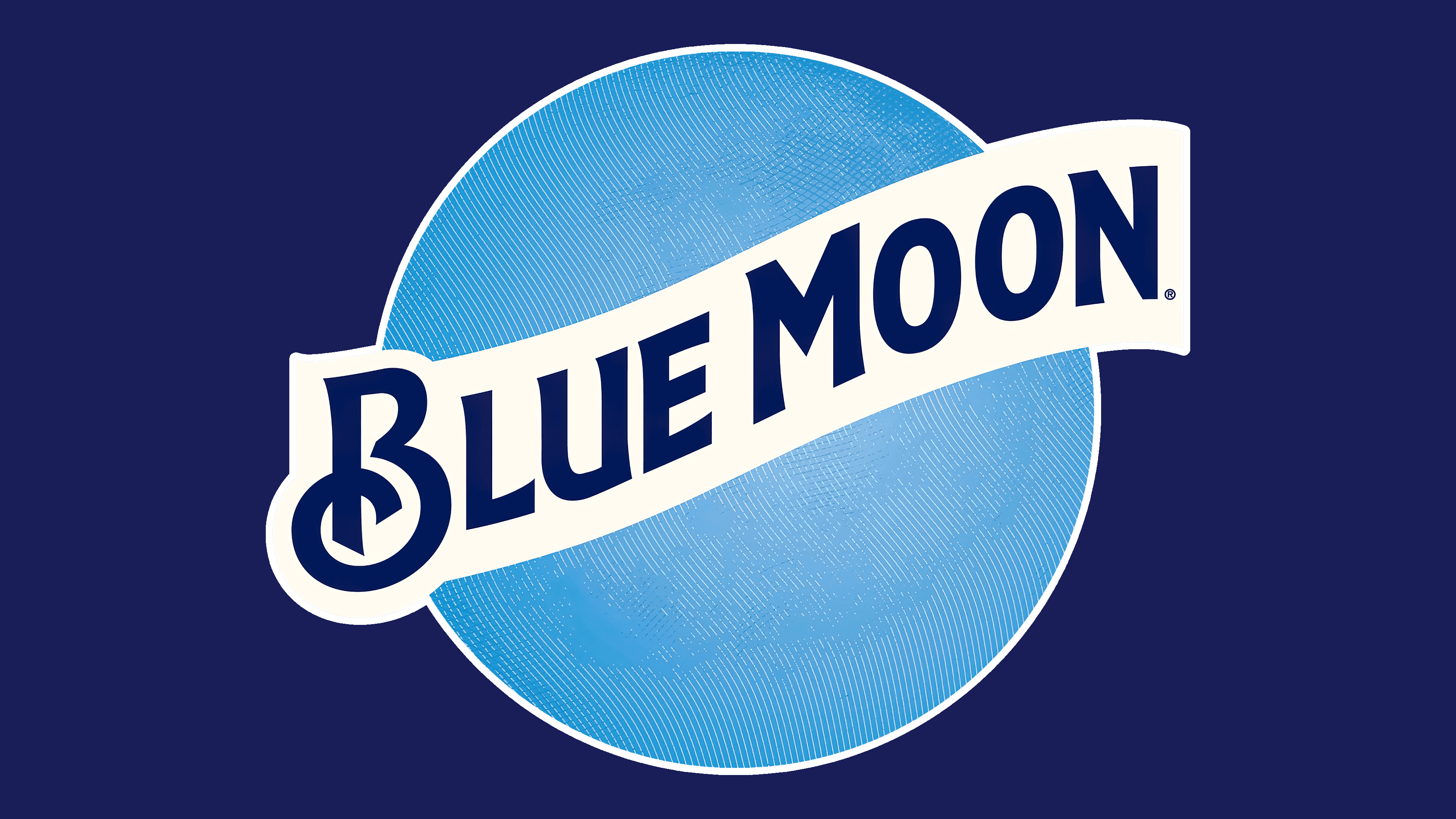
The updated Blue Moon logo has become even more minimalist while maintaining its recognizability and strong connection to the brand’s name. The changes reflect modern visual design requirements, making it more adaptable across various media and formats.
The circular shape symbolizes the Moon, central to the brand’s name. This element emphasizes a natural association with the night sky and a serene atmosphere. The surface of the circle features a texture reminiscent of the Moon’s terrain. Lines applied to the background convey a sense of depth and naturalness, adding dynamism to the otherwise flat two-dimensional design.
The emblem’s color palette is now simpler and more expressive. A dark blue hue at the edges transitions smoothly into a lighter blue at the center, enhancing a sense of freshness and lightness. The colors evoke associations with a cool drink, making them perfect for a relaxing evening. A white ribbon, placed diagonally, retains visual continuity with the previous logo version but is now centrally positioned to emphasize the brand name.
The “Blue Moon” inscription uses a font that appears more modern and easier to read. The lack of outlines around the letters makes them cleaner and brighter against the background. The stylized curve of the letter “B” adds distinctiveness and recalls the Moon’s symbolism. The font is lower than in the previous version, providing better balance to the overall composition. The diagonal placement of the text maintains a sense of dynamism, evoking motion.
The logo update underscores the brand’s commitment to minimalism and simplicity. This approach ensures the design is easily adaptable across all platforms, from labels to digital interfaces. However, the core symbolism of the Moon and its connection to the brand name remains unchanged. “Blue Moon” evokes rarity and uniqueness, reflecting the beverage’s quality and distinctive flavor.
Font and Colors
To emphasize the elitism of the alcoholic beverage, the brewery chose the elegant Beaufort Condensed Bold typeface, with each letter framed by a contoured border. Later, the Blackriver font appeared as a minimalist variant, remotely resembling the previous inscription style but simpler and more grounded.
The emblem’s palette is blue, as dictated by the beer brand’s name. Its spectrum ranged from sky blue to a soft shade of late evening at different times. The light range is used to color the moon; the dark range is used for the inscription. In addition to the signature color, white and beige are also available in several variations.