The Borgward logo symbolizes unity and symbiosis, creating something larger and more perfect. The emblem stretches to the top, using the strengths and capabilities of all corporation members.
Borgward: Brand overview
Borgward is a now-defunct German concern for cars, trucks, and buses, liquidated in 1961. The Borgward logo was placed on several models included in the association: Hansa, Goliath, and Lloyd.
The history of Borgward is the story of the conglomerate’s gradual consolidation, growth, and subsequent collapse, which ranked 5th in the German auto industry.
Meaning and History
What is Borgward?
It is a historic German automobile manufacturer founded by Carl F. W. Borgward. The company gained fame in the mid-20th century for producing stylish cars like the Borgward Isabella. Despite early success, the company ran into financial difficulties and ceased operations. The brand was revived in the 21st century, focusing on modern cars. The new brand produces SUVs and aims to regain its position in the competitive global automotive market.
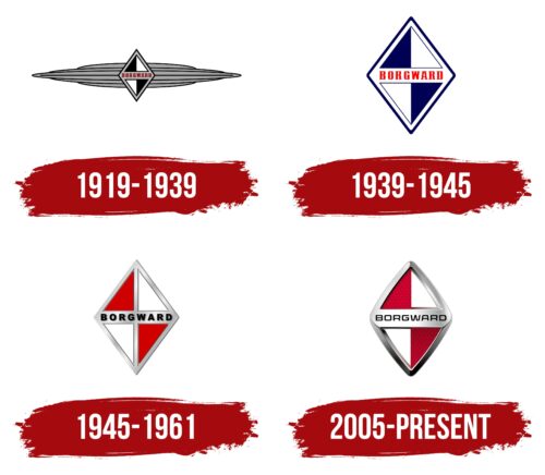
1919 – 1939
Borgward, active from 1919 to 1939, made a significant mark in the automotive industry with its distinctive logo. The manufacturer’s logo was designed to perfectly harmonize with the cars’ designs, serving not merely as an ornament but as a crucial element of brand identity. It features prominently as a badge on the car’s bumper, integrating seamlessly with its visual perception.
The logo’s visual elements include elongated stripes that symbolize the radiator and wings of the car. The radiator, positioned at the front, serves as a functional detail and a recognizable design element. The wings suggest high-speed driving that conveys a sense of flight, reinforcing the company’s image as a manufacturer of vehicles with top-tier technical characteristics.
The logo’s central element is a diamond divided into four parts with black and white checks, adding elegance and style to the design. This diamond, usually large and positioned at the center of the company car’s hood line, highlights the vehicle’s premium and elite nature. The placement of the diamond in such a prominent spot draws attention to the brand and serves as a statement of the high status of the owners of these cars.
1939 – 1945
In the year Hansa cars were renamed Borgward, the company updated its emblem to reflect this significant moment in its history. The new logo was streamlined into an elegant and compact diamond shape, executed in blue and white colors that symbolized freshness and the brand’s innovative approach. These colors were deliberately chosen: blue is associated with reliability and stability, while white highlights purity and simplicity.
The logo design was enhanced with a border that crossed the center of the figure in the form of a wide stripe. The new brand name was displayed on this stripe in bright red letters. The vivid red color drew attention to the name change, focusing on the company’s dynamic development and commitment to renewal.
1945 – 1961
In 1945, following the end of World War II, the company’s emblem was updated to reflect a new phase in its history. The changes in the emblem’s design included colors corresponding to the flag of Bremen. This was a symbolic gesture indicating local authorities’ support for the manufacturer. During the post-war reconstruction period, many German enterprises faced restrictions on their operations, so support from local authorities was crucial for their recovery and continued operation.
Additionally, the factory was under the control of French allied forces, who may have influenced the choice of the emblem’s color palette. While sources do not specify whether this influence was direct, the change in colors could symbolize a new beginning in the relationships and management of the enterprise.
The owner’s choice of colors might have been linked to his roots, as he was born and raised in Hamburg. The new logo colors reflect Hamburg’s traditions and cultural symbols, emphasizing the owner’s connection to his hometown.
The red shades in the emblem’s design were chosen deliberately. This color is traditionally associated with energy, strength, and optimism — qualities essential for the company’s revival and new growth in the post-war years.
2005 – today
The company logo resembles a road sign, showing the main road and direction of travel. It is a rhombus with a metal frame and a plate with the brand name in the center.
The figure indicates the desire for the top, progress, and development. The company’s founder constantly improved the technical characteristics of machines and developed new models. Shows a good start. Carl Borgward started the business in 1919 and was a director a year later. And after 10 owned three brands and several firms.
A rhombus made up of four rectangles shows a game with four marks. Their union and separation. At the heart of all processes was Carl Borgward, whose name is written on the seam in the center of the figure.
In 1925, he founded the Goliath brand, and in 1929, he bought former Bremer partners Hansa Lloyd Werken. As a result, the magnate controlled three factories and three brands (Goliath, Hansa, and Lloyd). I decided on what enterprise and what type of machine to launch. 1938, he added a 4th stamp under his name, and Hansa closed. In 1948, he sold the Borgward brand, and after two years, he bought it. Then, due to the decline in industry and the lack of raw materials, the concern is divided into three separate enterprises.
Brand juggling is well conveyed in the logo due to the chess placement of colors and individual fragments that exist together and simultaneously.
The layout of the sign itself is associated with brand logos. The red and white figures are taken from Bremen’s flag, where the factories are based. Their chess alternation was in the Hansa sign. The triangle underpinned the identity of the Lloyd brand, and the metal parts were Goliath.
Font and Colors
The sign’s main colors are white and red, echoing the shades of road signs and the heraldry of Bremen.
- White represents the ability to start all over again. The owner had to deal with the vicissitudes of fate more than once, hiding behind the color and the desire for discovery.
- Red – passion and love for your work. The texture of the red sections of the diamond resembles machine reflectors, which indicates the company’s direction.
The lettering font is similar to QB One Semi Bold Expanded.
