 Bright Horizons Logo PNG
Childcare and educational programs include daycare centers, skill development, and a safe environment for young children. These services help parents balance work and family responsibilities. The Bright Horizons logo is associated with a company that operates childcare centers and educational programs, providing care and development for children.
Bright Horizons Family Solutions was founded in 1986 in Cambridge by Linda Mason and Roger Brown. They started the business from their home. The first centers opened in 1987 in Prudential Center and One Kendall Square. In 1988, the company launched the Horizons Initiative charitable program. It aimed to support homeless families in Boston.
By 1994, the network included 38 centers in 19 states. The company worked with major corporations. In 1996, the founders received the Ernst & Young “Entrepreneurs of the Year” award. In 1998, it merged with Corporate Family Solutions to form Bright Horizons Family Solutions. That same year, the company was first included in the Fortune 100 Best Companies to Work For list.
In 1999, the National Access Program was launched. It provided priority enrollment for children of employees of the client company. By the end of the decade, the network included about 300 centers serving more than 200 corporate clients.
In 2000, the company’s headquarters moved to Watertown. International expansion began through acquisitions in the United Kingdom and Ireland. In the years that followed, Bright Horizons broadened its services. The portfolio added College Coach, EdAssist Solutions, and the Sittercity platform. The company developed educational and advisory services.
From 2011 to 2019, Bright Horizons strengthened its position in Europe. It acquired the Kindergarten, kidsunlimited, and Asquith Court networks. The company also acquired the GP Strategies business. In 2022, it bought the Australian network Only About Children, expanding its presence to five countries.
The company operates more than one thousand child care centers in the United States, Canada, the United Kingdom, the Netherlands, Australia, and India. It provides early education and family support services. The company employs more than thirty thousand people.
Meaning and History
What is Bright Horizons?
An American organization operates the largest network of early education and preschool centers, with more than 700 locations. The main format consists of childcare centers located at partner companies’ workplaces and offices, allowing employees to balance work and care for children up to age 6. Teachers have specialized training, receive pay comparable to that of school teachers, and can study at college for free. The educational program follows the Reggio Emilia approach, which allows children to freely choose topics for study.
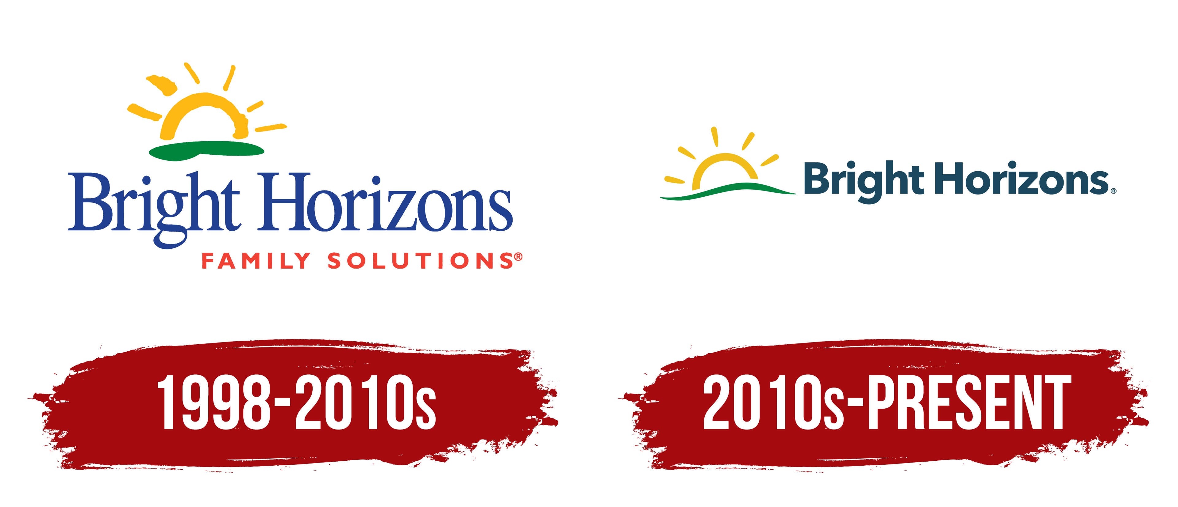
1998 – 2010s
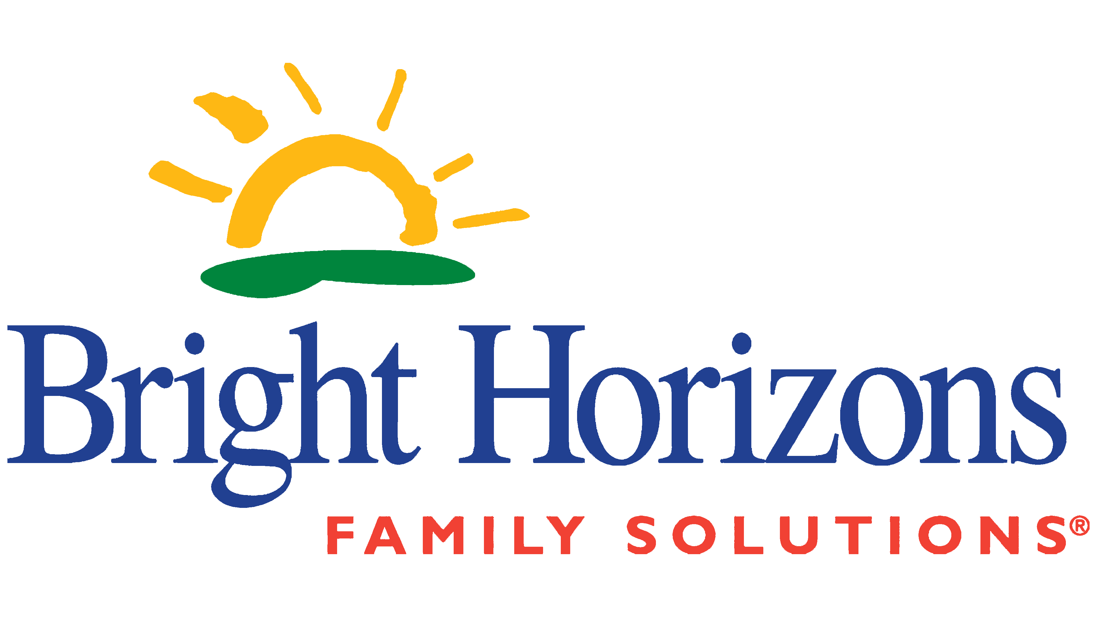
From 1998 until the early 2010s, the Bright Horizons Family Solutions emblem featured a rising sun. Linda Mason and Roger Brown founded the company in Cambridge, Massachusetts, in 1986. Their goal was to help working parents who had difficulty finding high-quality, affordable childcare. The company later expanded into early childhood education, family programs, adult education, and support for people caring for older relatives. The full name Family Solutions reflected its broad range of services.
Bright Horizons translates as “bright horizons.” The name refers to child development, family support, and future opportunities. The company used the full form of its name in official materials. The sun continued the name’s meaning and suggested the beginning of a new day, learning, and growing up.
A yellow semicircle with thin rays appeared in the upper section of the emblem. Beneath it was a green semi-oval shape resembling the ground or a lawn. Together, the two figures created the image of a sunrise over the horizon.
The Bright Horizons name appeared below in a large blue serif typeface. The first letter of each word was uppercase, while the remaining letters were lowercase. The words Family Solutions appeared beneath the main name. They were shifted to the right, reduced in size, and colored red-orange. The main name occupied the leading position, while the lower line explained the company’s field of work.
2010s – today
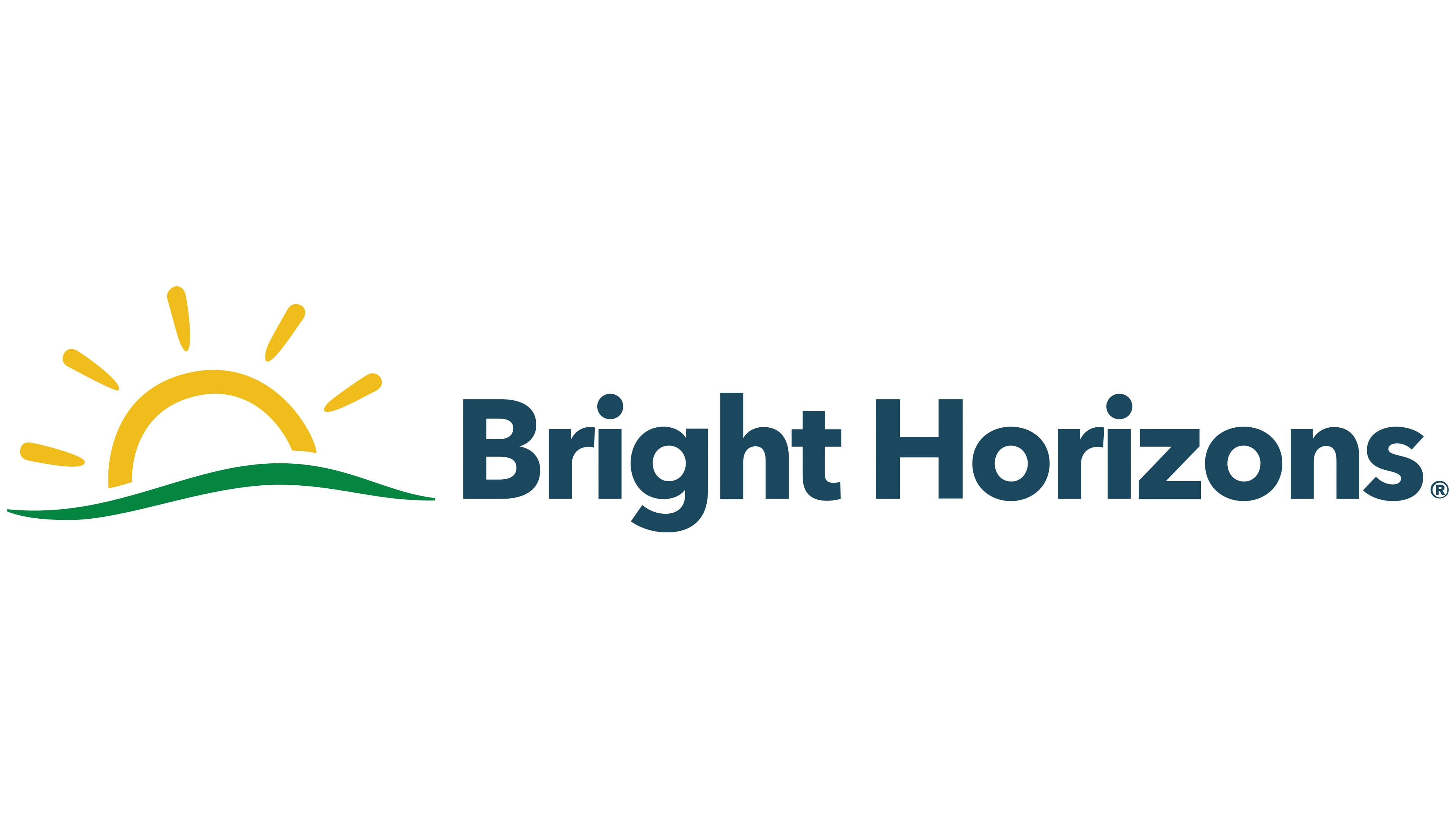
In the new Bright Horizons emblem, the sun moved from the upper section to the left of the name. The logo adopted a horizontal format suitable for websites, signs, and printed materials. The sunrise image preserved a connection with the previous identity.
A sun above a green hill appears on the left. The light yellow semicircle has five short rays. A green wavy line resembling the ground and horizon runs beneath it.
The Bright Horizons name appears on the right. The wordmark uses a sans-serif typeface with uniform stroke widths. The letters “B” and “H” are uppercase, while the remaining letters are lowercase. The blue-green text complements the green line beneath the sun.