Bunnings: Brand overview
Founded in 1886 by Arthur and Robert Bunnings, two brothers who moved from England to Perth, Western Australia, Bunnings was originally a sawmill business. In 1952, the company changed from a private enterprise to a joint stock company. Around the same time, the company entered the retail business, acquiring a number of hardware stores. In the 1990s, the company began to make a name for itself across the country. In 1994, it opened its first warehouse-type store in Melbourne and was acquired by Wesfarmers in the same year.
Over time, the company grew exponentially, absorbing other hardware retailers and opening extensive warehouse facilities across Australia. Bunnings now has over 300 locations in Australia and New Zealand, employing over 50,000 people. The company has become a leading supplier of home improvement and hardware products in both countries.
The cornerstone of Bunnings’ success has been its warehouse-type stores and its unwavering commitment to customer service. In addition, unique initiatives such as community sausages have embedded the brand into the cultural fabric of Australia. These strategies have earned Bunnings a reputation as one of Australia’s most trusted retail brands.
Meaning and History
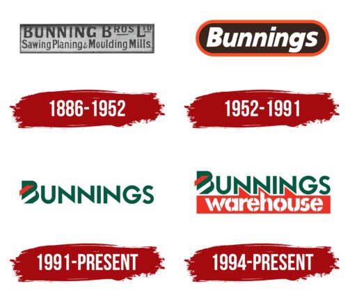
1886 – 1952
1952 – 1991
1991 – today
1994 – today
The main focus of the Bunnings logo is on the text part, which is turned into a full-fledged graphic element. The first line uses a chiseled font with sharp ends, and where there are no sharp ends, smooth cuts with right angles are made. The letter “B” is complemented by two trapezoidal bands of red and white color inside the letter space. In the second row is the word “Warehouse,” made in a stencil style. While the upper glyphs are uppercase, the lower glyphs, on the contrary, are lowercase, located on a red background. Such a contrast visually preserves dynamism and effectively attracts attention.
The combination of sharp and smooth edges in the text is reminiscent of the dance between hard and smooth. The red and white stripes inside the letter “B” are reminiscent of a secret code, making you think about its meaning. The stencil-style word “Warehouse” seems downright practical: “Yes, we’re here to do business.” The red background adds the finishing touch, making everything more colorful.
Bunnings color codes
| Deep Bottle Green | Hex color: | #045940 |
|---|---|---|
| RGB: | 4 89 64 | |
| CMYK: | 96 0 28 65 | |
| Pantone: | PMS 3298 C |
| Pigment Red | Hex color: | #ed3024 |
|---|---|---|
| RGB: | 237 48 36 | |
| CMYK: | 0 80 85 7 | |
| Pantone: | PMS Bright Red C |
