


![]() Bushmaster Logo PNG
Bushmaster Logo PNG
The legendary Bushmaster logo reflects the aggression of the brand’s products. It also embodies focus and the unmistakable accuracy of a firearm. The style of the emblem is realistic because all the elements depicted in it actually exist. The designers redrew them and added the corporate concept.
Bushmaster began in 1973 in Bangor, Maine, when Vietnam War veteran Mack Gwinn Jr. founded Gwinn Firearms. The company grew from the IMP-221 survival-weapon prototype, developed by Colt engineers for downed U.S. Air Force pilots. Gwinn revised the design, combining AR-15 ideas with a long-stroke gas piston system, as in the AK-47. The commercial version became the Bushmaster Arm Pistol in 5.56 NATO, but failed contracts, including one with Mexico, pushed the firm into bankruptcy.
In 1976, Richard Dyke bought the company for $241,000, moved production to Windham, Maine, and renamed it Bushmaster Firearms. Under Dyke, the focus shifted from pistol-carbines to semi-automatic AR-15 rifles. The Arm Pistol stayed in production until 1990, while the M17S bullpup rifle, based on ArmaLite AR-18 ideas, remained on sale until 2005.
After the 1994 federal assault-weapons ban, Bushmaster modified its rifles to keep selling them legally. By 1999, it had sold 64,506 AR-15-style rifles, surpassing the combined sales of 10 major rivals in that segment. Buyers included civilians and U.S. agencies such as the Secret Service, the U.S. Marshals Service, the Border Patrol, and the DEA. By 2005, revenue reached $65 million.
Dyke sold Bushmaster to Cerberus Capital Management in 2006 for $70 million. The brand entered Freedom Group alongside Remington Arms, Marlin Firearms, and Advanced Armament Corp. In 2008, Bushmaster licensed Magpul’s Masada rifle, later sold as the Bushmaster ACR. After the Sandy Hook lawsuits and Remington’s 2020 bankruptcy, Crotalus Holdings acquired the brand. Production restarted in 2021 in Carson City, Nevada. In 2023, Bushmaster marked its 50th anniversary with the Bravo Zulu and a limited-edition XM15A2 anniversary series.
Meaning and History
Throughout the company’s time on the market, only one version of the logo has been presented to the target audience. Consequently, visual brand recognition is high, as customers are accustomed to the logo’s verbal lettering and emblem. Moreover, the bright colors attract users from all over the world. They make the logo powerful and confident, clearly associating it with the firearms leader.
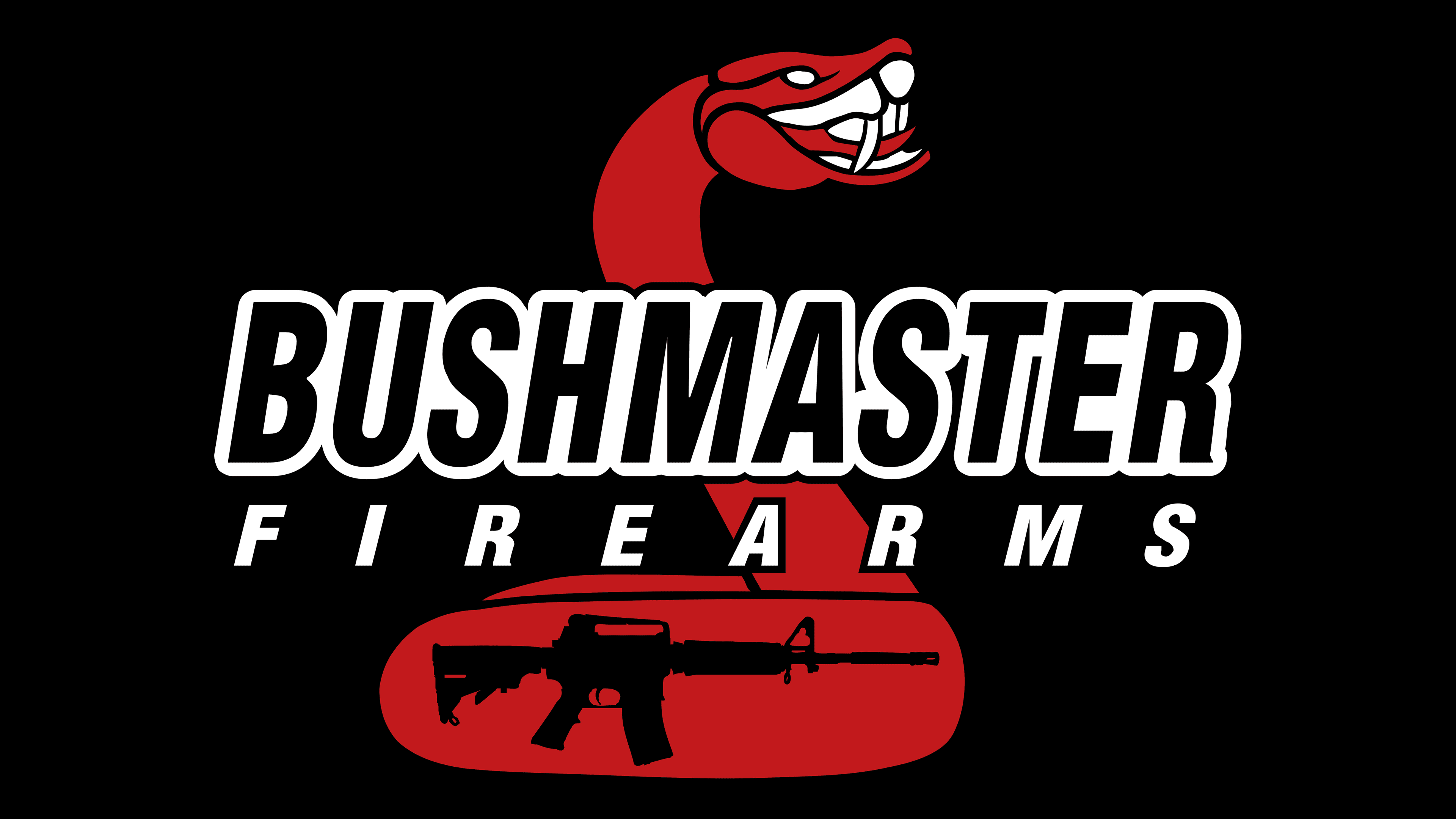
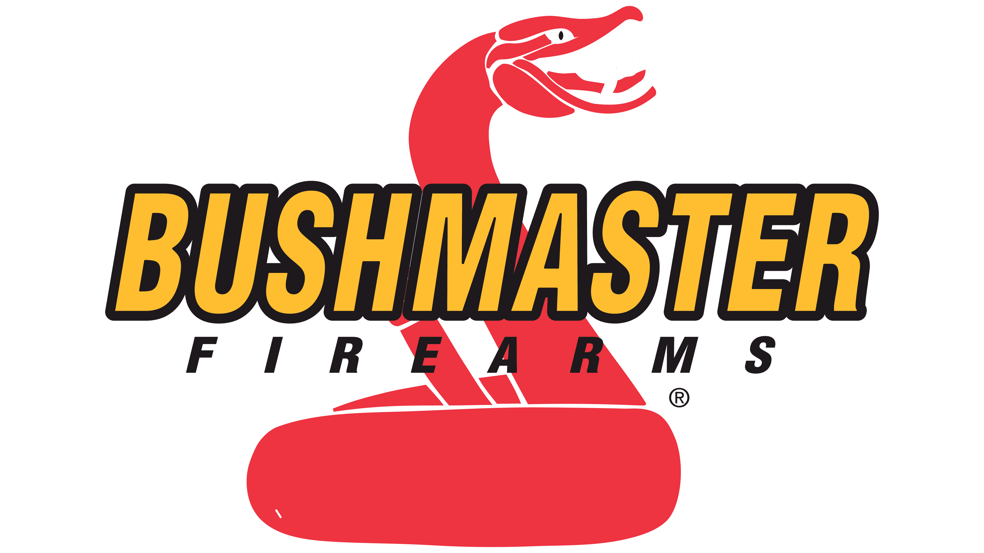
It consists of an emblem, on top of which is also a verbal inscription. The emblem features a red snake with its head turned to the right and its mouth open, revealing its tongue. The contours of the snake are white. The only element not part of the red-and-white color palette is the pupil, which is black.
What is Bushmaster?
It is an opportunity for any U.S. citizen with the appropriate permission to purchase legal weapons for self-defense. The company has been in the market for over 40 years and, during this time, has received millions of satisfied customers from 50 states.
The brand name in the verbal lettering is in capital letters, set in a bold, narrow sans-serif font. The orange fill and black outlines create a sense of three-dimensionality in the image. Also, all the characters are tightly spaced, creating a sense of unity in the lettering.
Below the main inscription is the slogan “firearms.” Despite the name, it is written in a simple sans-serif font with thin black lines. Also, there is a large space between the characters.
The chosen red-yellow palette is immediately associated with passion and ambition.
Font and Colors
The Bushmaster company logo consists of two verbal inscriptions. The first one, connected with the brand’s name, is printed in an elegant, bold, sans-serif font. The three-dimensional effect created by the black outline lends confidence to the image, making it more visually appealing. In contrast, the slogan “firearms” was added in the simplest possible font.
To attract the target audience’s attention, a color palette consisting of black, white, orange, and red was chosen. The last two are worth paying special attention to, as they are associated with the passion and reliability Bushmaster is trying to provide its customers. In addition, this range of colors demonstrates the brand’s progressive approach to its operations and the values shaped by years of experience in the firearms market. Overall, thanks to the element’s interesting contrast, the logo is associated with strength and confidence.