


 Cap’n Crunch Logo PNG
The Cap’n Crunch logo can confidently be called one of the most dynamic, vibrant, and unconventional. It is as original as the product it represents. The sweet-and-salty breakfast cereal is designed to delight children and adults alike.
Starting the day with this cereal provides energy, culinary enjoyment, and boundless pleasure. This belief is shared by both the producers and the customers, who become more convinced with each new box.
The super breakfast Cap’n Crunch, specifically a dry breakfast for the American audience, is made from corn and oats, with added sugar and oil. Its recipe was Grandma Lowe’s secret, who always cared for her family’s health. Although it began long ago, every cereal flavor remains a favorite. The logo accurately reflects all the product’s quality advantages. Bright and three-dimensional, it captures customers’ enthusiastic attention.
Cap’n Crunch began in 1963, when Quaker Oats developed a new breakfast cereal for children and assigned food technologist Pamela Low to create its taste and texture. Jay Ward Productions shaped the advertising concept, giving the product the name Captain Crunch and the character Captain Horatio Magellan Crunch, a mustached sailor in a naval cap.
The cereal launched in 1963 with a sweet flavor and a crisp texture promoted as staying crunchy in milk. First-year sales exceeded company expectations. In 1967, Peanut Butter Crunch joined the line, reflecting the popularity of peanut butter in the United States. In 1974, Crunch Berries added fruit-flavored pieces, making the brand more colorful and more recognizable to children.
During the 1980s, the line expanded with versions such as Vanilla Crunch and Chocolate Crunch. In the 1990s, the brand used movie and television tie-ins to stay connected with pop culture. In the early 2000s, growing concern about children’s nutrition prompted the company to adjust the cereal’s profile, including reducing sugar and increasing whole-grain content.
In 2011, Cap’n Crunch marked its 50th anniversary with special packaging and nostalgia-based marketing. In 2013, the brand answered social media jokes about the captain’s uniform rank with humor. In 2014, it launched The Cap’n Crunch Show on YouTube. Oops! All Berries returned in 2015, followed by Sprinkled Donut Crunch in 2017, Chocolatey Berry Crunch in 2018, Chocolatey Churro Bites in 2019, greener packaging in 2020, strawberry shortcake ice cream in 2021, co-branded ice cream in 2022, Cosmic Crunch in 2023, and Cap’n Crunch Wellness in 2024.
Meaning and History
What is Cap’n Crunch?
It is a brand of breakfast cereal manufactured by Quaker Oats. The cereal is known for its sweet and crunchy pieces of corn and oats, shaped like little pillows. The brand’s mascot, Captain Horatio Magellan Crunch, is the friendly sea captain featured on the cereal’s advertising and packaging. The brand has many flavors and variations, including Crunch Berries, Peanut Butter Crunch, and Oops! All Berries.” The cereal is popular with kids and adults alike due to its unique texture and flavor, making it a staple in many families.
1963 – 1969
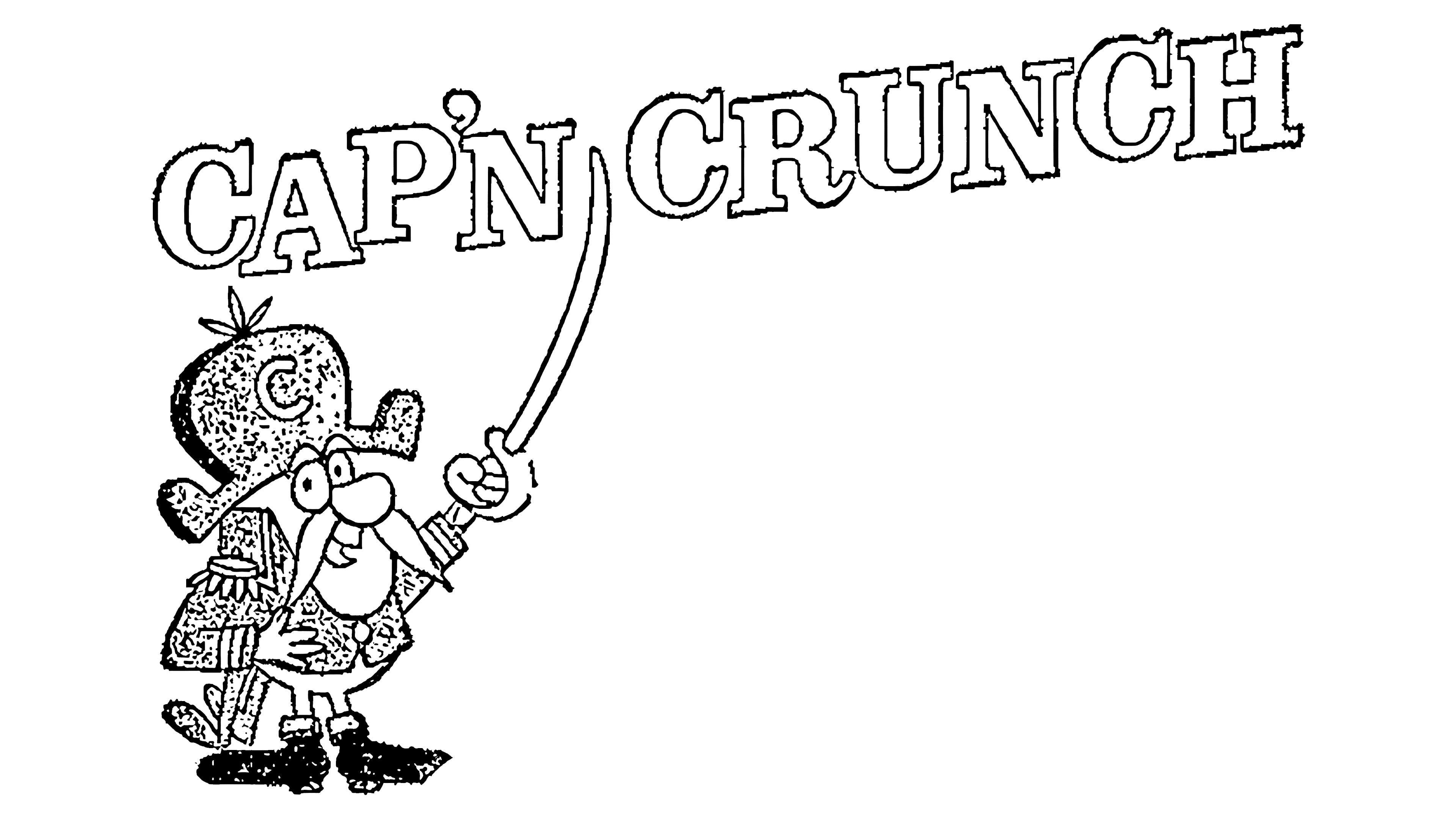
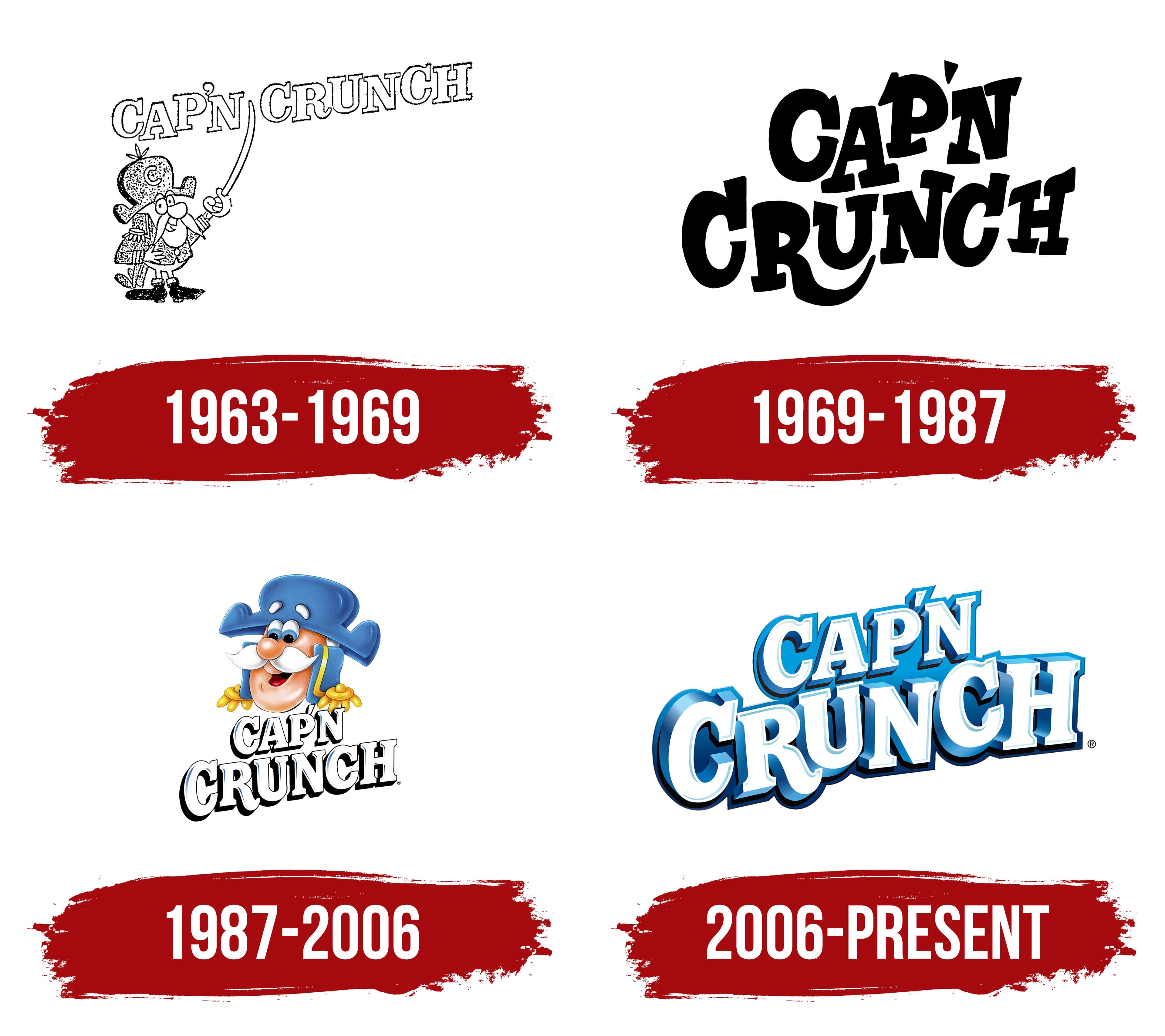
Not many food companies of that time were ready for innovation and experimentation. Therefore, Cap’n Crunch products could not go unnoticed. The flavor emphasized originality, and the logo conveyed that customers were holding a real treat. The kind yet fierce Captain Horatio Magellan Crunch, the company’s mascot and keeper of the tastiest cereal recipes, became the main element of the logo.
The black-and-white tones of the logo were tied to the technical capabilities of the time and a classic palette, indicating the unique taste of an ordinary breakfast. The logo could be read differently, considering the main elements, the character, and the inscription, but the details mattered. The focus was on the captain’s comical image. His huge nose, luxurious mustache, clothing, and shoes created a funny image. The captain’s sword symbolized forward movement: “Only forward!” Placing the sword between the letters served as a pointer, a hint, and a main recommendation, as if saying: “Try my breakfast, it’s the best!” and “Remember the name of the tastiest cereal in America!”
The inscription deserves special attention. It was three-dimensional, with each letter massive and distinct. Given its prominence, the text was perceived in great detail. The playful letters were arranged sequentially at different levels, especially appealing to children. Holding the package, they would look at the logo curiously for a long time. Adults often mimicked children’s behavior, examining the neat letters and the captain’s wardrobe elements. Over its six-year existence, the logo positively influenced customer demand.
1969 – 1987
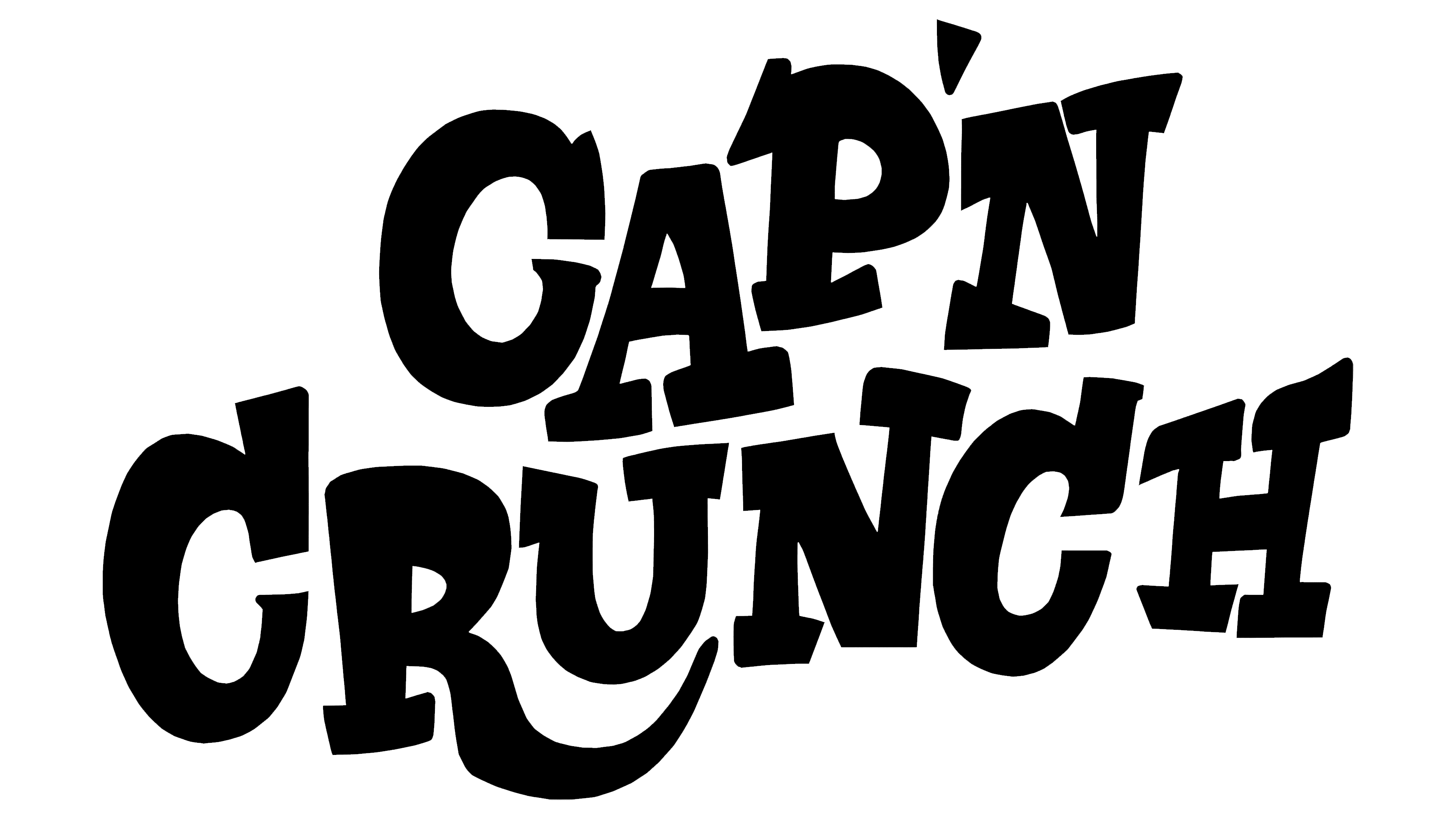
In 1969, Captain Crunch mysteriously disappeared from the logo for 18 years. There are no specific details about the charismatic character’s whereabouts. However, even without him, the logo with just the inscription conveyed much important information. The letters, like relaxed guitar strings, floated in the air. They looked provocative and striking despite the absence of a bright color scheme. The letters had volume and a free form, each unique, like a new, distinctive, interesting film episode. The text evoked pleasant memories of the fearless captain and the beloved flavors of corn cereal. The logo was free of excesses and characterized by simplicity and clarity for all ages.
1987 – 2006
Customers’ long-awaited expectations were fulfilled. Captain Crunch returned. His face now exuded kindness; he looked neater and more confident, retaining his youthful charm. Those who remembered him from childhood were delighted to see the updated character radiating happiness on the company’s new logo. His charisma captivated new fans of sweet morning cereals at first sight.
Thanks to innovative printing capabilities, the character became detailed and sharp. The blue shade of his hat and clothes is increasingly associated with the boundless sea expanses the captain conquers. He enhances each letter in each text with his shadow effect, adding depth and dynamism.
The cheerful white letters with fragments of sky-blue tones look harmonious, just like the captain’s luxurious white mustache. The colorful interpretation of the logo combines simplicity and originality. The friendly design highlights the captain’s uniqueness and the excellent taste of his cereals. The manufacturer emphasizes that tastier breakfasts than Cap’n Crunch’s are hard to find.
2006 – today
The change sequence led Captain Crunch to embark on another long sea voyage. He is absent from the new logo, but the text remains even more contrasting and memorable. The thin lines of the bold letters prompt contemplation of important matters, while their non-parallel arrangement reminds them that life should include excitement and fun.
Only those who have tried the new cereal flavors can easily withstand hardships and challenges. The logo embodies confidence in one’s abilities, stability, and openness to any experiment, even the most incredible.