


 Quaker Oats Logo PNG
The Quaker Oats logo conveys the enjoyment of life that comes from eating this brand’s oatmeal daily. The emblem is filled with the joy and energy that healthy nutrition provides. It embodies the desire to always stay on a positive note, starting with the first spoonful of breakfast.
Quaker Oats began in Ravenna, Ohio, in 1877, when Henry Seymour and William Heston founded the Quaker Mill Company. The Quaker trademark was registered in 1879, and Henry Crowell bought the mill and logo in 1881. Round cardboard packaging followed in 1888, improving storage and shelf life. In 1901, a merger with three oat producers created the Quaker Oats Company and expanded national production.
Quaker Puffed Wheat and Puffed Rice appeared in 1908, followed by the purchase of Mother’s Oats in 1911. Ful-O-Pep animal feed launched in 1922. The 1925 acquisition of Aunt Jemima Mills Company widened the breakfast portfolio, while a research center established in the 1940s supported new products and manufacturing methods. Fisher-Price joined the group in 1969.
Gatorade entered the portfolio in 1983 and became a major beverage business. Snapple Beverages was acquired in 1994 but sold in 1997 after weak results. In 2001, PepsiCo bought Quaker for $13.4 billion and integrated its products into a global production and distribution network.
Simple Harvest arrived in 2006, True Delights in 2008, and Real Medleys in 2011. Packaging and the logo were revised in 2012. Gluten-free products expanded in 2015, Overnight Oats followed in 2016, and an oat beverage launched in 2018. Protein bars and oat drinks appeared in 2019. From 2020 to 2023, online sales and social-media marketing grew alongside new oatmeal, cereal, snack, and drink formats. Global distribution widened during this period.
Meaning and History
What is Quaker Oats?
A well-known American food company known for healthy breakfast cereals and snacks. The company has grown significantly beyond its original oatmeal offerings. It offers a range of products, including cereals, granola bars, rice cakes, and instant oatmeal, to meet diverse dietary preferences and busy lifestyles. Leveraging the inherent value of oats, the brand has skillfully positioned itself as a provider of wholesome, heart-healthy products. The product lineup includes traditional favorites that evoke fond memories and innovative flavors that align with modern tastes.
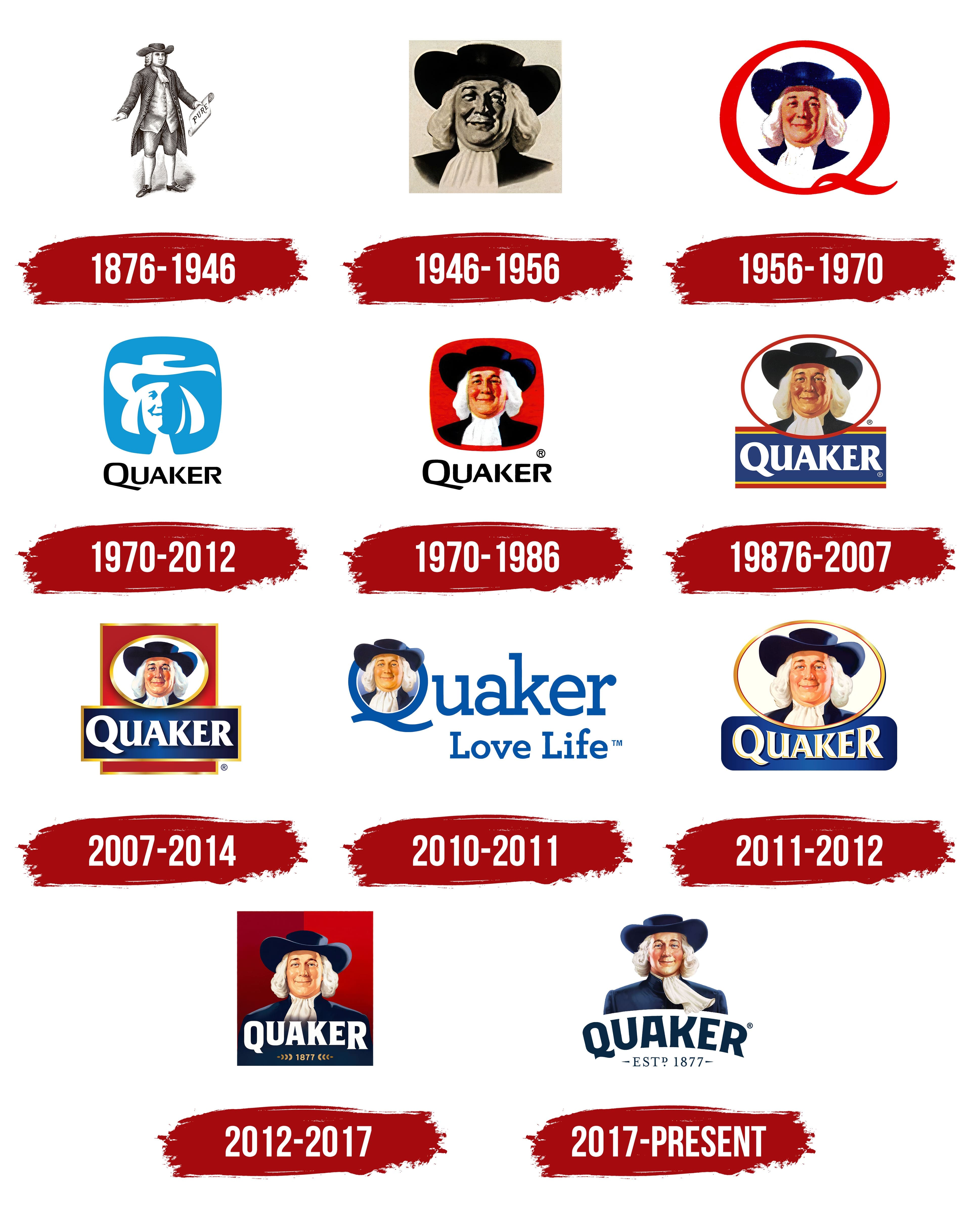
1876 – 1946
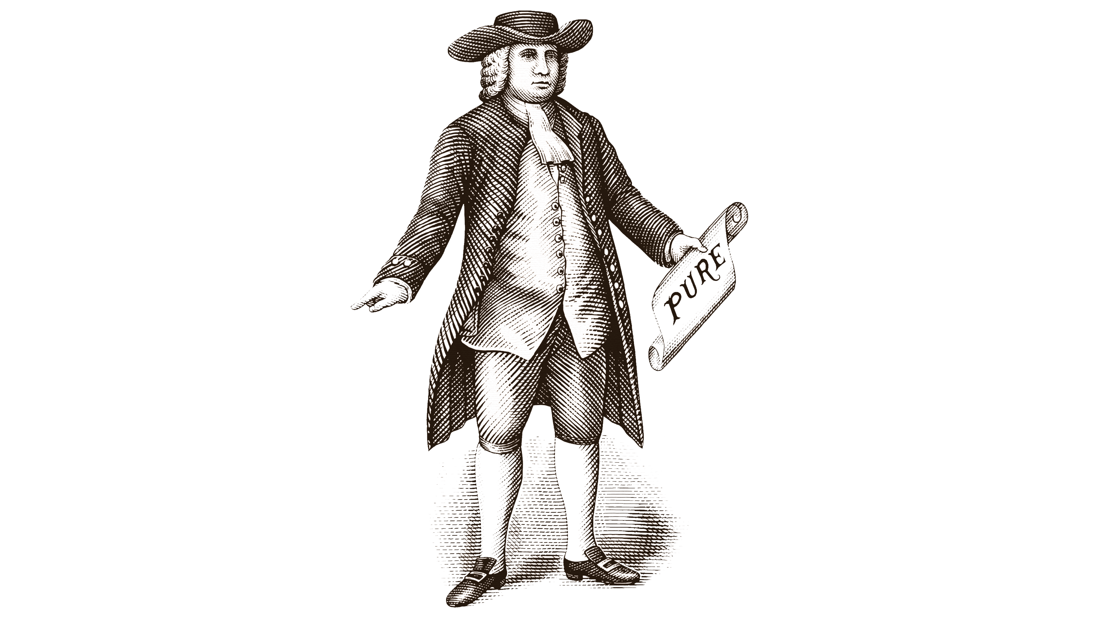
In the Quaker Oats emblem from this period, one can be surprised to find a man standing with his arms spread wide. In one hand, he holds a scroll with the word “Pure,” and his eyes reflect confidence. Confidence in what? The oatmeal product bearing such a label is pure, authentic, genuine, and natural. This is understandable, as the person represents the product and characterizes it. However, it is hard to relate a figure in a medieval wig to ordinary breakfast oats.
But it turns out to be quite simple. One of the company’s founders read about Quakers in an encyclopedia and named the brand after them. He justified it by noting that members of this religious society were known for their utmost decency, purity, and honesty, qualities he wanted consumers to associate with his products. As a result, the new company’s logo featured a businessman, a Quaker man, drawn in full length.
Although it was initially stated that this was a composite image, the person in the picture resembles William Penn, the founder of Pennsylvania, a writer, philosopher, and religious leader. The figure inspires trust because, judging by his clothing, he belongs to a wealthy class. He wears a jacket, jabot, waistcoat, trousers, shoes, and a wide-brimmed flat-top hat. His formal appearance suggests that eating oatmeal can make one healthy, intelligent, attractive, successful, and affluent, just as he is.
The illustration is black-and-white, in the style of an 18th-century engraving, a key feature that sets it apart from a typical emblem. Instead, the symbol is perceived as a full-length portrait without surrounding objects. The image comprises strokes with a fine mesh of tiny lines that highlight the shadows. Thanks to these, the Quaker figure appears three-dimensional, with depth.
1946 – 1956
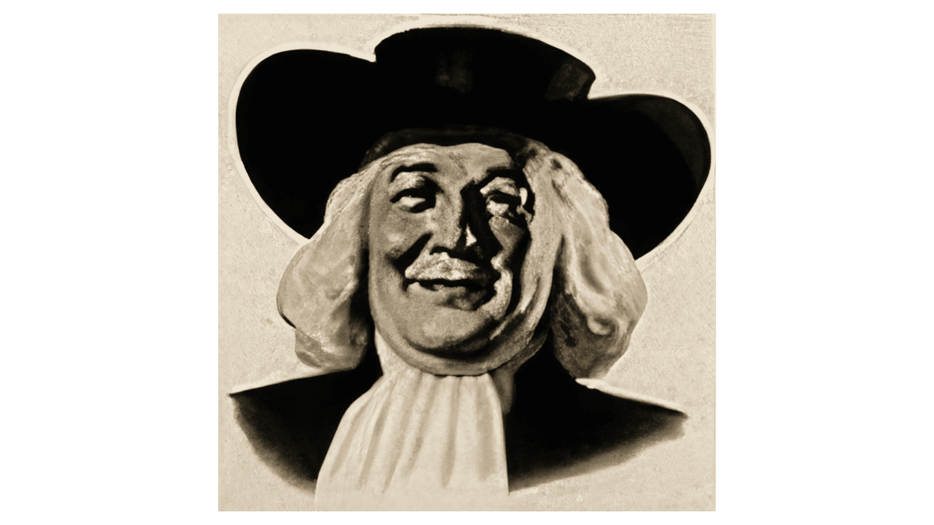
Designers transformed Quaker Oats’s visual identity into a classic portrait of a smiling person. Now, he has completely different features and no longer resembles the Quaker William Penn, since the concept required a composite character. However, it is believed that the prototype for the new emblem was the artist Harold W. McCauley; the abstract image was drawn from him, as the resemblance is nearly exact. Thus began the era of the portrait logo.
The character presented wears a wide-brimmed hat with a flat top, a white wig resembling natural gray hair, and a jabot. This time, the designers focused solely on the head and shoulders, highlighting the kind face glowing with a smile. This label looks better than one depicting a full-length figure. The plump cheeks and large chin convey a sense of well-nourishment, once seen as a sign of healthy eating. This way, the company illustrated the benefits of eating oatmeal for breakfast.
The logo’s portrait was drawn with maximum realism for that era, making it look like a faded black-and-white photograph. However, the shadows and highlights are visible, giving the man a three-dimensional appearance. Special emphasis was placed on the smile, encompassing the lips, eyes, cheeks, and eyebrows. It creatively conveys the concept of healthy eating and, interestingly, reflects the oatmeal producer’s care for its customers.
The Quaker Oats logo of this period is monochromatic. Designers used a simple combination of black and white to express positive emotions, enjoyment of the product, an uplifted mood, joy, and kindness. It’s all about the play of light and shadow, which contrast well and blend beautifully, balancing each other.
Black embodies seriousness, practicality, and professionalism, while white symbolizes sincerity, purity, and safety. In addition to the composite character, they create the essential concept and effectively communicate it to adults who decide what to serve their children for breakfast.
1956 – 1970
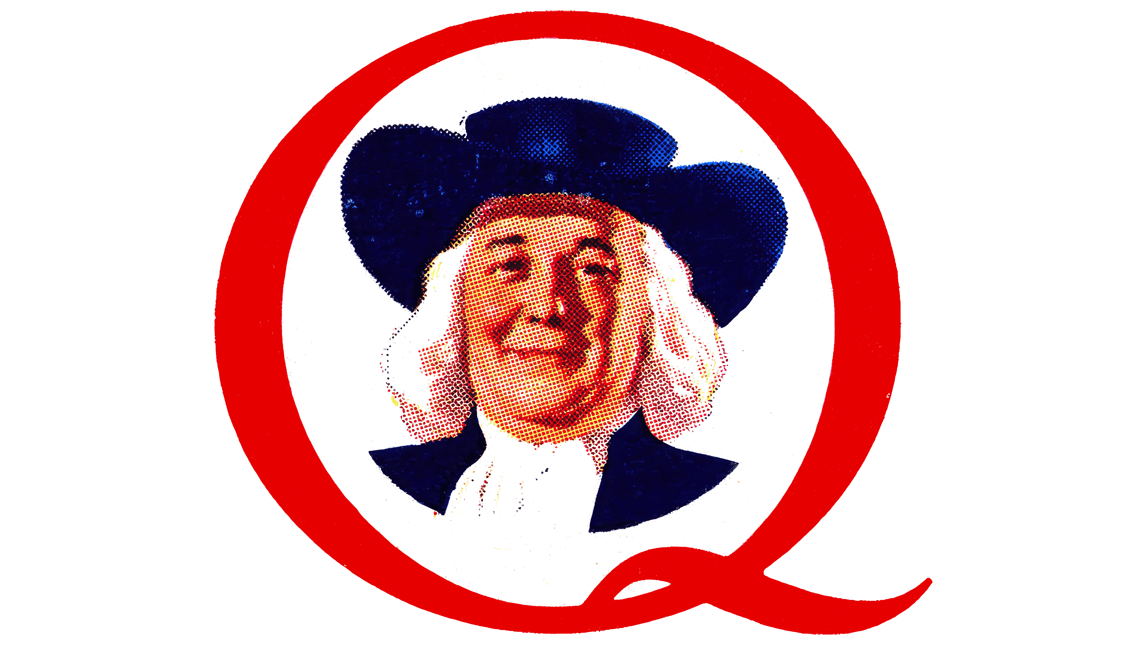
The era of monochrome has come to an end, ready to give way to the Quaker Oats emblem to attract as many customers as possible. Colorfulness certainly catches the eye, so packaging featuring the dignified man, who not only exudes a friendly smile but also looks elegant, appeals more to customers. They see in such a logo the potential for their children’s success, hoping they will grow up to be just as kind and attractive.
But the trademark conveys more than that. It reflects care for consumers, product safety, impeccable quality, and excellent taste. This is “encoded” in a simple image rooted in Quakerism, which was considered a symbol of honesty, decency, and prudence. To emphasize the visual connection to such figures, the man depicted on the label wears a flat-topped Quaker hat. Thanks to the harmonious coloring, it’s now clear that its shape resembles a cylinder, only with very wide brims.
Another clear advantage of using color is the healthy appearance it gives a person. In the black-and-white version, the character’s face was bloated and pale, but now it has a rosy blush and light reflections on the cheeks. The hat and jacket are a beautiful combination: both are dark blue. Against their background, the gray hair looks dignified, and the hairstyle seems natural rather than a wig. The only thing that remains white is the bib at the neck.
Moreover, the logo now resembles a vignette, for which designers made several adjustments:
- They reduced the portrait’s size.
- They rounded the lower part.
- They added a border in the shape of a “Q.”
This frame is a decorative element, and the first letter of the company name is Quaker Oats. In this way, the brand personalized its visual identity, presenting itself through the emblem rather than an abstract figure. The glyph is round, not matching its actual shape but fitting perfectly into the graphic format. An elegant wave-like stroke emphasizes its elegance and hints at the lightness of the food products.
The new logo creates a favorable impression: friendly, positive, and discreet. The character depicted offers a welcoming smile, setting the tone for a good day and a pleasant attitude toward oatmeal for breakfast. The Quaker encourages starting the morning with optimism and joy. Lightness is the primary feeling evoked by this emblem.
1970 – 2012
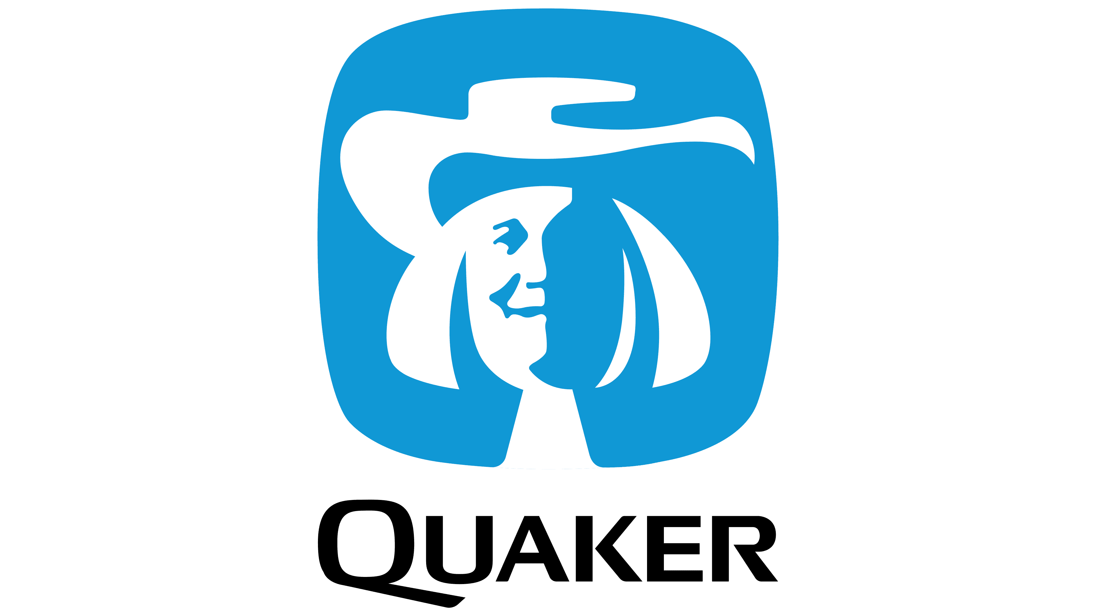
At the same time, a very interesting version of the Quaker Oats logo appeared: a schematic in only two colors. It was used exclusively as a corporate symbol, though it can still be seen on some branded products. The simple palette conveys the approximate outlines of a person’s face, making it seem half-hidden in shadow: the left side is visible, while the right is not. It is absent, as it blends with the surrounding space.
The Quaker hat, with its characteristic flat top, is depicted most clearly and is highly recognizable. The jabot and wig are also visible since they are white, which pairs well with the sky-blue background. The brain mentally fills in the missing details. As a result, the absence of elements does not stand out and does not interfere with the image’s perception. It looks as though the person has simply stepped into the shadows.
This version confirms that the character on the instant breakfast producer’s label is fictional and not based on any real person. With bold strokes, confident lines, and a solid presence, the character is well associated with strength, trust, and honesty, qualities the brand originally aimed to convey.
The portrait, in an abstract style, is set in a square with rounded corners and slightly sloping edges. This adds a sense of friendliness and softness to the emblem, underscoring the company’s care for consumers’ health and satisfaction. Below, in contrast, the name of the oatmeal manufacturer is indicated: it is black and geometric, with plenty of sharp and straight angles. The bold uppercase font makes the logo feel professional and serious, conveying the company as a true expert in its field.
1970 – 1986
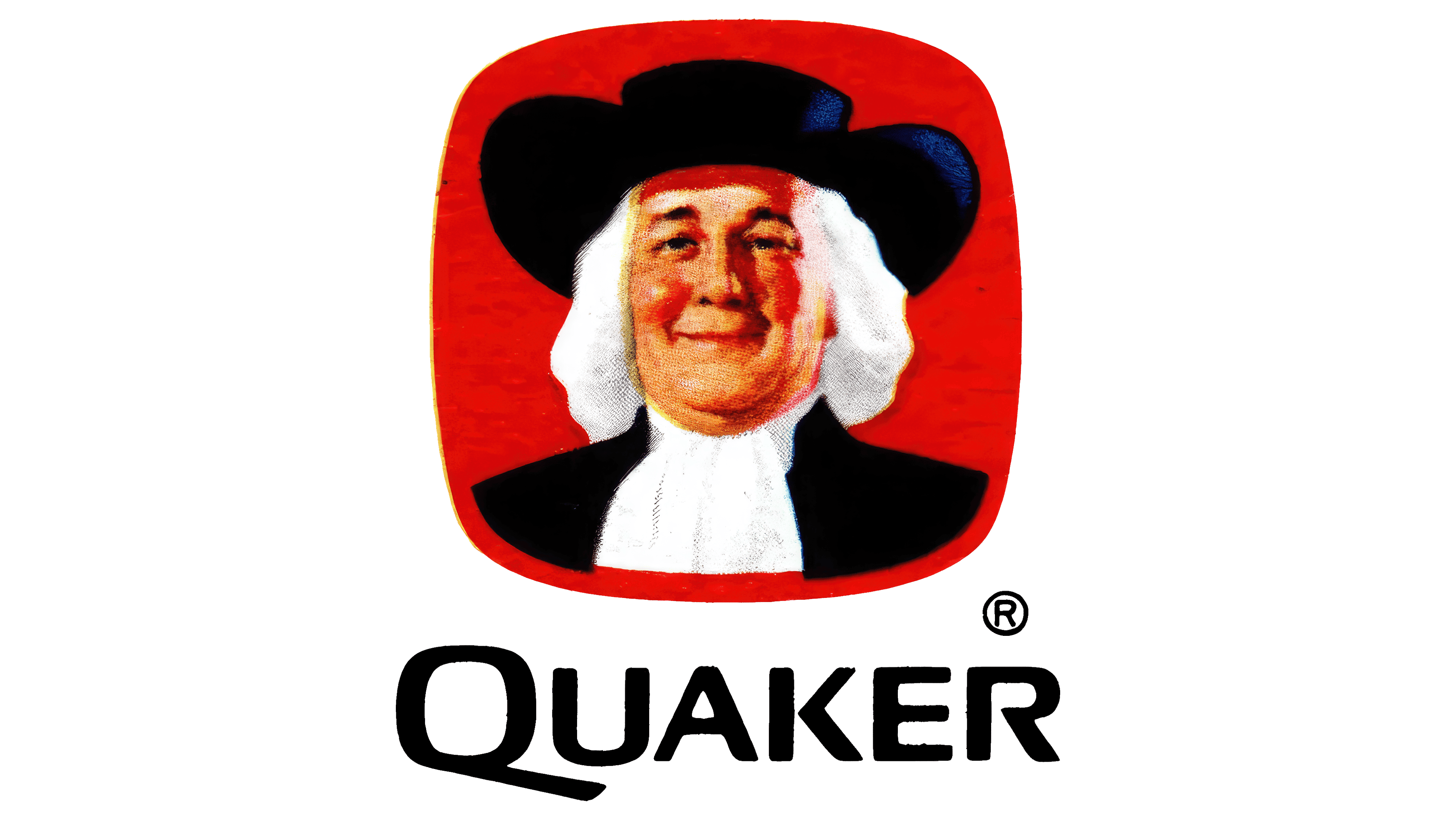
The colored version of the Quaker Oats logo looks beautiful and self-sufficient. The idea of an oatmeal producer is represented by a youthful man with a clear smile, looking at us. This time, the smile is softer, gentler, and kind, as if the face is glowing with happiness. Of course, the brand conveys the concept of maintaining health and vitality, hinting to customers that they, too, can enjoy life if they eat its products for breakfast.
However, the Quaker’s role goes beyond that: he also personifies the company, reflecting its kindness and honesty towards consumers. The person in the picture exudes openness, sincerity, and heartfelt purity, helping buyers feel confident in the quality of branded products. The wig no longer looks like a wig; instead, it appears the man has real hair, naturally graying with age.
Significant changes were also made to other details. The upper part of the dark jacket and the white jabot at the neck are visible in the Quaker Oats emblem. These, along with the light-colored hair, soften the darkness of the hat and jacket, balancing the ratio of dark and light areas in the image. This positively affects visual identity, as the company conveys seriousness, responsibility, and practicality (through black) alongside openness, kindness, and purity (through the white palette).
The Quaker hat has also become predominantly black: only two blue highlights remain on the right side, as if the light source were positioned from that direction. Everything is tied together and accentuated by the red square in the background. It still features rounded corners and curved edges to soften the central image as much as possible.
The red in the Quaker Oats logo is deep, rich, and pleasant to the eye. It is reminiscent of the color of ripe berries found in a wide variety. This striking brightness does not irritate but is perceived harmoniously as a vivid addition to the monochrome. It also complements the healthy blush on the plump cheeks.
The inscription at the bottom emphasizes the seriousness of the trademark. It is still in uppercase, but the corners of the letters are now rounded and slightly softened, helping to eliminate the imbalance between the smooth square and the sharp glyphs. The bold symbols lend the emblem authority, highlighting that the product before customers is from a market leader in oatmeal production.
1986 – 2007
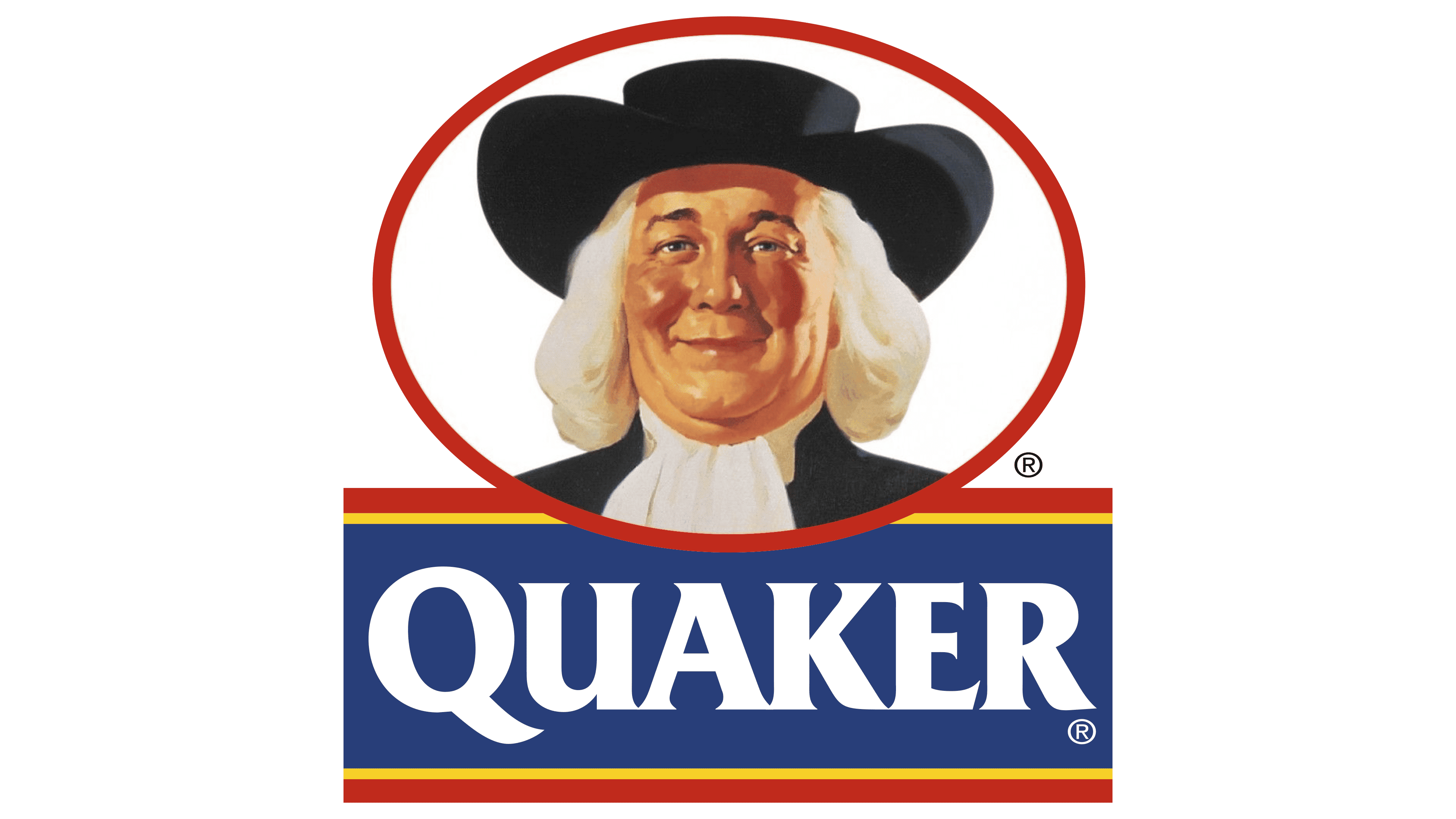
Many significant changes in the new Quaker Oats logo have allowed the company to refine its concept. The focus shifted to a collective image of a kind-hearted person to increase trust in the oatmeal producer and thereby boost sales. The result of the modernization included:
- A muted color palette
- An oval around the portrait
- Extra-bold font
- An abundance of white
- Highlighting stripes
- A blue background for the brand name
So, there were indeed quite a few changes, each adding its unique touch to the visual identity, creating a compact trademark. The person’s features became more distinct, allowing even the smallest details to stand out on the face. Proper image scaling helped achieve this. Thick eyebrows, a double chin, gray eyes, deep wrinkles, a large nose, rosy cheeks, folds on the jabot, curls of hair, and the hat’s shadow on the forehead. Everything is clear, showing a realistic picture with all its flaws and advantages. This way, the company emphasized its honesty and transparency.
The color palette is now subdued, resembling pastel shades. Yet, the emblem did not lose from this; it became more restrained, drawing attention to the sincere smile rather than to vividness. The inscription below the oval also indicates a shift in focus to the Quaker. It is highlighted with two red and two yellow lines, matching the ellipse’s length. The framing is above and below the brand name, set in an extra-bold font.
Massive white glyphs are visible against the blue background, a horizontal rectangle. The letters now have neat serifs in the form of sharp extensions at the ends. This graphic technique added expression and dynamism to the Quaker Oats logo, which it previously lacked, since the portrait generally conveys a static image. All elements aim to foster a trusting relationship with customers, demonstrate care for consumers’ health, and discreetly market the product.
2007 – 2014
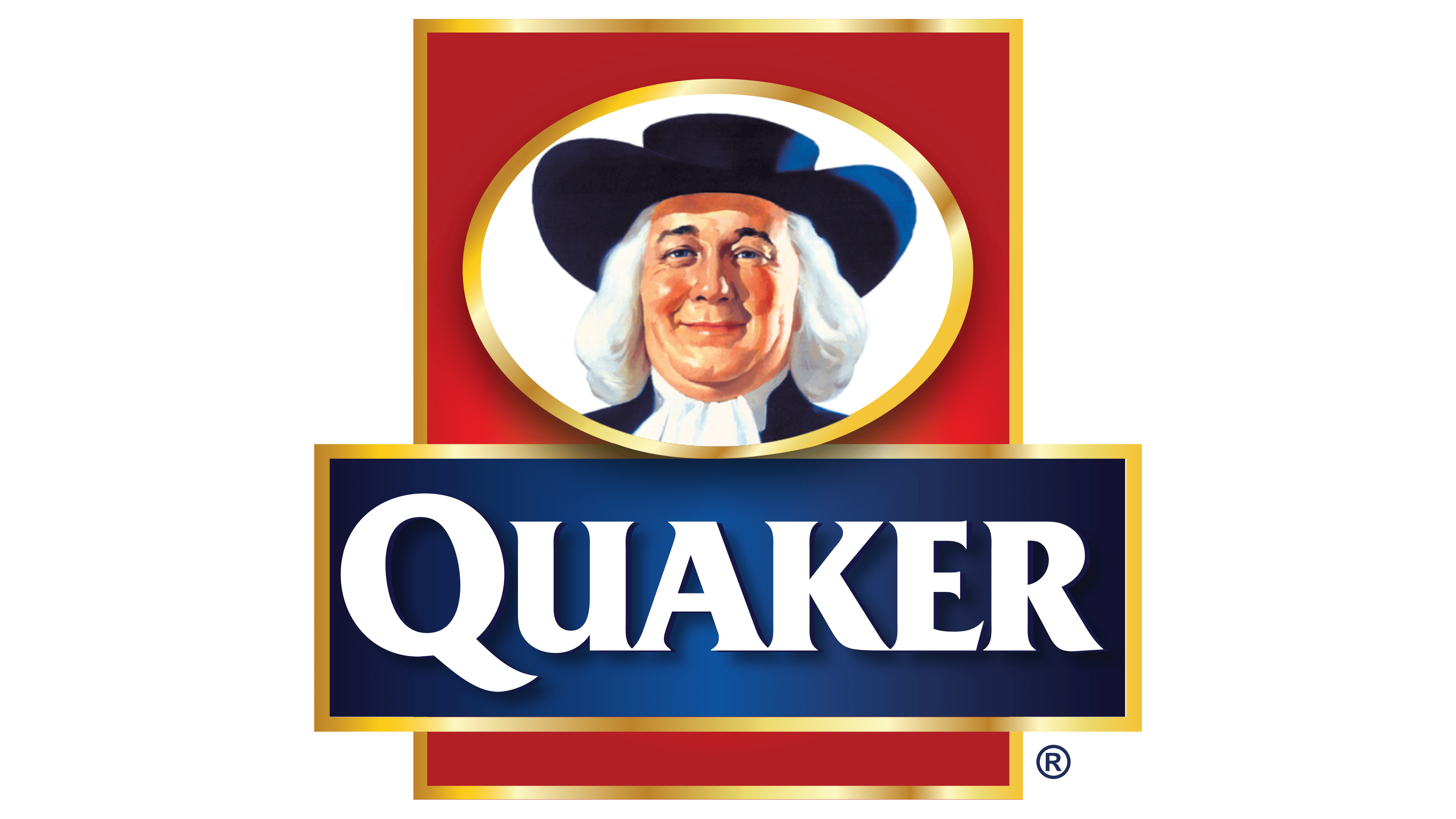
This time, the designers created an emblem with a mirror effect. It is delightful, refined, and elegant, but it does not hint at the company’s line of business or align with the range of oatmeal products offered by the Quaker Oats brand. Essentially, what customers see is typical kitsch, a clichéd sign. This impression comes from abundant gold, shine, and an overly radiant gradient.
A stout gentleman is looking at the customers. He looks down at them with a mocking grin and a silent question, “Can you afford to buy oatmeal?” The man’s eyes have turned blue, matching the color of his jacket and Quaker hat. The double chin has significantly increased, and blue shadows have appeared on the shirtfront and in his hair, making the gray hair look less realistic and accentuating the effect of an artificial wig.
The designers placed the character in a horizontally elongated oval with a wide gold frame, demonstrating his high status, which customers must attain by consuming the offered oatmeal. The white ellipse is located within a red vertical rectangle, also outlined in gold, giving the impression that the stout man is closely watching customers through an oval window on a door. He inspects those around him arrogantly and smirks sarcastically as his kind smile vanishes.
The likely reason for this is the new distribution of shadows and the excessive softening of facial features. The black color has created an optimal balance with the rest of the palette and disappeared from the logo. As a result, the image has become overly colorful: gold frames, a red velvet background, blue hair, a blue satin rectangle; everything is too bright, pretentious, and flashy. Combined with the radiant gradient, it evokes the idea of primitive kitsch.
The font smooths out the impression. It is the same as the previous logo: still extra-bold, uppercase, and antique. Small serifs at the ends of the letters add strictness, while the large “Q” at the beginning of the word “Quaker” indicates the company’s commitment to sticking to existing rules.
2010 – 2011
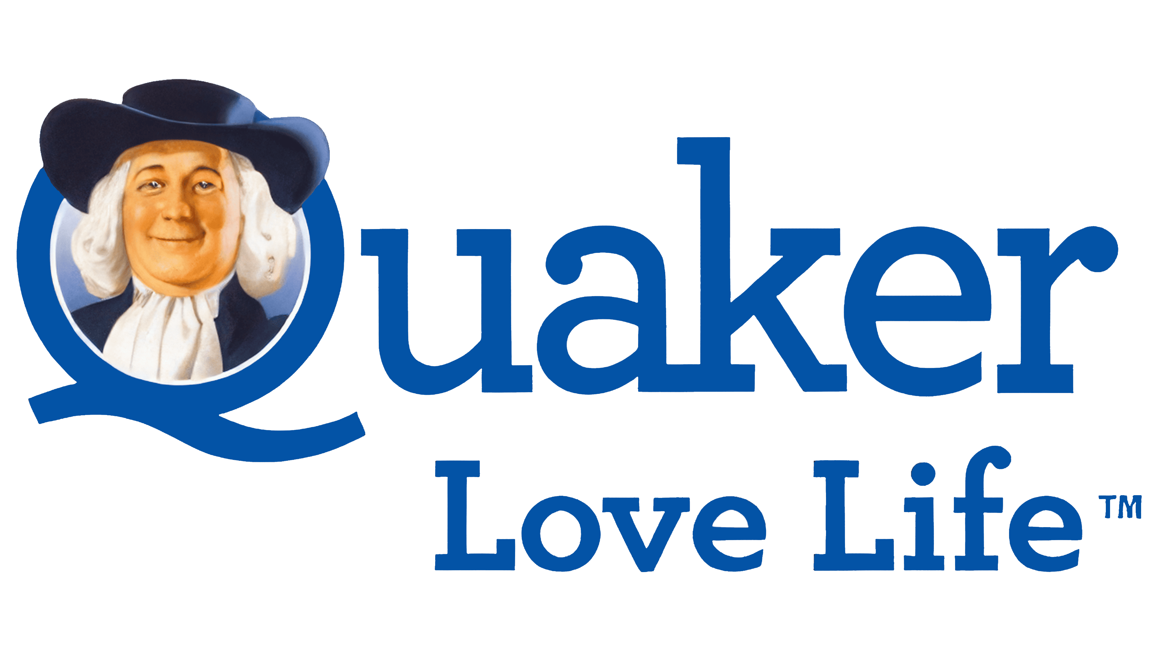
Another Quaker Oats logo was used, simple, modest, and unpretentious. It shows a trend toward harmonious elegance, expressed in the new font with massive rectangular serifs and the unique addition of “Love Life.”
Another original detail appeared: a portrait of a smiling gentleman inside the letter “Q.” Designers used this as the basis for the graphic sign, creatively combining the person and the letter. Since the hat is incredibly large, with very wide brims, the Quaker figure did not fit snugly in the inner space. He cheerfully peeks out, inviting customers to stock up on a tasty, healthy breakfast of oatmeal.
The man’s face here is pleasant, neither overly bright nor overly dark. Everything is balanced: fair skin with a natural tone, blue eyes, a white wig, and a barely noticeable blush on his round cheeks. These create a harmonious contrast with the dark jacket and hat. Even the blue background within the glyph does not spoil the positive impression. By the way, the hat’s curved brims go well with the lower stroke of the “Q”: it has a wavy shape with a slight bend, adding a sense of motion to the emblem.
The other letters are lowercase, geometric, and semi-bold. Both lines use the same font, presumably Archer. Despite the identical style, the upper line (with the name) is much larger and visually dominates the lower one. The second line (with the slogan) modestly nestles between the “u” and “r,” barely reaching the right edge.
2011 – 2012
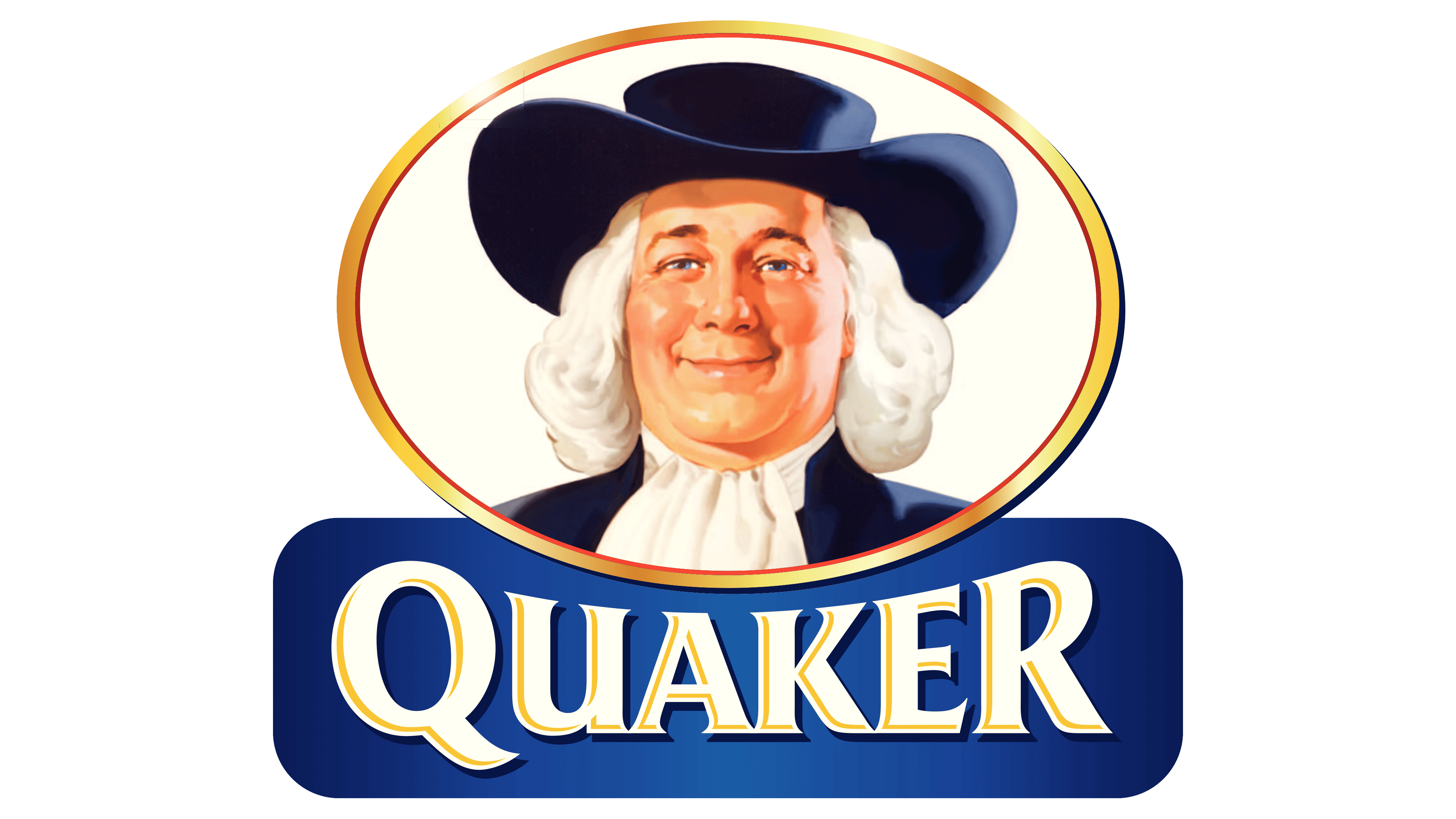
Calm, kind, confident, these are the traits of the gentleman on the current Quaker Oats logo. He inspires trust in the product. There’s even a sense of pride in his gaze at the product he represents, as the man, with sincerity in his eyes, offers it to customers, smiling gently from every oatmeal package. This impression arises because the company has rejuvenated its character: he now has fewer wrinkles, making the gray hair seem almost like a wig.
The face appears fresh: bright, slightly rosy, and without deep shadows. Designers did not emphasize the double chin, so it’s barely visible on the right side (where the light falls). The hat is also slightly illuminated with two bright spots, making it more distinct. Light also falls on the gentleman’s shoulder. Thanks to the clear light source, whose direction was barely noticeable before, the shirtfront now looks realistic, showing soft folds and ruffles.
The Quaker’s head is surrounded by an oval, like the one in the 1986 emblem, which features a thin red frame. But now, the outline is yellow, with a golden sheen, giving it a metallic appearance. This choice aims to showcase the company’s reliability, strength, and market stability. The golden border is also present in the text: each letter has its own outline, giving it a three-dimensional look.
A massive, uppercase, extra-bold font was chosen for the name, with elegant needle-like serifs. The text background begins with the character’s jacket, separated only by the golden ellipse. The horizontal rectangle has rounded corners and darkened edges, directing viewers’ attention to the bright center with the word “Quaker.” The glyphs are of varying heights for the same purpose: they are shorter in the middle and taller on the sides, creating a “fish-eye” effect.
2012 – 2017
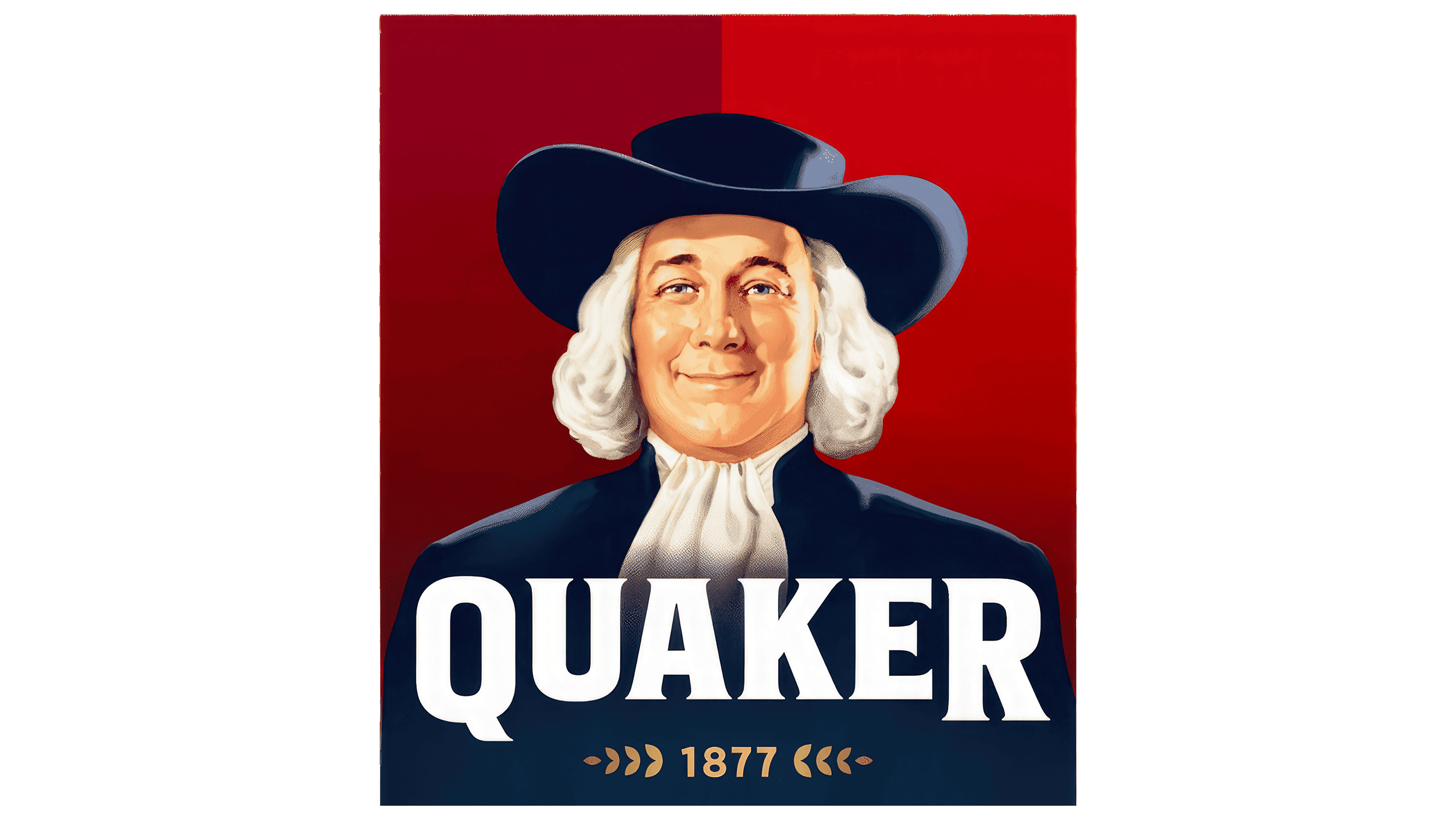
The oatmeal producer has significantly rejuvenated its character: now, a youthful-looking man cheerfully looks at us from the logo. He has a slimmer face, gray eyes, a playful gaze, and a strong chi. In general, the emblem features a middle-aged gentleman with gray hair. This dissonance creates a mixed impression:
- First, the man’s hair appears artificial, like a wig, suggesting the character is hiding something from consumers and raising doubts about the product’s quality.
- Second, the company appears to be concealing the truth from customers, failing to fully disclose product information. It aims to make a good impression, presenting what it wishes were true.
Even the “Quaker” inscription does not help to create a positive perception, as it seems to represent not the brand but the person depicted in the portrait. However, it’s important to understand that this is the exact effect the producer aims for by associating itself with a Quaker, a figure seen as honest, businesslike, and respectable.
The distinguished man does not avert his gaze; he looks directly and calmly. There is not a hint of doubt in his eyes, neither about the quality of the products nor their popularity among consumers. The Quaker Oats emblem presents a true businessman, determined and goal-oriented. His kind smile is a marketing tool inviting purchases.
The character wears a dark blue suit and hat with a burgundy gradient background behind him. This combination suggests confidence, reliability, and leadership. It is well balanced by white, which is present in the wig, jabot, and inscription. The bright, large letters give the logo a stylish appearance. All the glyphs are uppercase and feature small serifs. “Q” and “R” are the largest among them because they stand at the beginning and end of the name as if framing it.
This version of the visual identity includes another line modestly positioned beneath the main inscription. It indicates the company’s founding year, emphasizing its age, rich experience, and extensive historical heritage. The text is set in golden glyphs. On either side, paired leaves form an original pattern. This hints that the contents of the package are plant-based. The golden text looks splendid against the dark blue background, highlighting the products’ exclusivity, as this color scheme is considered regal.
2017 – today
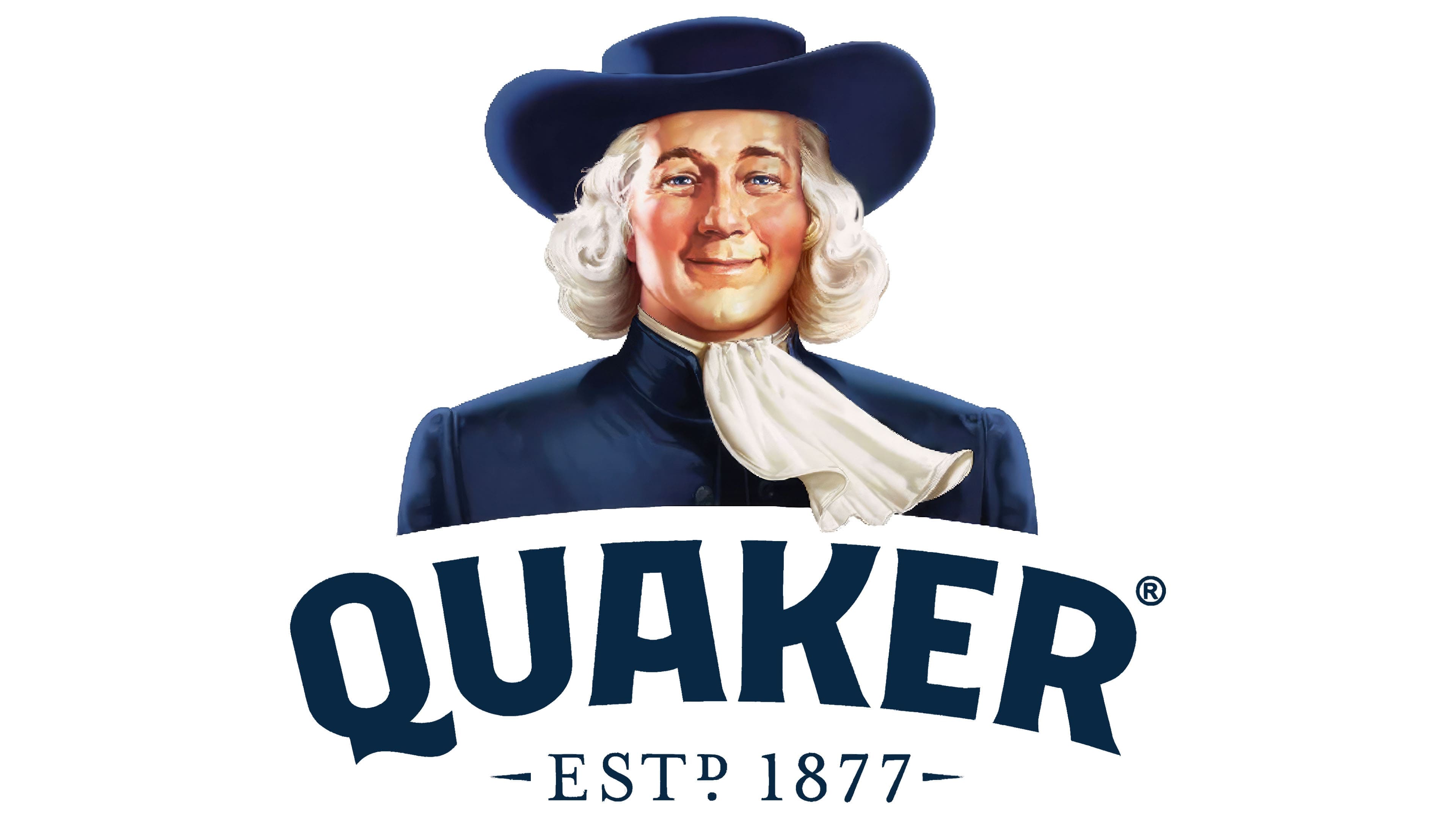
After the redesign, the Quaker Oats logo became significantly simpler. It became a concise trademark, with every element serving a purpose, conveying specific information, or setting the desired mood. Its most distinctive feature is the sense of movement.
- The movement in the image is conveyed by the cravat, which appears to flutter in the wind.
- The text’s dynamism is concentrated in the name, arranged in a smoothly curved arc.
Another notable feature of this emblem is the absence of a background. Technically, it has a background, but it appears as simple white space. There are no frames, as the designers removed the square and have long since abandoned the oval. However, new elements were introduced. Specifically, there are now flowing curls in the wig, a youthful, toned appearance for the character, a well-defined jacket below the shoulders, and a change in the hat’s curve direction (previously, it curved from left to right; now, it curves in the opposite direction).
All the adjustments greatly refined the Quaker Oats logo, modernized the Quaker figure, and added a natural friendliness. Now, he has a gentle, unassuming smile, calm, confident, and welcoming. This makes the face appear approachable, and even the blush doesn’t look excessively red.
The inscriptions remained the same; only their style and form changed. The top line turned into an arch. A custom font was created specifically for it, so the name is now written in the Quaker Sans typeface. The extra-bold blue letters are easily read on a white background and scale well. The “Q,” resembling an “O” with a wavy stroke at the bottom, and the “K” with a widely curved upper diagonal, reminiscent of a cup, stand out in particular.