


 Lunchables Logo PNG
The Lunchables logo reflects the popularity and convenience of these meal kits. The compact design highlights the variety and assortment of tasty ingredients in a single box. Every detail of the logo underscores a commitment to health and balanced nutrition for schoolchildren, making the product appealing to parents and kids alike.
Lunchables began in 1985, when a development team at Oscar Mayer, a Kraft Foods subsidiary, started working on a portable lunch product. The idea reflected changes in American family life, with more working parents and growing demand for quick meals for children. Bob Drane, who led the team, studied how adults built lunches from separate items and applied that model to children’s meals.
The brand launched in 1988 after two years of research. The first range included pizza, hamburgers, and turkey sandwich kits, all built around assembly by the child. By the mid-1990s, Lunchables had become a major name in children’s ready-to-eat lunches. Nuggets arrived in 1995, while criticism from nutritionists over fat, salt, and preservatives pushed the company to review the nutritional profile in 1997.
In 1999, Fun Fuel added items such as fruit and yogurt. The 2000s brought Mega Pack in 2001, Jr. meals for younger children in 2004, and Lunchables with Smoothie in 2007. Uploaded launched in 2010 for teenagers, followed by a 25th anniversary redesign in 2013. In 2017, the brand moved away from artificial colors, flavors, and preservatives, and organic products followed in 2018.
Breakfast kits appeared in 2020, and Lunchables with 100% Juice launched in 2021. In 2022, the brand announced recyclable packaging plans through 2025 and introduced World Tour meals inspired by global cuisines. Build Your Own kits arrived in 2023. In 2024, Lunchables added its first fully plant-based line in response to veganism. They launched Food Lab with colleges to study future children’s meals.
Meaning and History
What is Lunchables?
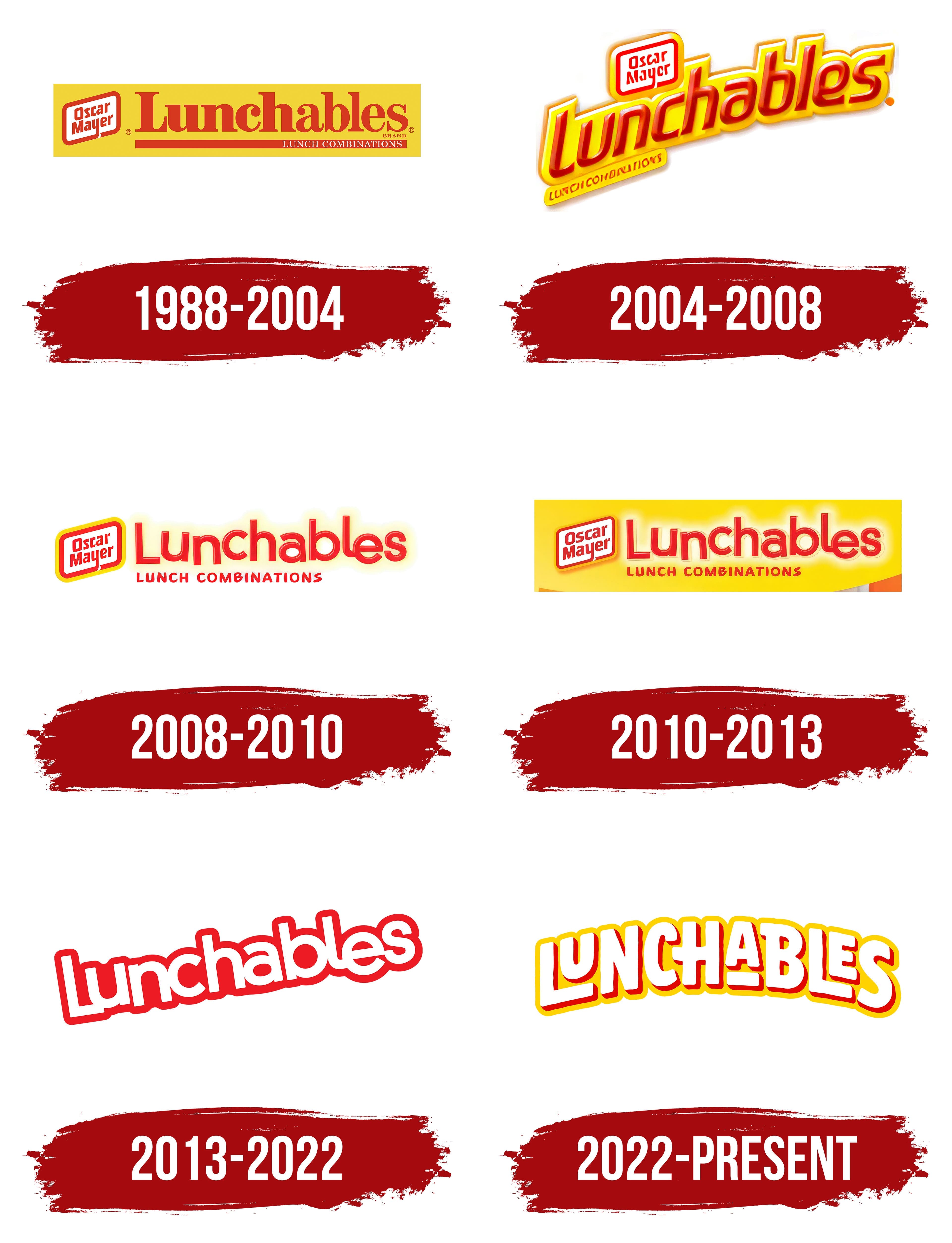
This is a popular brand of prepackaged lunches produced by Kraft Heinz. Designed primarily for children, the brand offers a variety of convenient meal options that typically include crackers or small tortillas, cheese, and proteins such as ham or turkey. The company has expanded its product line to include pizza, nachos, sandwich kits, and packaged desserts and beverages. The brand is known for being interactive, allowing children to assemble their own food, making lunch hour more fun. These products are advertised as a convenient solution for busy parents and a fun food option for kids, especially for school lunches or on-the-go snacking.
1988 – 2004
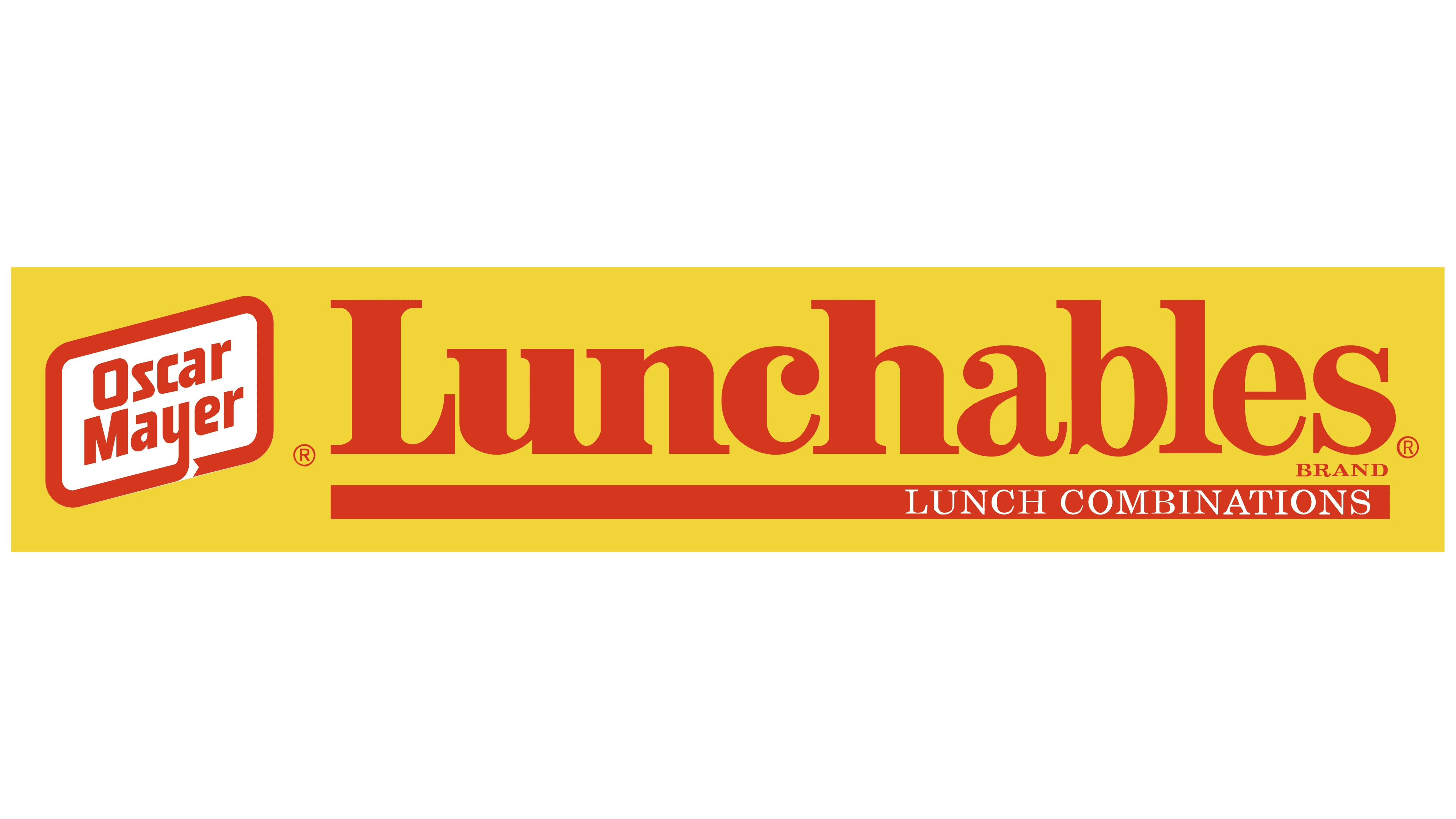
From the beginning, the Lunchables brand focused on comprehensive service and compactness. The logo’s yellow rectangular background was associated with a closed box, reflecting the products’ readiness and primary color scheme.
On the left side of the logo was an image of a complete kit, depicted as a white rectangle with rounded corners. This image symbolizes the brand’s convenient plastic containers with multiple compartments that hold its products. The bold red outline added a sense of completeness and emphasized the company’s original concept. This element is part of the Oscar Mayer logo, the brand’s producer.
On the right, the red name was displayed, with the word “Lunch” in a bolder font, highlighting the boxes’ primary purpose. Below the name, on a red line, was the tagline: “lunch combinations.” This line, resembling a news ticker, symbolized the products’ freshness and readiness for immediate consumption.
2004 – 2008
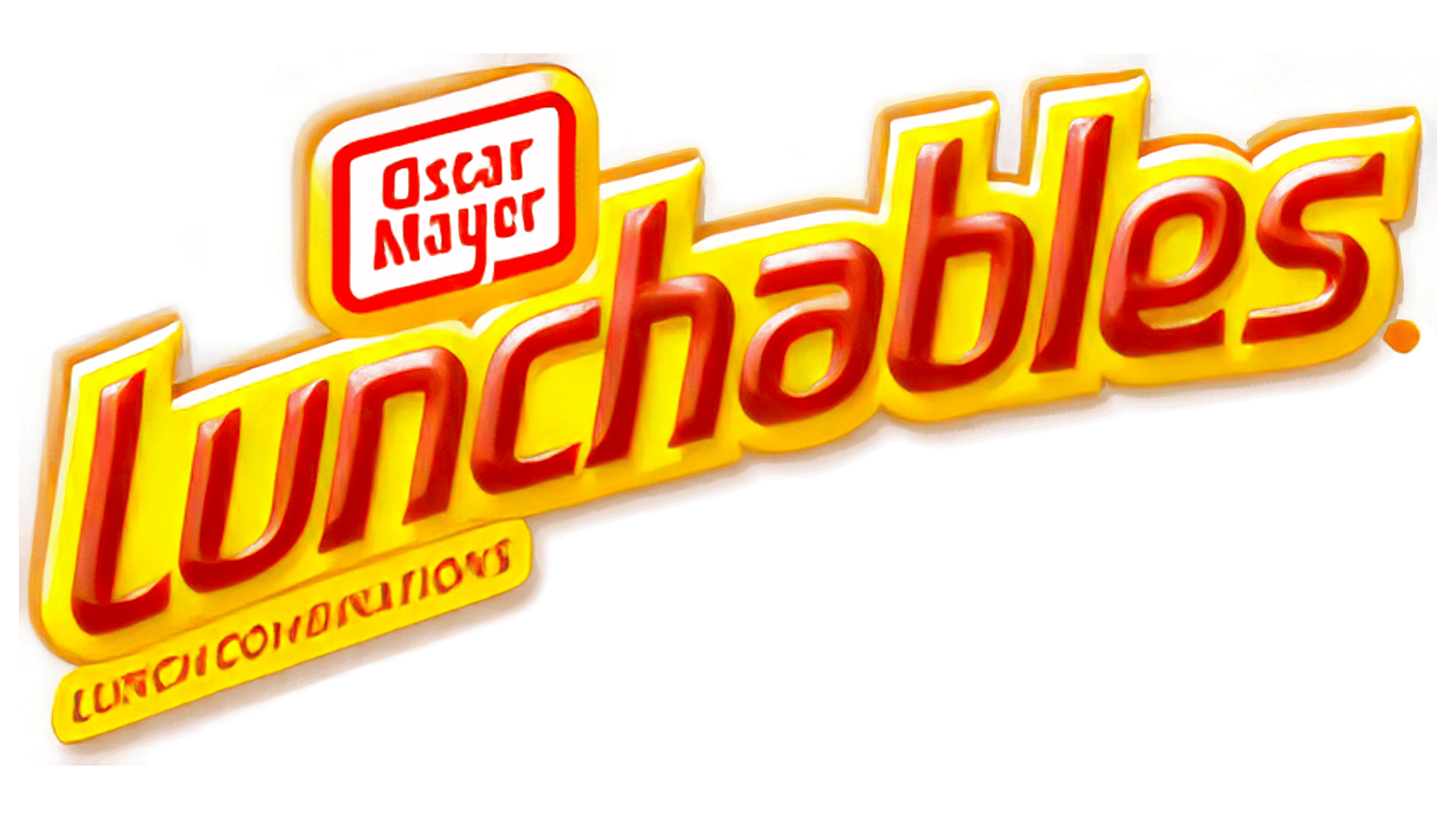
The logo appears compact and appetizing. The name is written in red letters that resemble ketchup. The yellow background, which follows the shape of the letters, evokes associations with baked dough, French fries, and cheese slices.
At the top of the logo, above the name’s first half, is a compact lunchbox, which serves as the Oscar Mayer emblem. This symbol is placed on a separate yellow background to maintain harmony with the rest of the logo.
At the bottom of the logo, on a third yellow background, it states that the brand offers “lunch combinations.” All the text is curved in an arc, symbolizing care for consumers and emphasizing the great taste of the ingredients. The emblem evokes strong associations with food, giving the logo a rich and “satisfying” appearance.
2008 – 2010
The logo returned to its original combination, but the font changed. The letters became more playful and childlike, bringing the brand closer to its consumers. Instead of the usual yellow rectangle, a light, semi-transparent outline was used around the letters, giving the characters a sense of fun and lightness. This design choice highlights the product’s lower calorie content and creates the impression of a fragrant trail accompanying the boxes’ delicious contents.
2010 – 2013
The logo was once again placed on a yellow rectangular background, giving the emblem a familiar and appealing look. The outline of the letters transformed into a light glow, creating the impression that the brand is a gift, the perfect solution for school lunches. The letters come to life, playfully bouncing, reflecting the energy and lively spirit of their young consumers.
2013 – 2022
In 2013, the brand focused on “quick and tasty lunches.” The yellow elements were removed from the design, and now the white, upward-facing letters emphasize the box’s freshness, safety, and low-calorie content. The red outline of the letters highlights urgency, but because of its association with danger, the new logo became less appealing to consumers.
2022 – today
The Lunchables logo stands out with its brightness and cheerfulness, perfectly reflecting the brand’s core message for children. The modern symbol has moved away from overuse of red, returning to a warm, friendly yellow palette that evokes joy and fun. This choice gives the emblem a sense of lightness and appeal, making it visually pleasing and delicious.
The bold white letters of the logo resemble lines made with cottage cheese, sour cream, or dough, evoking associations with the product’s softness and fluffiness. These glyphs convey a sense of lightness, underscoring that the brand’s products are easy to consume and ideal for a quick snack.
An interesting detail is the reduction in the size of two letters in the logo, symbolizing the compact arrangement of products in Lunchables boxes. This reflects the variety of compartments in the boxes, where different ingredients can be found to create your meal. This element also serves as a reminder that the brand is child-focused, highlighting the product’s playful, creative aspects.
The red shadows added to the letters emphasize and symbolize spices and seasonings, enhancing the associations with flavor and appetite. The light yellow outline around the letters transforms the text into a delicious cloud, reinforcing the theme of children’s meals and making the emblem more dimensional and visually appealing.
Every element is thoughtfully designed to resonate with the brand’s target audience, children, and their parents. This logo evokes positive emotions and helps the brand maintain its leadership in the kids’ snack market.