


 CDW Logo PNG
The CDW logo symbolizes the company’s technological excellence, essential to its operations. The concise, dynamic design reflects the pursuit of cutting-edge IT solutions, conveys a sense of progress, and underscores a focus on success.
CDW was founded in 1984 by Michael Krasny in his garage near Chicago, Illinois. The company was first called MPK Computing and sold printers and computer hard drives. Krasny, a former accountant, entered the growing personal computer market by placing small ads in computer magazines for hardware and components.
In 1985, the company changed its name to Computer Discount Warehouse, matching its focus on a broad range of computer products at lower prices. In 1986, operations moved from the garage to a small office in Northbrook, Illinois, and the first printed catalog helped expand sales. In 1987, CDW opened its own call center. By 1989, it had added networking equipment as business customers needed more connected systems.
The company improved operations in 1991 with a computer system for inventory and order processing. In 1993, it opened a 50,000-square-foot distribution center in Vernon Hills, Illinois. In 1995, CDW held its IPO on NASDAQ, and in 1996 it launched its first website, which later became a full online sales platform. In 1998, the company acquired Micro Warehouse and entered the education technology supply market.
In 2000, CDW opened a second major distribution center in Las Vegas. John Edwardson replaced Krasny as CEO in 2003, and Berbee Information Networks Corporation was acquired in 2005. In 2006, Computer Discount Warehouse became CDW Corporation. Providence Equity Partners and Madison Dearborn Partners bought the company in 2007. From 2009 to 2023, CDW opened a London office, returned to public status, acquired Kelway, Scalar Decisions, and Sirius Computer Solutions, launched CDW Amplified Services, and opened a Security Operations Center.
Meaning and History
What is CDW?
It is a leading provider of technology products and services for businesses, governments, education, and healthcare. The company offers a wide range of hardware, software, and integrated IT solutions from leading brands, meeting the needs of diverse organizations. The brand’s services include procurement, customization, deployment, and managed services, helping customers manage their IT infrastructure and achieve technology goals.
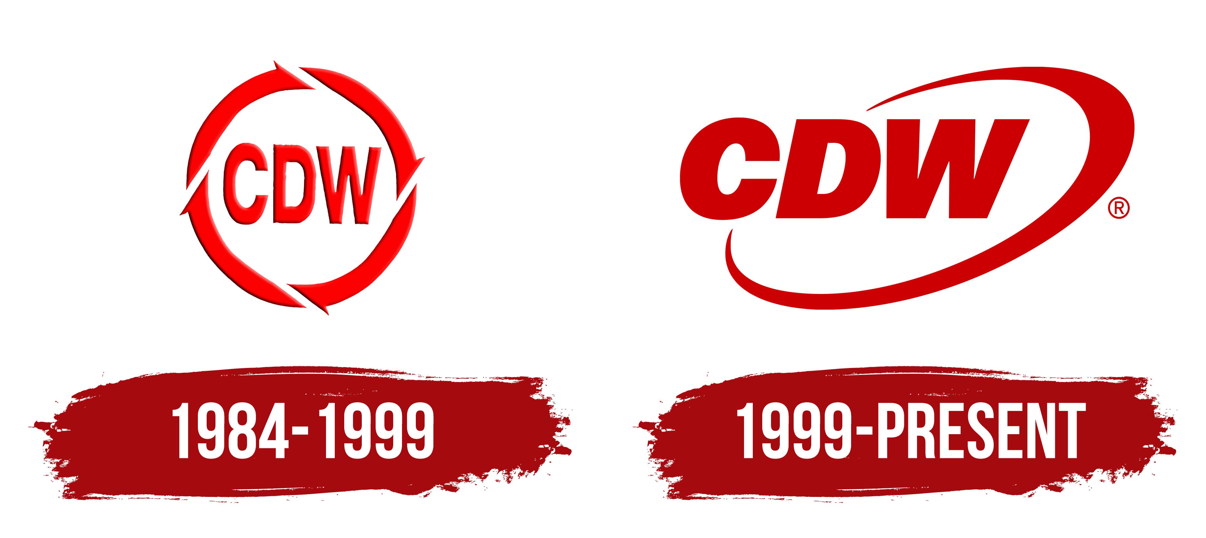
1984 – 1999

CDW began using this logo only after adopting its current name, as it was previously known as MPK Computing and Computer Discount Warehouse. The concise emblem, with a short abbreviation, symbolizes technological progress, depicted by a ring of four stylized arrows. This ring signifies several aspects of the brand:
- The cyclical nature of processes, as CDW operates according to strict algorithms.
- Dynamism underscores the company’s ambition to lead its industry.
- Infinity indicates the continuous improvement of service quality.
- Integrity and completeness are important in everything the technology product supplier does.
The four arrows, moving in a circle, convey a sense of purpose, mobility, and progress. The bright red color further enhances these associations, embodying powerful energy and passion. The red logo reflects the company’s love for what it does and helps capture its customers’ attention.
Inside the dynamic ring is a short inscription. This also ensures brand recognition, as the designers chose a clear, sans-serif font for the wordmark. The bold, clear, vertically elongated letters convey the strength and confidence of CDW. The simple style reflects the company’s commitment to accessibility for its customers. The subtle gray shadows on each glyph and all four arrows create a sense of three-dimensionality. This visual depth reflects the modernity of the technology product supplier and its comprehensive approach to delivering IT services.
1999 – today
The company changed its emblem because the previous version had become outdated and needed a refresh. This created a bright, dynamic, and recognizable symbol that has become CDW’s calling card. It is still rendered in a rich red color, associated with energy and determination. The intense brightness might seem aggressive, but this is precisely what draws attention, reflecting the brand’s drive for leadership and innovation.
The wordmark also emphasizes the company’s ambition, with its name in bold font. The massive capital letters appear impressive and authoritative. This typography conveys a sense of stability, which is crucial for a technology product supplier that businesses and organizations rely on.
The slanted font gives the logo a dynamic feel. The illusion of movement symbolizes the drive toward progress and continuous development. This underscores CDW’s active stance in the field of modern IT solutions. The geometric nature of the letters positively influences the brand’s perception, as the straight, clean lines are associated with precision, professionalism, and advanced technology.
A distinctive feature of the emblem is the arched line that encircles the text. It enhances the visual dynamism and completes the logo by acting as a frame. The line has an uneven thickness: its top part widens while the ends taper, creating an appealing contrast. This variation gives the impression of a spatial perspective.
The line forms an oval, rotated diagonally. This shape resembles an orbit or trajectory, reflecting the wide range of possibilities the company offers its clients. An orbit often evokes associations with scientific achievements and cutting-edge technology, aligning with the image of an IT industry leader.
Interestingly, the oval is not solid: one side of the figure is split in half by the three-letter abbreviation. The open line symbolizes the brand’s openness, showing its readiness for new opportunities and modern solutions. This element also creates an impression of continuous movement and growth as CDW constantly strives for innovation. It’s worth noting that a similar ellipse surrounding the text appears in Intel’s old emblem. It’s unclear whether this resemblance was coincidental or if the technology product supplier intentionally sought to be associated with one of the world’s most influential computer companies.