


![]() Corvette Logo PNG
Corvette Logo PNG
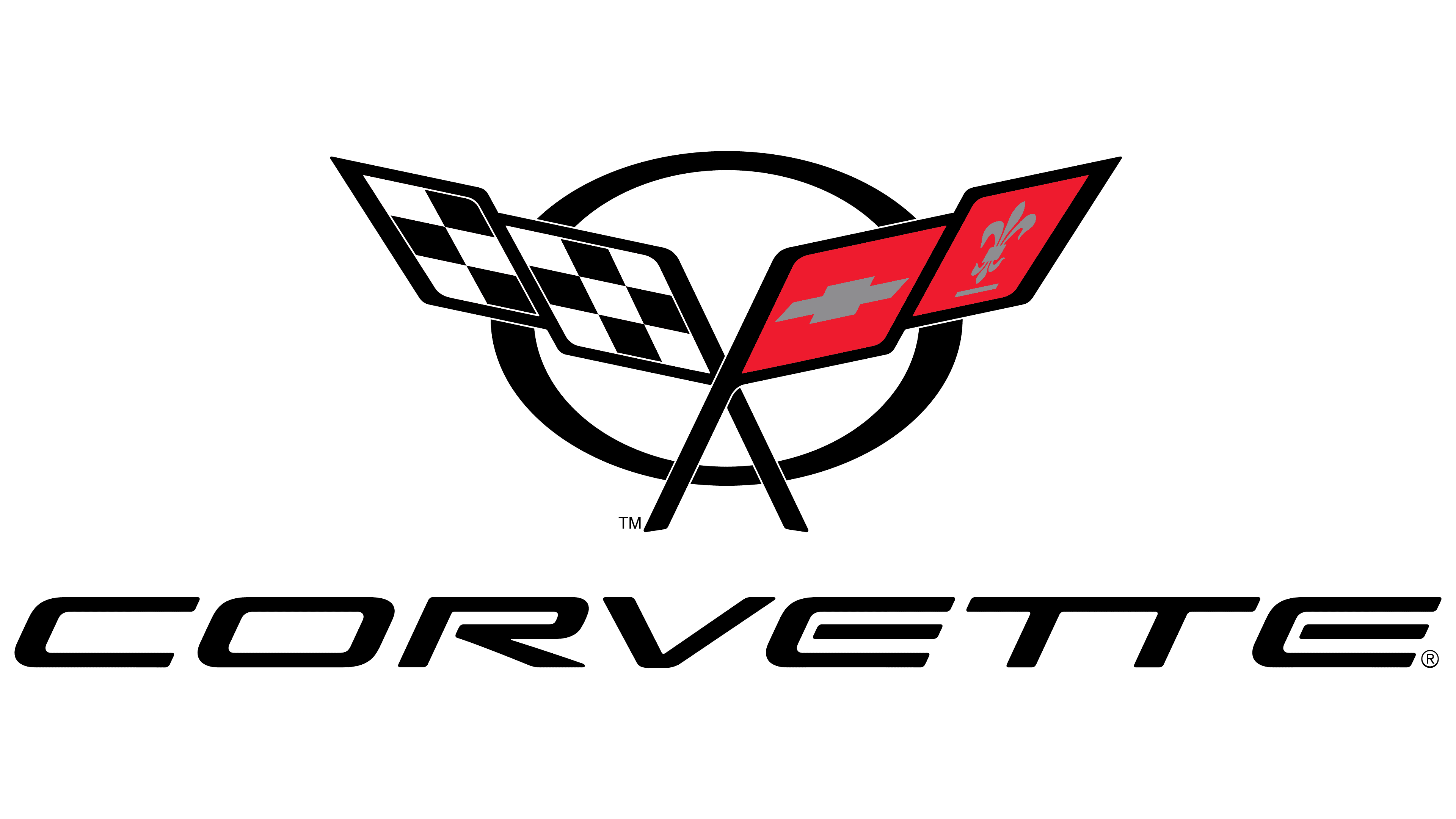
The Corvette logo embodies determination and power. The emblem flies forward, prompting the viewer to give way. Speed, power, and metal are all in the picture. The company’s vehicles will overcome all obstacles, says the sign.
Corvette began in 1951, when General Motors designer Harley Earl watched European sports cars such as Jaguars, Ferraris, and MGs race at Watkins Glen. He believed America needed its own two-seat sports car, and the idea became Project Opel.
On January 17, 1953, GM showed the prototype at Motorama in New York’s Waldorf-Astoria. The car had a fiberglass body, a six-cylinder engine, and the name Corvette, taken from a light naval escort vessel. The first production Corvette was built by hand in Flint, Michigan, on June 30, 1953. It cost $3,490, and only 300 were made.
The launch was troubled. Buyers complained about leaking soft tops, uneven fiberglass quality, and inconsistent parts. In 1953, only 180 cars found buyers. Production moved to St. Louis in 1954, but demand stayed weak. GM considered ending the project. Two things saved Corvette in 1955: Ford launched the Thunderbird, and Corvette gained a V8 engine. Engineer Zora Arkus-Duntov then reshaped the car’s chassis, suspension, and performance image.
In 1963, the C2 generation introduced the Sting Ray name and the famous split-window coupe. The C3, built from 1968 to 1982, survived the oil crisis and stricter emissions rules. The C4 restored credibility with the 1990 ZR-1 and its Lotus-developed 375 hp engine. The C5 brought better weight balance, and the Z06, while the C6 and C7 pushed output as high as 755 hp in the ZR1.
In 2019, GM introduced the C8, the first mid-engine Corvette, moving the model closer to the architectures of Ferrari and McLaren while keeping the entry price lower.
Meaning and History
![]()
Each car model had its logo, and the badges on the hood often changed for no particular reason. Designers experimented with two crossed flags, changed slope angles, and added and removed inscriptions. At some point, stripes appeared against the background, similar to the sun’s rays, but this motif was not very popular. Another little-known variation included the American flag. It was abandoned four days before Corvette’s debut, when it was revealed that US law prohibits the use of state symbols in advertising.
What is Corvette?
This is America’s top sports car, a product of General Motors engineering, produced at the Bowling Green plant in Kentucky. Models, ranging from the base Stingray to the high-performance Z06 and ZR1, combine vast technical capabilities with unique styles. Each car, equipped with advanced materials and powerful engines, is priced more affordably than European exotics and embodies American technology through its unique production facility.
1953 – 1955
![]()
When General Motors Corporation was planning to launch its first sports car, it turned to interior designer Robert Bartholomew to create an emblem. He designed a symbol depicting two crossed flags: on the left is the traditional US flag with stripes and stars, and on the right is the checkered black-and-white flag waved at the start and finish of races. Above was the Chevrolet wordmark. Opposite it, at the very bottom, there was a coherent and illegible inscription “Corvette.”
At the very last moment, the brand owners learned that this logo could not be applied to cars; otherwise, it could violate federal law. Bartholomew only had four days to fix the bug. First, Chevrolet wanted to play up the famous Louis Chevrolet racer’s family crest, after whom it was named. But she never managed to find suitable archival materials.
As a result, the classic French symbol, the fleur-de-lis, was chosen. Next to it were three horizontal stripes and a shield with a cross. Both flags and inscriptions were placed within a white circle outlined in black. The original emblem is still kept at the Corvette Museum in Kentucky.
1955 – 1962
![]()
The typography has been changed. Graphic elements became three-dimensional and lost their original shape. In front of the flags (at the bottom), the letter “V” appeared as clock hands. It stood for V-8 engines and was equipped with all the sports cars of that time.
1963 – 1967
![]()
In 1963, the second Corvette model, the StingRay, appeared. Its name appeared at the bottom of the logo, inside a black rectangle beneath the word “Corvette.” The ‘Chevrolet’ lettering was removed because sports-car fans already knew the brand. The silvery V is gone. The shape, size, and colors of the flags have changed slightly.
1968 – 1982
![]()
After the third model of sports cars was released, the circle on the emblem was removed. The designers depicted the flags at a new angle to make them appear more stable.
1982 – 1996
![]()
The fourth Corvette’s logo has been changed beyond recognition. Having lost their flagpoles, the flags switched places and took on a new rectangular shape. The usual black ring has been returned. At the same time, the fleur-de-lis disappeared, yielding the main role to the Chevrolet Gold Cross.
1997 – 2005
![]()
For the C5 generation, the designers have updated the emblem, keeping the flags in their previous positions and returning them to their classic form, along with the fleur-de-lis symbol. Though halfway outside the circle, the crossed flagpoles returned to their usual place.
2005 – 2014
![]()
The company redesigned the logo by removing the black ring and replacing the flagpoles with elongated ridges on the banners’ inner edges. At the bottom, the caption “CORVETTE” was added in a new, right-tilted, stylized font.
2014 – 2019
![]()
A new symbol was needed for the seventh generation of cars, so the designers moved the flags to a distinct V-shape. The typography hasn’t changed, but the letters are silver. The graphic part now has a metalized outline with shading.
2019 – today
![]()
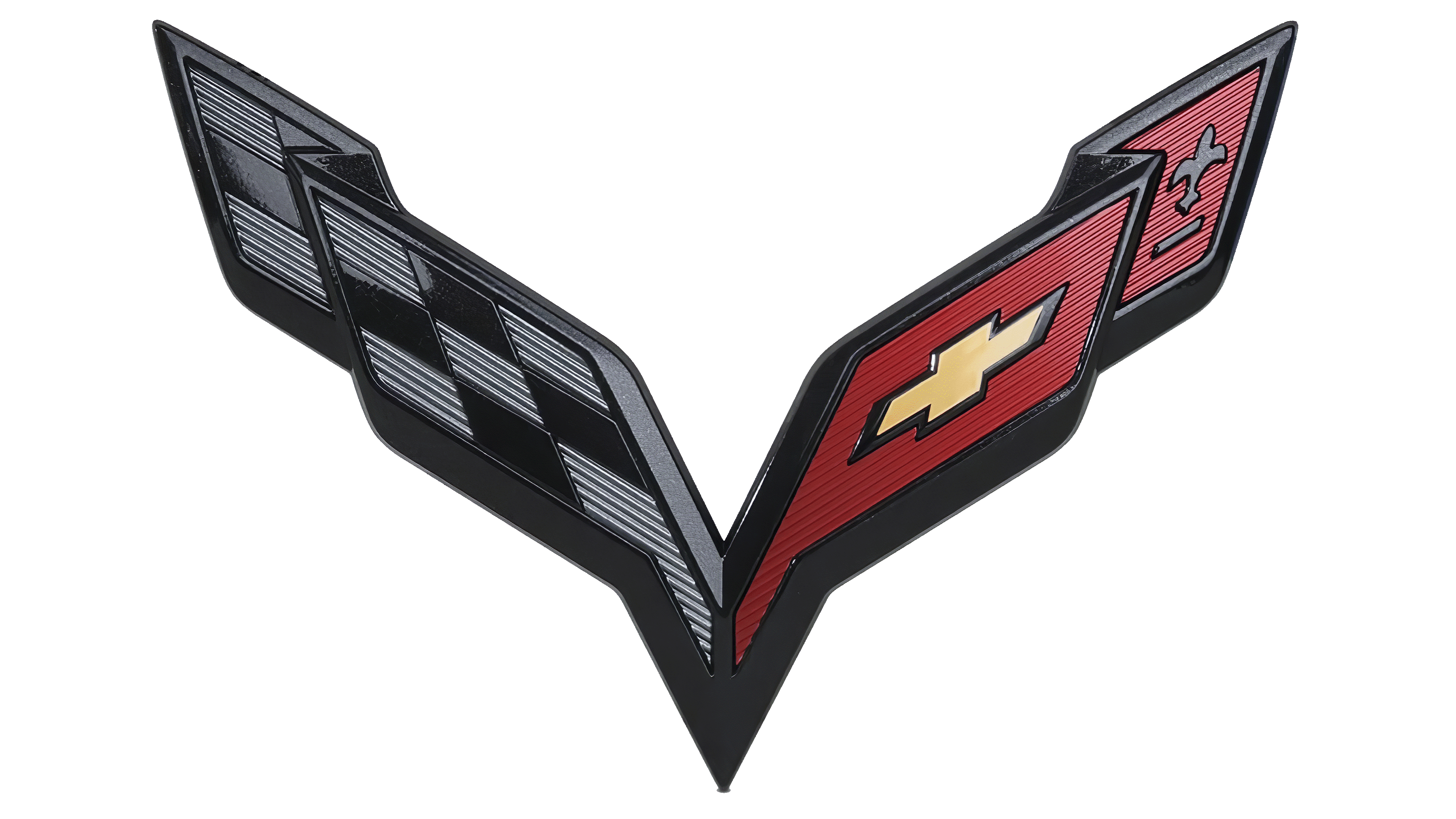
The Chevrolet Corvette C8 logo looks more like a “V” than the previous one. The developers have removed the V-notch at the bottom, so the flags are closer together. The letters in the brand name have been separated, making it much easier to read. The colors are lighter, and the upper corners are sharper. This version of the so-called “butterfly” was leaked in February 2019, after which it appeared in the official render.
Font and Colors
Crossed flags accompany all generations of Corvette vehicles, portraying them as high-speed sports cars. The checkered black-and-white flag resembles the standard racing flag that marks the finish. The second half of the emblem is more symbolic. It is adorned with a fleur-de-lis (a reference to Louis Chevrolet’s French roots) and a bold cross (Chevrolet brand badge).
The designers used a custom font for the inscription, created specifically for the Corvette. Later, the Grand Sport Typeface family was developed based on it. This is a set of 19 styles by Daniel Zadorozny.
The logo color scheme contains black, white, gray, red, and pale yellow. Combining different shades creates a 3D effect and gives the image a metallic sheen.
FAQ
What does the Corvette emblem mean?
The emblem has a deep meaning and history that reflects the brand’s heritage and purpose. It features two crossed flags: a checkered racing flag and a flag with a Chevy bow tie and fleur-de-lis.
The checkered flag demonstrates racing history and performance. The fleur-de-lis, a stylized lily flower, has historical and cultural significance. This French symbol represents peace and purity. It pays homage to the name’s French origins, as Louis Chevrolet, one of the founders, was French. The emblem combines elements that show its racing history.
Why was the Corvette named Corvette?
The brand got its name from a fast warship. The name was chosen to reflect the car’s speed and agility. The car debuted at General Motors’ Motorama auto show at the Waldorf-Astoria Hotel in New York.
Myron Scott, a Chevrolet employee, suggested naming the car after a warship. He wanted the name to reflect the car’s power, speed, and elegant design. The first corvettes were small, fast warships used in naval battles, known for their speed and maneuverability in shallow waters.
The name suited a sports car designed for high performance and an exciting driving experience. The brand quickly became popular and iconic, and its cars became a staple of American muscle cars. Its elegant design, powerful engine, and advanced technology have helped it achieve legendary status.
What does the Corvette logo mean?
The logo features two crossed flags forming a V. One is black-and-white, like the traditional racing flag used at the finish line. This flag demonstrates the brand’s strong connection with motorsport and its high performance. The other flag is red and features a fleur-de-lis, a nod to the French roots of Louis Chevrolet, the brand’s co-founder.
The logo captures the spirit of a car with a rich heritage, marking its journey from its beginnings to its status as an iconic American sports car.
Why is the 2020 Corvette so cheap?
The 2020 Corvette’s starting price is low to generate interest and attract more buyers. The brand wants to make this high-performance car more accessible and increase sales.
One reason for the lower price is competition from other sports cars. The brand aimed to offer a mid-engined sports car that could compete with more expensive European models at a more affordable price.
This pricing strategy had financial consequences for the company, resulting in lower profits. Despite this, the decision was part of a plan to build a loyal customer base and enhance the car’s reputation as a high-performance vehicle with great value.
Who made the Corvette logo?
The creator of the current logo is unknown, but Robert Bartholomew, an automotive interior designer, designed the original logo.
The original logo had two crossed flags. One flag featured a checkered pattern, symbolizing racing and performance, in keeping with the Corvette’s sporty image. The other red flag included a Chevrolet bowtie emblem and fleur-de-lis, paying homage to the brand’s heritage and the French roots of co-founder Louis Chevrolet.
The logo has changed over time, but has always retained the key elements of the crossed flags. The checkered flag symbolizes the car’s racing past, while the other flag reflects the brand’s history and personality. The logo remains a symbol of the brand as an iconic American sports car.
Is the Chevy logo on the Corvette?
The brand does not use the traditional Chevy logo. Instead, it has its distinctive emblem. This emblem features a pair of crossed flags forming the letter V, symbolizing the company’s unique identity and heritage.
The emblem includes a racing flag, symbolizing speed and performance, and a red flag with a fleur-de-lis, paying tribute to the French roots of Louis Chevrolet, the brand’s co-founder. This emblem is recognized worldwide and symbolizes the brand’s heritage and role as an iconic American sports car.