Despite the absence of complex graphic elements, the Deftones logo remains an important part of the brand. Its simple design aims to create a recognizable and memorable image, contrasting with the heightened emotionality of the music. In this way, the group seeks to emphasize the directness and ambiguity of its creativity.
Deftones: Brand overview
Meaning and History
Deftones uses its logo as a personal signature that adorns the covers of numerous albums and indicates its authorship. The emblem is often very simple because it contains the music group’s name. Some fans think it is formed from the words “deft” and “ones” to emphasize the musicians’ skill and individuality. However, this is not the case. The name of the metal group was invented by guitarist Stephen Carpenter, combining two parts:
- “def” – a slang term used to mean “outstanding” (originating in the African American community and picked up by hip-hop artists in the 1980s, including Public Enemy and LL Cool J);
- “-tones” – a word often found in the names of groups from the 1950s (e.g., The Harptones, The Monotones, The Quin-Tones, and other doo-wop and surf music performers).
The name Deftones does not hint at rock or metal. Carpenter showed a reluctance to focus on any specific genre. There is a bit of self-irony in this, as “Deftones” is phonetically similar to “tone deaf,” which means the inability to recognize notes and reproduce melodies. The band’s logos also look universal: it’s hard to tell they belong to heavy and experimental music performers.
What is Deftones?
Deftones is a metal band formed in Sacramento by three friends: Abe Cunningham, Stephen Carpenter, and Chino Moreno. Eventually, Frank Delgado joined them. The group performs music in various experimental genres, including avant-garde rock, art rock, and alternative metal. Its creativity has been honored with numerous awards. For example, in 2000, White Pony was recognized as the best album at the Kerrang! Awards, and 13 years later, Koi No Yokan was named Album of the Year by Revolver magazine.
1995 – today
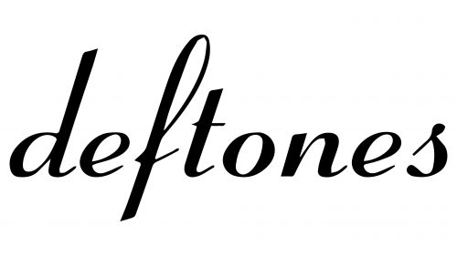
This logo first appeared on Adrenaline’s debut album cover, released in 1995. It contains just one word – the band’s name, neatly written in lowercase letters. The font imitates calligraphic handwriting with alternating thin and thick strokes. The elegant inscription contrasts with the heavy sound of the music, creating dissonance. However, it must be acknowledged that the songs also contain an eclectic mix: the band members skillfully combine tranquility, melody, anger, aggression, and anxiety. Thus, behind the neat cursive glyphs lies something more than just an attempt to make a good impression. Even the fact that all the letters are separated already suggests emerging chaos.
2006 – today
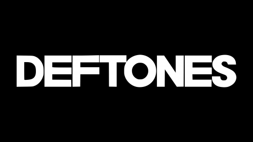
2006, the fifth studio album, Saturday Night Wrist, was released. On its cover, in the top left corner, was the barely noticeable inscription “DEFTONES,” which got lost against provocative images. This logo looks unremarkable, especially compared to the emblems of other metal bands. It’s impossible to tell the genre of music the musicians play, as the strict uppercase sans-serif letters are more fitting for a business style than an informal one.
Font and Colors
For Deftones, the blending of opposites is characteristic, evident in the group’s music and typography. The 1995 wordmark is radically different from the one that appeared in 2006. If one uses cursive, stylized as calligraphic handwriting, the other is based on bold grotesque. The colors, however, coincide: both inscriptions are painted black on a white background. This classic combination symbolizes the unity of opposites.

