The Digimon logo is explosive and cool. Elements of the emblem convey a sense of power and energy discharges. The sign creates an image of digital monsters existing as data packets within the network.
Digimon: Brand overview
Digimon is a computer creature from a virtual world, capable of transitioning into a parallel reality. The franchise includes digital toys, video games, films, and six anime series. Bandai Namco Holdings owns the world rights, Toei Animation produces the anime, and Saban Entertainment distributes the films outside Japan.
The history of Digimon began in 1997 when the Japanese company Bandai introduced a line of portable electronic toys called “Digital Monster.” These devices had a unique feature that set them apart from the popular Tamagotchi virtual pets—the ability to “battle” other devices using an infrared port. Players could care for, nurture, and train their virtual monsters for combat.
The success of these toys led to the rapid expansion of the franchise. 1998, Tenya Yabuno published the first Digital Monster manga, C’mon Digital Monster. Though brief, it laid the foundation for the future development of the universe.
The year 1999 marked a major turning point for the franchise. The first anime series, Digital Adventure, premiered in Japan on March 7. The show followed a group of kids transported to the Digital World, where they befriended virtual creatures. The anime quickly became popular and was broadcast in many countries, including the U.S., where it debuted on August 14 of that year.
Alongside the anime, the franchise’s video game line began to grow. Digital World, the first game in the series, was released for the PlayStation in 1999. Players could train their creatures, battle, and explore the Digital World. The game was well-received by critics and set the stage for future sequels.
In 2000, the first full-length animated movie, Digital Adventure: Our War Game!, was released and later included in the English-language Digital Movie. The film expanded the universe and introduced new characters and ideas.
The anime’s second season, Digital Adventure 02, aired in 2001. It introduced new characters while continuing the story of the original cast. Digital World 2 was released for the PlayStation that same year, offering a more complex role-playing system.
The anime series continued to expand in the following years, introducing fresh characters and worlds each new season. The third season, Digital Tamers (2001–2002), was notable for its darker tone and more complex storyline. Subsequent series included Digital Frontier (2002–2003) and Digital Data Squad (2006–2007).
The video game series also continued to evolve. Digital World 3 for PlayStation, released in 2002, and Digital World 4 for PlayStation 2, GameCube, and Xbox in 2005, introduced players to action role-playing gameplay.
In 2006, Bandai merged with Namco to form Bandai Namco Holdings, providing the franchise with more growth opportunities.
The sixth season of the anime, Digital Fusion, debuted in 2010, bringing the franchise back to its roots. The series introduced a new twist on the fusion concept, previously explored in earlier games.
In 2015, to celebrate the franchise’s 15th anniversary, a new film series called Digital Adventure tri. was announced. This series was a direct continuation of the original Digital Adventure and Digital Adventure 02. Between 2015 and 2018, six feature films were released, sparking nostalgia among fans and attracting new viewers.
In 2017, Digital Story: Cyber Sleuth – Hacker’s Memory was released for PlayStation 4 and PlayStation Vita. The game received praise for its gameplay and story.
The franchise’s 20th anniversary was celebrated in 2020 with the release of Digital Survive, a new game that blended tactical role-playing elements with visual novel storytelling across multiple platforms. That same year, a new anime series titled Digital Adventure was released, offering a modern retelling of the original series with updated visuals.
Digital Survive was finally released in 2022. It features tactical role-playing gameplay, graphic novel elements, and decision-making mechanics that shape the story.
Over the years, the Digital Monster franchise has continuously evolved, adapting to changing consumer preferences and technological advancements. From simple electronic toys to complex video games and anime series to full-length movies, the series remains one of the most beloved Japanese media franchises, captivating fans worldwide.
Meaning and History
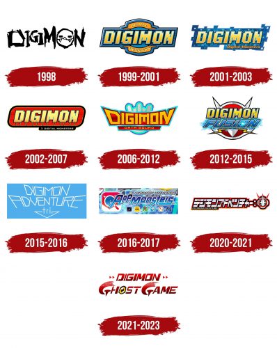
Despite the franchise’s start in 1997, the first logo appeared a year later, as the pets initially did not have a common label. The emblem surfaced in a video game when third-generation devices hit the shelves. These devices allowed players to connect consoles and engage in battles. Rebrandings are associated with releasing new tablet versions and anime series dedicated to toys. However, each emblem maintained a clear connection to the digital world in its design.
What is Digimon?
A franchise dedicated to a whole universe of digital monsters, about which many series, anime, games, cards, toys, and other items have been produced. It was conceived by Akiyoshi Hongo (a collective pseudonym of three-story creators: Aki Maita, Hiroshi Izawa, and Takeichi Hongo).
1998
Digimon World, a video game featuring digital pets, has hit the market. The first logo is executed in various-sized black letters as if painted on a wall in an alleyway. Paint runs down the characters, forming streaks on the elements. The letter ‘O’ is replaced by a monster’s face, which looks like an altered, malicious Pac-Man with fangs.
Pets were conceived as a Tamagotchi equivalent for men. Therefore, they were given a more aggressive appearance. In the game, monsters could be grown and then pitted against each other in battles. Hence the fangs and the black color.
The franchise’s name combines the initial syllables from “digital monsters”—Digi and Mon.
1999 – 2001
A short film about the pets was shot. In 1999, it was released in Japanese cinemas. After this, a whole series followed.
The logo of the period takes on a more computerized digital look. It has a thick blue border inside, a logo with the inscription on an orange background, Digital Monsters, and the name Digimon in large, tilted letters in the center.
The logo’s color and shape conveyed the toy’s appearance, which resembled a rectangular yellow-blue keychain on the screen on which pet growth occurred.
The letters of the inscription appear to be laid out of cubes, just as the monster consists of connected squares. The technique emphasizes the toy’s digital nature. The inscription’s tilt speaks to the franchise’s gradual development and dissemination.
2001 – 2003
The logo has a maximally digital look: a background fragment laid out of cubes, like Minecraft’s, with a similar yellow inscription Digimon. The emblem fully corresponds to digital reality.
The only element that connects the image with the real world is the usual small orange signature Digital Monsters, made with very smooth and clear letters. The message is intended for readers unaware of the franchise and helps to acquaint them with its meaning.
2002 – 2007
The new logo resembles a sign in a fight club. An oval elongated plaque, inside which, on a red background, the franchise name is displayed in yellow letters. Each letter is connected to wires through which electricity powers the glowing symbols. The wires also hint at data transmission.
Below, on a black background, on the right bottom, is an inscription about digital monsters. Before it, there is a cursor, demonstrating that the words are a console command.
The red color speaks of battles for which pets are grown and hints at the owner’s attachment to the creature.
Overall, the logo looks like a part of a game inside a computer.
2006 – 2012 (Digimon Data Squad)
2006, the fifth anime series was released, rebooting the franchise in Japan. A logo and the game Digimon World Data Squad were released for it. The emblem depicts a pet in the background. The picture resembles a button on a transformation remote, leading to the monster’s transition into a combat state.
In the foreground is the inscription Digimon Data Squad, done in the form of a crown. The diadem personifies the organization’s rule to balance the real and the digital world. Therefore, the first and last letters of the word in the title are highlighted, like two poles.
2012 – 2015 (Digimon Fusion)
Bandai Namco Holdings developed a series of events for the franchise’s 15th anniversary. In 2012, the video game Digimon World Re: Digitize and a card game appeared. The sixth anime series was released. The logo for the movie was updated.
The monster’s face is placed against the backdrop of the sign in a silvery frame. Its round face and eyebrows, from which lightning bolts emanate, are visible, hinting at their striking power. The familiar yellow digital-style title is placed on top, and below is the metallic Fusion in sparks, like a jolt of electricity. The “O” letter depicts a digital portal. The image shows leaps through space to different areas of the digital world, where Fusion squad fighters are looking for code crowns.
2015 – 2016 (Adventure tri.)
The new logo was developed for Digimon Adventure Tri, the third series about monsters, and the events took place in 2005. The logo is not similar to the previous ones.
The blue rectangular background resembles a computer screen. The words Digimon Adventure Tri are placed as if the viewer is looking at the screen from top to bottom. The words are in a thin white font made of polygonal letters. Below is an arrow.
The entire inscription and the arrow seem to draw the viewer into the screen, sweeping them into a whirlwind. The technique points to the teenagers’ transition into the digital world where the movie’s action takes place.
2016 – 2017 (Appmonsters)
The Digimon Universe App Monsters logo is dedicated to a series of manifestations of apps for phones and tablets infected with viruses.
The movie emblem is designed as an application icon next to the name of these monsters: Manifestations – App Monsters. Below the name are other icons. Connections run between them to show the mutual influence of apps on each other and the digital world.
The main images are placed on a background of battle snippets.
2020 – 2021 (Card game)
In 2020, the Digimon Adventure series was rebooted. The logo features the series’ name written on a red background as if by metallic plates. At the end of the characters is an image of a monster’s head dressed in combat gear. The emblem gives a feeling of a flash, a shock, symbolizing pet transformation and the clashes between the heroes.
2021 – 2023 (Digimon Ghost Game)
The “Digimon Ghost Game” logo is designed in an energetic and futuristic style that conveys the themes of the digital world and ghostly entities central to the anime’s storyline. The dominant red color in the design symbolizes the dynamism and tension characteristic of the series’ plot. The logo features two key elements: the word “DIGIMON” is rendered in a large font with sharp angles and a forward slant, emphasizing the speed and modernity of the digital world.
The word “GHOST” is stylized with the letter “O” replaced by an eye, adding an element of mystery and fear directly tied to interacting with otherworldly beings. It suggests that someone or something is watching. The letters “G” and “H” have a pixelated effect, symbolizing a disintegrating digital world or a transformation process. This adds a dynamic quality to the emblem and underscores its connection to the digital realm.
The stylistic choices in the visual design, such as the slanted font and pixel elements, reflect the rapid advancement of technology and the increasingly close integration of digital and real worlds, which was particularly relevant at the time of the series release. The choice of colors and the form of the letters create a sense of tension and uncertainty, perfectly aligning with the theme of “Ghost Game.”
Font and Colors
The main logo colors are red, blue, yellow, and white.
- Red represents battle, the clash of two energies, and the bond between humans and digital beings.
- Blue – refers to the computer, the digital world, logic, and schemes.
- Yellow – the color of the digital being, like a burst of energy and a packet of data.
- White is the color of the flash, embodying the heroes’ power and metal in the costumes.
The font of the characters is concise, with smooth rounding at the ends of the glyphs. This adds a positive tone to the monsters, making them seem more friendly and cute despite their formidable power.
