 Dillard’s Logo PNG
Department stores combine clothing, footwear, cosmetics, and home goods, offering a wide range of products for all types of shoppers. The store layout is designed to facilitate relaxed browsing and regular shopping. The Dillard’s logo is associated with a U.S. department store chain that sells everyday and seasonal goods.
William Thomas Dillard founded Dillard’s in February 1938 in Nashville, Arkansas. The first store, T.J. Dillard’s, succeeded because of affordable prices and partnerships with well-known brands. In 1948, the entrepreneur acquired the Wooten’s department store in Texarkana.
In 1961, Dillard created a subsidiary, Dillard Investment Company. This structure allowed the company to offer credit sales without using bank loans. In 1962, the company established itself in Little Rock by purchasing the Pfeifer department store. This opened the path to further regional growth. By 1968, the network included fifteen stores. In 1969, the company’s shares were listed on the American Stock Exchange.
In 1970, new shopping centers were opened. In 1971, the company acquired five Fedway stores, which were later renamed Dillard’s. By 1972, the network had twenty-two stores and was expanding its presence in the southern United States. In 1988, the company acquired the Selber Bros. chain, founded in 1907.
In 1990, Dillard’s acquired the J.B. Ivey & Company chain. In 1998, the largest deal was completed, through which the company bought Mercantile Stores. This expanded its operations to twenty-seven states. After the founder died in 2002, his son, William T. Dillard II, took over leadership. Under his leadership, the company restructured and remained a national retailer.
In the 2010s, Dillard’s focused on optimizing its network, updating stores, and developing online sales. In the 2020s, the company stabilized its operating performance and continued closing unprofitable locations.
The company updated its store format. It remains one of the largest department store retailers in the United States and maintains an active nationwide network.
Meaning and History
What is Dillard’s?
Dillard’s is an American department store chain headquartered in Little Rock, Arkansas. It operates about 270 retail locations and targets middle-class shoppers. The assortment includes clothing, footwear, cosmetics, accessories, and home goods, complemented by boutiques of well-known brands. The company operates primarily in the southeastern and central United States.
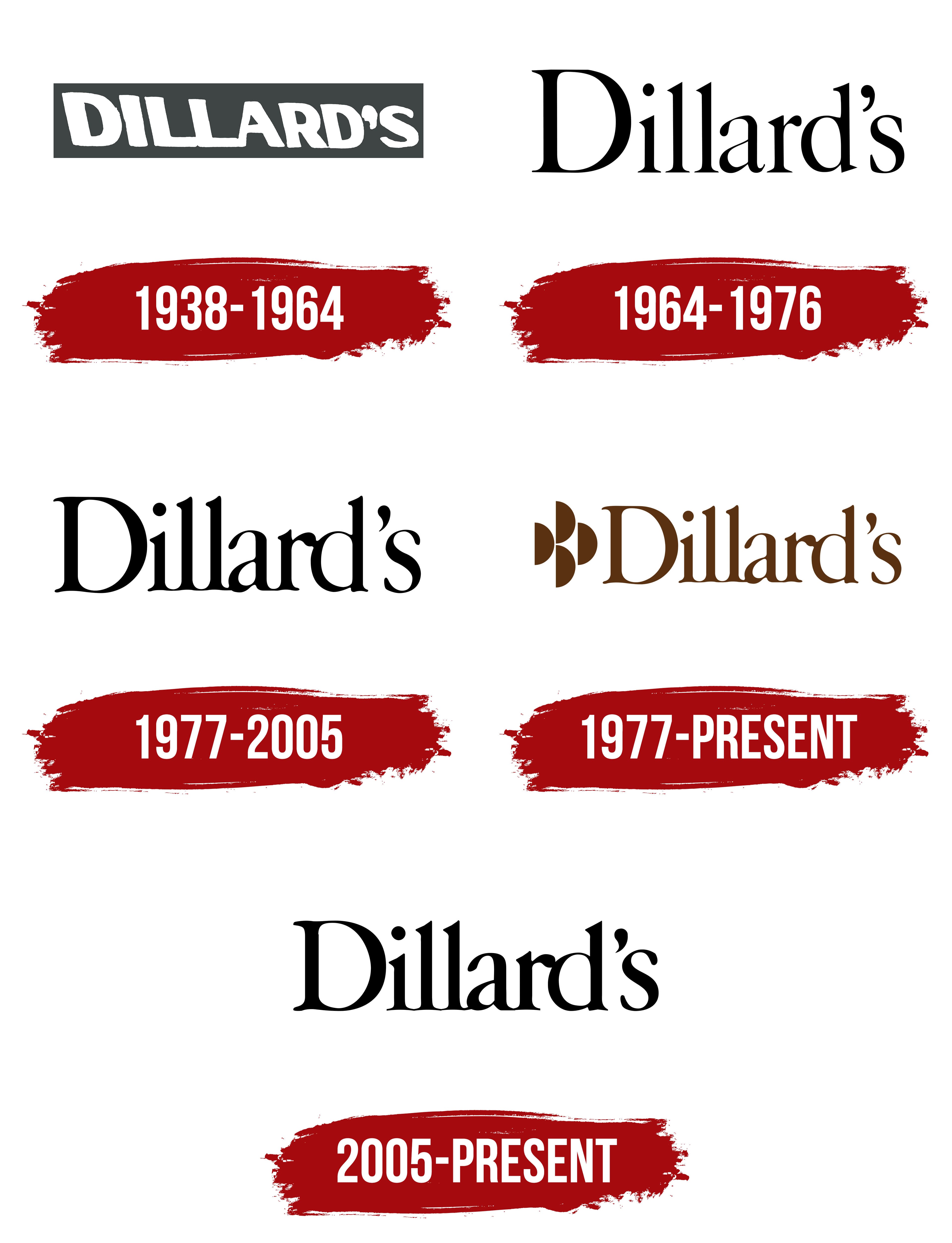
1938 – 1964
The Dillard’s logo began as a family surname on a storefront. That name later grew into an American department store chain selling clothing, shoes, cosmetics, accessories, and home goods. William Thomas Dillard opened his first store on February 12, 1938, in Nashville, Arkansas. He named it T. J. Dillard’s after his father’s store in nearby Mineral Springs. Local shoppers already knew the family name, which connected the new business to his father’s retail operation. Dillard’s later became the chain’s name. The apostrophe and “s” form the English possessive, a traditional naming convention for stores named after their founder.
The early logo appeared on the storefront sign. In a historic photograph of the first store, a dark gray rectangular panel stretches above the display windows, carrying white “DILLARD’S” lettering. The name uses large sans-serif capitals with narrow spacing. The strokes are thick and nearly uniform, though the letters vary in proportion. A slight slant and minor outline irregularities give the lettering a brush-painted appearance. Its size and the white-on-dark contrast make the name stand out. The elongated panel fits above the windows, letting the surname stretch across the facade.
As the business expanded, the family name appeared alongside the names of acquired department stores. In 1948, Dillard sold the Nashville store and bought an interest in Wooten’s in Texarkana. The store became Wooten & Dillard, combining its existing name with its new co-owner’s surname. Further acquisitions brought businesses into the chain that continued operating under local names, including Mayer & Schmidt, Brown-Dunkin, and Pfeifer-Blass. The company grew while its department stores retained different signs for several years.
The company transitioned to a shared name in the 1970s. In 1972, the company renamed the acquired Fedway stores Dillard’s. In 1974, the family name united department stores that had previously operated under regional names. The family name of an Arkansas store now appeared on department store facades throughout the chain.
1964 – 1976
A new Dillard’s logo appeared on the store at Austin’s Hancock Center, which opened on February 26, 1964. By then, William Dillard had acquired several department stores in Texas, Oklahoma, and Arkansas. Those purchases began with Mayer & Schmidt in Tyler, Texas, in 1956. The lettering on the Austin store differed from the chain’s early sign.
Instead of large capitals, the name appeared as “Dillard’s,” with an uppercase “D” followed by lowercase letters. The apostrophe before the “s” preserved the familiar possessive form. The change in capitalization accompanied a new lettering style. Heavy sans-serif letters gave way to thin serifs and contrasting stroke weights. Thick verticals combined with fine horizontals and connecting strokes. The letterforms incorporated features of transitional and modern serif typefaces. The letters sat close together, with small gaps between them.
The logo’s placement on the building also changed. The dark rectangular panel was removed, and black letters were mounted on the light-colored facade. This reversed the earlier arrangement of white lettering on a dark panel. The department store wall became the background, while fine serifs and stroke-weight variations defined the sign’s appearance.
1977 – today
Alongside the standalone Dillard’s wordmark, a version appeared with the “4-D” emblem to the left. The combined design had been used since October 1, 1976, with March 25, 1977, listed as its launch date. The name remained the primary part of the logo, while the added emblem repeated the surname’s initial in geometric form.
Four identical solid semicircles formed the emblem. Each had a straight vertical left edge and a curved right edge, resembling a simplified “D.” Two semicircles were stacked vertically. The other two sat at mid-height on either side of that pair. Narrow, light gaps separated the shapes, bringing four repetitions of the letter into a compact group.
To the right, “Dillard’s” appeared in Amsterdamer Garamont. A capital “D” was followed by tightly spaced lowercase letters. Serifs combined with smooth transitions between thick and thin strokes. In the brown version, a shared color united the name and emblem. The trademark registration also used brown, although protection extended to the design in any color.
Beginning in the 1990s, the “4-D” emblem appeared less frequently. It remained on delivery vehicles, price tags, and certain types of packaging.
1977 – 2005
The next Dillard’s logo retained the existing letterforms. The update focused on spacing and color. Narrower gaps brought neighboring letters closer together, tightening the wordmark. The lower serifs nearly met, making the name more compact. The letter shapes remained unchanged.
Black replaced brown. The logo still consisted entirely of the Dillard’s name. The rest of the design remained intact, with revisions limited to color and letter spacing.
2005 – today
In the August 19, 2005 logo version, Dillard’s returned to a wordmark-only design. The surname retained its Amsterdam Garamond-based lettering, large capital “D,” and tight spacing. The changes affected the wordmark’s height, the contours of certain letters, and where they joined. The letters became slightly shorter, and some vector lines became rougher. The remaining features carried over from the previous design.
Black lettering on a light background became the primary version. A white version appeared on dark backgrounds, including the cover of Dillard’s 2018 annual report. The back cover reproduced the name in gray.
In 2006, Condé Nast Media Group added the phrase “The Style of Your Life” to the name. The tagline accompanied a new brand positioning focused on contemporary fashion and a more upscale merchandise assortment. Its message connected shoppers’ personal preferences to choosing clothing for different occasions.
In the logo, the phrase occupied a second line beneath Dillard’s and ended with a period. It used a much smaller serif typeface than the main wordmark. “The Style of Your Life” retained conventional uppercase and lowercase lettering. The lower line had wider spacing than the tightly set surname, helping distinguish the store name from its customer message.