![]() Dove Chocolate Logo PNG
Dove Chocolate Logo PNG
The Dove Chocolate logo conveys the premium, refined nature of the chocolate brand. Its concise and elegant design highlights the product’s quality and appeal to consumers who appreciate rich flavors.
The history of Dove chocolate began in 1939 in Chicago when Leo Stefanos, a Greek-American, opened the Dove Candies & Ice Cream store. In 1956, he created the DOVEBAR, an ice cream bar covered in thick chocolate, motivated by his concern for children’s safety when chasing after ice cream trucks. This dessert remained a local favorite in Chicago for a long time.
In 1977, Leo’s son Mike took over the business and expanded the brand nationally. The turning point came in 1984 when DOVEBAR gained recognition at the Fancy Foods Show, becoming widely popular across America. In 1986, the brand was acquired by the international corporation Mars, which enabled its global expansion.
In 1991, Mars introduced Dove chocolate bars and the Dove Promises line with inspirational messages inside the wrappers. Mars actively expanded Dove’s offerings, adding dark chocolate and fruit-and-nut candies. In 2012, Dove launched Dove Fruit, dark chocolate with dried berries.
In recent years, Dove has supported sustainability initiatives alongside CARE, assisting women farmers in Côte d’Ivoire. Today, Dove, owned by Mars, remains a global leader in premium chocolate, comparable to Nestlé and Lindt.
Meaning and History
![]()
What is Dove Chocolate?
It is a premium chocolate brand known for smooth texture and rich taste, created by a Greek-American entrepreneur. Initially, the brand produced a chocolate coating for ice cream bars. Marketed as an everyday indulgence, the candy comes with wrappers featuring inspirational messages.
1939 – 1956
![]()
In 1939, entrepreneur Leo Stefanos founded the store “Dove Candies & Ice Cream” in Chicago. Seventeen years later, Dove Bar ice cream was introduced to the product lineup, marking a new stage in the development of the brand’s visual identity. At that time, the store’s sign featured a distinctive calligraphic inscription: “Dove,” designed in the style of American commercial typography of the 1930s and 40s.
The composition relied on smooth, rounded outlines with emphasis on decorative stroke treatments. The first letter, “D,” was larger than the others, designed with a prominent loop and elongated vertical stroke that set the rhythm for the entire inscription. The letter “o” had a closed shape with a gentle curve, and the letters “v” and “e” continued the overall styling, maintaining consistent proportions in stroke thickness and height. Curved serifs and smooth stroke transitions created an expressive yet legible form.
Originally, the typeface had a handcrafted quality typical of signs and storefront lettering found in small artisan and confectionery shops. Lines of varying thickness, alternating between soft and firmer strokes, created a friendly and welcoming impression. It was perceived as a mark of a brand oriented toward warm, home-style customer communication.
The color scheme at the time ranged from golden-cream to rich brown tones, suitable for chocolate- and confectionery-related products.
1956 – 2003
![]()
Following the introduction of Dove Bar ice cream in 1956, the brand adopted a new logo that reflected its name and symbolic content. The design was developed in line with Leo Stefanos’s vision for the brand’s character and premium presentation. The logo appeared on dessert packaging, promotional materials, and marketing merchandise, accompanying Dove Bars as they entered the market.
The word “Dove” was executed in bold, stylized lettering outlined in black. The letter “D” was designed with a smooth curve, giving the structure an elegant silhouette that distinguished it from the remaining letters. The letter “o,” featuring the silhouette of a flying dove with an olive branch in its beak, added thematic emphasis associated with peace and purity. The dove’s lines were integrated into the letter shape, preserving readability while creating a symbolic visual impression.
Typography was based on a slab-serif typeface model, yet it included decorative curves, lending expressiveness and individuality to the words. The word “Chocolate,” placed beneath the main wordmark, was designed in a more reserved, classic typeface, clearly indicating the product category. The contrast between the decorative main word and the functional subline establishes a clear visual hierarchy.
The original palette was monochromatic, which enhanced its versatility. When needed, the composition could be inverted or used as a monochrome icon without text.
The image of a dove with a branch reinforced the brand’s emotional appeal, communicating values resonant with audiences of the time and highlighting associations with sophistication and quality.
2003 – 2013
![]()
In 2003, the brand introduced a redesigned emblem, marking the first change to its visual concept in nearly half a century. The new version retained the name “Dove” and the mention of “Chocolate,” but shifted its stylistic emphasis toward imitating flowing chocolate. This effect was achieved through volumetric modeling of forms and precise detailing of highlights and shadows, creating the impression of a viscous, glossy surface.
The composition featured the word “Dove,” executed in a custom-designed script typeface. The outlines were smooth, with rounded and elongated elements creating the illusion of liquid flow. The initial letter “D” had a wide, expressive curve, setting the rhythm for the whole design. At the bottom of the composition, two small chocolate droplets transitioned into a long, elongated stroke, emphasizing dynamic movement and completeness.
Typography was custom-made without reference to existing typefaces. Glyph structures were sans-serif, reinforcing a soft impression. Stroke connections were smooth, with no sharp transitions, emphasizing fluid forms. Letter spacing was arranged so that letters flowed into one another, reinforcing the association with liquid chocolate.
The color palette was built around warm brown tones with gradients. The contrast between highlights and shadows created a sense of volume, visually approximating the lettering to real chocolate. Collectively, this strengthened the association with a premium product and conveyed to the audience a feeling of silky, velvety texture.
2013 – today
![]()
In 2013, the brand introduced an updated version of its logo, building upon the image established after the previous redesign. Keeping the concept of imitating flowing chocolate, the new version became more sophisticated through refined outlines and more intricate calligraphy. The letterforms acquired greater fluidity, while the loops in the “D” and “e” gained additional dynamism, enhancing the handcrafted, artistically detailed impression.
The word “Dove” was executed in a custom script, with each line conveying the soft, stretchy texture of chocolate. Flexible curves and balanced glyph proportions create a sense of movement. At the same time, glossy highlights and rich color transitions add depth and volume. Beneath the main inscription is the word “Chocolate,” executed in a clear sans-serif typeface. It serves as a functional descriptor, clarifying the product category and visually balancing the upper calligraphic element.
The color palette is based on rich chocolate-brown shades with soft gradients and light accents. The contrast between highlights and shadows convincingly suggests a viscous surface characteristic of high-quality chocolate.
In the composition, letters flow smoothly into one another, without sharp angles or interruptions, creating the impression of continuous motion. The ends of the strokes are elongated and tapered, resembling thin ribbons freshly formed from liquid chocolate.
The symbolism of this design evokes images of luxury, velvety textures, and the pleasure of tasting chocolate.
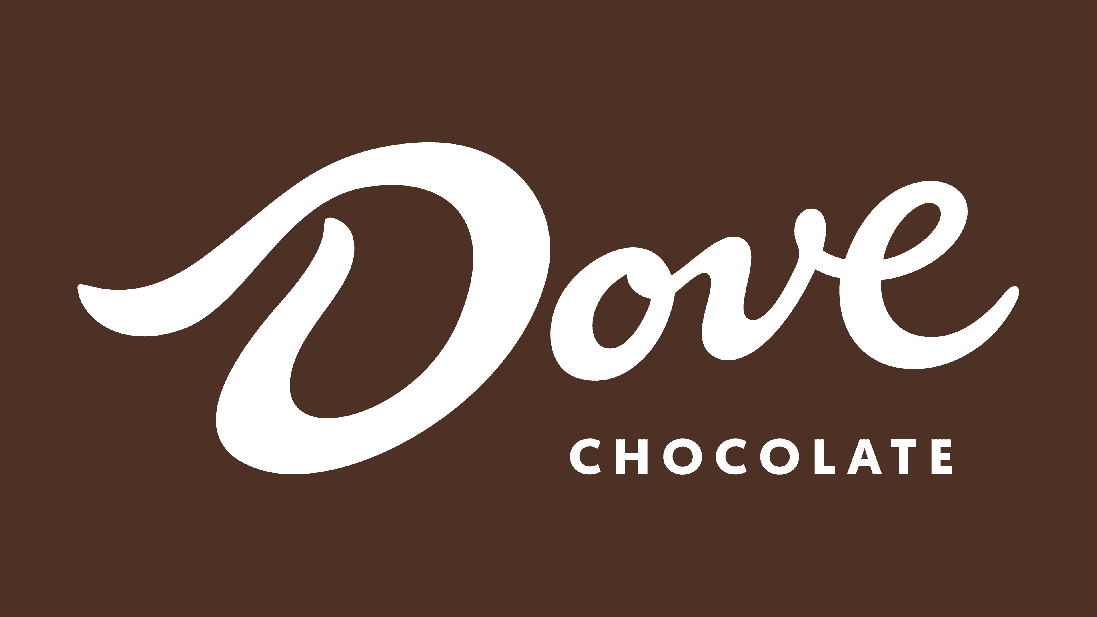
2021 – today
![]()
In 2021, the Dove brand, also known as Galaxy in certain markets, introduced an updated visual identity designed to strengthen its global presence and enhance recognition. The core concept centered around the idea of “perceived smoothness,” a quality intended to be communicated through a concise yet expressive visual presentation.
This version moved away from highlights, gradients, and complex shading characteristic of the three-dimensional logos of previous years. The word “Dove” retained the same calligraphic styling as in the three-dimensional version. Still, it was converted to a flat, monochromatic format. The letterforms remained smooth and flowing, with elongated strokes and gentle curves evoking a ribbon of chocolate. Beneath it, the word “Chocolate” is set in straight, geometric forms.
The color palette is limited to a warm, rich brown shade associated with chocolate.
Symbolically, moving away from complex textural imitations toward minimalist styling emphasizes clean shapes and contemporary aesthetics. The logo retained recognizable characteristics while becoming more adaptable.