


 Planters Logo PNG
The Planters logo evokes crunchy roasted nuts that you immediately want to try. Every emblem element reflects the quality and memorable taste of this satisfying treat. The logo emphasizes the snack’s versatility, as it contains essential nutrients and is a complete alternative to other snacks.
Planters began in 1906, when Italian immigrant Amedeo Obici sold roasted peanuts from a street cart in Wilkes-Barre, Pennsylvania. In 1908, he joined Mario Peruzzi to form Planters Nut and Chocolate Company, giving the business a larger production base and access to nearby markets. In 1913, the company opened a processing plant in Suffolk, Virginia, a city later known as the “Peanut Capital of the World.”
In 1916, Planters introduced Mr. Peanut after schoolboy Antonio Gentile won a logo contest with an anthropomorphic peanut. A professional artist refined the figure with a cane, top hat, and monocle, turning it into the brand’s main symbol. During the 1920s, the company added other nuts, candy, and gum. That broader range helped Planters remain active through the Great Depression.
In the 1950s, television advertising made Mr. Peanut more familiar to American consumers. At the same time, exports to Europe and Canada expanded the brand outside the United States. In 1961, Planters released roasted peanuts, which became one of its best-known products. Corporate ownership changed later, including links to Nabisco and then Kraft Foods after the 2000 acquisition.
The 2010s brought new marketing and product lines, including Robert Downey Jr. voicing Mr. Peanut in 2010, “Naturally Remarkable” in 2011, a 2016 mascot redesign, NUT-rition, and flavored peanuts in 2018. Kraft Heinz announced plans to sell the brand in 2019. In 2020, Mr. Peanut was “killed” and reborn as Baby Nut in a Super Bowl campaign. Hormel Foods bought Planters in 2021 for $3.35 billion, then added Planters Protein, updated packaging, regional flavors, and the Craft line in 2023.
Meaning and History
What is Planters?
It is an American snack brand known for its wide range of nuts and nut-based products. The company’s mascot, Mr. Peanut, a dapper anthropomorphic peanut wearing a hat, monocle, and cane, has become widely recognizable in American advertising. The company offers a wide range of products, including peanuts, cashews, almonds, pistachios, and mixed nuts, in various flavors and formulations, such as roasted, salted, and flavored varieties. The brand has expanded beyond traditional nuts to include peanut butter, blends, nut bars, and other snacking products. The company has also adapted to changing consumer preferences by offering lower-sodium products and a more diverse range of flavors. With its long-standing presence in the U.S. snack market, the company has become a trusted brand for nut and snack lovers.
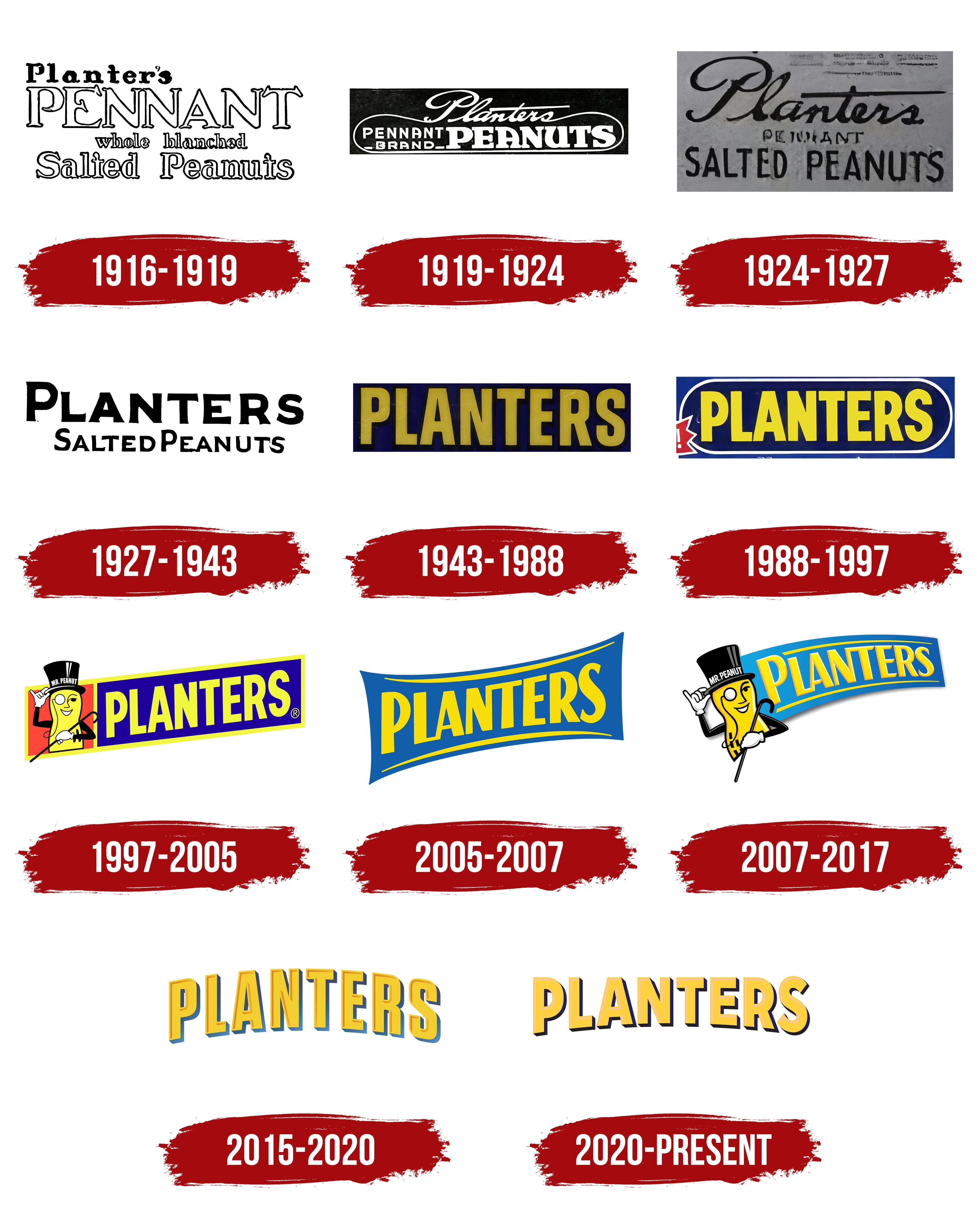
1916 – 1919
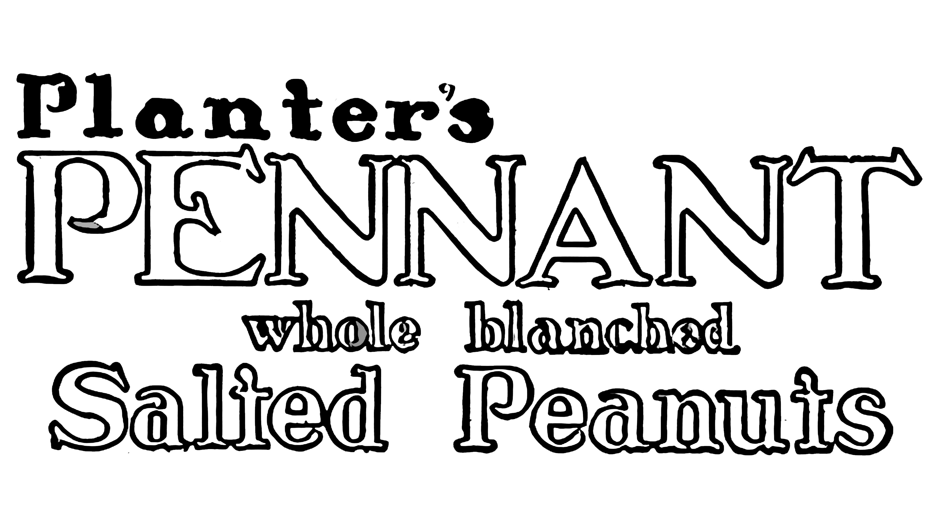
By the time this logo was introduced, the brand had been on the market for over ten years, and the company developed the identity after opening its factory. The emblem featured text that clearly explained what the brand offered customers. The first logo displayed the brand name “Planters” as a pennant. The company’s name was bold and the largest element on the emblem, emphasizing its market leadership and association with quality peanuts.
Below the name was a statement explaining that the product had undergone blanching, a special method of removing the skin using steam. This message highlighted the convenience for customers, who no longer needed to shell the peanuts themselves.
At the bottom of the logo, the words “salted peanuts” were prominently displayed, clearly indicating the product type. Most of the text used a black outline and a white interior, symbolizing the peanut’s roasted, golden-brown exterior and white core.
1919 – 1924
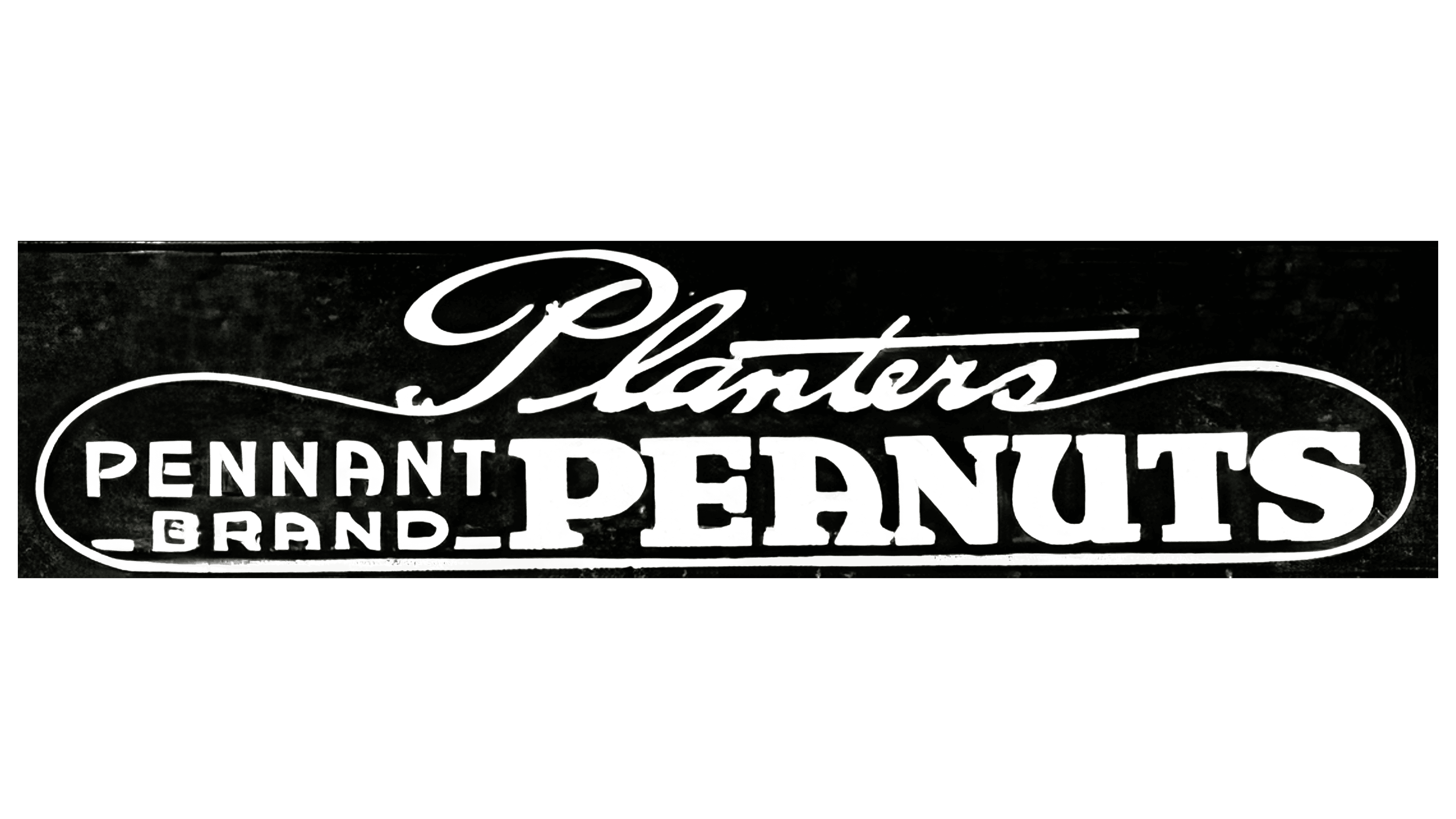
The logo appears elegant and balanced, though its style is disconnected from the food product theme. The rebranding aimed to give the snacks, often sold from street carts, a more refined, cultured appearance that could attract customers from diverse social backgrounds.
The new emblem focuses on the primary product, peanuts. The word “peanuts” is bolded to draw immediate attention. To the left, the phrase “pennant brand” is added in thin letters, interpreted as a mark of excellence, a champion brand.
The brand name, written in ornate script, is placed at the top of the emblem. The ends of the letters frame the rest of the logo, creating a border resembling a peanut’s shape. The black background lends the logo sophistication and emphasizes its association with a roasted product.
1924 – 1927
The emblem once again shifted the focus to the brand. The name “Planters” is set in a large font, standing out from the rest of the composition and drawing primary attention. The long horizontal stroke of the letter “t,” resembling a pen flourish, adds elegance to the logo. Below it, the word “pennant” appears in a smaller font, smoothly transitioning into a larger explanation of the package’s contents: “salted peanuts.” This design emphasizes the brand and indicates the product inside the package.
1927 – 1943
The logo became more concise and straightforward. The word “pennant,” which was neither part of the brand nor the company name, was removed from the emblem, making the design cleaner and more focused. The font was unified, giving the logo a more cohesive look. The “Planters” brand is now highlighted in large letters, while the descriptive text “salted peanuts” has been reduced in size, emphasizing the brand and making the logo more modern and appealing.
1943 – 1988
Color and simplicity became the new logo’s defining features. The yellow letters evoke the golden, roasted sides of peanuts, adding warmth and appetite appeal. The bold and large characters highlight the brand’s popularity and significant market share. The dark blue background complements the text, symbolizing the brand’s expertise and emphasizing its long history and reliability.
1988 – 1997
The name was placed inside a capsule with a white outline, visually resembling an elongated peanut kernel. This design choice emphasized the whole nuts in the packaging, strengthening the association with the product and enhancing the logo’s appeal and recognizability.
1997 – 2005
In 1997, the company made significant efforts to refresh the brand’s image. The company updated the slogan, logo style, and mascot. The slogan “Relax. Go Nuts.” was introduced, along with Mr. Peanut, a character schoolboy Antonio Gentile created early in the brand’s history.
The friendly gentleman, Peanut, wearing a top hat and monocle and carrying a cane, peeked out from the left side of the emblem. His constant smile and welcoming demeanor created a warm connection with customers. The early-20th-century image of Mr. Peanut emphasized the company’s longevity and traditions.
In the modern emblem, Mr. Peanut became a symbol of the brand’s long-standing presence, signifying the snack’s quality and versatility in any setting. The red background of the window hinted at roasting in a hot oven, evoking associations with the preparation process. On the right, against a rising blue background, the brand name appeared in yellow text, its upward angle symbolizing prosperity, success, and the company’s continual growth.
A yellow outline tied all background elements together, giving the logo a cheerful, welcoming appearance well suited to engaging consumers.
2005 – 2007
The butterfly-shaped background curve gave the logo a more cartoonish, dynamic look, even without the mascot. The yellow lines above and below the text symbolize premium, large nuts, making the logo resemble treat packaging. The lighter, brighter blue looked much more delicious than the deep, dark shades used previously. This design restored elegance to the logo and improved its appeal compared to the previous emblem’s straight lines.
2007 – 2017
The mascot was integrated with the previous text, changing the logo’s overall appearance. The logo lost its smooth concave lines but gained a sense of perspective. It now gives the impression that the logo starts near the viewer and recedes into the distance, gradually shrinking in size at the far end. In the foreground, at the edge, stands the friendly Mr. Peanut, inviting people to try the brand’s products.
2015 – 2020
In 2015, when the parent company became Kraft Heinz, the emblem was redesigned in a minimalist style. The yellow text, with letter edges shaped like borders, is arched, adding dynamism to the logo. The absence of a background and illustrations shifted the focus entirely to the brand name. This minimalist approach highlighted the company’s longstanding commitment to consumer well-being and its dedication to offering new, high-quality products. Under Kraft Heinz’s management, the brand will continue to thrive, preserving beloved snacks and flavors. The new logo conveyed this message.
2020 – today
In 2020, the logo was updated to feel as modern as possible in preparation for the sale of its nut brands, which was announced a year later.
Roasted nuts remain a favorite snack for many Americans, and the new Planters logo conveys this message, along with Kraft Heinz’s new ownership. It is bright and contemporary, highlighting the brand’s quality, taste, and reliability. The logo continues to uphold the brand’s image as a leader in the nut market, symbolizing not only satisfaction but also the pleasure the product brings to consumers.
The Planters brand icon, updated in 2020, became more modern and confident. It now features bright, bold, three-dimensional letters in a rich yellow color with black sides. This color combination creates a strong contrast, symbolizing the brand’s stability and confidence in the market.
The letters’ three-dimensional form gives the emblem depth and a sense of stability. It looks as if it stands on a solid foundation, signifying the product’s durability and reliability. The emblem’s enlarged first and last letters emphasize the brand’s consistent quality from its inception to the present day. This approach highlights the brand’s long history and traditions, which have helped it maintain its position for many decades.
The logo also conveys an important message about the product’s heartiness. Its bold, robust design suggests that one package of Planters nuts is enough to satisfy hunger without additional supplements. This reflects the brand’s core message: everything needed for a delicious and nutritious snack is already inside the package.