


![]() Dr. Brandt Logo PNG
Dr. Brandt Logo PNG
Scientific knowledge is at the forefront of the company. It is based on them that the brand can fight aging and skin problems. Dr. Brandt’s logo represents the company’s products as a light in the dark, shining for those who need it.
Fredric Sheldon Brandt was born on June 26, 1949, in Newark, New Jersey. After graduating from Rutgers in 1971, he earned a medical degree from Hahnemann Medical College and trained at New York University. He specialized in dermatology at the University of Miami. Early work at Sloan-Kettering focused on how ingredients such as green tea and vitamins A and C affect the skin at a cellular level.
In 1980, he opened a dermatology practice in Miami. Brandt began using botulinum toxin and fillers at a time when many doctors avoided them. He later took part in clinical studies that contributed to FDA approvals. Media outlets such as W referred to him as the “Baron of Botox”.
His client list included figures like Madonna, Gwyneth Paltrow, and Naomi Campbell. Visits became routine for high-profile clients, comparable to those at clinics like Perricone or SkinCeuticals. However, Brandt combined injections with broader skincare routines.
In 1995, he launched Dr. Brandt Skincare to maintain results between procedures. The first product, a microdermabrasion scrub with aluminum oxide, was marketed as “prescription strength without a prescription” and gained traction among editors and clinic clients.
In 1998, he opened a second practice in New York on East 34th Street. Under CEO Stéphane Colliot, the brand expanded internationally, entering Europe in 2005. Brandt hosted a SiriusXM show and published “10 Minutes/10 Years” in 2007.
Brandt died on April 5, 2015, at age 65. His team established the Dr. Brandt Foundation the same year. In 2023, the brand rebranded as Dr. Brandt Integrative Dermatology, updating its product structure while retaining the original approach.
Meaning and History
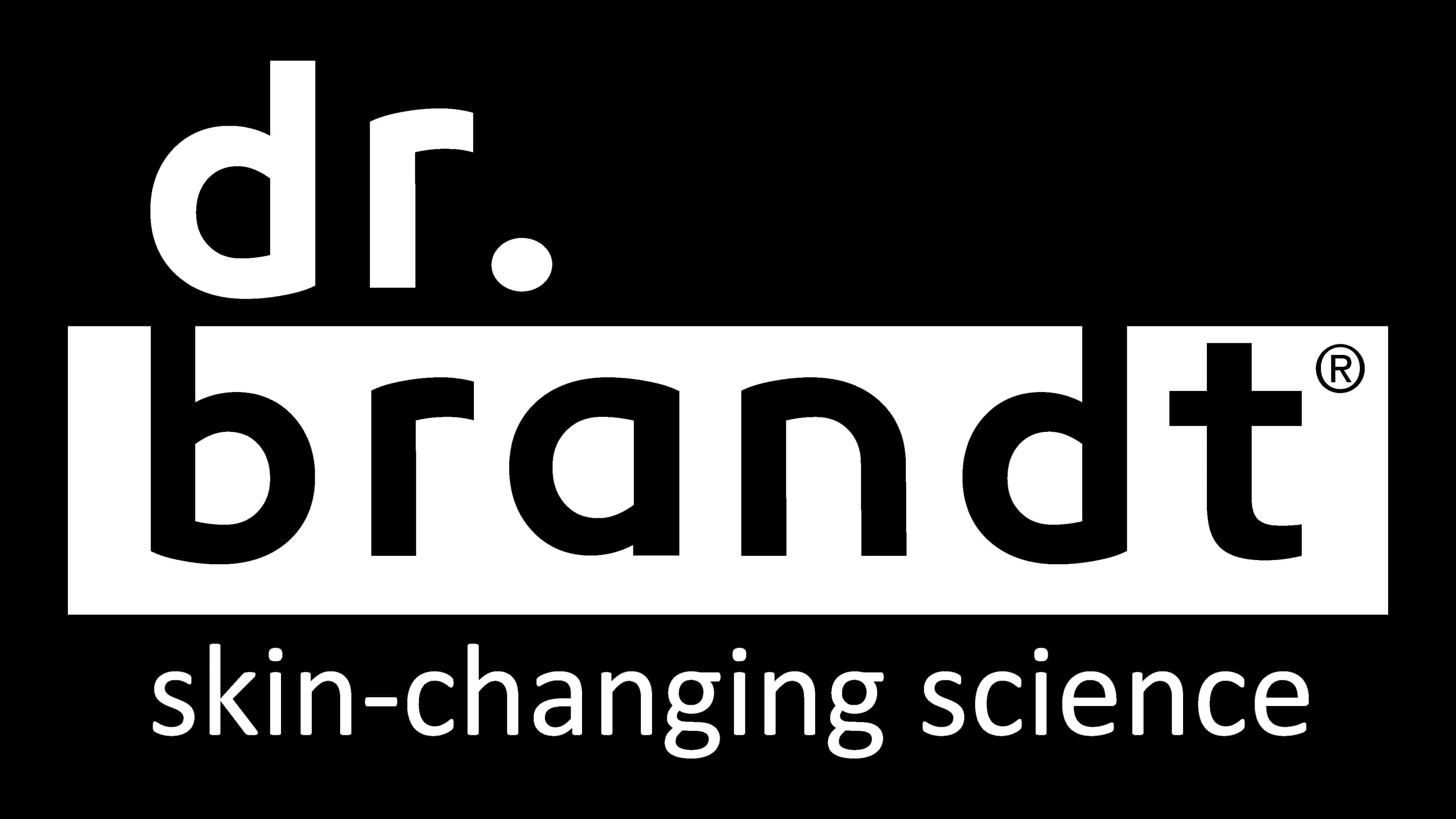
The brand’s logo is truly individual; it reflects the extraordinary personality of the founder. For this, the developers have made a three-level logo that reads from top to bottom. They used the slogan to make it as informative as possible. In general, throughout its existence, the company had only one logo.
The brand’s identification mark consists of three lines. At the top is the abbreviated word “dr.” In the middle, “Brandt” at the bottom, “skin-changing science.” The most important of them is the central inscription. It is highlighted in stark contrast: white letters on a black field. The opposite holds for the other two elements: the background is white, and the signs are black. Due to this visual technique, the logo appears striped: the first and third lines are light, and the second is dark. The tops of the legs “b” and “d” extend out of the field and connect to the adjacent background.
What is Dr. Brandt?
Dr. Brandt is a brand of innovative cosmetics for facial and body skincare. It was founded by Dr. Fredric Sheldon Brandt, who made significant changes in the beauty industry by first applying non-surgical rejuvenation injections and Botox. As a result of his experiments with natural compositions, the company was established in 1995, offering products based on two types of vitamins (C and A) and green tea.
Font and Colors

Two types of typefaces are used in the emblem: one hand-drawn (individual) and the other printed (traditional). The name is executed in wide, streamlined characters. The logo’s slogan is set in a classic, thin sans serif typeface: Monochrome, a combination of black and white.