The DTAC logo symbolizes movement and development, reflecting the company’s commitment to innovation in the telecommunications industry. The emblem’s smooth lines convey the idea of ease and freedom of communication, creating an association with unhindered access to the digital world and providing high-quality communications and the Internet.
DTAC: Brand overview
DTAC (Total Access Communication Company Limited) was founded in August 1989 as a joint venture between Thailand’s Bencharongkul Group and Norwegian telecom provider Telenor. The company aimed to develop mobile communications in Thailand, which was just beginning to embrace this technology.
In 1991, the organization received a concession from the Communications Authority of Thailand (CAT) to offer cellular services in the 800 MHz frequency range. This was a crucial step in its history, allowing the company to build a nationwide mobile network.
A major milestone came in 1994 when the company launched Thailand’s first GSM network, introducing services like SMS and enhanced communication options to its customers.
In 1995, the company introduced prepaid mobile services, making mobile communication more accessible to the public, which led to rapid growth in the company’s subscriber base.
The business went public in 1997, listing its shares on the Stock Exchange of Thailand. This initial public offering helped raise funds to expand its network and solidified its standing in the market.
The organization entered the mobile Internet sector in 2000 with the launch of its first website, marking the beginning of its expansion into online services for customers.
In 2002, CAT granted the company an additional concession to use the 1800 MHz frequency, further expanding its network and improving service quality.
The launch of the EDGE service in 2005 provided faster mobile Internet, opening new opportunities for mobile applications and services.
In 2007, the brand underwent rebranding, introducing the “Feel Good” slogan and a new logo, symbolizing its commitment to delivering a positive customer experience.
A significant technological leap occurred in 2009 when the 3G network on the 850 MHz spectrum was launched, allowing for faster data speeds and new multimedia services.
In 2010, Telenor increased its ownership stake to 42.6%, becoming its largest shareholder and solidifying its global development strategy.
In 2012, the first flagship store opened in Bangkok as part of efforts to improve customer service and strengthen the brand.
The company secured a license in 2013 to operate its 3G network on the 2100 MHz spectrum, significantly expanding high-speed mobile Internet coverage across Thailand. In 2014, it launched the 4G LTE network, starting in Bangkok and expanding to other major cities, offering customers even faster data speeds.
2015 marked the shift towards digital transformation, with new mobile apps for service management and a focus on digital customer support.
In 2016, the company launched “dtac accelerate,” a startup accelerator program to support innovative tech projects. This initiative played a key role in fostering Thailand’s digital innovation ecosystem.
In 2018, the organization secured a new 15-year license for the 1800 MHz spectrum, ensuring the long-term future of its 4G network.
A new license for the 700 MHz spectrum was granted in 2019, allowing the company to expand network coverage, especially in rural areas.
In 2020, active testing and rolling out of the 5G network began, preparing for the next generation of mobile technology.
By 2021, the 5G network coverage will expand in major cities across Thailand, focusing on developing new applications and digital services leveraging 5G technology.
In 2022, discussions of a potential merger between the company and True Corporation, another major Thai telecom provider, garnered significant attention from regulators and the market, with the potential to reshape the Thai telecom industry.
By 2023, the company remained one of Thailand’s leading mobile service providers, continuously expanding its digital services and 5G network. Focusing on innovation and improving customer experience helped it stay competitive in a rapidly changing market.
The organization has evolved from a small joint venture into one of Thailand’s largest telecom providers. The company’s ability to adapt to changing consumer needs and technological advancements has played a significant role in the growth of Thailand’s digital economy.
Meaning and History
What is DTAC?
It is one of the leading telecommunications service providers in Thailand. The company offers millions of users various services, such as voice, data, and digital solutions. It operates an extensive network infrastructure and provides high-speed internet, various value-added services, and prepaid and postpaid mobile plans.
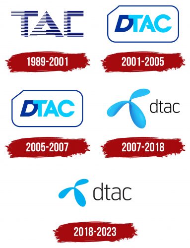
1989 – 2001
2001 – 2005
2005 – 2007
2007 – 2018
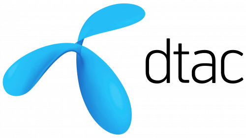
The company logo consists of three smooth, streamlined elements that resemble petals or drops of water, twisted at the center. These three shapes symbolize flexibility and fluidity, emphasizing the company’s ability to adapt to changes and offer modern communication solutions. The design is associated with technology and modernity while also conveying a sense of lightness and friendliness. These forms create a feeling of dynamism, highlighting the company’s innovative approach.
The blue color of the petals, with a gradient from light to a deeper tone, creates a sense of depth, adding dimension to the entire logo. This hints at the layered complexity of the technology that remains invisible to the user, as it appears simple and intuitive. Blue is often associated with reliability and calmness, fostering trust in the brand. It’s important to note that when the company updated its logo, blue became a commonly used color in IT companies, emphasizing their focus on the future and technology.
The font is designed in a simple, clean, sans-serif style, emphasizing minimalism and accessibility. The logo quietly communicates that the company is open, easy to use, and cares for its customers. Lowercase letters enhance this effect, giving the emblem an additional sense of groundedness and approachability.
2018 – 2023
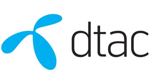
The emblem still consists of three blue petals connected at the center. These elements, resembling drops of water, create a sense of dynamism and lightness. In the past, a gradient was used to add depth and dimension to these petals, but in this version of the logo, the company opted to remove that effect, leaving a solid color fill. This decision reflects a trend toward simplification that has become popular in design.
The petals symbolize connection and movement—key aspects of the company’s operations. Each element seems to point in different directions, symbolizing expansion, growth, and forward movement. They also resemble a figure, giving the logo a friendly, “alive” appearance. This creates an association with the user, who remains the company’s central focus.
The blue color emphasizes the reliability of the brand’s services. The shift from gradient to solid fill represents the company’s commitment to simplicity and clarity, conveying that its technologies are easy to use.
