![]() Electronic Arts Logo PNG
Electronic Arts Logo PNG
Computer games from the American company Electronic Arts occupy a significant place in the libraries of many gamers worldwide. EA’s logo consists of a monogram of the name, symbolizing the brand’s international direction and the company’s commitment to modern technologies.
EA (Electronic Arts): Brand overview
EA is an acronym for Electronic Arts Corporation, a company that develops and distributes video games. It was founded in 1982 by American entrepreneur William Murray Hawkins III, also known as Trip Hawkins.
Meaning and History
![]()
The company’s corporate style has changed throughout its history. Designers have variously denoted the name Electronic Arts, encrypting it in abstract symbols or using standard fonts for its writing.
What is EA (Electronic Arts)?
EA (Electronic Arts) is a corporation that develops the computer game industry. Initially, it was only a publisher, but later became a developer. Its main brand is also called EA. It is known for games like The Sims, Need for Speed, Dragon Age, and FIFA.
1982 – 2000
![]()
The original logo was created with the help of graphic designer Barry Deutsch from Steinhilber Deutsch & Gard. The composition contained a gray inscription “ELECTRONIC ARTS” and three geometric shapes: a tetrahedron, sphere, and cube, consisting of blue stripes. While the meaning of the polyhedra was clear – they denoted the letters “E” and “A,” the origin of the sphere raised many questions.
One theory suggests that it’s the middle “O” from the word “electronic,” thus the image could be interpreted as “EOA.” Other theories propose that the sphere symbolizes a yo-yo, as keychains similar to the printed logo were often found in the offices of Electronic Arts. Additionally, yo-yos appeared on the screen during game loading. Another unofficial theory is that the spherical element represents the globe, indicating the company’s global connections.
Mystifiers believe that the sphere appeared by accident. In their opinion, it’s an error in the computer program, which automatically added an additional geometric figure to the cube and tetrahedron. However, this combination became quite popular and recognizable. Initially, the trademark appeared only on promotional products. Later, Bing Gordon and Nancy Fong began applying it to game packaging.
1993 – 1997
![]()
A redesign of the corporate style led to the creation of an entirely new logo. Designers depicted the inscription “ELECTRONIC ARTS,” replacing the letters “E,” “O,” and “A” with a square, circle, and triangle, so all questions about the origin of the sphere were removed. The font noticeably changed: it became similar to a stencil, with short interrupted lines. The color palette also changed: artists used more contrasting combinations of shades, replacing pale blue with bright blue, gray with black, and adding red and green.
1995 – 1997
![]()
In 1995, the video game developer first began using a simple logo without any additional images: a black wordmark on a purely white background. Since the only element at that time was the inscription, designers tried to make it memorable. For this, they chose a geometric font with long, thin serifs reminiscent of Copperplate FS Bold from FontSite Inc. and its free analog Copper Penny DTP Regular from Fontry.
1997 – 2000
![]()
In 1997, a simplified version of the logo was introduced, devoid of colorful geometric shapes and stencil font. Developers settled on a simple inscription, “ELECTRONIC ARTS,” for which a classic serif font was chosen.
2000 – today
![]()
The emblem created in 2000 is based on the EA Sports division. It was the first time the full name of the company was not present, as it was encrypted in abstract graphic elements. It represents a monogram of the letters “E” and “A,” placed next to each other and interconnected. They are depicted in an individual stylized font. In 2006, the logo was placed in the center of a large circle.
2000 – 2020
![]()
Until 2020, the EA (Electronic Arts) logo with the characteristic monogram was used for 20 years, but it was blue, not black and white as it is now. The letter “E” consisted of two parallel stripes and an angle connected to the next letter. The letter “A” also looked unconventional: its horizontal stroke did not reach the left diagonal and ended somewhere in the middle with a slanted cut. The monogram was complemented by an inscription, which was located at the bottom and was the same light gray color as in the wordmark of 1982. However, only the color remained unchanged, while the font was different. In the version created in 2000, a bold font with asymmetric serifs was used for the full name of the company. A modern analog is Fremont Regular from FontSite Inc.
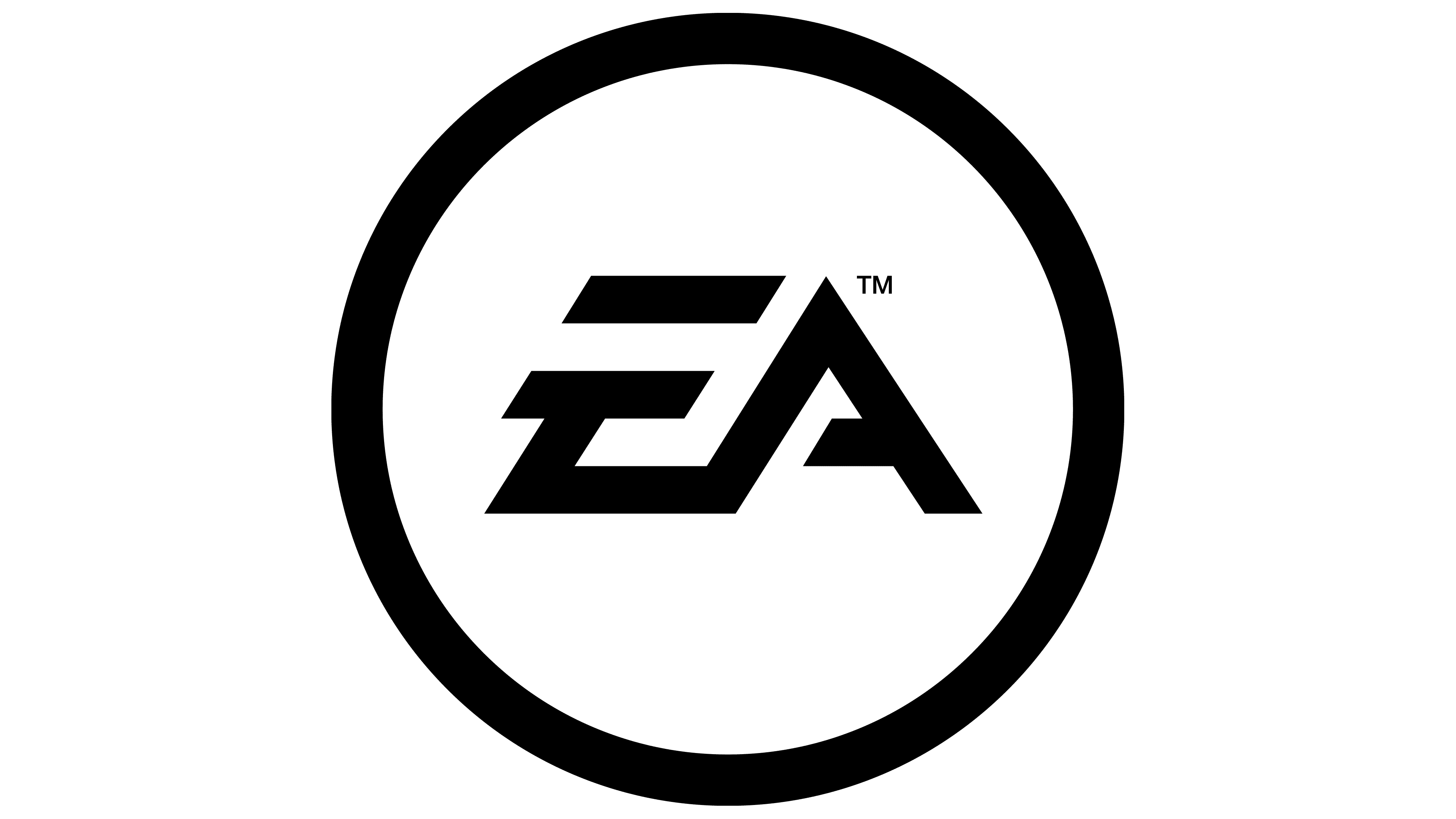
2006 – today
![]()
In 2006, a new yet old logo appeared in the press. Now, the EA sign is enclosed in a black circle, and the inscription itself is in white.
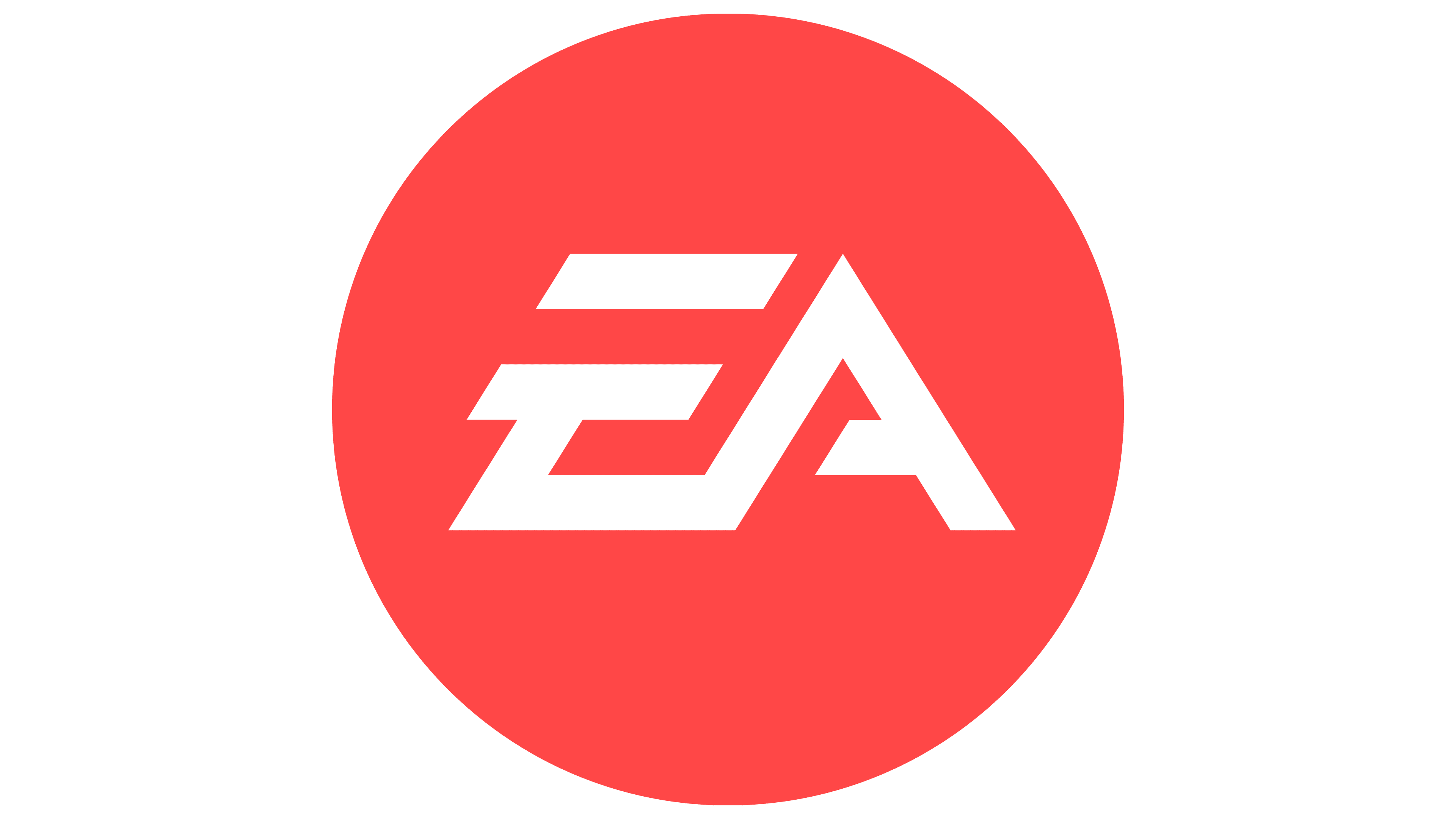
2020 – today
![]()
This year, another variation of the emblem appears. But the difference is only in color; instead of a black background, a bright red one is used.
EA (Electronic Arts): Interesting Facts
Electronic Arts (EA) is a big name in video games and has been around since 1982. Trip Hawkins started it with the idea of making a place where game makers could shine like rock stars.
- Starting Out: EA began by treating game developers like celebrities, showing off their names on games like bands on music albums.
- Famous Games: EA made some popular games that lots of people love, like “The Sims,” “FIFA,” and “Madden NFL.” These games are not just fun; they’ve become a big part of gaming culture.
- Growing Bigger: EA expanded by partnering with other game makers, such as BioWare and Respawn Entertainment, which allowed them to offer even more cool games.
- Origin Platform: In 2011, EA started its place to buy and download games online called Origin, which is like its own version of an online game store.
- EA Sports: When you think of sports games, you probably think of EA Sports. Their “FIFA” games are some of the most played video games ever.
- Subscription Service: EA was one of the first to let players subscribe and get access to many games, new game trials, and other perks with EA Play.
- Esports: EA knows that gaming competitions are a big deal, so it supports esports, especially with its “FIFA” and “Madden NFL” games.
- Ups and Downs: Not everything EA does is perfect. They’ve had trouble with loot boxes and how they handle game money, which upset some gamers.
- Looking Ahead: EA is always trying new things, like cloud gaming and artificial intelligence, to make games even more exciting and realistic.
EA has been a huge part of making video games what they are today, with lots of hits and some bumps along the way. They keep looking for new ways to make gaming even better.
Font and Colors
The EA emblem is an unusual combination of letters found in the brand name. Designers experimented with the shape of the elements for a long time, so the abbreviation became difficult to read. The circular boundaries maintain the logo’s conciseness. An animated version of the character appears on the splash screens and changes depending on the game’s plot.
Electronic Arts ordered the letters “E” and “A”. The italic letter “E” consists of two parallel horizontal lines and a sharp angle formed by two rays. The letter “A” connects to the lower side of the angle and looks like a continuation of the letter “E.” Subsequently, users of Behance and 538Lyons created a similar font, naming it the EA emblem font.
The emblem is executed in a classic monochrome palette. The combination of white and black is considered a universal option and looks good against any background. This is opposite to the first emblems, which used contrasting colors: blue, red, and green.
EA (Electronic Arts) color codes
| Grapefruit Red | Hex color: | #f05556 |
|---|---|---|
| RGB: | 240 85 86 | |
| CMYK: | 0 65 64 6 | |
| Pantone: | PMS 178 C |
FAQ
What does the EA logo mean?
The logo represents Electronic Arts as a creative video game developer, as it has an unusual element – the stylized abbreviation EA. It is placed in a circle to the left of the corporation’s name.
What is an EA account?
An EA account is the same as an Origin account. It allows you to use the Electronic Arts online store, connect to the network, and buy and launch games.
Does EA stand for Electronic Arts?
EA is an acronym formed from the full name Electronic Arts.
What is EA’s slogan?
The main slogans of Electronic Arts are “We see the future” and “EA Games. Challenge everything.”