 EDP Logo PNG
Electricity supply includes generation, distribution, and grid maintenance across many countries. Energy companies are developing new sources, including wind and solar installations, while maintaining existing infrastructure. The EDP logo represents an international energy group that produces and supplies electricity, manages networks, and develops renewable energy projects.
EDP, or Energias de Portugal, was established on June 30, 1976. It was created through the nationalization of Portugal’s energy sector. The new organization united private and municipal entities. This created an integrated system for generating, transmitting, and distributing electricity.
In the 1980s, the company modernized its network and built new power plants. The 1990 law prepared the company for transformation into a joint-stock entity. In 1994, it became known as EDP Electricidade de Portugal S.A. The 1997 initial public offering opened access to international capital markets.
In 2000, it began expanding beyond Portugal. The company acquired energy assets in Spain and Brazil. In 2001, it gained control of the Spanish company Hidrocantábrico.
In 2007, EDP established the subsidiary EDP Renováveis. It specializes in renewable energy sources. In 2008, EDP Renováveis shares began trading on the Lisbon and Madrid stock exchanges. By 2011, EDP had become one of the world’s largest wind energy producers. That same year, the company acquired the American firm Horizon Wind Energy for $2.2 billion.
In 2011, China Three Gorges acquired a 21.35 percent stake in EDP. It became the company’s largest shareholder and strategic partner. In 2012, the Portuguese government fully exited its ownership stake.
In 2019, the company announced an investment program totaling € 24 billion. The company allocated three-quarters of the funds to developing renewable energy sources. In 2020, the company acquired the Spanish company Viesgo for € 2.7 billion. As a result, the number of customers increased by three million.
In 2023, EDP presented its development strategy through 2026. The program includes € 25 billion in investments. The company operates in twenty-nine countries. It serves twelve million customers and manages more than twenty-seven gigawatts of capacity. A significant portion of that capacity comes from wind and solar power plants.
Meaning and History
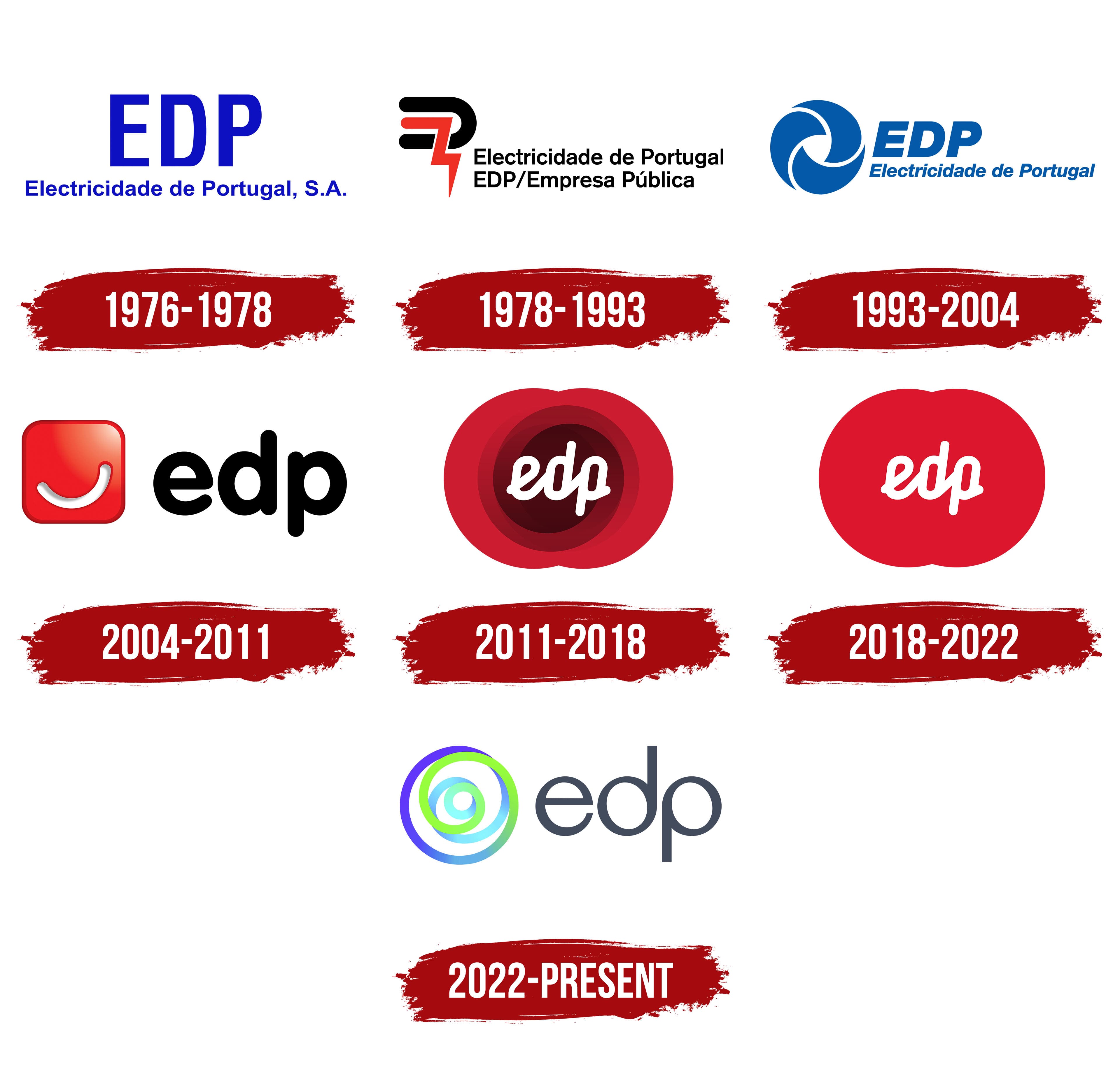
What is EDP?
A Portuguese energy holding company based in Lisbon, EDP generates, distributes, and supplies electricity and natural gas. It serves more than ten million clients in Europe, the United States, and Brazil. Through its subsidiary EDP Renováveis, it ranks among the world’s top three wind energy producers. In Portugal, it operates under EDP Produção, EDP Distribuição, and EDP Comercial. In Spain, it owns Hidrocantábrico, and in the United States, it operates EDP Renewables North America. China Three Gorges Corporation and the Portuguese government are the largest shareholders.
1976 – 1978
EDP was established on June 30, 1976, through the merger of 14 nationalized Portuguese energy companies. The name Electricidade de Portugal, meaning “Electricity of Portugal,” indicated the company’s nationwide scope. The first letters of the 3 words formed the abbreviation EDP. Both versions appeared in the first logo, introduced on the founding date.
Large blue uppercase “EDP” lettering appeared at the top, with a smaller “Electricidade de Portugal, S.A.” below. Helvetica formed the basis of the identity. The sans-serif letters stood upright, with narrow proportions in the abbreviation and tight spacing in the lower line. The size difference distinguished the short name from its expanded form. The shared blue color united the wordmarks and suited the business identity of a state-owned company.
A name review accompanied expansion into overseas markets in the 1990s. In 2004, the company became EDP Energias de Portugal. “Energias” replaced “Electricidade,” reflecting a shift from electricity into other areas of energy. EDP later became the primary corporate name, suitable for use in all countries where the company operated.
1978 – 1993
In EDP’s 1978 logo, the line “EDP/Empresa Pública,” identifying it as a public enterprise, explained the company’s state-owned status alongside the full name Electricidade de Portugal. Both lines appeared to the right of the emblem. They used black upright sans-serif lettering. Standard uppercase and lowercase combinations were retained, as was the accent in “Pública.”
On the left was a symbol composed of 2 interwoven angular bands incorporating the initials “E,” “D,” and “P.” The upper black section curved like a bracket and resembled an “E.” A red band zigzagged through the interior and ended in a point. Its resemblance to an electrical discharge referred to the company’s work.
Red and black replaced the previous blue. The logo with its separate emblem, full name, and status descriptor was used until the corporate reorganization of the early 1990s.
1993 – 2004
In 1993, Portuguese designer Carlos Rocha created a circular emblem for EDP consisting of 3 curved blades. A white triangular opening remained between them. The blades’ curves suggested rotation and connected the design to energy generation and transmission.
The name appeared on 2 lines to the right. Large uppercase “EDP” occupied the upper line, with a smaller “Electricidade de Portugal” below. Both lines used Helvetica Bold Italic, a right-slanting sans-serif typeface. The size difference made the full name look lighter than the heavy abbreviation.
The emblem and lettering were rendered in the same blue, restoring a connection to the company’s first identity. The circular symbol was also used separately, while the full logo paired it with the abbreviated and expanded names.
2004 – 2011

In 2004, EDP expanded its energy business and international operations, accompanied by a transition to the name Energias de Portugal. Portuguese consultancy Mybrand developed a new identity featuring a smile. Through it, the company sought to build a closer connection with consumers.
A white arc appeared in the center of a red square with rounded corners. A gray shadow beneath the smile created depth, while a highlight at the upper right gave the surface a glossy appearance. A thin dark red outline ran along the edge. Red replaced the previous blue, adding warmth to the identity.
Black lowercase “edp” lettering appeared on the right, set in bold VAG Rounded. The rounded terminals of the sans-serif letters complemented the smile’s curve and the square’s rounded corners. The phrase “viva a nossa energia,” meaning “live our energy,” was used with the logo and was later replaced by “sinta a nossa energia,” meaning “feel our energy.”
2011 – 2018
In 2011, EDP set out to unify the identities of its businesses in different countries. By then, the smile had become a common design device, and the company’s name appeared separately from the emblem. The group needed a shared brand for all its divisions. The group introduced the new identity on July 1 during EDP’s 35th anniversary celebration.
Stefan Sagmeister’s team developed a system that paired a consistent wordmark with changing geometric forms. White lowercase “edp” lettering appeared on a red background made from circles, semicircles, squares, and triangles. The shapes overlapped to create combinations for different divisions, themes, and applications. The system included 7 primary logo versions and an expanded library of emblems. The shared name united EDP, EDP Renováveis, EDP Brasil, HC Energía, the foundation, and service divisions.
The wordmark was created from connected handwritten strokes with a slight rightward slant. The touching letters formed a continuous line. In the version with circles, several overlapping rounded layers appeared behind the name. Their transparent overlaps created burgundy, scarlet, and pink areas. A dark center transitioned to a bright red edge. Red maintained the color connection to the 2004 identity, while geometric combinations replaced the smile and conveyed energy.
A black wordmark with the same letterforms was prepared for use separately from the colored field. It supplemented the range of versions for different applications.
Stefan Sagmeister served as creative director, with Jessica Walsh as art director and designer. The team included Stefan Elbaz, Michael Freimuth, and Richard The. Brand New School created the animated presentation. In October 2011, the EDP identity appeared in a Paris exhibition of Sagmeister’s work at the Musée des Arts Décoratifs in the Louver complex.
2018 – 2022

In 2018, Sagmeister & Walsh simplified EDP’s red logo for small digital applications. They retained the handwritten name and rounded background, while a solid fill replaced the layered internal circles.
The overlapping circles formed a single bright scarlet shape. Reducing the number of shades made the emblem easier to reproduce at small sizes. White lowercase “edp” appeared on the red field. Smooth curves and connected strokes united the letters in a handwritten wordmark.
The revision affected the primary red version. The black wordmark and the remaining parts of the identity continued to be used until the system was updated in 2022.
2022 – today
In June 2022, EDP introduced a new identity connected to its transition to renewable energy and the unification of its operations across 28 markets. Marina Willer led the Pentagram project. The team created the corporate logo and shared identity guidelines for the group’s businesses. The regulated companies E-REDES and SU Eletricidade continued using separate brands.
The emblem’s development began with animation. A point on a rotating surface left a trail that gradually formed a spiral. The drawing evolved into a symbol of natural cycles, the planet, and the sun. Its shape recalled wind and water turbines, conveying energy transformation, growth, and the interconnectedness of natural processes.
Four spiral rings occupied the left side of the logo. Purple transitioned into blue, light blue, and green, with turquoise areas adding to the color shifts. A combination of shades with different meanings replaced the previous red. Green represented nature, blue tones represented clean energy, and purple represented technology and people.
Lowercase “edp” lettering in a bluish charcoal gray appeared on the right. Thin, rounded sans-serif letters were spaced out, replacing the connected handwriting introduced in 2011. The single-color name sat in the same horizontal row as the multicolored spiral.
The group received a shared symbol and descriptive wordmarks with consistent typesetting guidelines. Internal implementation began in June 2022. The team then extended the new identity to other applications through 2023.