The Elizalde logo is majestic, reflecting the brand’s storied history. The brand has etched its name in the annals of automobile manufacturers. The emblem highlights royal approval, as the company’s cars were used by royalty. The logo showcases original ideas and unique developments.
Elizalde: Brand overview
At the beginning of the twentieth century, Barcelona was home to a car manufacturer that left its mark in the annals of Spanish automotive history. In 1909, Arturo Elizalde Rouvier opened his business in the automotive world by founding a garage in the heart of Barcelona. Together with colleagues Rafael Biada Navarro and J.M. Vallet y Arnau, they created Vallet y Cia.
In 1914, the prototype car, Tipo 11, debuted. It made an impressive trip from Barcelona to Madrid and drew the attention and support of the Biada siblings. The very next year, the brand received royal approval: King Alfonso XIII became the proud owner of the Elizalde convertible. Building on its newfound fame, the company introduced a sportier version of the 25cv, calling it the “Reine Victoria.”
The Reine Victoria was unveiled at the 1919 Barcelona Motor Show and became the first Spanish car equipped with four-wheel brakes. With the advent of the 1920s, Elizalde expanded its lineup by introducing the Model 29, powered by a 3817cc four-cylinder engine. Throughout the decade, Elizalde occupied an increasingly prominent place in the Spanish automobile industry, producing several car models.
However, as the 1920s approached, Elizalde’s path in the automobile industry ended. In 1927, the company ceased production of automobiles, and in 1928, after operating for 14 years, it finally closed its doors.
Meaning and History
What is Elizalde?
It is a Spanish automobile manufacturing company known for producing luxury cars and aircraft engines. Founded by Arturo Elizalde, the company initially specialized in producing high-quality, elegant cars. The cars were known for advanced engineering. In addition to automobiles, the company also produced aircraft engines. Despite early success, over time, the cosigner stopped producing cars and focused solely on aircraft construction.
1914 – 1918
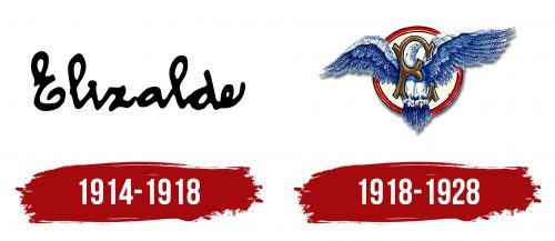
The first Elizalde brand logo features a brief pen stroke, resembling the founder’s signature. This design element highlights the founder’s involvement and individuality in creating and developing the brand. The name “Elizalde” in the signature style on the logo represents a deep personal commitment and responsibility for product quality.
The company initially relied on one person, who conceived and launched it in his garage, investing his soul and knowledge. The entire Elizalde automobile production process reflected the founder’s unique experience and technical expertise. This personal approach was crucial in the company’s establishment.
The slight leftward slant of the handwriting on the logo emphasizes the manufacturer’s reliance on their own experience and the achievements of previous generations of car enthusiasts. This demonstrates the company’s aim to create something unique based on automotive traditions and history.
1918 – 1928
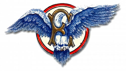
The emblem of Automóviles Elizalde, a Spanish car manufacturer, features a detailed brown letter “E” with decorative flourishes. A blue bird with spread wings, showing fine feather details, perches on the lower flourish of the letter. A large red ring encircles these elements, adding a bold contrast.
The intricate design of the brown “E” highlights craftsmanship and elegance. The bluebird brings life and vibrancy to the emblem. The red ring frames the logo, drawing attention to the central elements.
This combination of the ornate “E,” the bluebird, and the red ring creates a striking and memorable emblem. It reflects the brand’s dedication to quality and excellence, making it a distinctive symbol for Automóviles Elizalde.


