The Envoy Air logo symbolizes seamless travel, symbolizing a smooth and enjoyable flight. It evokes the comfort and ease of a well-planned trip, mirroring the experience of finding the perfect spot at the airport to relax, charge your phone, and grab a snack. Reflecting a piece of Americana, the logo resonates with travelers familiar with the comforts and style of modern American air travel.
Envoy Air: Brand overview
Since its inception in 1984 under the name American Eagle Airlines, Envoy Air has grown tremendously and achieved great success. As an integral part of the American Airlines Group, Envoy Air has played a crucial role in providing excellent services and has contributed to American Airlines’ overall success.
Envoy Air was founded in 1984 to expand American Airlines’ regional flights. Starting with a small fleet of aircraft, the airline focused on providing reliable and convenient regional air transportation throughout the United States. As a wholly owned subsidiary of American Airlines Group, Envoy Air proudly carries the American Eagle brand.
The collaboration between Envoy Air and American Airlines has been instrumental in their joint accomplishments.
Envoy Air constantly strives to improve its customers’ travel experience. The airline invests in state-of-the-art airplanes like the Embraer ERJ-145 to meet growing demands for improved performance, passenger comfort, and safety.
The airline continues to expand its route network, renew its fleet, and utilize the latest technological advances to make travel even more convenient and enjoyable for its passengers.
Meaning and History
What is Envoy Air?
The regional airline in the United States operates under the brand American Eagle. It is a subsidiary of American Airlines Group. The airline connects small towns with major American Airlines hubs, providing smooth connections between local airports and the main American Airlines network. The company’s headquarters are in Irving, Texas. The airline has a significant fleet, including Embraer and Bombardier aircraft, used for short and medium flights.
1998 – 2013
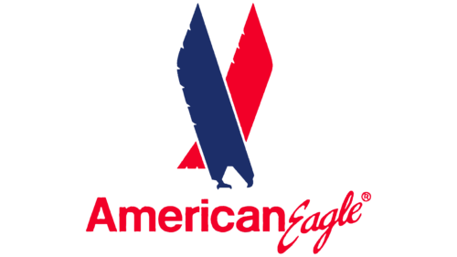
The initial logo of Envoy Air, originally known as American Eagle Airlines, featured two distinctive eagles. These birds’ wings were extended, resembling the wings of airplanes. Both figures appeared poised to swoop down on their prey in the image.
The image conveyed speed, strength, and the determination to achieve a goal. Envoy Air is a top carrier. Regional flights with this airline are quick, and its planes are fast and modern.
The two birds represented two sides together to form a new airline. The red eagle symbolized American Airlines, the parent company, and the blue represented the regional carriers under the American Eagle brand. The two eagles flying together depicted partnership and cooperation. Interestingly, each bird was shown with only one wing visible, and only together did they complete the image of flight.
The depiction of these air monarchs and their colors were chosen for patriotic reasons. The bird is a symbol of the USA. The bald eagle is prevalent throughout America and represents strength and dominance in the air.
Red and blue are the colors of the American flag. Envoy Air is not a private enterprise. The company represents the American air fleet. The shades correspond to the navigation lights at the wingtips of an aircraft. A red light was originally installed on the left wing, and a blue one on the right. Over time, blue was replaced by green.
The signature of the large word “American” and the ornate “Eagle” represented the partnership between the reliable and large parent company and its smaller carriers.
2013 – today
Following the successful completion of the bankruptcy process by AMR Corporation, the owner of well-known airlines such as American Airlines and American Eagle, the company merged into a new entity named American Airlines Group. It began updating the branding of its divisions, and new logos were introduced for each airline as part of this update.
The American Eagle division’s emblem stands out with its new design, featuring an iron eagle at the center. This eagle is stylized to resemble the tail of an airplane, enhancing its uniqueness and recognition. The logo incorporates blue and red elements arranged in a continuous line that symbolizes wings. The top of the logo features a sharp white element depicting the bird’s beak and head, reinforcing the theme of flight and freedom.
The outstretched wings emphasize lightness and freedom, symbolizing the vast opportunities and new directions available to American Eagle as part of the world’s largest aviation group. The emblem’s design conveys a sense of ambition and the company’s aspirations to expand its presence in the global aviation space.
The airline’s name is black, aligned straight, underscoring the brand’s stability, confidence, and reliability.
2014 – today
Envoy Air uses a logo that highlights the word “envoy” in lowercase, dark blue letters. The distinctive feature is the maroon corner of the letter “y,” which is separated from the rest. This triangular corner looks like a flying hang glider. Historically, this element represented a stylized wing because the airline was formerly known as American Eagle. The bird was removed from the emblem in 2014 when the company adopted its current name.
The maroon corner of the “y” stands out and immediately draws attention. Its triangular shape references hang gliding and hints at the airline’s history. The dark blue color scheme communicates reliability and professionalism, which are essential in the aviation industry. Lowercase letters give the logo a modern and approachable look, providing a contemporary contrast to the traditional use of capital letters in many other airline logos.
The dark blue color reflects stability and trust. The maroon triangle adds elegance and distinction, symbolizing the airline’s commitment to excellence and rich heritage. The lowercase typography contributes to the logo’s friendly image, making the brand seem more welcoming to passengers.
The logo’s simple and clean design makes it easily recognizable and memorable. The separation of the maroon corner from the rest of the “y” adds a dynamic element, suggesting motion and forward progress.
By incorporating a stylized wing element into the “y,” the logo pays homage to the airline’s origins and evolution. This subtle historical reference enriches the brand’s narrative, linking the past with the present while looking forward to the future.


