![]() Eugene Emeralds Logo PNG
Eugene Emeralds Logo PNG
The Eugene Emeralds baseball team logo symbolizes the club’s athletic affiliation and local identity. Its design emphasizes the team’s connection to the city of Eugene and the professionalism of its players.
The history of the Eugene Emeralds dates back to 1955, when the team became one of the founding members of the Northwest League. The club got its name from a contest won by an 11-year-old boy. Initially, the Emeralds played as an independent team but later became affiliated with several MLB clubs, including the San Francisco Giants, Cincinnati Reds, and Atlanta Braves.
In 1969, the team advanced to the Triple-A level, playing home games at Civic Stadium. That year, the Emeralds reached the league finals but lost to the Tacoma Cubs. In 1974, the club returned to the Northwest League and won championships in 1974, 1975, and 1980.
From 2001 to 2014, the Emeralds were affiliated with the San Diego Padres, after which they partnered with the Chicago Cubs. In 2016, the Emeralds won the Northwest League championship for the first time in 41 years. Since 2021, the club has competed at the High-A level as an affiliate of the San Francisco Giants and recently won another league championship. Notable players, such as Ian Happ (Chicago Cubs), began their careers with the team.
Meaning and History
![]()
What is Eugene Emeralds?
It is a baseball team from Eugene, Oregon, playing in the High-A Northwest League. Over the years, it served as a farm team for MLB clubs, including the San Francisco Giants, Cincinnati Reds, and Atlanta Braves. The team has won several league championships. Home games are held at PK Park on the University of Oregon campus.
2004 – 2009
![]()
The Eugene Emeralds logo was created as the team’s first official symbol during its time competing at the Class A Short Season level in the Minor League Baseball system and in partnership with the San Diego Padres. The new design aimed to strengthen brand recognition and emphasize the club’s local identity.
The foundation of the logo is the traditional baseball home plate shape, shown in dark green with a rich blue outline. These colors reference the natural surroundings of Oregon, with its dense forests and mountain ranges, underscoring the team’s regional connection.
At the center is a calligraphic “Ems,” the commonly used abbreviation for the team’s name. The font features smooth, handwritten forms, with large, bold letters that incorporate soft curves and wide strokes, enhancing the visual flow and sense of motion. The primary letter color is a gold-sand tone with a metallic effect and a light outline, symbolically linking to the team’s name (“Emeralds”).
Above the main lettering is an arched “EUGENE EMERALDS” set in a simple, clean sans serif typeface in white, contrasting with the dimensional central wordmark and stating the team’s full name. Above the text, the trajectory of a baseball in flight adds dynamism and reinforces the sports theme.
Crossed baseball bats behind the shield create visual symmetry, recalling the traditional heraldic style of baseball emblems. At the bottom of the composition is a simple depiction of home plate, rendered as a white diamond.
This version marked the first time in the club’s history that the “Ems” abbreviation became the primary graphic element, establishing it as the dominant identifier in the team’s identity and making the visual concept more concise and recognizable.
2010 – 2012
![]()
The next Eugene Emeralds emblem was the result of a redesign aimed at reflecting Oregon’s local character and natural features. In this version, the focus shifted away from baseball-related elements toward a representation of the region’s landscape and the natural beauty surrounding Eugene.
The composition is built on a shield with a pronounced, angular form reminiscent of a stylized mountain peak. The central area features a landscape: a blue mountain range with flowing white clouds and a symbolic river winding toward the horizon. These graphic elements create a sense of depth, movement, and perspective, highlighting the rich natural environment of Lane County and the Willamette Valley, often referred to as the Emerald Valley.
At the top of the emblem is an arched “EUGENE” in a clean, geometric sans-serif typeface, set in white, contrasting with the main word “Emeralds,” rendered in white italic script. The “Emeralds” font is smooth and dynamic, with a calligraphic style and bold flourishes that suggest motion. The lower part of the letter “E” is distinctive and broad, featuring a looped flourish that enhances the design’s expressiveness and flow.
The color palette is based on natural shades of green, blue, and white. Green outlines the emblem, reinforcing the connection to emeralds and the richness of Oregon’s forests. Blue represents the sky and mountains, while white suggests clouds and provides bright highlights, creating an effect of lightness and freshness.
The visual composition was developed by Studio Simon, a sports logo design agency specializing in this field. The goal was to emphasize the team’s connection to its geographic location through visual language while maintaining its sporting identity and emotional appeal to fans. This version was a short-lived stage in the club’s visual history, after which the team moved to a new look featuring a different mascot.
2013 – today
![]()
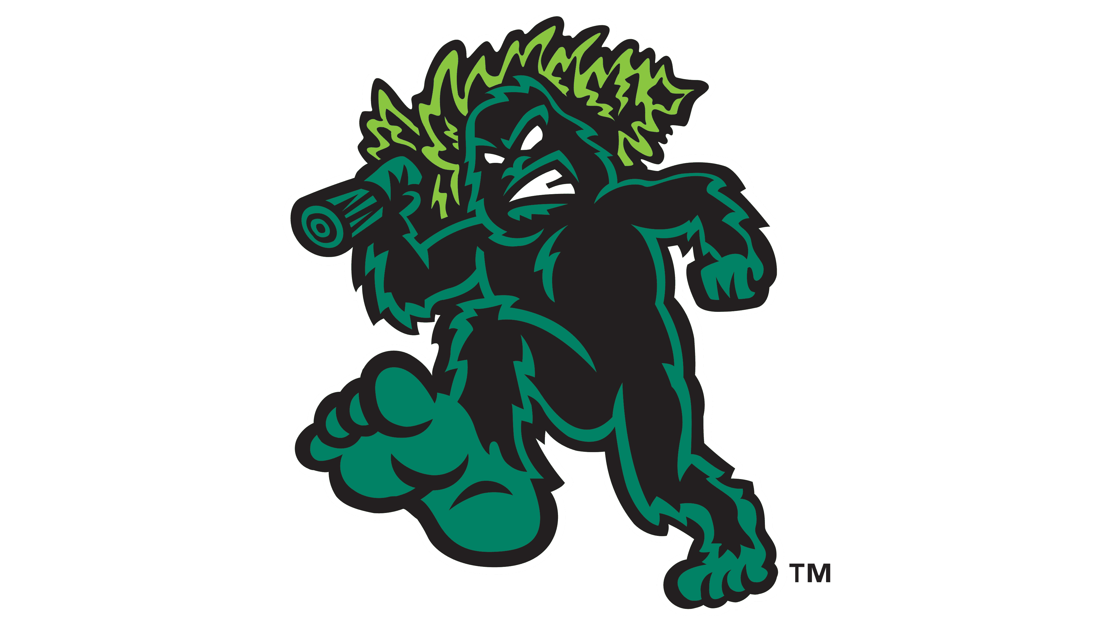
The current Eugene Emeralds logo appeared after a complete shift in the team’s identity, moving away from geographic and natural themes toward a bright, charismatic mascot. At the center of the design is an aggressive sasquatch. This mythical creature has become an unofficial symbol of Oregon’s forests and the Pacific Northwest region as a whole.
The Sasquatch is depicted in a cartoon style, with a muscular body, broad shoulders, and massive limbs, emphasizing the character’s power and athletic energy. The creature is shown moving forward, lifting one leg and swinging an arm that holds a tree stylized as a baseball bat. The tree-bat symbolizes physical strength and primal power, while also serving as an obvious reference to baseball as a sport.
Leaves that replace the sasquatch’s hair reinforce the forest theme and highlight the regional connection. The character’s face is rendered with an exaggeratedly fierce expression, white pupil-less eyes, and bared teeth, creating an impression of aggression and determination.
The typography is divided into two levels. The upper word “Eugene” is set in a small, thin sans serif with even letter spacing and placed horizontally across the character’s chest. The main word “Emeralds” is rendered in a large, blocky, custom-made typeface that sharply reinforces the emblem’s aggressive style. The letters feature bold geometric proportions, asymmetrical angles, and stylized decorative elements that enhance the composition’s overall dynamism.
The color palette is built on a strong contrast of bright green, dark green, and black. The vivid, almost neon green of the word “Emeralds” serves as the main focal point, symbolizing the brand’s energy and freshness, while the black and dark green tones of the figure and outlines provide depth and visual dimension.
The design was created by Brandiose, a branding agency known for producing bold and distinctive mascots for Minor League Baseball teams. The choice of the sasquatch was a key decision that connected a recognizable cultural legend with the energetic, daring style of a modern sports team.