Euro NCAP: Brand overview
The European New Car Assessment Program, known as Euro NCAP, began in 1996 as a discretionary car safety assessment initiative. The program, which has its administrative headquarters in the Belgian city of Leuven, was developed and implemented by the UK Transport Research Laboratory under the direction of the Department for Transport. The goal of the program was simple: to arm consumers with important information about the safety of new cars.
Having already attracted public attention a year after its creation, Euro NCAP presented the results of the first tests of seven major European car models in 1997. This generated a great deal of public interest and debate. Financial support from several European governments and the European Union enabled the program to expand its reach and influence in the following years. By the beginning of the 21st century, the lion’s share of leading automakers were eager to submit their new models for Euro NCAP evaluation.
Euro NCAP introduced a star rating structure in 2009 to improve public understanding of its performance. Under this system, cars can receive a maximum of five stars. Given the rapid advances in automotive safety technology, the organization periodically updates its rating criteria.
Today, Euro NCAP is the safety authority for autonomous cars and encourages automakers to invest in improved crashworthiness and crash avoidance technology. To date, the program has issued evaluations for more than a thousand car models and claims to have prevented more than 78,000 fatalities since its inception.
Although participation in the program remains voluntary, Euro NCAP safety ratings have become a crucial benchmark for potential car buyers and design engineers in Europe and around the world.
Meaning and History
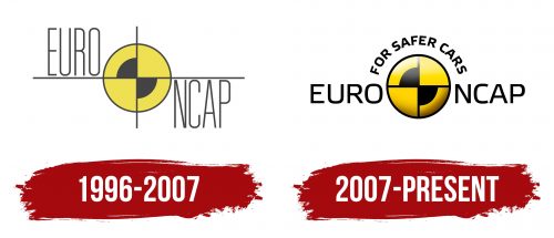
1996 – 2007
2007 – today
In the center of the logo of the European New Car Assessment Program, the designers placed a crash test target as it best characterizes the work of the committee. The symbol is a circle divided into four segments, two of which are partially black. The dominant color is a bright shade of yellow (#FFCC00). Due to gradient effects, the emblem seems volumetric. On the left side, there is the word “Euro”; on the right side – “NCAP”. Above them, in the form of an arch, is the phrase “FOR SAFER CARS.” All text elements use Etelka Text Pro Regular font.
The use of a crash test target is clearly in line with the committee’s emphasis on vehicle safety. The choice of bright yellow color attracts attention, reinforcing the importance of the safety message. The three-dimensional look gives the design depth and modernity.
