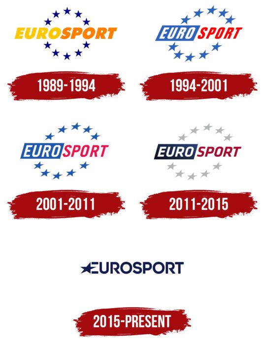
The Eurosport logo stands out from the background of other TV channels. It is made in clear block letters, painted in deep blue. The design is fully consistent with the concept and essence of the brand.
Eurosport: Brand overview
| Founded: | 5 February 1989 |
| Founder: | Warner Bros. Discovery Sports |
| Headquarters: | Issy-les-Moulineaux, France |
| Website: | corporate.eurosport.com |
Meaning and history
For more than 30 years, Eurosport has delighted fans with high-quality TV broadcasts of sports competitions. During this period, the company changed owners, received the rights to broadcast the Olympic Games, expanded its network, and even created a convenient service (Eurosport Player). As a result of these efforts, Eurosport has taken a leading position and won the trust of more than 200 million viewers.
The brand’s corporate identity is based on elements that evoke direct associations with the world of sports. Confirmation is the blue color on a white background and the thematic name placed in the center of the logo. The laconic design and associative elements make the icon particularly recognizable. At the same time, the graphic addition in the form of a star symbolizes the championship and the company’s leading position.
1989 – 1994
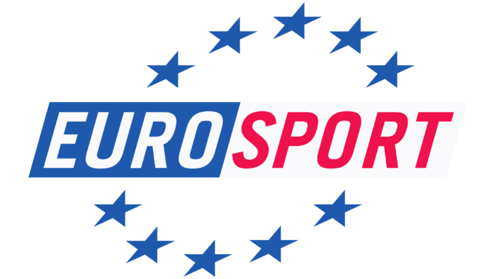
The first broadcasts of Eurosport were launched in February 1989. The channel logo at that time was an expressive image that included an inscription and graphic elements in the form of stars. The name of the network of sports TV channels, Eurosport, was used as an inscription. It was decorated with ten small stars that lined up in a round frame.
It was a rather symbolic image, the general concept of which was complemented by thematic coloring. The stars were painted rich blue, evoking associations with sports and television. In addition, blue in the context of the brand’s design means stability, reliability, and confidence.
The inscription itself was made in yellow and orange. The contrast was needed for expressiveness, especially against the basic white background. The letters of the inscription were massive and rounded. Italics gave them a certain dynamism, which made it possible to focus on the company’s rapid development.
1994 – 2001
After Eurosport merged with its main competitor, Screensport, in 1993, the company decided to change its logo. The new version appeared in 1994 and became a stylish continuation of the identity concept. It retained the features of its predecessor in deference to the past format and also received some updates, symbolizing the company’s rise.
The new emblem has several changes:
- a circle of 10 stars has changed from a circle to a diagonal direction;
- the color palette has changed to a combination of lighter blue, red and white;
- the font has become more direct and thinner;
- the inscription was divided in terms of design into two parts.
The first part of Euro was placed in a blue rectangle, and the letters were given a neutral white color that created a contrast. The second part did not fit in the frame but changed the color from orange to red. The new three-color palette displayed energy, professionalism, and leadership.
2001 – 2011
January 2001 was marked by the complete transfer of the network to the ownership of Groupe TF1. The changes led to another rebranding. But, the changes in the logo were insignificant, even almost imperceptible. The designers changed the font and made the colors lighter. The letters have become more rounded and softer, making the overall concept more stylish and pleasant to read. This decision refreshed the corporate identity.
2011 – 2015
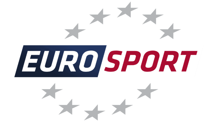
The new achievements of the Eurosport channel network have led to new changes in the logo. This time the management turned to the experts of the well-known French company Les Télécréateurs. Experienced designers have made several changes to the existing version of the emblem, and it sparkled with completely new colors.
The stars changed color from blue to gray, the font became more voluminous and expressive, and the coloring became deeper. The overall composition remains the same. The changes made the corporate identity more modern and harmonious. And the addition of gray colors made a bright accent directly on the name, that is, its activities.
2015 – today
2015 was a landmark year for the Eurosport network. This year she won the rights to broadcast the Olympic Games. This significantly affected the company’s activities as a whole and its logo. The new design is radically different from previous versions. The changes affected the following elements:
- font;
- general concept;
- graphic sign;
- colors.
The designers essentially changed everything about the logo. Of the ten stars, only one remained, which was placed at the beginning of the company’s name and complemented its first letter. Of the logos that were before, only the brand name remained.
Font and Colors
The version that was created in 2015 is still in use today. It is a simple inscription, which means the name of the network of TV channels, supplemented by a star. The inscription consists of all capital letters made in lines of medium thickness. This font is close to Posterama Pro 1984 SemiBold and Integral CF Regular style. But, the letter R stands out from the general style. It has a slightly modified outline.
Such a performance is elegant and quite bizarre at the same time. This makes the inscription unique, which emphasizes the channel’s identity. The color palette is based on rich and deep blue colors, and a basic white is used as a background. They reflect the specifics of the channel (sports) and symbolize professionalism and a high reputation.
Eurosport color codes
| Sonoran Sand | Hex color: | #141b4d |
|---|---|---|
| RGB: | 20 27 77 | |
| CMYK: | 74 65 0 70 | |
| Pantone: | PMS 274 C |
