


 Eventbrite Logo PNG
The Eventbrite logo appears optimistic and energetic, emphasizing the company’s business focus. It embodies the promise of enhancing the organizational aspects of events, highlighting advertising and ticket sales, and providing a better user experience. The design reflects a commitment to engagement and active work with the audience.
The lines of the emblem convey a readiness for collaboration, showcasing the company’s openness to new opportunities and partners. These design elements underscore the goal of reaching a broader audience, involving more viewers and participants in every event.
Eventbrite was founded in San Francisco in 2006 by Kevin Hartz, Julia Hartz, and Reno Visser. The idea came after Kevin Hartz struggled to plan his wedding. Working from home and using personal funds, the founders built an early platform for event pages, registration, and online ticket sales.
European investors provided $350,000 in 2007, followed by backing from Keith Rabois and Kevin Rose in 2008. By 2009, Eventbrite had released a mobile app and ticket-scanning system and processed more than $100 million in tickets. A $6.5 million Sequoia Capital round in 2010 funded staff growth and international expansion.
In 2011, Eventbrite raised $50 million from Tiger Global and other investors and integrated with Facebook. Eventbrite opened a London office in 2012 and expanded its registration management and analytics tools. The company acquired Eventioz and Lanyrd in 2013, launched a developer platform in 2014, adopted RFID for major festivals and concerts in 2015, and bought music-technology firm Queue in 2016. A $200 million Ticketfly deal followed in 2017.
Eventbrite listed on the New York Stock Exchange in 2018 under EB, raising more than $230 million as international expansion continued. The company expanded its marketing and analytics tools in 2019. During 2020 and 2021, the platform added virtual and hybrid event functions, including online participation and streaming. A 2022 update introduced deeper data analysis and additional marketing tools for organizers.
Meaning and History
What is Eventbrite?
This ticketing and event management platform connects organizers with their ideal audience. The platform enables organizers to design, promote, and sell event tickets, providing guests with a convenient booking process, mobile ticket delivery, and secure payment processing. Going beyond simple ticket sales, the platform serves as a complete event ecosystem: attendees easily discover events aligned with their interests, and organizers gain access to comprehensive analytics, attendee list management, customizable registration forms, and marketing tools to boost attendance.
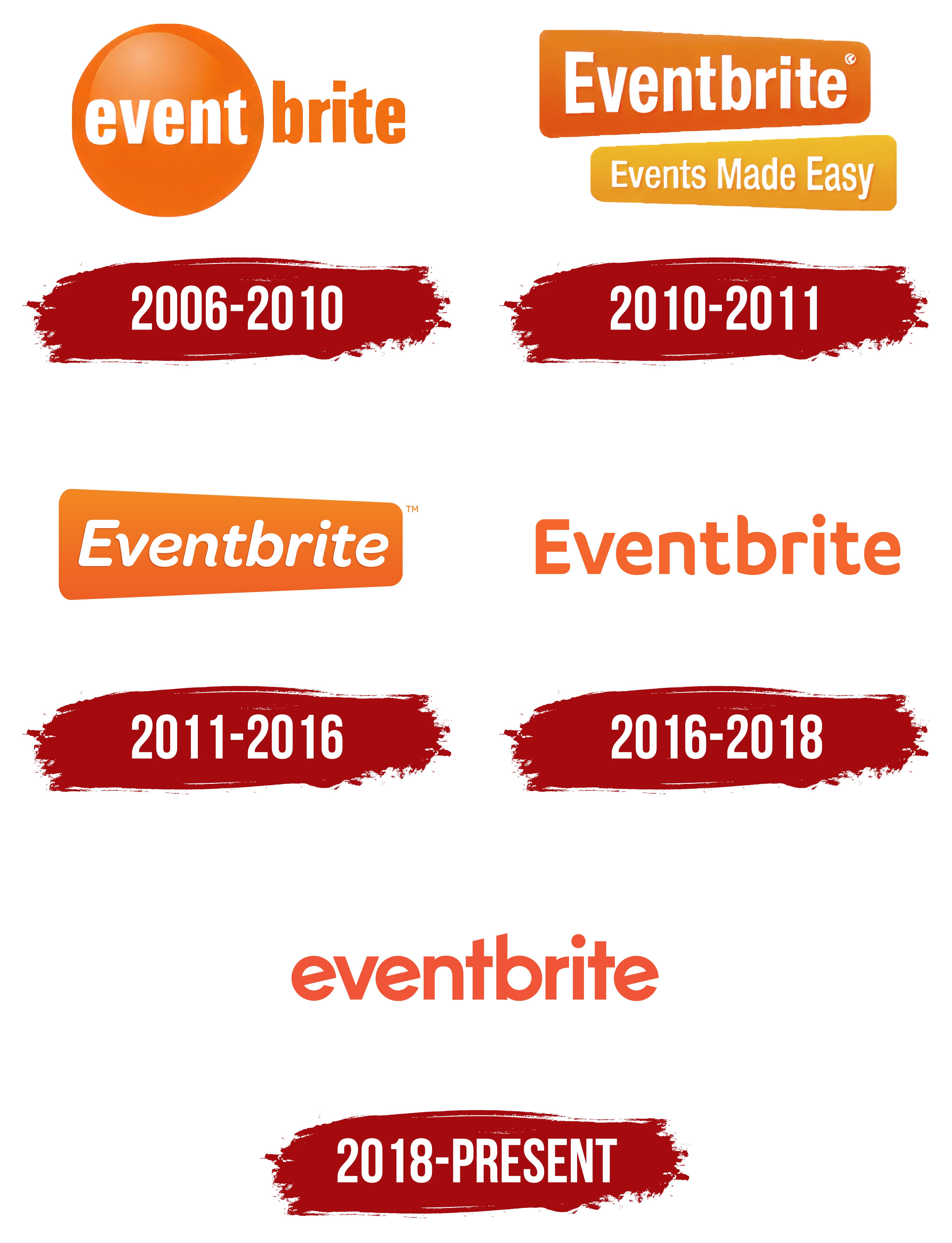
2006 – 2010
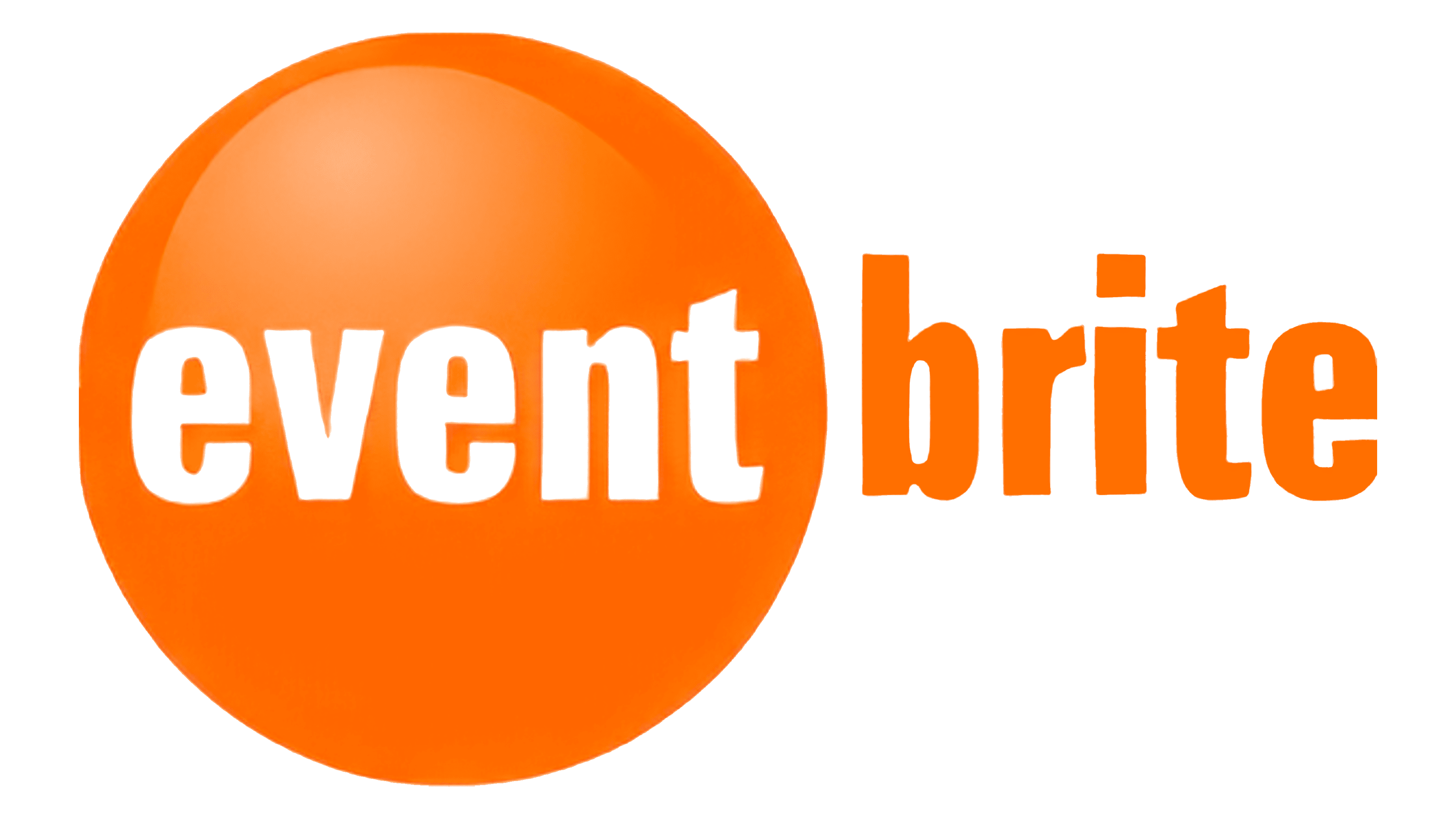
A large orange circle divided the original Eventbrite logo into two parts. This element could evoke different associations, resembling:
- The Earth symbolizes local events that companies organize to attract people to their city.
- A disco ball, a billiard ball, or a balloon evokes images of entertainment and fun.
On the shiny surface of the circle, the word “Event” was written in white letters. Next to it, in orange letters that matched the circle’s color, was the word “brite.” The second part of the name could be seen as a modified version of the word “bright,” symbolizing vibrant, successful, and memorable celebrations and events.
This logo’s design was intended to draw attention to something exciting and noteworthy. The shape of the ball used in the logo points to a platform where tickets for various entertainment events are gathered. This image visually supports the idea that Eventbrite brings together all offerings for organizing unforgettable events.
2010 – 2011
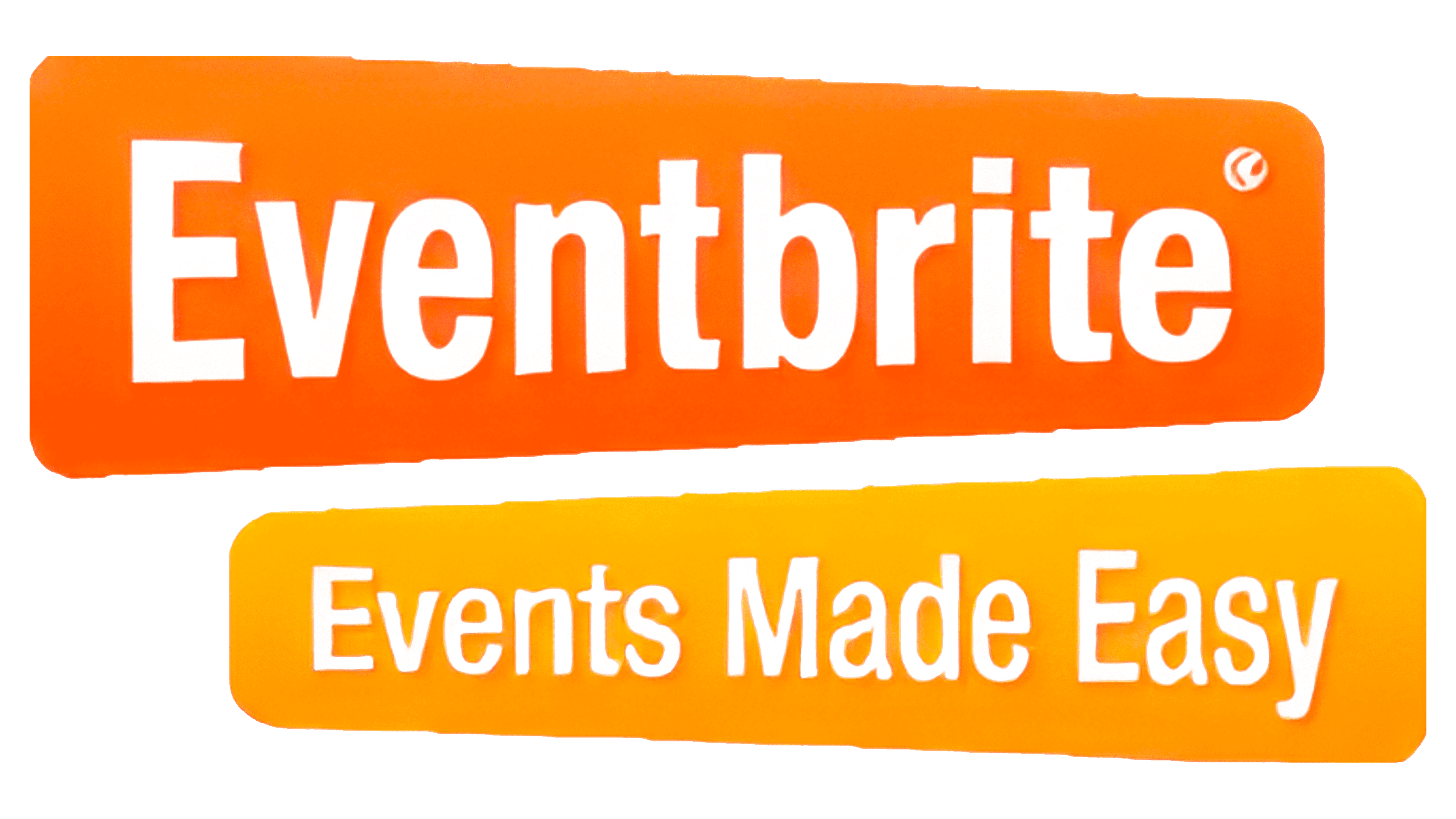
After the company’s expansion and increased user base, the emblem was updated to reflect a modern look. The new logo consists of two rectangular signs with smoothly rounded corners, creating an impression of movement in opposite directions. This image evokes associations with signposts leading to the event location, emphasizing the company’s focus on event organization.
The company name is set against a bright orange background on the first sign. The brand’s positioning is highlighted on the second sign: “Making Events Easy.” Each word is capitalized, giving the logo clarity and structure. The company emphasizes that all events are organized to a high standard. The light tone of the logo’s background visually conveys ease and simplicity in the event organization process.
Orange symbolizes communication and bringing people together, and it is associated with a warm and friendly atmosphere. This shade highlights that Eventbrite is a platform that fosters communication and the organization of enjoyable, memorable events.
2011 – 2016
An investment of $50 million further developed the company, leading to a change in the company logo. Only the top sign with the resource name remains on the emblem, while the right part of the background is slightly elongated and fades into the distance, creating a sense of forward movement. This design element symbolizes an invitation to follow new opportunities, like an open door calling toward new achievements and prospects.
The font was a light italic, highlighting the company’s growth and development process. The script style reflects the brand’s unique character, showcasing the individuality of each event. The light, flexible font emphasizes that every event organized through the platform is a unique, one-of-a-kind experience specially prepared for its participants. Posters and announcements for these events are created with special attention to detail, highlighting a personalized approach to each occasion.
2016 – 2018
The logo strives for minimalism, focusing not on the design but on the events announced through the resource. A simple and concise orange inscription, free of unnecessary details, conveys the brand’s main idea. The name reflects the company’s purpose, while the orange color conveys a sense of communication, bringing people together and hosting events, creating an atmosphere of lively interaction.
The simplified design keeps the focus on the essence of organizing and promoting events. The color palette enhances the logo, highlighting its mission to facilitate meetings, communication, and uniting people through the platform. The visual symbol simultaneously communicates that the platform offers access to a wide range of events and fosters a comfortable environment for participant interaction and engagement.
2018 – today
After going public, the logo changed. The letters lost their script elements, giving the name a more business-like and formal appearance. This new styling, without capital letters, emphasizes the platform’s supportive role: it serves as a resource that provides information and tools, not taking center stage at the event itself.
The slightly slanted lines symbolize upward movement and instill a sense of optimism. This reflects growth and development, indicating that using the platform helps increase attendance, which is crucial for event organizers. The logo promises mutually beneficial cooperation, highlighting the opportunity to attract more viewers and creating an impression of effective and productive interaction between the platform and event organizers.