


![]() Evinrude Logo PNG
Evinrude Logo PNG
The Evinrude logo conveys the shape of the boat engines that the company produced. Although it is now discontinued, its emblem has gone down in the history of visual identity as corresponding to the corporate concept. The badge consists of two elements facing each other to form a kind of “case” or “housing.” Inside the non-crossing brackets is the company’s name, the basic “stuffing,” without which the boat would be unable to move easily and quickly.
Evinrude is a brand of 2-stroke outboard motors that was registered in the USA in 1907. It originated in Milwaukee, Wisconsin, and was founded by Norwegian-American inventor and engineer Ole Evinrude. This person is the creator of an innovative engine for light boats and boats. Until 2020, the trademark belonged to Bombardier Recreational Products, but it ceased to exist thereafter. Its head office was in Sturtevant, Racine County.
Paradoxically, the emergence of this industrial site is associated with ice cream. Ole Evinrude and his assistant, Bessie Cary, were relaxing on the lake one day. Suddenly, the girl wanted ice cream. It was necessary to sail two and a half miles on a boat to the shore. However, Ole still went after him. On the way back, the sweetness naturally melted away. Impressed by this incident, Evinrude had a burning desire to develop a special device that would successfully replace the oars and allow the boat to move much faster than by hand.
By that time, the young man had become familiar with mechanics and was passionate about it, so he designed and built an outboard boat engine. To do this, he founded the company Evinrude Motors in Milwaukee. His company immediately set about developing a 1.1 kW (1.5 hp) single-cylinder model. He introduced the novelty in 1909, and it immediately became popular. However, due to his wife’s health problems, the engineer sold his business in 1913. In parallel, the entrepreneur created a two-cylinder outboard engine and put it into production in 1921, opening another company – ELTO Outboard Motor Company, where the abbreviation stands for Evinrude’s Light Twin Outboard.
The new project also received wide appreciation and high interest among buyers, so the developer combined his two companies into one, adding a competitor, Johnson Motors. This happened in 1929. The company was later named OMC (Outboard Marine Corporation). Then there were many mergers, divisions, and transitions, after which the Canadian Bombardier Recreational Products owned the original brand. However, this technical organization failed. In 2020, it announced the closure of the Evinrude brand as it decided to move from outboard motors to pleasure boats.
Meaning and History
![]()
The Evinrude brand logo uses its name. It is made in the original style, with some of the letters resembling geometric symbols and even elements of technical devices.
Although the North American company Evinrude has been closed, it is still remembered by the logo that adorns outboard motors on boats produced before the business’s liquidation. This sign has several versions with different inscription designs. Recently, massive bold letters inclined to the right side have been used. They seemed to be sliding because the emblem’s authors softened the severity of right angles with smooth rounding. Due to the glyphs’ location and shape, the movement’s effect was created because speed is the main thing for a motor manufacturer.
What is Evinrude?
Evinrude is an American brand that manufactures outboard engines for boats. It appeared in 1907 and was founded by an engineer of Norwegian descent, Ole Evinrude. The last owner of this brand was Bombardier Recreational Products, but in 2020, they abandoned it.
Before 2004
![]()
The company once had a patriotic logo that remains one of its most recognizable symbols. It contains blue “EVINRUDE” lettering with red and white outlines. In the background is a curving ribbon stylized as the official US flag. It is decorated with seven white five-pointed stars on a blue background and horizontal stripes of red and white. This emblem reflects the brand’s national identity.
2004 – 2019
![]()
The unique “E” glyph can be said to be depicted like an outboard motor or its fasteners. The lower part of the symbol is rounded and mimics the detail that allows the engine to be mounted on the side of the boat. Both “Es” have a similar structure, the first and the last.
Two more letters are particularly interesting from a typographical point of view: “U” and “N.” To emphasize their resemblance, the developers used the lower case “n,” which is almost identical to the inverted “u.” For maximum similarity, the designers removed the protruding mini-strokes at the ends. These glyphs also echo “D” with a semi-circular right side.
The word “EVINRUDE” is one line, stretched horizontally. It is typed in bold printed characters with straight lines and a slight right-sided slope. All letters look uppercase, but this is only at first glance. Looking closely, you can see two lowercase characters among the capital characters.
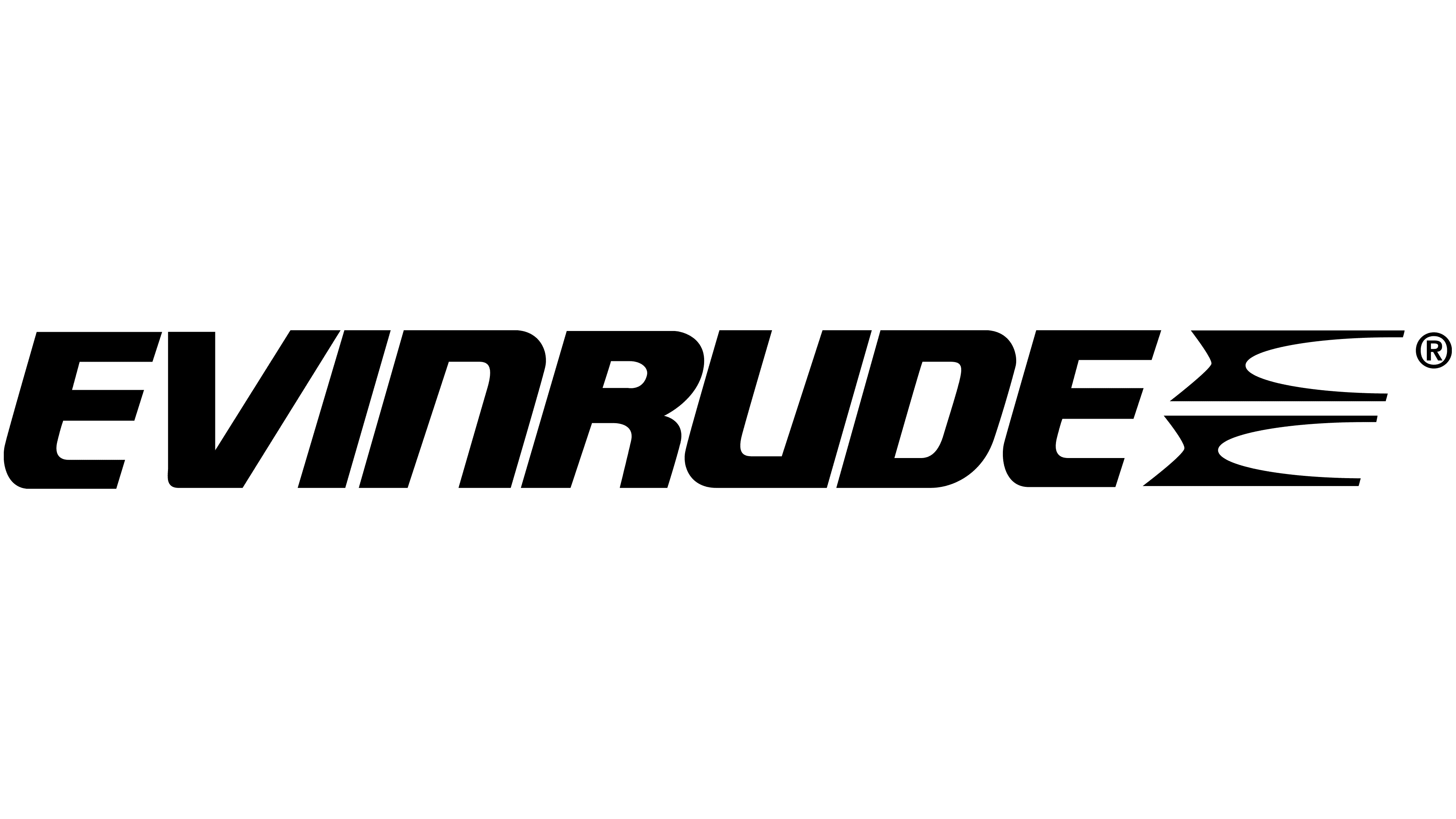
2019 – today
![]()
Here, the familiar Evinrude wordmark is set in an open frame with two horizontal elements resembling square brackets. All parts of the logo are black except for the empty white background. The letter spacing is narrow but just enough to keep the glyphs from touching.
Font and Colors
For its logo, the company chose a technological typeface that is related to the theme of internal combustion engines. That is why the letters are massive, bold, and in an industrial style, with details reminiscent of the era. Moreover, they lack serifs and look as if they were cast from metal. The brand’s color palette is simple, combining black (for the inscription) and white (for the background).