


 Extra Gum Logo PNG
The Extra Gum logo conveys a cool, minty freshness. The emblem emphasizes the product’s popularity and hints that the flavor intensifies with each chew. The day-and-night cycle symbolizes the long-lasting taste and reliable protection for your teeth, 24/7.
Extra Gum entered the US market in 1984 under Wm. Wrigley Jr., responding to rising demand for sugar-free chewing gum. The first flavors were peppermint and cinnamon, sweetened with sorbitol and mannitol instead of sugar. Early advertising focused on dental care and promoted chewing between brushings. Fruit flavors such as apple and strawberry followed by the late 1980s.
Growth continued through the 1990s as the brand added new flavors and packaging. A reusable plastic bottle appeared in 1992, followed by a slim pocket case in 1997. In the early 2000s, Extra expanded into Europe, Asia, and other markets, adjusting flavors and advertising to regional preferences. Mars acquired the parent company in 2007, giving the line access to wider production resources.
Marketing changed during the 2010s, with campaigns centered on personal connections and small acts of kindness. Dessert Delights launched in 2013 with Apple Pie and Strawberry Cheesecake flavors. Chewy Mints followed in 2015, Refreshers in 2017, and pocket-sized Sticks packaging in 2018. Mint Mojito and Tropical Mango joined the range in 2019.
Fusion arrived in 2022 with vitamins, antioxidants and natural energy ingredients. In 2023, the Extra Fresh app added breath-freshening tasks, dental-care tips and purchase rewards. The same year brought limited-edition packaging created with a designer and an online subscription service offering adjustable delivery schedules, order contents and regular product shipments.
Meaning and History
What is Extra Gum?
It is a brand of chewing gum manufactured by Wrigley Company, a subsidiary of Mars, Incorporated. Known for its long-lasting flavor and sugar-free formula, chewing gum offers a variety of flavors to suit different tastes. The brand’s product line includes classic mint flavors such as Spearmint and Peppermint, as well as fruity options such as Polar Ice, Winterfresh, and various berry flavors. The gum is marketed as a breath freshener and teeth cleaner, often advertised as beneficial to oral health. It comes in various packaging formats, including traditional sticks and convenient granulated gum in plastic bottles or blister packs. With long-lasting flavor, no sugar, and a range of flavors, the gum has established itself as a leading brand in many markets worldwide.
1984 – 1994

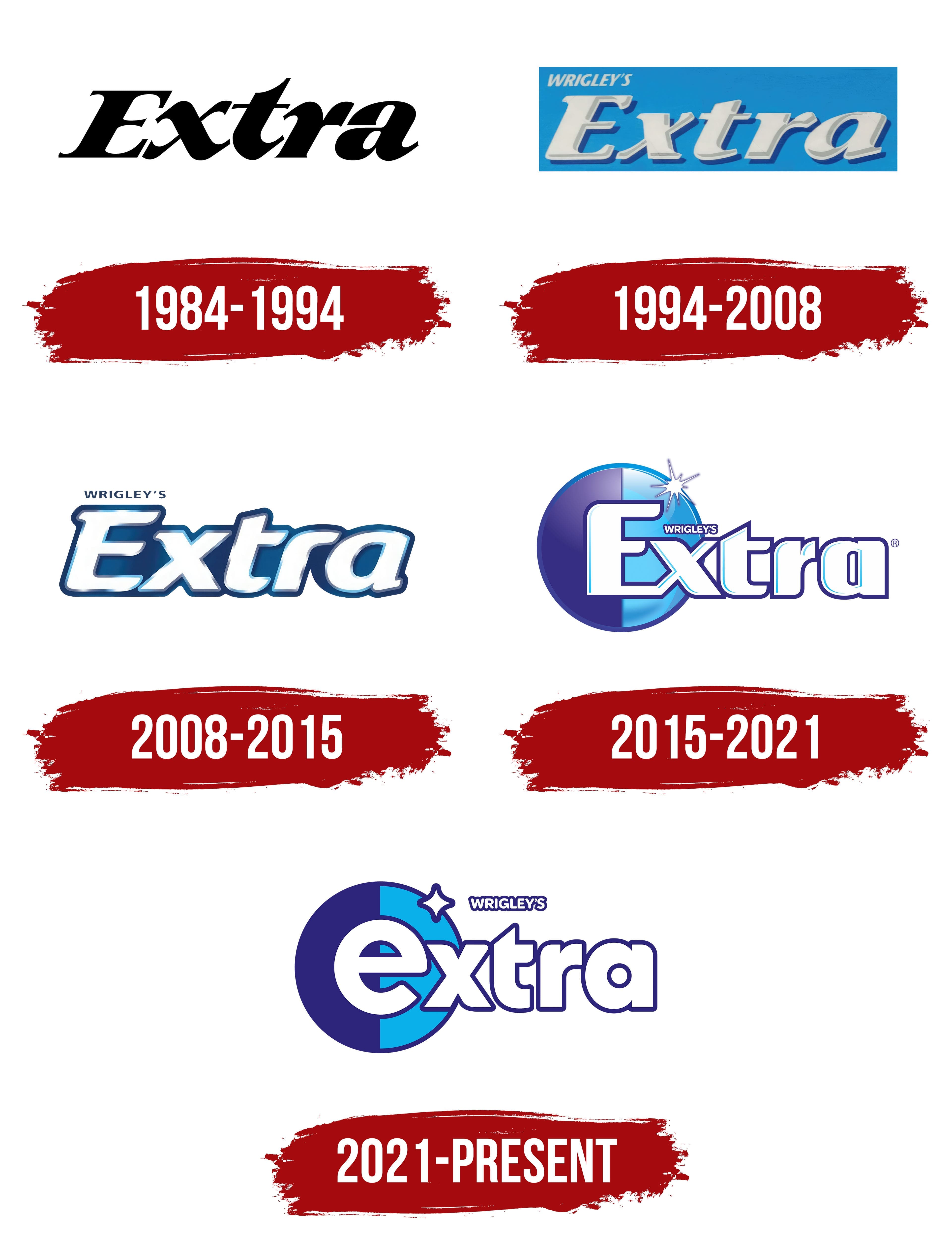
The first Extra Gum logo was minimalist, consisting only of the brand name. The elongated letters resembled chewing gum strips, emphasizing the connection to the product. The font featured sharp ends, creating an effect of freshness and dynamism, as if the letters were themselves bent from gum. The color palette highlighted the long-lasting flavor, while the slender ends of the glyphs hinted at the sharp and refreshing note characteristic of Extra chewing gum.
1994 – 2008
In 1994, the Extra Gum logo was transformed to convey a better sense of freshness. The light blue background evoked the sky, lightness, and coolness, enhancing the perception of the product’s freshness. The white letters became three-dimensional, resembling gum pillows, emphasizing the product’s softness and pleasantness. The white color also symbolized clean teeth, reflecting the sugar-free formula recommended by dentists. The logo mirrored the packaging’s shape, making it easily recognizable. The parent company’s name, Wrigley’s, was placed above the brand name without any additional effects, helping to keep the focus on the main product.
2008 – 2015
The logo was updated to convey Extra Gum’s refreshing chewing gum flavor more accurately. The background became textured, with white and greenish swirls reminiscent of frost patterns on glass. White ice crystals emphasized the cool freshness, while green hues symbolized mint leaves, whose extract was used to create the flavor. The logo’s background represents naturalness and coolness. The white lettering was framed by dark green shadows, enhancing the sense of brightness and associating it with the color of the gum strips and the cleanliness of the teeth.
2015 – 2021
A circle appeared in the logo’s background, divided into light blue and dark blue halves, symbolizing day and night, the time when the gum protects the teeth. A shining dot is highlighted on the edge of the circle, representing the sun and embodying the purity and radiance of tooth enamel. The letters of the brand name are set in a unique font, with the capital “E” featuring rounded corners that resemble a tooth, emphasizing the product’s enhanced protection and freshness.
2021 – today
The Extra brand and its new visual identity are closely tied to the evolution of the chewing gum industry, where Wrigley’s has consistently held a leading position, offering consumers a product that meets their expectations.
The Extra logo from Wrigley’s successfully blends symbolism and modern aesthetics, conveying the product’s long-lasting, rich flavor and freshness. The emblem’s core idea of round-the-clock protection has been preserved and enhanced with new elements that underscore the company’s leadership in this industry.
The font has been transformed into a smoother, more rounded style, creating a sense of continuity and the product’s long-lasting effect. The flowing lines of the letters symbolize the softness and comfort consumers experience when using Extra gum. The font’s visual simplicity and rounded nature emphasize the product’s ease of use and accessibility to all consumer categories.
The color scheme, consisting of shades of blue and white, reinforces associations with cleanliness, freshness, and reliability. Blue is associated with stability and trust and evokes a sense of coolness and freshness, making it an ideal choice for a product designed to refresh breath. The white letters emphasize purity and simplicity, making the emblem memorable.
A key element is the stylized star on the letter “E.” This symbol represents a celestial body, highlighting the product’s round-the-clock effectiveness and signifying Wrigley’s leadership in its field. As a bright accent, the star adds energy to the logo, which is crucial for a brand emphasizing unparalleled quality.