


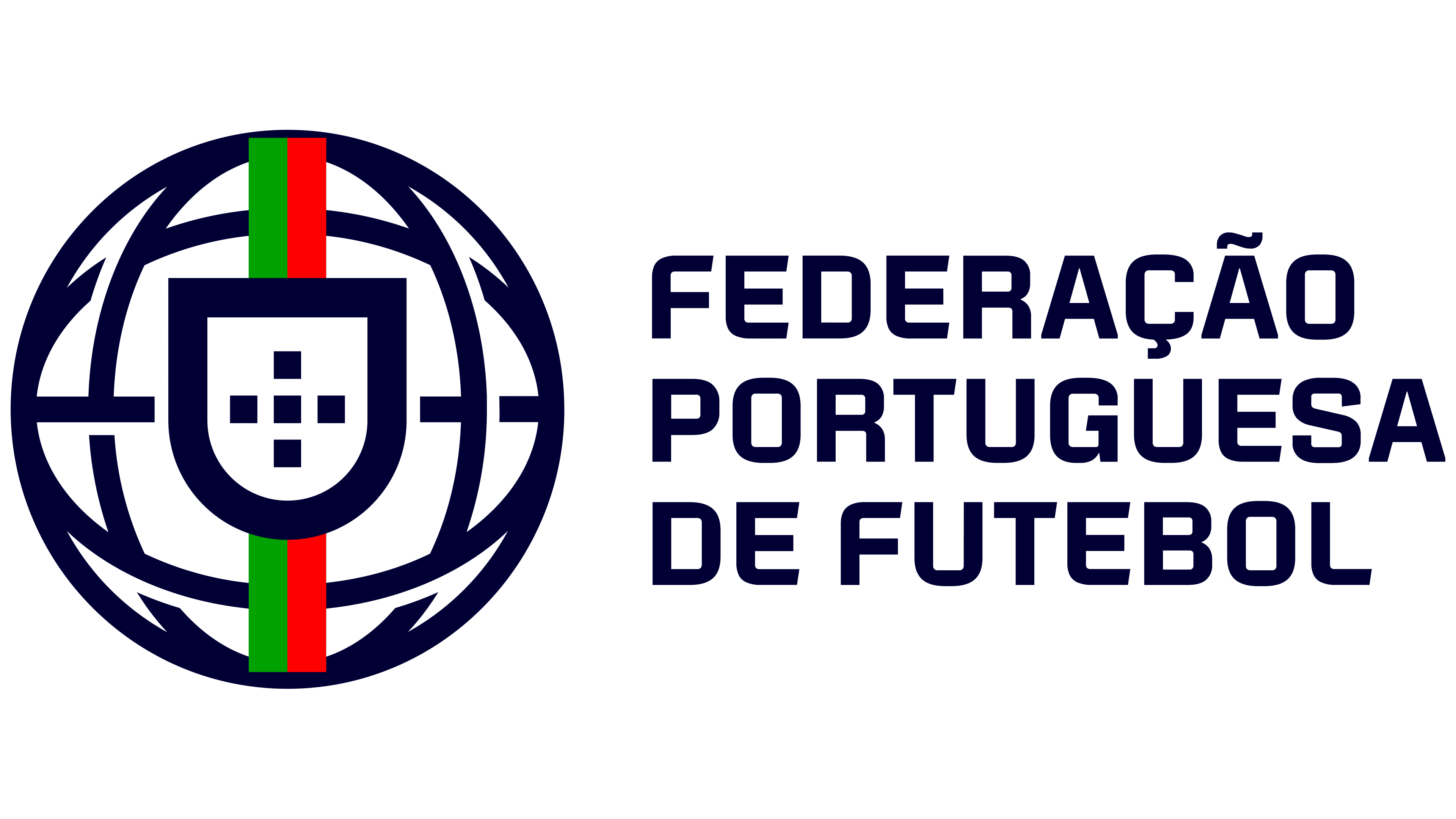
The Portuguese Football Federation’s new corporate logo sparked debate when it was unveiled on July 1, 2026. An emblem featuring a sphere around a shield appeared on the FPF website, prompting fans to question the fate of the familiar red cross. That evening, the federation clarified the update’s purpose. It applies to business and administrative communications, while the national teams’ jerseys will continue to carry the historic crest.
The change reflects the way FPF organizes its operations. The units within FPF Empresarial needed a shared identity that would establish their connection to the federation. The logo was developed for a range of sizes and applications, from phone screens to printed materials and events. The new version relies on bold shapes with simplified internal details.
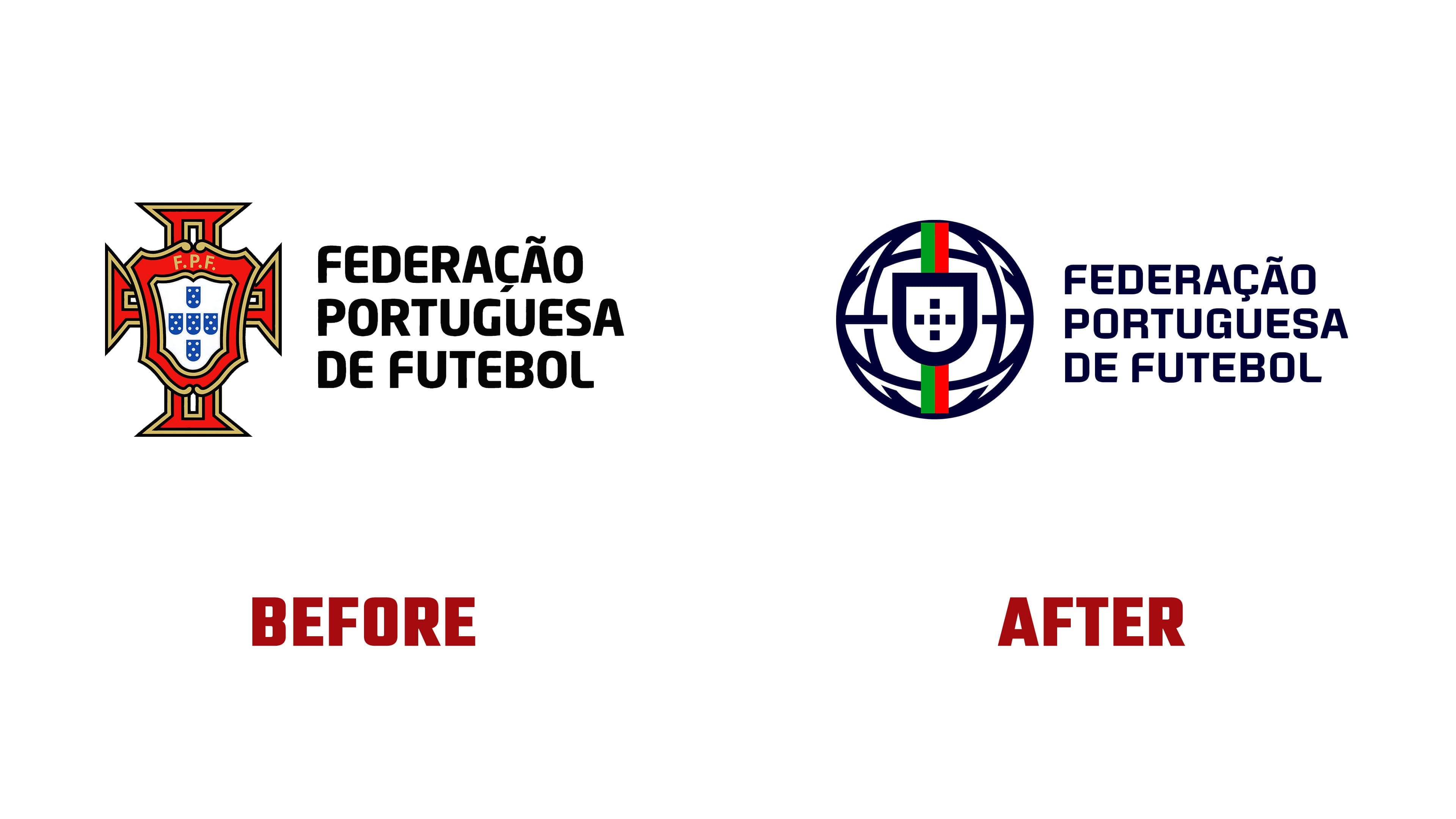
The biggest change surrounds the shield. In the previous emblem, it sat in front of the red Cross of the Order of Christ, with flared ends, a light border, and decorative interior lines. The corporate version replaces it with a sphere. Arcs and a horizontal line cross the outer ring, creating a rounded framework. The shield’s proportions and its size relative to the federation’s name have also changed.
Design Tagebuch commentator Achim Schaffrinna compares the new construction to the armillary sphere on Portugal’s flag. The country’s Museum of the Presidency connects the sphere’s national significance to the Age of Discovery, known in Portuguese as the Descobrimentos. In Schaffrinna’s interpretation, the logo references Portuguese history through a different symbol.
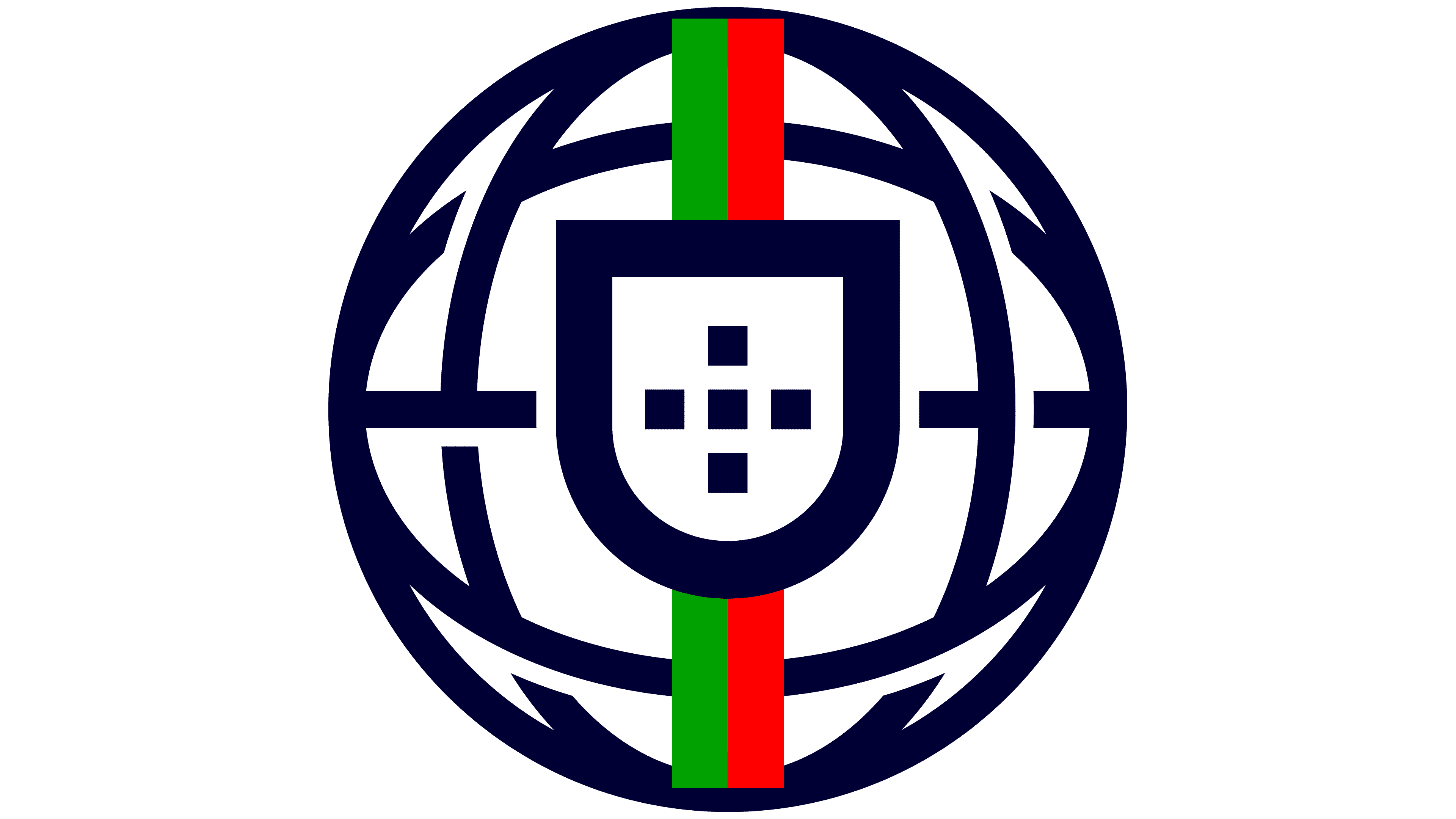
The arrangement of five shapes inside the shield remains. Previously, five small blue shields containing white dots formed a cross. Five white squares now replace them. The FPF initials have been removed from the upper section. The outer shield has a thick white border, a horizontal top edge, and a rounded base. The shape arrangement maintains a connection to the old version, while large solid forms replace the small heraldic details.
Red has moved from the cross to short bands above and below the shield. Green bands appear alongside them, introducing the second color of the Portuguese flag. These colored sections sit along the emblem’s vertical axis and interrupt the sphere’s white lines. In the primary version, the framework, shield border, internal squares, and name are white against a dark blue background.
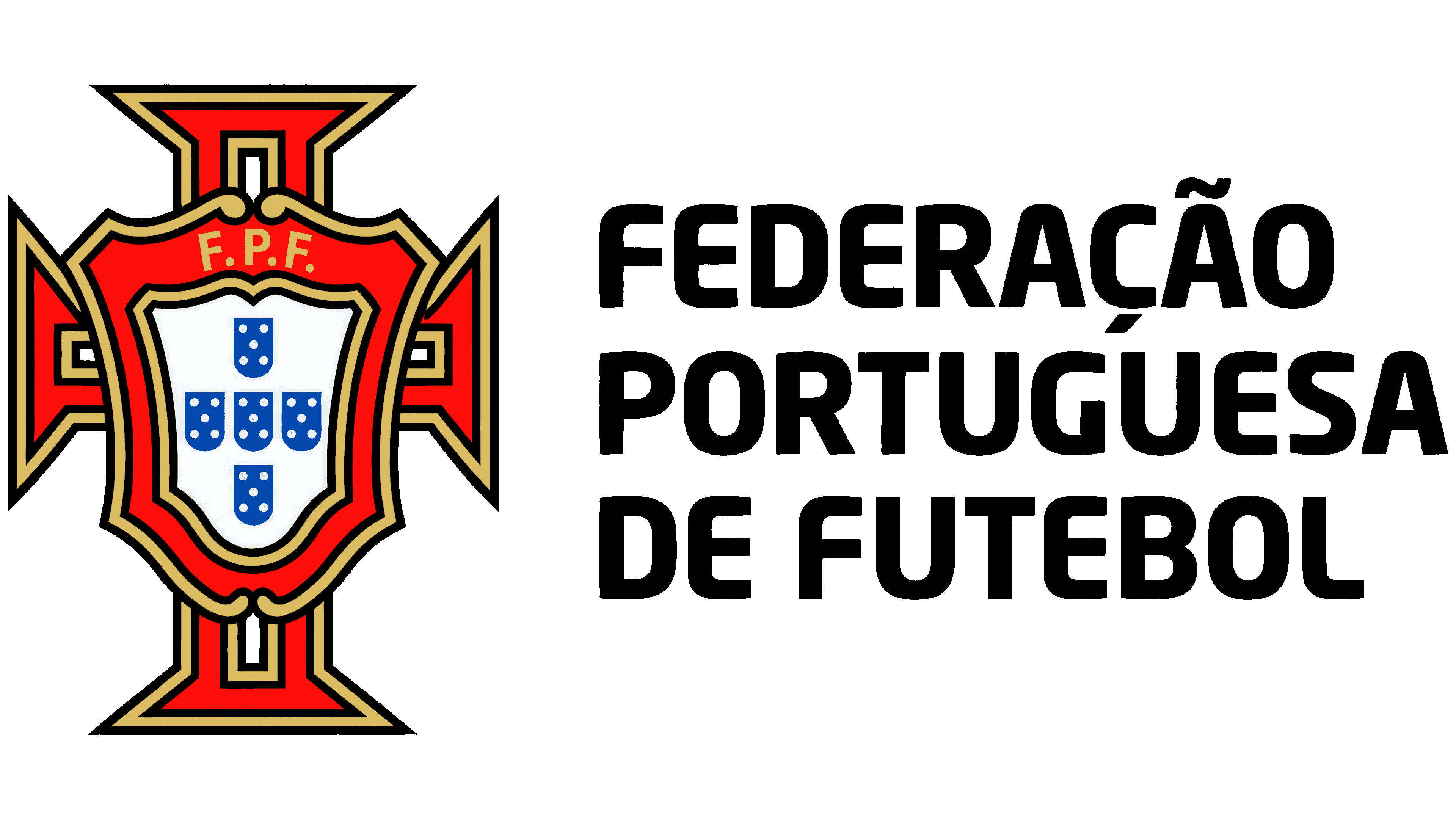
The name FEDERAÇÃO PORTUGUESA DE FUTEBOL remains on the right, arranged across three lines. It uses a new bold sans-serif typeface. The uppercase letters are heavier, with angular forms and nearly uniform stroke widths. Rounded sections now have extended horizontal and vertical strokes joined by softened corners. The diacritics required by the Portuguese spelling are preserved. The lettering’s weight echoes the shield’s border.
The logo appeared on the website during the World Cup, intensifying interest in the change. Some fans associated replacing the red cross with a loss of soccer heritage. Others compared the shield to the emblem of beer brand Sagres, as Footy Headlines reported. The social media response prompted FPF to clarify that evening the intended use of the corporate identity.