The Fisher-Price logo is designed in a bright and festive style, which fully corresponds to the character of a children’s brand. The use of rich, vibrant colors and elements, such as the shape of a tent, instantly evokes associations with joy and fun, characteristic of the world of toys. This emblem seems to refer to the image of a cozy store filled with the best products for children, where every design element attracts attention and creates a sense of warmth and comfort.
Fisher-Price: Brand overview
The story of Fisher-Price began in 1930 during the Great Depression in East Aurora, New York. Herman Fisher, Irving Price, and Helen Schelle combined their advertising, business, and toy development expertise to create a company focused on producing high-quality, affordable toys. Their goal was to create products that could withstand the difficult economic times while still bringing joy to children.
The first product, “Dr. Doodle,” a wooden pull-along duck on wheels, was introduced at the 1931 New York Toy Fair and became an instant success. This early achievement helped the company survive the tough financial challenges of the era.
Throughout the 1930s, the company remained focused on producing durable wooden toys, sourcing materials locally, and supporting the regional economy. The 1940s brought new challenges during World War II as the company shifted to producing wooden parts for military vehicles. After the war, the team returned to toy production, incorporating new technologies into their designs.
In 1950, one of the company’s most iconic products, the Little People series, was introduced. Initially simple wooden figures, these toys evolved into detailed playsets that became favorites for generations of children.
The 1960s marked significant growth. The company used plastic in toy production for greater durability and more intricate designs. In 1969, Quaker Oats acquired the business, which led to further expansion and innovation.
During the 1970s, the company expanded internationally and entered new markets, launching iconic toys like the Chatter Telephone and Music Box. By the 1980s, the company had expanded into educational toys, electronics, children’s furniture, and baby products. 1984, it became a publicly traded company after separating from Quaker Oats.
In 1993, Mattel, the world’s largest toy manufacturer, acquired the company. This acquisition opened global growth and innovation doors, with new product lines like Laugh & Learn introduced in 1997, which became popular with parents and children.
The 2000s embraced digital technology, with kid-friendly cameras, toy computers, and other electronic devices, expanding the company’s baby and toddler market presence. The 2010s continued this innovation with toys connected to smartphones and tablets, like the Apptivity series, blending traditional play with modern tech.
In 2020, the company celebrated its 90th anniversary, introducing new products while adapting to global challenges. In 2021, they launched a modern version of the classic Chatter Phone, integrating Bluetooth technology for real-time calling.
By 2022, the brand remained a leader in educational toys, with an enhanced online presence that included apps and digital content aimed at interactive learning. As 2023 began, the company continued to evolve, focusing on the needs of modern families while staying true to its founding values of creating high-quality educational toys that bring joy to children and peace of mind to parents.
Over nearly a century, the company has consistently delivered innovative, durable, and educational toys, remaining a major force in the children’s toy industry.
Meaning and History
What is Fisher Price?
This brand is well-known in the children’s toy industry and is renowned for combining entertainment with educational value. The company offers a variety of toys for infants, toddlers, and young children — from brightly colored rattles and teething toys to interactive learning tools and creative playsets. The distinguishing features of the toys are vibrant colors, friendly characters, and durable construction that withstands active play. The range includes modern electronic educational toys that adapt to children’s developing skills and timeless classics like the Chatter Telephone and Rock-a-Stack. The toy designs consider age-specific needs and aim to develop sensory skills, improve motor abilities, and stimulate cognitive growth.
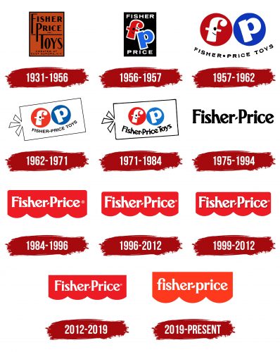
1931 – 1956
The company’s first emblem was designed in a style reminiscent of a catalog cover or a label on toy boxes. The design conveyed a sense of reliability and tradition, reflected in the terracotta background, which evoked treated wood, symbolizing craftsmanship and quality. The brand name, Fisher-Price, was written in black letters on this surface, and beneath the line formed by the upper glyph of the letter “T,” the product type—Toys—was indicated.
The company name was chosen for its founders, Herman Fisher and Irving Price, and his wife, Margaret Evans Price, emphasizing the family roots and legacy at the brand’s core. At the bottom of the emblem was a mention of the city of Aurora, where production was organized. This city played a key role in the company’s formation, as its mayor made significant investments in establishing the enterprise.
1956 – 1957
The emblem was developed when the company switched its primary material from wood to plastic, marking an important milestone in its history. The first batch of toys made from the new material was released in the late 1950s. On the emblem, set against a black background, bright, cartoon-like letters representing the abbreviation of the name stood out. This design emphasized the main advantage of plastic—its ability to retain vibrant and bright colors.
The color scheme, consisting of red and blue, symbolized products for both boys and girls. A smiling face was depicted on the letter “f,” giving the emblem a lively and friendly character. This character reflected the main feature of the brand’s toys—they become true friends for children, coming to life in their hands.
The full company name was written in white capital letters on both sides of the emblem, above and below. The color and thickness of these glyphs were carefully chosen to harmonize with the outline of the central symbols, creating a cohesive and balanced composition. The emblem presented the company as a bright burst against its competitors, like a gift that delights the eye and conveys a sense of joy and magic.
1957 – 1962
The next brand logo was designed as a smiley face, bringing playfulness and joy to the design. The two former letters, “f” and “p,” were placed in circles, colored blue and red. These symbols, resembling animated pupils, evoke associations with cheerful sparkles in the eyes, giving the emblem a bright and friendly character.
The lower part of the visual mark is shaped like a smile, and the full brand name is written in black capital letters inside. This element creates a cohesive visual impression, where every detail works to create an image that conveys a sense of joy and fun. The colors and shapes blend harmoniously, enhancing the emotional impact of the logo and emphasizing its focus on a children’s audience.
1962 – 1971
The new logo’s transformation is based on a play on words and associations with the brand’s name and underwater creatures. The emblem now resembles a cartoon fish with an original and whimsical tail, adding dynamism and fun.
One of the features of this design is its ambiguity: each viewer can interpret the shape in their own way. In the lines, one can see a fish, a candy, a carrot, a robot’s head, or even a price tag. This versatility brings an element of play and imagination, making the logo more appealing and interesting to children and adults. This sense of playful fun has become a key feature of the brand’s new image.
At the same time, the core element remains intact—the smiley face, carried over from the previous version, is still at the center of the logo. The face is slightly turned to the side, adding a playful and cheerful character and reinforcing the feeling of lightness and friendliness.
1971 – 1984
After the acquisition of Quaker Oats Company, the logo underwent minor changes. The core image of the emblem remained recognizable, preserving its original identity. However, one of the key changes involved the font: the brand name is now written in a different, more modern typeface, with each word beginning with a capital letter. This detail creates the impression of a toothless child’s smile gaining its first teeth, symbolizing the brand’s growth and development.
The unique new font added freshness and originality to the logo, making the brand’s image more expressive and authentic. It highlights the company’s commitment to its roots while demonstrating a readiness for change and renewal, making the logo a harmonious blend of tradition and innovation.
1975 – 1994
Only the signature black font remains in the updated version of the visual mark, which remains a key element of the visual identity. This symbol appears clear and concise, reflecting the core characteristics and approaches of the Quakers. The simplicity represents the pursuit of clarity and straightforwardness, aligning with the movement’s philosophy.
The parent company, Quaker Oats, uses the religious image of the Quakers to associate its products with integrity, honesty, and high quality. The logo conveys these values through its simplicity and minimalist design. The naturalness and sincerity inherent in the Quaker movement’s philosophy are embedded in every detail of the emblem, emphasizing that the brand strives to create products that uphold these important principles.
The logo’s strictness and purity convey trust in the brand, making it recognizable and evoking respect for the traditions embedded in its philosophy.
1984 – 1996
In 1984, the emblem first featured a tent image similar to those on store facades. This element added an association with real retail locations where customers could find the brand’s products. The lettering on the canvas seems to emphasize simplicity and accessibility, likely drawn from actual store signs, making it familiar and recognizable to shoppers.
The emblem conveyed the image of stores designed in a unified style and strengthened the visual connection between red tents and the company. The bright red color of the tent looked festive and appealing, perfectly suited for children’s products, creating a sense of fun and joy. This approach added an element of play and made the brand more memorable to its target audience.
This image may have been conceived because Quaker Oats sponsored the filming of Charlie and the Chocolate Factory. In the film, sweets were sold under a red tent, which could have been a subtle reference to beloved children’s products, evoking associations with something pleasant and desirable for customers. This bright and playful logo element added an emotional connection to the brand, associated with joy and childhood dreams.
1996 – 2012
The logo’s color scheme became lighter while the original image was fully preserved. The updated colors gave the emblem a fresh look, making it brighter and more appealing without altering its core structure and recognizability.
1999 – 2012
The logo’s color scheme was changed to a rich burgundy shade to highlight the company’s historical heritage and give its image a touch of respectability and exclusivity. This color palette emphasizes the brand’s association with unmatched product quality, tradition, and durability. The burgundy hue creates a sense of solidity and sophistication, reinforcing the company’s connection to its long-standing history.
Additionally, the lettering on the emblem was enhanced with a shadow, creating the effect of it slightly rising above the background. This technique added visual depth and dimension, making the logo more expressive and dynamic. The shadow gives the lettering a special significance, emphasizing its role as a symbol of reliability and the brand’s status, which strives for perfection in all aspects of its work.
2012 – 2019
The logo was reverted to its 1996 design, but the font became noticeably smaller, symbolizing the company’s desire for further growth and development. The reduced text size leaves room for future achievements, emphasizing that the brand has not yet fully realized its potential. This decision visually demonstrates the company’s readiness for new challenges and ambitions that lie ahead on its path.
2019 – today
The well-known studio Pentagram updated the modern Fisher-Price logo and reflected a new, simpler, and more contemporary approach to the brand’s visual identity. The main feature of the new design is the three waves at the bottom of the emblem, replacing the previous four. This change symbolizes the company’s three founders, thus highlighting the brand’s historical foundation and a return to its roots.
The red symbolizes energy, activity, and joy, perfectly aligning with the brand’s primary audience—children and their parents. The emblem conveys fun and friendliness, creating a warm and trustworthy feeling for the customer.
The font was changed to lowercase letters, making the logo simpler and more accessible, especially for young children. The rounded letters add a sense of softness and safety—important qualities for a brand that specializes in making toys. The style appears friendly and welcoming, making the visual mark appealing to children and their parents.
The logo brings the brand back to the themes of childhood and fun, emphasizing the company’s key philosophy: toys should be entertaining, safe, and easy to understand. The simplicity and lack of unnecessary details in the brand’s identity make it memorable.
