


![]() Five Below Logo PNG
Five Below Logo PNG
The Five Below logo reflects the young age of its customers and the low prices available to its target audience. Among the many cute little things, there is sure to be something that will appeal to you. The emblem assures: the network is a great place to spend pocket money.
Five Below grew out of the retail experience of David Schlessinger and Tom Vellios, who had worked together on Zany Brainy in the 1990s. Schlessinger had also founded Encore Books at 18, while Vellios had led operations at Zany Brainy. Their next idea focused on preteens with pocket money and limited places to shop independently.
The first Five Below store opened on October 4, 2002, in Wayne, Pennsylvania. The concept sat between dollar stores and department stores, with most items priced at $5 or less. The chain used a bright “treasure hunt” format aimed at children and young teens. The company was first registered as Cheap Holdings before adopting the Five Below name.
In 2005, Five Below raised $20 million in Series B funding, then expanded across the Mid-Atlantic region. By 2010, after Advent International acquired a controlling stake, total funding had reached $231 million. On July 19, 2012, the company went public on NASDAQ under the ticker FIVE at $17 per share, raising about $192.5 million for expansion.
By 2016, Five Below had opened its 500th store and was nearing $1 billion in annual revenue. In 2017, sales benefited from the fidget spinner trend. In 2018, the headquarters moved to WowTown in Philadelphia. In 2019, the company added Five Beyond for items above $5, a shift shaped by rising costs. In July 2024, CEO Joel Anderson resigned and later joined Petco. In December 2024, former Forever 21 CEO Winnie Park was named the new head of Five Below.
Meaning and History
![]()
The very first Five Below store was opened in 2002. When choosing a name for it, the founders of the service, Tom Vellios and David Schlessinger, focused on the business concept under which the maximum price would be $5. Over time, one commercial point has turned into a whole network of discounters. But it did not start immediately; it began only in 2011, when the brand became known outside Philadelphia. The expansion is still ongoing, and the owners prefer to place new locations in shopping centers, where a large flow of visitors is guaranteed.
The company went public in 2012. But this did not affect its identity: one of the fastest-growing American retailers has been using a single logo for many years. The blue wordmark is easily recognizable thanks to its distinctive typeface. It contains the brand name written in letters of different sizes. The first word (“five”) is completely lowercase, but the “v” and “e” appear to be lowercase due to being out of proportion.
What is Five Below?
Five Below is a super-popular American retailer headquartered in Philadelphia, Pennsylvania. He owns more than 1,000 locations, all in the United States. Its range includes popular products in the low-price segment.
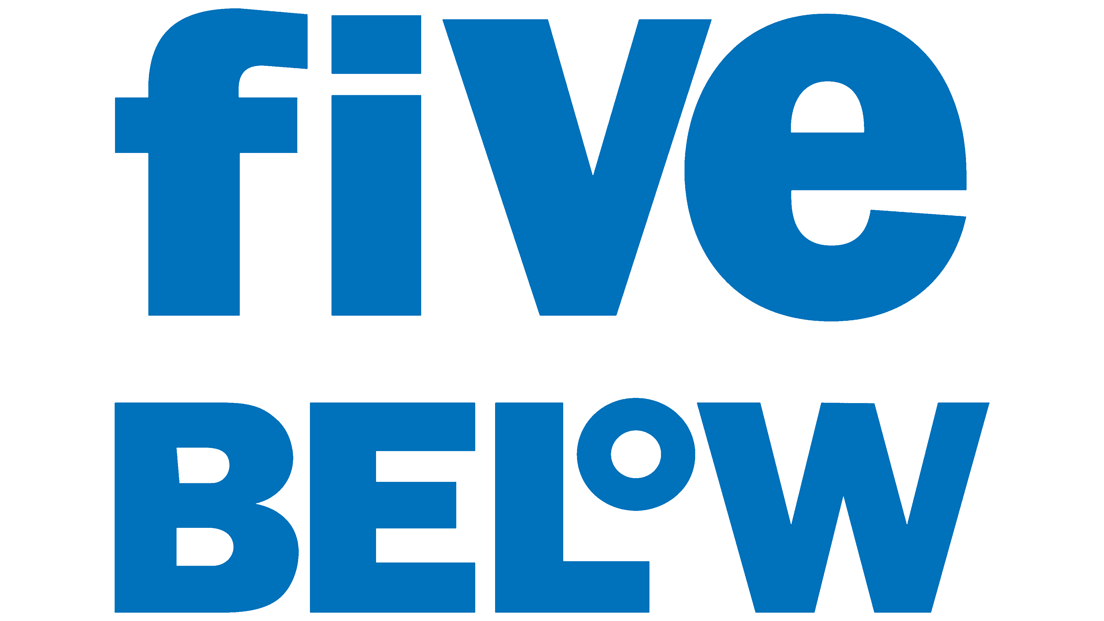
Almost all letters in the word “BELOW” are capital. The only exception is the small “o,” which is located at the top, between the right angle “L” and the diagonal line “W.” It looks exactly like a degree sign. Otherwise, the logo is completely unremarkable, except for its bright blue palette.
Five Below customers know its brand name, which adorns store signs. Despite its simple structure, it has a hidden dynamic because the transition of letters between registers expresses a willingness to change and grow. An unusual element in the form of a degree represents a creative business strategy. In general, the logo is designed for the trading network’s main customers: teenagers aged 10 to 19. Therefore, it looks informal, bright, and youthful.
Font and Colors
Given that graphic symbols do not complement the Five Below wordmark, the designers could only experiment with the inscription style. To do this, they used the usual, at-first-glance font: bold grotesque with right angles. Its exact analog is Five Below Gothic Regular from Bryan Howell Design. All letters in the logo have the same height, even though some are uppercase and some are lowercase. In this case, lowercase and uppercase characters differ not in size but in graphemes. The only exception is the “o,” reduced to fit in the “L” fold. This letter imitates the degree sign.
The white background contains only blue lettering in Blue Ribbon (#015ef0). It has no outlines, no shadows, and additional elements, so the palette is limited to two colors.