


![]() Gardaworld Logo PNG
Gardaworld Logo PNG
The GardaWorld logo signals a commitment to protecting clients and their property. The ability to fight, vigor, and vigilance can be traced in a bright sign. “We will take the hit,” the emblem promises.
GardaWorld began with Stephan Crétier, born in Montreal in 1963 to Italian and Swiss immigrant parents. After studying labor relations and earning an MBA, he saw how fragmented Quebec’s security market was in the mid-1990s. Dozens of small firms worked with uneven standards, and Crétier saw room for consolidation.
In 1995, he took a second mortgage on his home, sold his car, and raised 25,000 Canadian dollars to start Trans-Québec Security Inc. Its first client was CAE, the flight-simulator maker, a relationship that lasted for decades. Revenue reached 600,000 dollars in year one, 1.8 million in year two, and 3.6 million in year three, though Crétier later said he came close to bankruptcy four times.
The September 11 attacks in 2001 changed the security industry. Corporations, governments, and transport operators increased spending, and GardaWorld strengthened its position. In the mid-2000s, the company expanded through acquisitions, including the $391 million acquisition of ATI Systems International, while competing in a market dominated by Securitas and G4S.
By 2009, GardaWorld’s revenue had surpassed $1.2 billion. In 2012, Crétier took the company private with Apax Partners in a 1.1-billion-Canadian-dollar deal. Aegis Defense Services was acquired in 2015, adding high-risk operations in Africa and the Middle East. Rhône replaced Apax in 2016-2017, Drum Cussac joined in 2019, and BC Partners bought a 51% stake in a 5.2-billion-Canadian-dollar deal. In 2024, Crétier regained control with about 70% ownership, valuing GardaWorld at $13.5-$14 billion.
Meaning and History
GardaWorld’s clients include:
- African embassies.
- Middle Eastern oil producers.
- Canadian airports.
- U.S. financial and credit institutions.
- Major Fortune 500 corporations.
- Individuals who care about their safety.
The company provides 100 percent protection for people and property, as well as comprehensive cash management solutions, ATM monitoring, and value preservation. Therefore, the GardaWorld logo is associated only with reliability and stability.
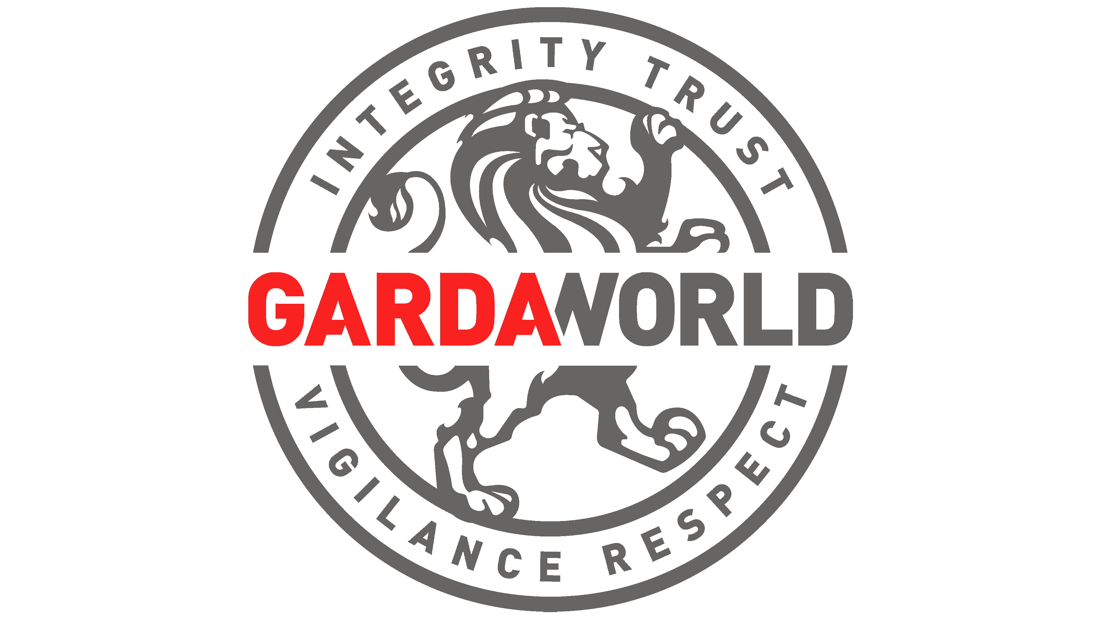
The visual sign of the service contains its name, written in upper-case boldface and sans serif. One half of the word (“GARDA”) is red, and the other half (“WORLD”) is gray, with the adjacent letters “A” and “W” sharing a diagonal line. It looks as if the “A” overlaps the “W.”
The decorative inscription is the central element of the GardaWorld seal. It is located between two concentric circles and divides them into four semicircles (half-arc circles), because only the gray outlines are visible. The circles themselves merge with the white base behind the text. In the upper margin, formed by an arched frame, is the phrase “INTEGRITY TRUST.” At the bottom, in an inverted arch, is the continuation of the motto: “VIGILANCE RESPECT.” And in the central circle is the figure of a lion, which stands on its hind legs, like a heraldic animal.
The lion on the seal symbolizes the company’s leading position and its commitment to protect customers in all circumstances. It is the embodiment of the determination and courage of specialists on the service staff. Although smooth gray strokes form its silhouette, the predator is drawn quite realistically. It raises its front paws upwards, thus resembling a heraldic lion. The emblem on which this GardaWorld animal appears embodies generosity, courage, and strength.
Font and Colors
The typography is chosen to make the text look imposing and monolithic. All the letters are big, bold, and sans serif, and the spaces between them are very narrow. The typeface could be called standard were it not for the triangular notch in the horizontal “A” stroke. As for the text around the edges of the print, a traditional grotesque with evenly thickened lines is used.
The only striking element of both logo versions is the first half of the company name: “GARDA.” It is painted in rich red. The other components, including the inscription and the lion image, are dark gray. At the same time, the base is completely white.