


 Giant Eagle Logo PNG
The Giant Eagle logo reflects the brand’s key values and mission, centered on providing fresh and natural products. The emblem symbolizes an abundance of plant-based goods that go straight from the farm to the shelves, emphasizing the importance of quality and sustainability. This symbol also represents a company that consistently supports its customers, offering convenient, accessible solutions for everyday needs.
Giant Eagle began in 1931, when the Goldstein, Porter, Chait, Polansky, and Weisenberg families combined their small grocery businesses during the Great Depression. The merger created Eagle Grocery Company and gave the owners greater purchasing power. In 1936, the first supermarket opened in Pittsburgh, bringing a broad range of products together under one roof.
During the 1940s and 1950s, the chain expanded across western Pennsylvania and tested new store layouts and service methods. In the 1960s, it moved into other parts of Pennsylvania and neighboring states, while automated checkout systems entered stores. The 1970s brought Fuelperks!, linking grocery purchases with fuel discounts, and the 1980s added locations in Ohio and West Virginia.
In the 1990s, Giant Eagle renovated older stores, opened larger formats, and expanded private-label goods. In the early 2000s, pharmacies, bank branches, and coffee shops appeared inside supermarkets. A compact grocery, fuel, and convenience format followed in 2004, while the 2013 acquisition of Rx21 Specialty Pharmacy expanded healthcare services.
Market District launched in 2015 with prepared food, organic products, and specialty departments. During the 2010s, the company introduced a mobile app, online ordering, home delivery, and pickup. By 2020, Giant Eagle operated more than 400 stores. In 2021 and 2022, it continued expanding digital services, renovating locations, and concentrating on its stronger store formats.
Meaning and History
What is Giant Eagle?
This family-owned business offers a variety of services to customers, combining traditional supermarket goods with additional offerings, including gas stations, pharmacies, and banking. The stores are known for their commitment to using fresh regional products and a wide selection of private-label items that offer high-quality alternatives to national brands. The Fuelperks+ loyalty program offers customers savings on groceries and fuel. In addition to the main supermarket format, the company operates premium Market District stores and smaller neighborhood markets tailored to different customer preferences.
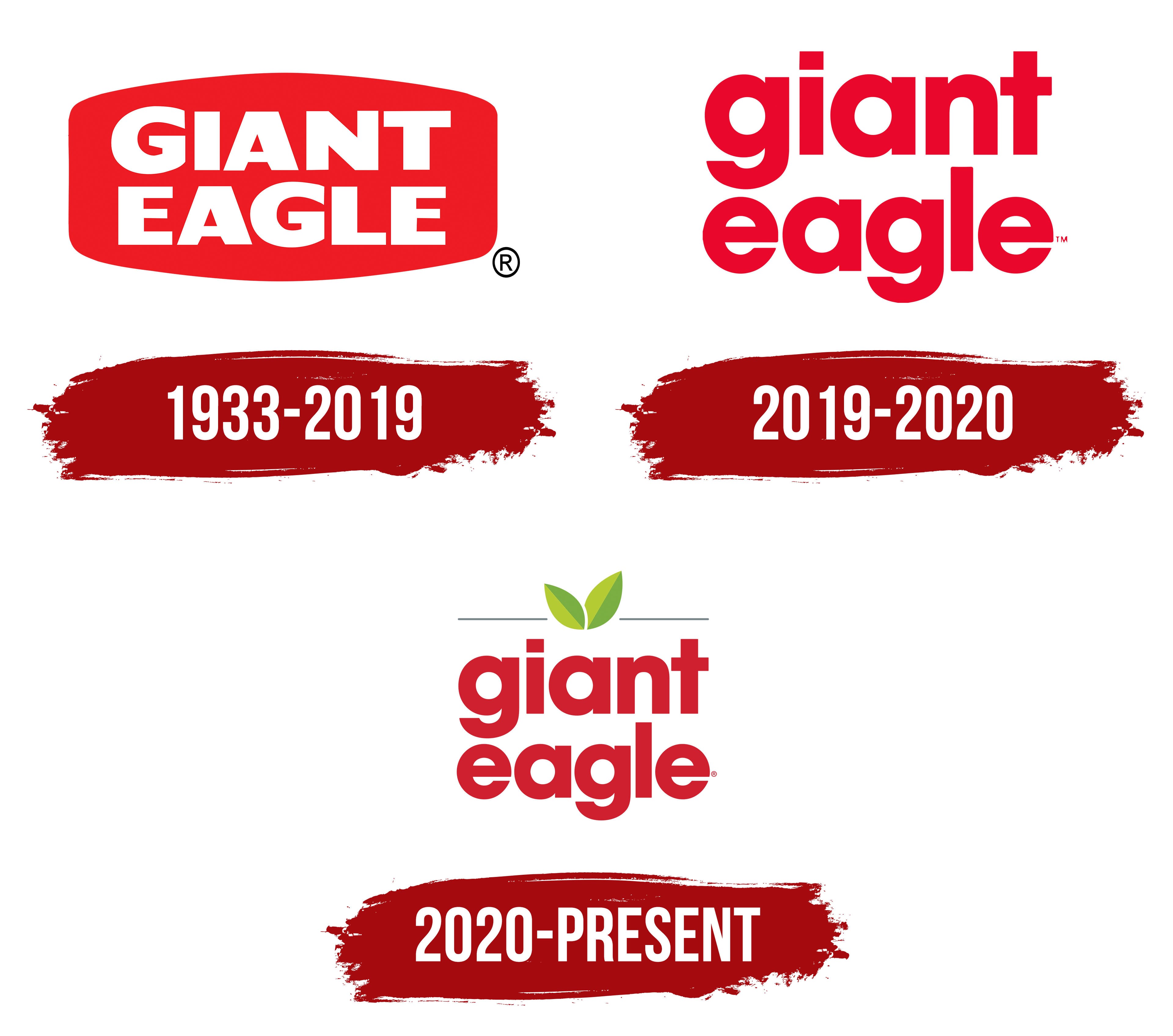
1933 – 2019
The first supermarket emblem is designed on a red oval base, emphasizing the pursuit of leadership and the importance of the brand. The red color was chosen deliberately, symbolizing strength and the chain’s dominant position from the start through the merger of two major retailers. This merger allowed Eagle to own many stores, securing a substantial market share.
On the oval, white letters form the brand’s name. The word “Eagle” is connected to the fact that the eagle is a symbol of the USA and appears on the seal of the state of Pennsylvania, where the chain operated. Despite changes, this word remained in the new name. To reflect the scale of the chain and its ambitions, the word “Giant” was added, indicating the company’s vast capabilities and broad presence.
The white color of the letters symbolizes the freshness and quality of the offered products, highlighting the importance of these aspects to the company. The large font conveys a wide range of products and a rich selection for customers, emphasizing that the chain provides everything its clients need.
2019 – 2020
The logo’s uppercase letters were replaced with lowercase letters, and the letters were given a rich dark-cherry color. This change occurred after Ricker’s convenience stores were acquired, marking an important step in the brand’s development. The background removal symbolized the expansion of boundaries, demonstrating that the company was no longer limited to operations in Pennsylvania. New supermarkets were already operating in Indiana, reflecting growth and increased geographic reach.
The logo’s switch to lowercase underscores that, after the acquisition, the brand intends to improve the quality of its customer service, making it more accessible and convenient. The dark cherry color chosen for the font emphasizes the company’s solidity, accumulated experience, and stability. It also indicates continuous 24-hour operation, ensuring customers can rely on the service at any time.
2020 – today
The Giant Eagle logo became brighter and more modern with the addition of green leaves and a thin stripe on top. The red lettering is in large font, emphasizing the brand’s confidence and stability. This approach helps the supermarket chain remain recognizable among customers.
The green leaves symbolize the freshness and natural quality of the products, emphasizing high quality and environmental friendliness. The leaves at the center of the composition serve as a symbol of nature, highlighting the brand’s commitment to healthy living and offering high-quality products.
The thin stripe above the lettering conveys the chain’s high standards. It visually separates the elements, giving the logo a neat, unified look.
The red lettering creates energy and dynamism, suggesting the company’s activity and engagement in its work. The green color of the leaves is associated with nature and health, reinforcing the connection to eco-friendly products.
The Giant Eagle emblem represents care for customers and product quality, reflecting the company’s drive to meet high standards.