![]() GNU Logo PNG
GNU Logo PNG
The GNU logo emphasizes the idea of free software. Its simple graphic design symbolizes the project’s independence and its role in promoting open-source code.
The GNU Project began in 1983, when programmer Richard Stallman opposed proprietary software and set out to create a free Unix-like operating system, thereby establishing the Free Software Foundation (FSF).
In 1985, Stallman introduced the GNU GPL, which guarantees four essential user freedoms. Early successes included the GNU Emacs editor and GCC compiler.
By the early 1990s, most GNU system components were ready, but development of the GNU Hurd kernel stalled. In 1991, Linus Torvalds created the Linux kernel, which led to the development of the complete GNU/Linux operating system.
GNU also gave rise to major projects, including the GNOME desktop environment and the Debian GNU/Linux distribution. In 2007, the GPLv3 was introduced, providing stronger protections.
Stallman briefly left the FSF in the late 2010s amid controversy but returned to the board in 2021.
Today, the GNU Project continues to develop free software and remains a significant influence within the global open-source community.
Meaning and History
![]()
What is GNU?
This project aims to develop a free, open-source Unix-compatible operating system. The system comprises core components, including a compiler, text editors, a command shell, and other tools. Another famous open-source OS, Linux, later emerged from its development. The project’s primary goal is to enable users to freely use, modify, and distribute software without restrictions on commercial licenses.
1996 – 2003
![]()
The GNU logo featuring a gnu antelope was rendered in an artistic pencil-drawing style with a soft texture and detailed contours. The visual concept presented the animal’s profile facing right, with emphasis on the expressive, carefully drawn horns. Light, elegant lines defined the main outline of the head, while the horns were highlighted with subtle shading to accentuate their complex shapes and curves. The absence of color gave the composition a natural feel, preserving its handcrafted quality and evoking associations with illustrations from naturalist reference books.
The symbolism of the mark reflects the project’s name, “GNU” (“GNU’s Not Unix”), in which the gnu antelope serves as a visual allegory for both the word and the philosophy of the free software movement. The animal was intentionally chosen, as its name resembles the project’s acronym, underscoring the informality, openness, and originality of the developers’ approach.
Artist Etienne Suvasa created the original drawing, which Peter Gerwinski later refined to adapt the image for digital formats and typography. The updated version became cleaner and more contrasted while retaining the pencil-sketch style and emphasizing the artistic and non-commercial nature of GNU’s visual identity.
The logo was used in GNU documentation, official materials, and informational resources, reinforcing the project’s positioning as a community built on transparency, creative freedom, and collaboration. The pencil-drawn image proved to be an expressive tool for conveying the project’s core values and distinguishing it from other technological initiatives.
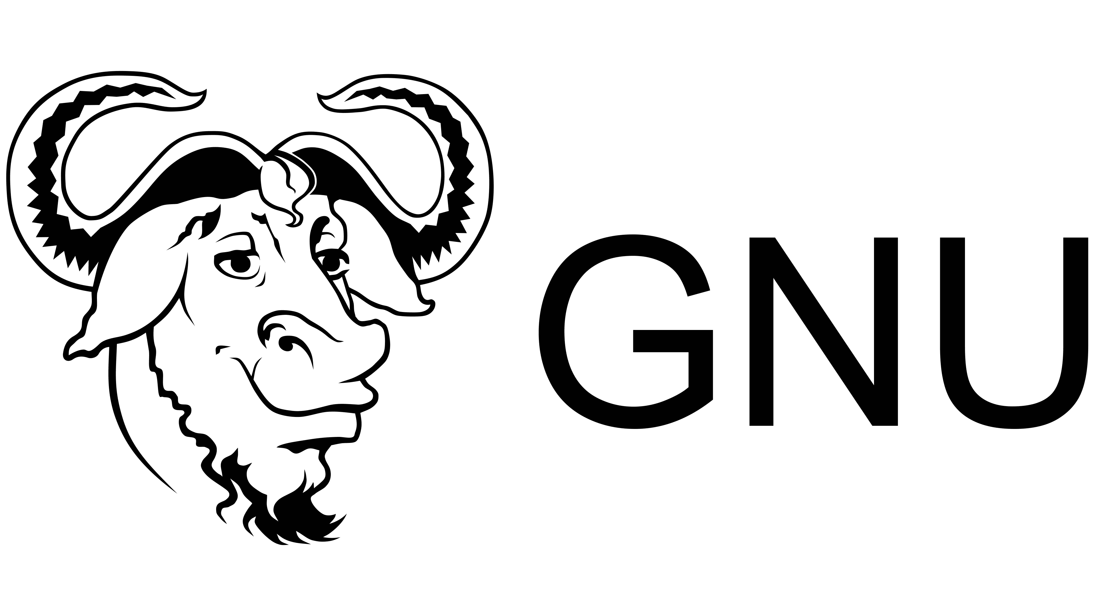
2003 – today
![]()
The updated GNU mark is a monochrome design of a GNU antelope’s head executed in bold, flowing lines. Compared to the earlier pencil version, the new visual concept is more streamlined, with cleaner graphics, a smoother silhouette, and more expressive contours.
Special attention is given to the horns, which become the primary visual focal point: large and wave-like, with sharply defined internal geometric patterns. The horns are drawn with thick lines, conveying strength. The gnu’s facial contours convey a humorous mood, highlighting the symbol’s open and friendly character.
The logo’s color palette is monochromatic, featuring a solid black outline against a white background. The lack of additional colors gives the symbol a tattoo-like quality, creating a strong emotional association with independence and individuality.
The philosophical undertone of the mark is tied to the core principles of the free software movement: freedom, transparency, and collectivism. The gnu, as an animal, symbolizes liveliness, activity, and sociability, resonating with the primary values of the GNU community. The choice of the antelope underscores the project’s ideology, its forward-looking openness to communication, and the exchange of ideas.
This version of the logo is widely used across the Free Software Foundation’s official resources and has become a required element in the branding of documentation, websites, and community materials. Despite numerous unofficial variations (ranging from ASCII art to pixel graphics), the official black silhouette remains the most authentic expression of GNU’s identity, thereby ensuring strong brand recognition and emotional engagement among its audience.