The Hallmark logo symbolizes high quality, premium status, and prestige. This is how the manufacturer of gift and souvenir products characterizes its products. The company uses the emblem to show a huge historical legacy spanning several decades.
Hallmark: Brand overview
| Founded: | January 10, 1910 |
| Founder: | Joyce Hall |
| Headquarters: | Kansas City, Missouri, United States |
| Website: | hallmark.com |
Hallmark is a world-renowned company specializing in producing an extensive range of products. The main direction is the production of unique greeting cards. But in addition to them, the brand produces exclusive lines of gift packaging, goods for the holidays, dishes, stationery, as well as original jewelry. Hallmark’s central office is located in America (Kansas City). But supplies are not limited to this country. The products are sent to stores all over the world.
The brand’s identity is underlined by an elegant, mesmerizing corporate identity that is reminiscent of the design of children’s fairy tales. This is due to the presence of the logo of a beautiful laconic crown and the name of the company, made in an unusual handwritten font. Such a concept symbolizes creativity, inspiration, and a creative approach to business. The use of the name itself focuses attention directly on the brand, its heritage, and its long history.
Meaning and History
Hallmark Cards is a privately owned family business. Throughout the history of its existence, the company was led by people who adhered to a single worldview and followed certain values. This approach can be seen in every detail of the brand – from the choice of equipment to product design.
The visual component is also no exception. The corporate logo has smooth lines, an author’s font, and a single design style. All this emphasizes the influence of family traditions and foundations on brand identity formation. Another important detail is the discreet classic coloring, which symbolizes stability, prestige, and excellent reputation.
What is Hallmark?
Hallmark Cards is one of America’s oldest manufacturers of colorful holiday cards. The company has even been awarded the National Medal of Arts. Currently, it produces not only postcards but also party goods, tableware, stationery, gift wrapping, and decorations. Hallmark Cards is also involved in television. She launched her own Hallmark Channel.
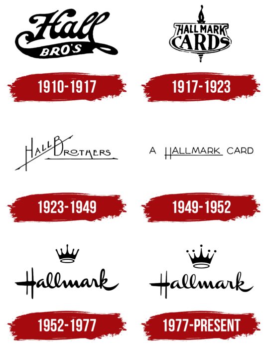
1910 – 1917
The first logo differed significantly from the modern version since it featured a different inscription. The emblem was based on the name Hall Bro’s. It was an abbreviation for the Norfolk Post Card Company that started Hallmark. Its founders were the Hall brothers (William, Joyce, and Rolly), who decided in 1907 to create a business to produce postcards.
At that moment, an unusual stylish logo was developed for the company. It consisted of two words – Hall Bros. The first word was in thick, flowing type with original round tails and had a black color. The second used a simpler serif font. Bros were painted white and were located on a black stripe that connected with the first word with lines.
1917 – 1923
In 1917, the characteristic inscription Hallmark Cards appeared on the logo for the first time. The replacement of the inscription symbolized the approval of the company’s status in the market and its development. This fact was also confirmed by the change in the overall visual concept. The brand name was placed inside the original figure. She was completely white with black outlines.
Against this background, the black inscription created a beautiful contrast. The font has also been updated. The word Cards was in a straight, confident serif typeface. The first and last letters were slightly stretched to fit the shape of the figure. For the design of Hallmark, a similar font was chosen, but without serifs. It was smoother and rounder, which symbolized trust.
1923 – 1949
During this period, another rebranding was carried out. Instead of a strict expressive emblem with the company’s name, they began to use a new version with the inscription Hall Brothers. So the company wanted to re-emphasize that it is family-owned and values. The font was thinner and more elegant in the updated version, and the design was significantly different from its predecessor. Both words were underlined with a straight thin line with sharp ends. Hall was placed diagonally, with the bottom line passing through B. This style showed a creative approach to product development and also favorably emphasized the brand identity.
1949 – 1952
In 1949, the company again decided that the logo needed to be updated. The designers kept the overall styling but changed the inscription. The new emblem was a beautifully designed “A Hallmark Card” lettering. These were the same thin and neat lines as in the version that existed from 1923-1949. But, this time, the underscore was only in the word Hallmark. The line was created by part of the first letter of the name. This version of the logo symbolized success, striving for excellence, and, at the same time, respect for the brand’s past.
1952 – 1977
This period became a landmark for the company. At the same time, the iconic emblem was created, reminiscent of the modern version. The well-known artist Andrew Szoke worked on the development of the logo at that time. He not only made the logo more modern but also added a recognizable element – the crown. It was located above the Hallmark inscription.
Both badges had a restrained black color and a similar design style. The inscription was made in a stylish handwritten font, similar to the symbols drawn with a brush. The elements created a harmonious picture demonstrating confidence, solid status, and prestige.
1977 – today
In 1977, an updated version of the previous logo appeared. It has completely retained the visual concept but has undergone changes in some details. The main ones concerned the font and the shape of the crown. If in the older version, the element looked more abstract, but the emblem from 1977 had a detailed image.
Small black dots have been placed on the five protrusions of the crown, and the lines themselves have become clearer. The font has also changed a bit. The lines became more elegant and refined, which made the logo more perfect overall. Such changes had a positive impact on the identity and became a symbol of the company’s prosperity. Hallmark Card developed rapidly, expanding its product range and market. Success followed in all directions.
Font and Colors
Hallmark is a solid company with a long history, directly reflected in its visual identity. The logo is based on a clear stylized name of the company, complementing a crown symbolizing a special status. For the design of the inscription, a decorative rounded font was used, made in a handwritten style. The letters have rounded lines that smoothly connect to each other. A feature is the almost complete absence of gaps.
There is only space between the first and second letters. The chosen format demonstrates trust, reliability, and creativity. The color palette consists of only two classic colors – black and white. They create an original contrast and emphasize the balance in the logo. Black symbolizes timelessness, stability, and prestigious status, while white symbolizes openness and simplicity.
Hallmark color codes
| Purple Heart | Hex color: | #61368f |
|---|---|---|
| RGB: | 97 54 143 | |
| CMYK: | 32 62 0 44 | |
| Pantone: | PMS 526 C |


