 Hang Seng Bank Logo PNG
In Hong Kong, banking connections are often maintained within families for many years. The Hang Seng Bank logo is associated with a bank that provides account management, lending, and investment services to private and corporate clients. The name translates as “constant development” or “continuous growth,” and this idea is at the core of the bank’s operations.
Hang Seng Bank was founded on March 3, 1933, in Hong Kong. The founders were entrepreneurs Lam Bing-dong and Ho Sim. The name translates as “constant growth.” The first branch was opened in Wan Chai. The bank served local merchants and small businesses.
During the Japanese occupation, operations were suspended. In 1945, the bank resumed activity. In the 1950s and 1960s, the branch network expanded rapidly. In 1960, Hang Seng became the first Hong Kong bank to list its shares on the stock exchange. In 1961, the Hang Seng Index was launched. This index became the main indicator of the Hong Kong market.
In 1965, the bank faced a liquidity crisis. HSBC acquired a 51 percent controlling stake. In the following decades, Hang Seng expanded its service offerings. It introduced mortgage lending, bank cards, and investment services. The bank became one of the largest financial institutions in Hong Kong.
By the 1990s, Hang Seng had installed ATMs and launched telephone banking. In 2000, it introduced an online service. In 2001, it began expanding into mainland China. The first mainland branch opened in 2007 in Shanghai.
In the 2010s, the bank strengthened its position in mainland China. During this period, it invested in digitalization and mobile service development. In 2021, the virtual bank Mox was launched. It is aimed at clients who use digital service channels.
In 2023, Hang Seng implemented artificial intelligence for customer service. In 2024, lending to small businesses was expanded.
The bank is among the largest financial institutions in the region. It serves about three million customers. The network includes around one hundred branches in Hong Kong and China. A controlling stake of approximately sixty-two percent remains with HSBC.
Meaning and History
What is Hang Seng Bank?
One of the largest banks in Hong Kong, part of the international HSBC Group. The main business areas include retail and corporate banking, asset management, and global markets. The bank offers accounts, mortgages, insurance, credit cards, and investment solutions, while companies receive financing, foreign exchange services, and trade credit. Clients are served in Hong Kong, mainland China, Macau, Singapore, and Taiwan. The bank is known as the developer and operator of the Hang Seng Index.
1933 – 1996
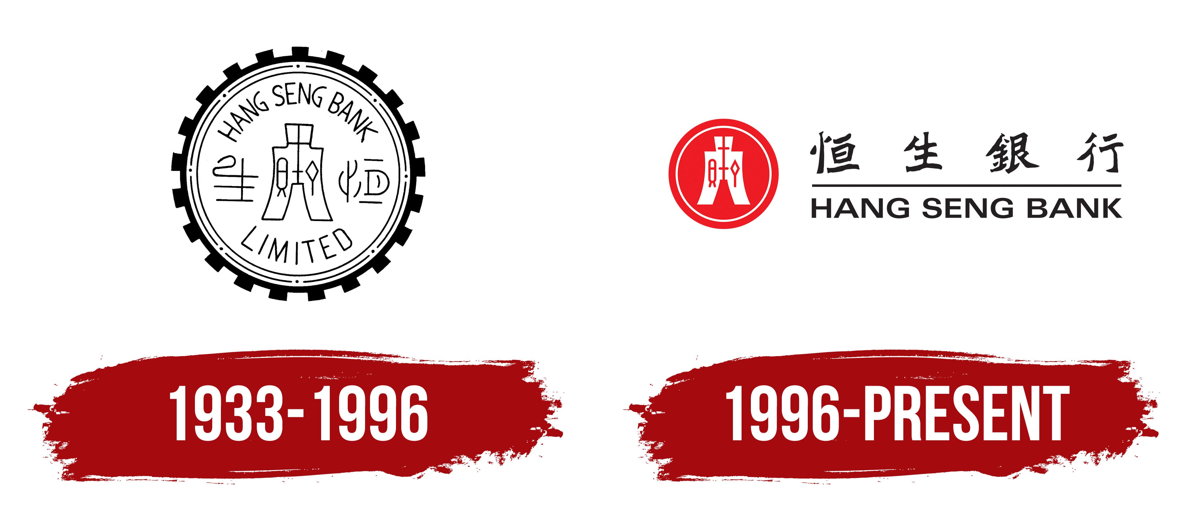
The name Hang Seng is connected to the bank’s opening date, March 3, 1933. The date 3.3.33 gained cultural meaning because the Cantonese pronunciation of the number three resembles words associated with life and growth. The repetition of three threes was interpreted as a wish for prosperity. The Chinese name 恒生 is pronounced Hang Seng in Cantonese and translates as “everlasting growth.” The bank connects the name with the shared development of Hong Kong and its residents.
The first Hang Seng Ngan Ho office opened on Wing Lok Street in Sheung Wan and provided currency exchange services. It had 11 employees and occupied approximately 800 square feet. Net profit reached HKD 10,389 during the first year. Historical materials name Lam Bing-yim, Ho Sin-hang, Leung Chik-wai, and several business partners among the founders. The variants Lam Bing-dong and Ho Sim resulted from inaccurate renderings of Cantonese names.
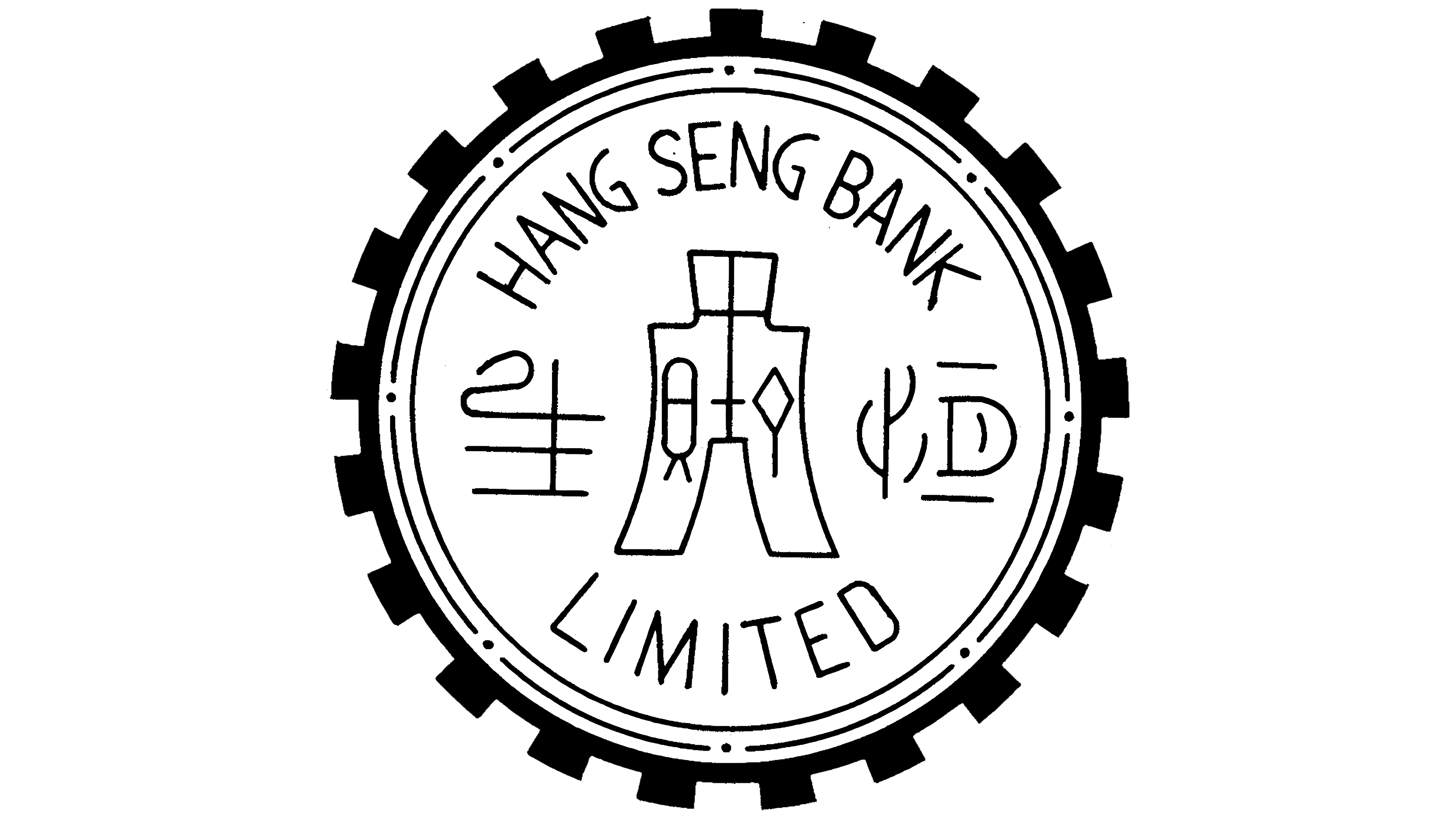
Hang Seng was incorporated as a private company in 1952 and became publicly traded in 1960. By then, the small currency exchange office had grown into a commercial bank. Its identity used an emblem shaped like an ancient Chinese coin with a heavy circular frame.
The outer edge had closely spaced projections and resembled the rim of a coin or a gear. Two rings followed, with a band of small dots between them. Several levels framed the inner field containing the English name and Chinese symbols.
HANG SENG BANK appeared along the upper part of the circle, while LIMITED occupied the lower section. The English text followed the curve of the ring. Narrow uppercase letters used a thin sans-serif typeface and occupied comparatively little space.
A large symmetrical Chinese symbol appeared in the center. It used thin lines inspired by ancient writing and engraved seals. Four additional characters appeared around it, with two on the left and two on the right. The coin image and historic letterforms referred to Chinese monetary culture and the bank’s Hong Kong origins.
During the banking crisis of 1965, Hongkong and Shanghai Banking Corporation acquired a 51 percent interest in Hang Seng. The stake later increased to 62.14 percent. After joining HSBC Group, the bank retained the Hang Seng name and a separate emblem.
1996 – today
Hang Seng Bank introduced a new identity in March 1996. A compact red figure replaced the previous emblem, which had been used for approximately 42 years. It suited branch facades, bank cards, documents, and advertising.
The design was based on ancient Chinese spade coins. These bronze payment objects had elongated bodies and broad lower sections. They circulated in China before round coins became common. The bank calls the symbol its “spade-coin emblem” and connects it with the country’s financial history and Hang Seng’s cultural roots.
The emblem appears inside a red circle with two outlines. The outer line is thinner than the inner one. A white symmetrical silhouette with a broad base and quadrilateral opening appears in the center. The internal lines resemble patterns found on ancient coins and seals. The circular frame and spade form combine imagery from different periods of Chinese monetary culture.
The Chinese name 恒生銀行 appears on the right. The brush-style characters use strokes of varying thickness and resemble traditional calligraphy. The English words HANG SENG BANK appear below in uppercase sans-serif letters. A thin horizontal line separates the two inscriptions. The Chinese name occupies the upper level, while the English version addresses Hong Kong’s international audience.
A green wordmark complemented the red emblem. The color combination distinguished Hang Seng from HSBC’s red-and-white system. The logo appeared on branches, cards, business documents, advertising materials, and Hang Seng Indexes products.
The bank updated its branch identity and materials for personal and corporate customers in 2006. The phrase “Managing wealth for you, with you” accompanied the program. The red emblem retained its 1996 form.
In January 2026, Hang Seng once again made the spade-coin emblem the primary image of its “Deeply Rooted. Ever Evolving.” campaign. Through the spade coin, the bank presented its cultural roots and brand development 30 years after the logo first appeared.