 Orkla ASA Logo PNG
Consumer goods include food, household chemicals, and everyday home products. The company produces and distributes these goods to keep them available in stores and supermarkets. The Orkla ASA logo represents a Norwegian company that manages brands in the food and home goods sectors.
Orkla’s history begins in 1654 with copper pyrite mining at the Løkken Verk mine in Trøndelag. In 1904, Christian Thams founded Orkla Grube-Aktiebolag. At the same time, he built Norway’s first electric railway, Thamshavnbanen. In 1929, the company was listed on the Oslo Stock Exchange. In 1931, the company launched a new smelting plant. In 1941, the company began forming an investment portfolio and gradually moved away from mining operations.
In 1958, the company formed a joint venture with Unilever that incorporated the Lilleborg brand. In 1975, it opened offices in Oslo. In 1981, Orkla entered the media sector and began expanding beyond Norway. In 1984, Orkla established Orkla Media. In 1986, Orkla merged with Borregaard. This created Orkla Borregaard, combining consumer goods and chemical operations.
In 1987, the Løkken Verk mines were closed, ending a three-hundred-year history of mineral extraction. In 1991, the merger with Nora Industrier strengthened its position in consumer goods production. In 1995, Orkla acquired Procordia Food and Abba Seafood. In 1997, the company acquired Pripps Ringnes and expanded its presence in Eastern Europe.
In 2000, Orkla acquired a 40 percent stake in Carlsberg Breweries and purchased the Danish media group Det Berlingske Officin. In 2004, Orkla sold its stake in Carlsberg. In 2005, the company acquired Elkem, Sapa Group, and the Finnish Chips Abp.
In 2006, Orkla sold Orkla Media and exited the media business entirely. In 2007, the company acquired the Indian firm MTR Foods. In 2010, it bought the Estonian enterprise Kalev. In 2011, the company sold Elkem and announced a focus on developing proprietary consumer brands.
In 2012, Orkla acquired Jordan and Rieber & Søn. That same year, Orkla spun off Borregaard as an independent company. In 2014, Orkla acquired NP Foods Group. In 2015, the company bought the Swedish Cederroth. In 2018, Orkla acquired the Finnish Kotipizza Group.
In 2021, the company strengthened its position in India and Europe by acquiring Eastern Condiments, NutraQ, New York Pizza, and Noí Siríus. In 2022, Orkla Health acquired the British Healthspan Group. In 2023, Orkla ASA became an industrial investment company. In 2024, Lilleborg was sold.
The company sold the Pierre Robert Group and its energy assets. This completed its transition toward a focus on consumer goods brands.
Meaning and History
What is Orkla ASA?
A Norwegian investment group from Oslo began with copper and pyrite mining and later became the owner of international consumer goods brands. Its market capitalization exceeds 180 billion Norwegian kroner. The company abandoned metallurgy, energy, and brewing and now focuses on food, cosmetics, and household products. Its portfolio includes the brands Kalev, Laima, Felix, Abba Seafood, MTR Foods, Gutta, and Põltsamaa. It previously owned the Russian factories Krupskaya and Sladko but sold them.
before 2007
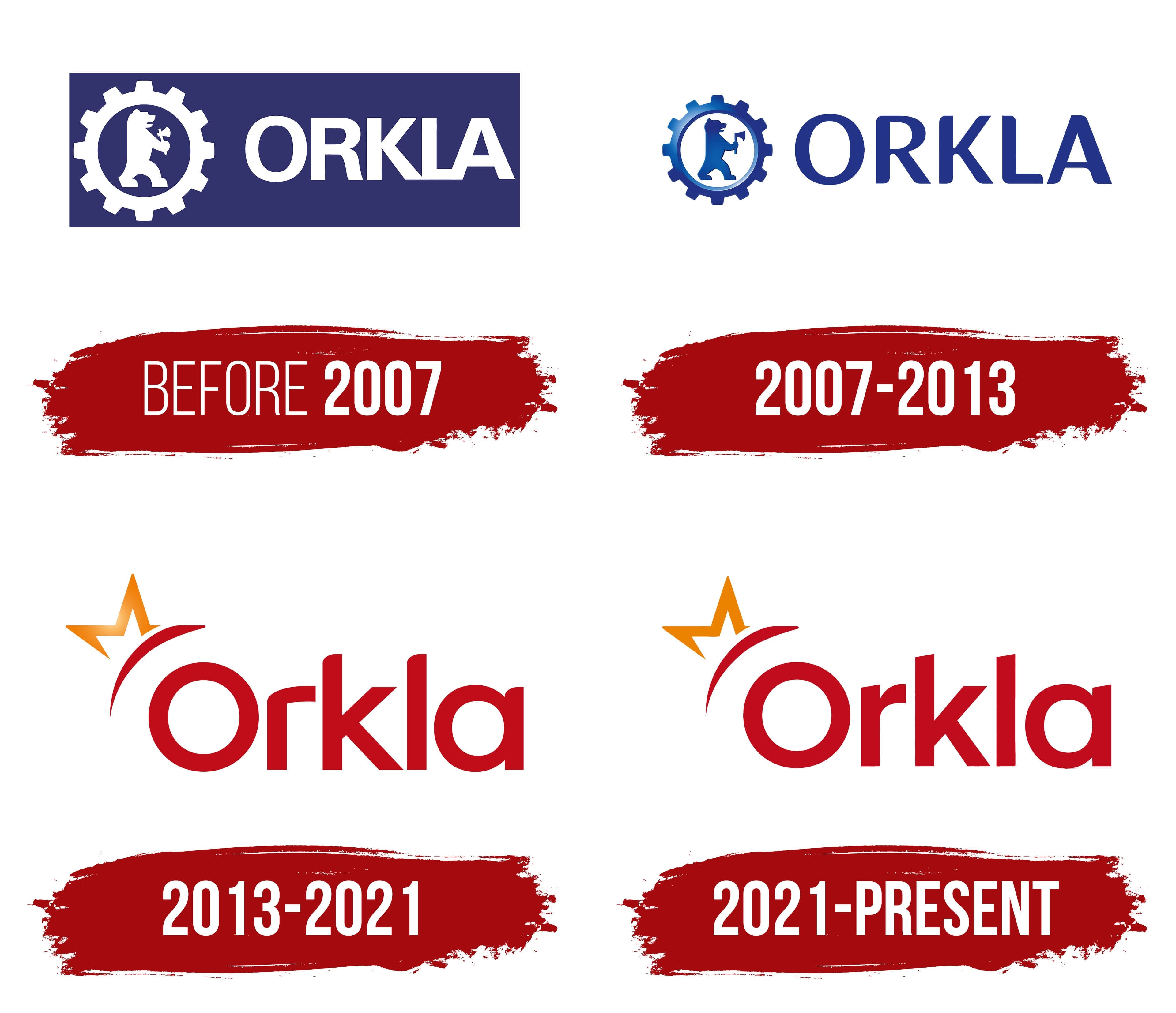
Before 2007, Orkla used a logo with a rigid industrial appearance. Its name comes from the area near the Orkla River in Norway, while the company traces its history to ore mining near Løkken Verk in Trøndelag in 1654.
Orkla Grube-Aktiebolag was established in 1904 to operate the Løkken mines. The old logo maintained a connection to the company’s industrial past. The bear, cogwheel ring, and formal ORKLA lettering referred to manufacturing, strength, and the brand’s Nordic origins.
The logo centered on a solid blue rectangle. A white cogwheel, bear, and company name appeared inside it. ORKLA was written in uppercase letters with rigid forms and no decorative styling.
The blue background and white details produced a dense, professional appearance. The logo resembled the emblem of a company rooted in mining, with a name tied to its place of origin, industrial operations, and growth from Norwegian mining sites into a major corporate group.
2007 – 2013
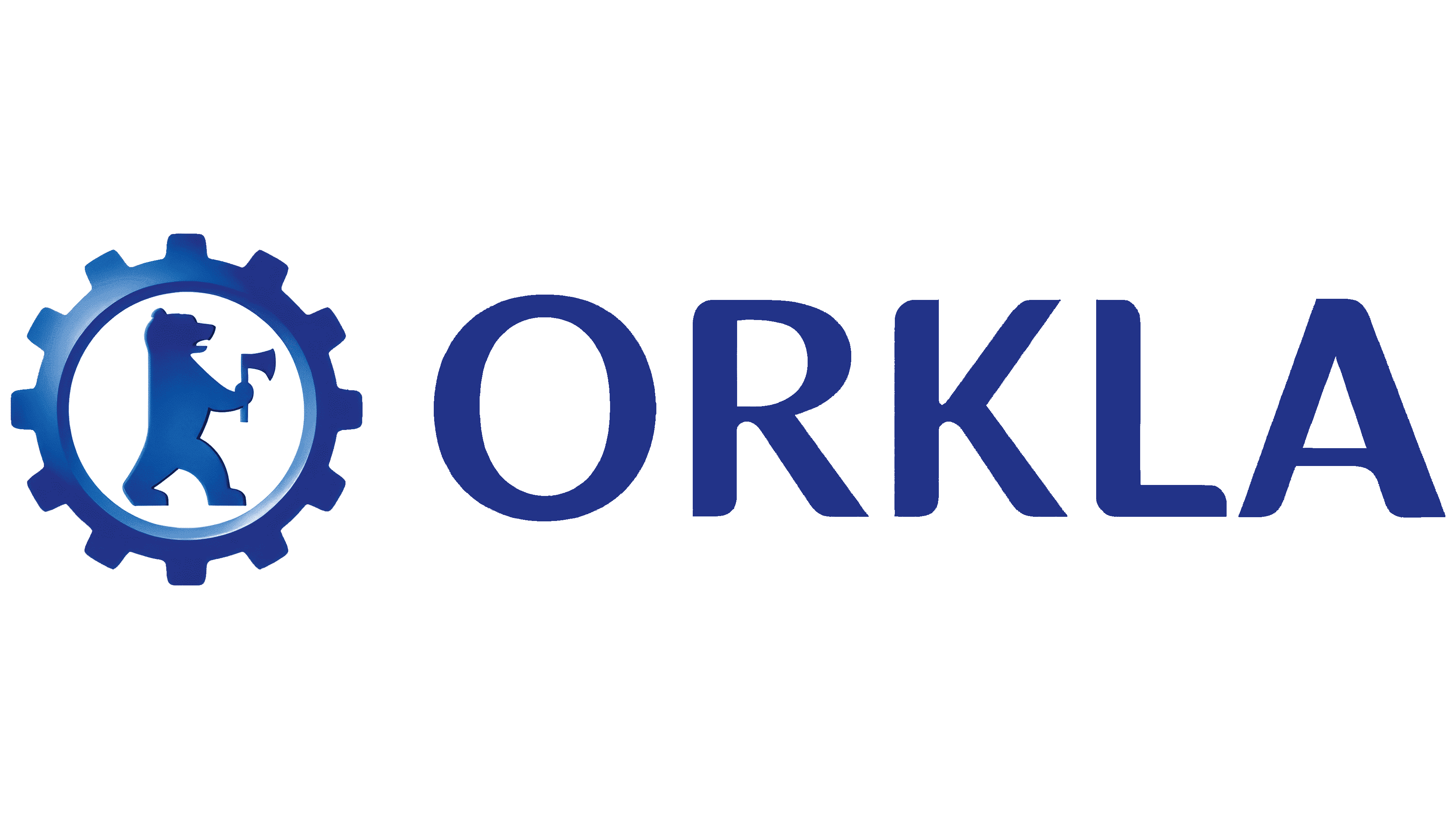
In 2007, Orkla discontinued the heavy blue rectangle. The updated logo had a more open presentation. A cogwheel containing a bear appeared on the left, with the ORKLA name placed on the right. The industrial foundation remained, though the overall appearance became lighter.
A gradient gave the blue cogwheel a softer sense of volume. Its evenly shaped teeth recalled manufacturing, while a white circle inside separated the bear from the outer form. The bear faces right and holds an ax in its front paw. Its silhouette was reduced to simplified outlines of the head, body, and legs.
The ORKLA name appears in uppercase dark blue letters. The sans-serif typeface has soft forms and resembles Myriad or Frutiger. Compared with the previous version, the logo looked lighter and better suited to a modern corporate environment.
The 2007 update retained Orkla’s connection to its past. The cogwheel continued to reference industry, while the bear preserved the brand’s Nordic imagery. Orkla used the logo in this form until 2013.
2013 – 2021
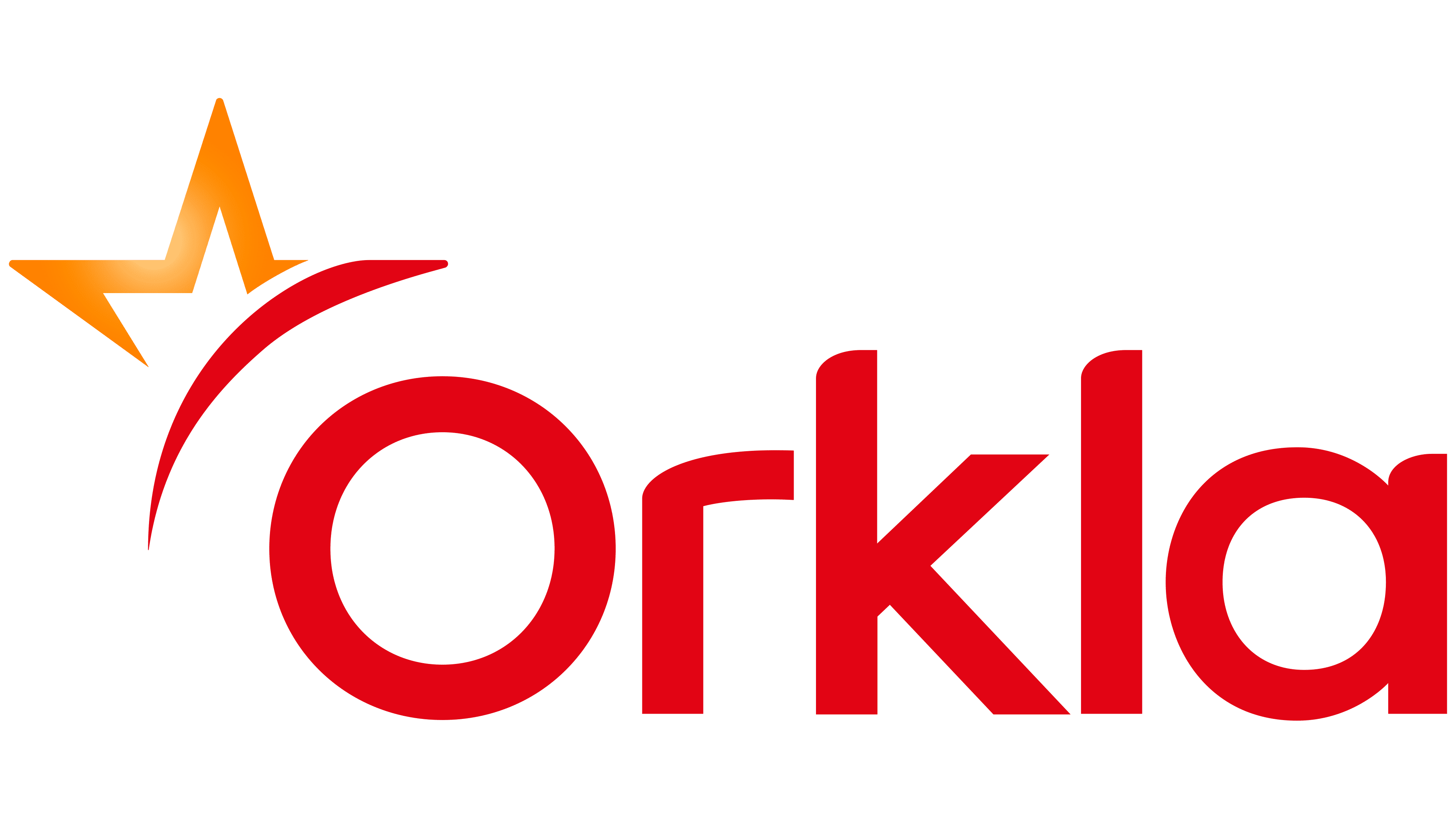
On September 16, 2013, Orkla introduced a new logo as part of a change in corporate direction. The company was moving away from a diversified conglomerate structure to focus on branded consumer goods. Under the new business model, the former industrial imagery of a cogwheel and bear appeared too heavy.
Norwegian agency Grid Design developed the logo in collaboration with Orkla’s internal project team. Arve Heltne, Senior Vice President of Commercial Excellence, led the work on behalf of the company. The new identity retained a professional tone while presenting Orkla as warmer and closer to the consumer goods market.
The logo is based on the red Orkla wordmark. The first letter is uppercase, and the remaining letters are lowercase. The sans-serif typeface has gently rounded corners and even strokes. Its form resembles modified geometric typefaces such as Avenir or Gotham Rounded.
A broad red arc extends above the letter “O.” Next to it is a fragment of a five-pointed star resembling the letter “M,” rendered with an orange gradient. The star motif referred to the goal of becoming “a star in the Nordic branded consumer goods markets.” Åge Korsvold described the new identity as innovation, energy, enthusiasm, warmth, and proximity.
2021 – today
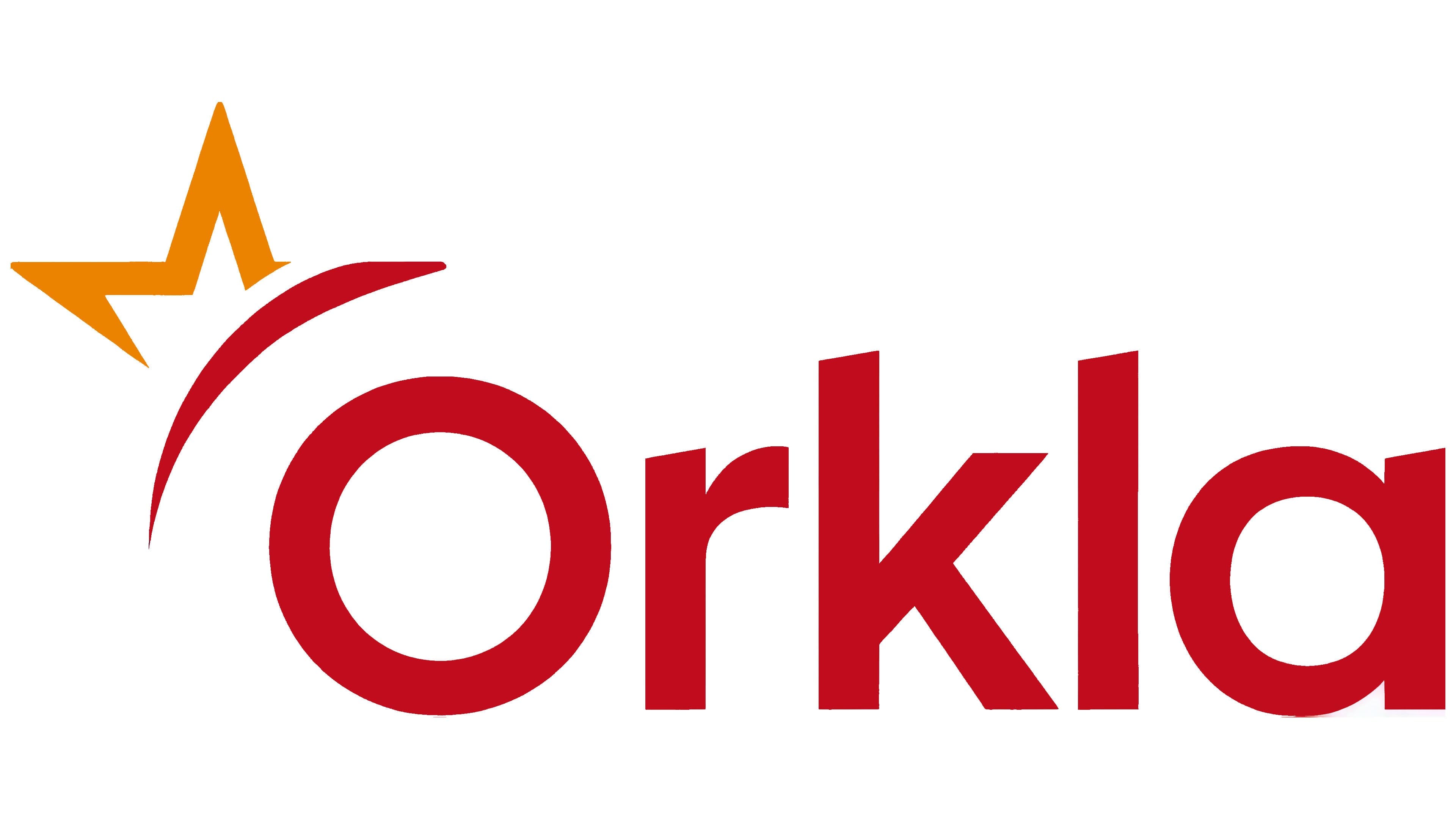
The Orkla logo introduced in 2021 retained the foundation of the 2013 redesign while adopting a more restrained appearance. The company kept the red Orkla wordmark and the symbol above the first letter, formed by a star fragment and an arc. The revisions affected details shaping the overall appearance.
The main adjustment appears in the upper symbol. The star fragment lost its gradient and became a uniform orange. Removing the color transitions gave the logo a flatter, more reserved appearance. The red arc above the letter “O” remained, preserving a connection to the previous version.
The Orkla name remains in a red sans-serif typeface. The first letter is uppercase, while the remaining letters are lowercase. Compared with the 2013 logo, the typeface became slightly more formal. Some letters lost their former rounded contours, giving the wordmark a less soft appearance.
The logo continues the direction established after Orkla discontinued the old blue symbol featuring a bear and cogwheel. The company no longer relies on the image of an industrial group. The newer version focuses on the branded consumer goods market, where warm colors and the star motif create a softer, consumer-focused presentation.